The well-loved kitchen is always fun to finesse. If you’re redoing everyone’s favourite room of the house, take a peek at these dream-worthy spaces for some serious kitchen cabinet inspiration. (Now, if only you could find someone to help with the dishes!)
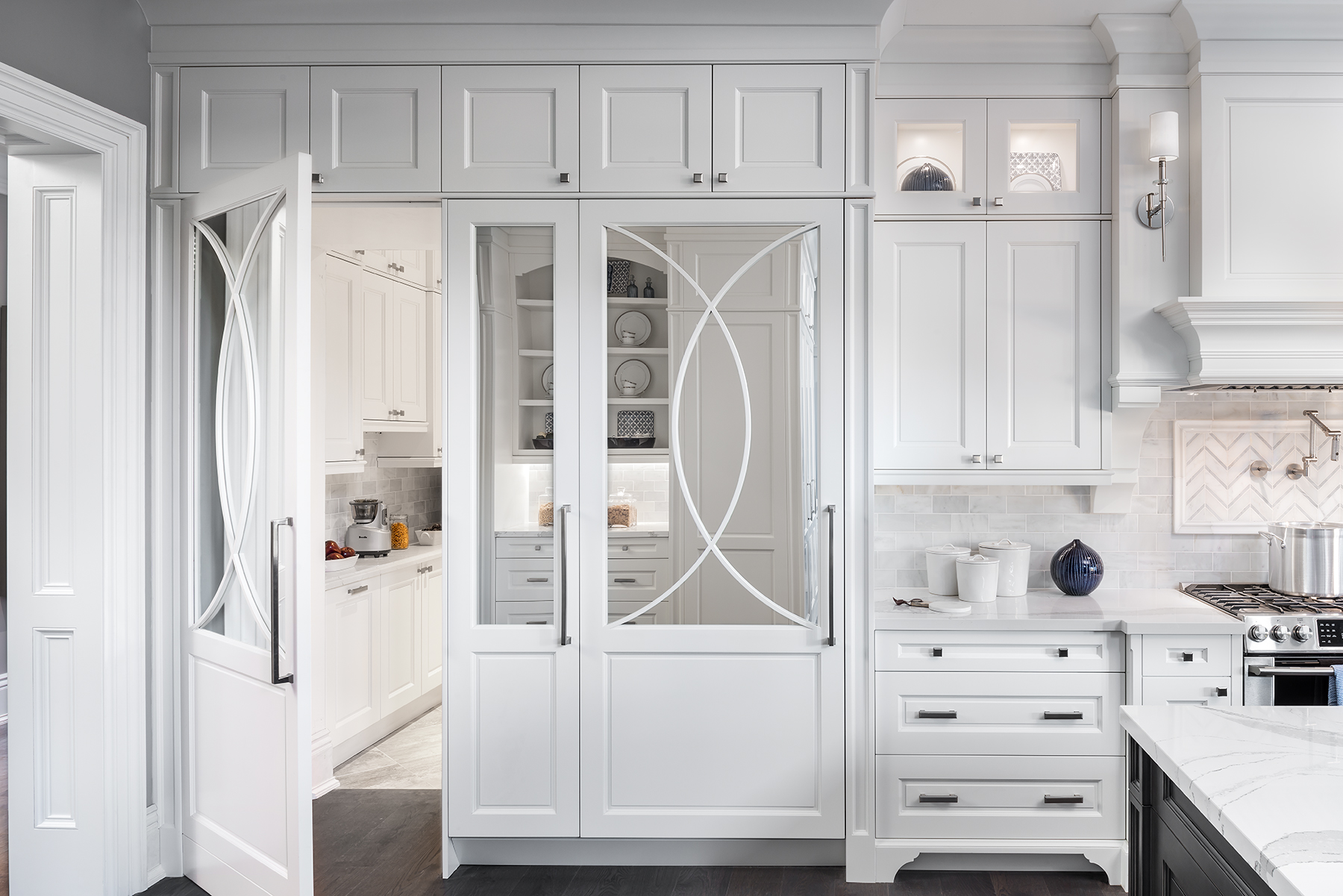
Touch of Glamour
All-white kitchen cabinets can be dull, dull, dull! But not if you shake things up a bit like Scott McGillivray did on Moving the McGillivrays. The intrepid designer’s use of mirrored doors and a swooping overlay ensures this kitchen will never feel too one-note.
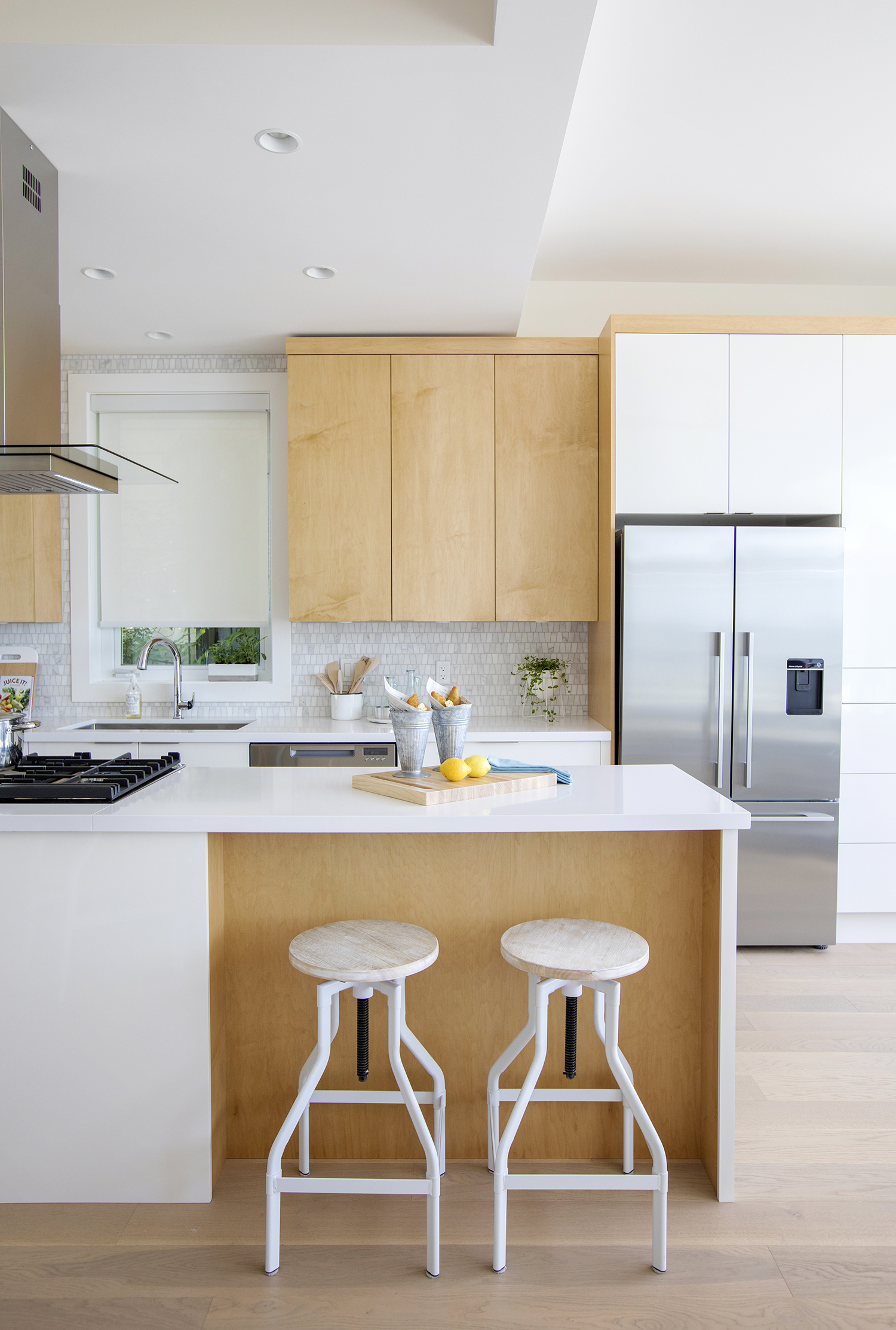
Seaside Sensibility
There’s nothing flat about these flat-fronted cabinets that feel interesting thanks to a two-tone scheme. The white portion is glossy for a modern vibe, while the wood reinforces the beach house portion of the equation
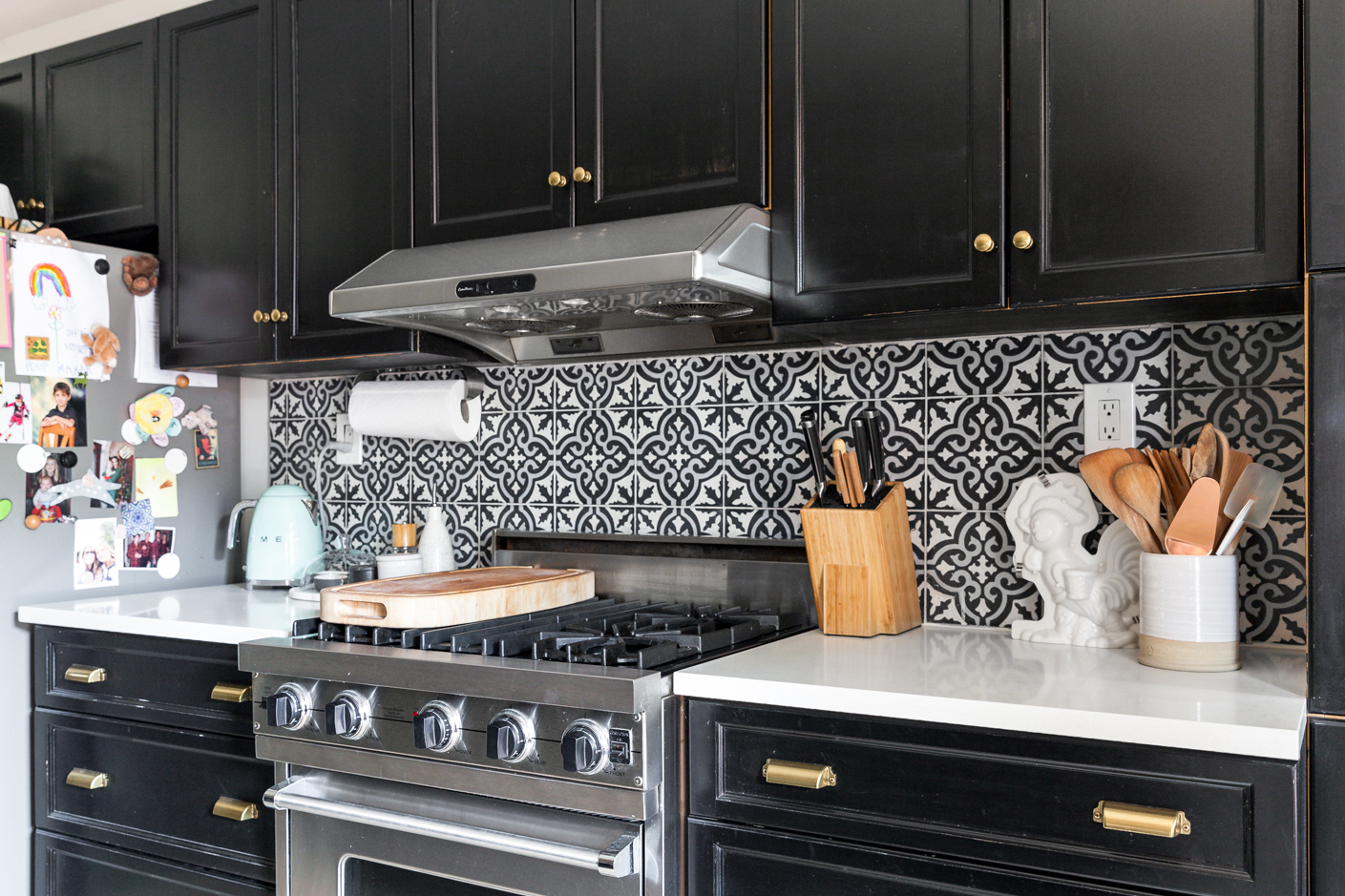
Sensing a Pattern
Interior design writer Vanessa Sicotte eschewed the usual white cabinetry for black in her cheeky Montreal home. The encaustic tiles are in sync with the rest of the pattern-filled house that we absolutely love.
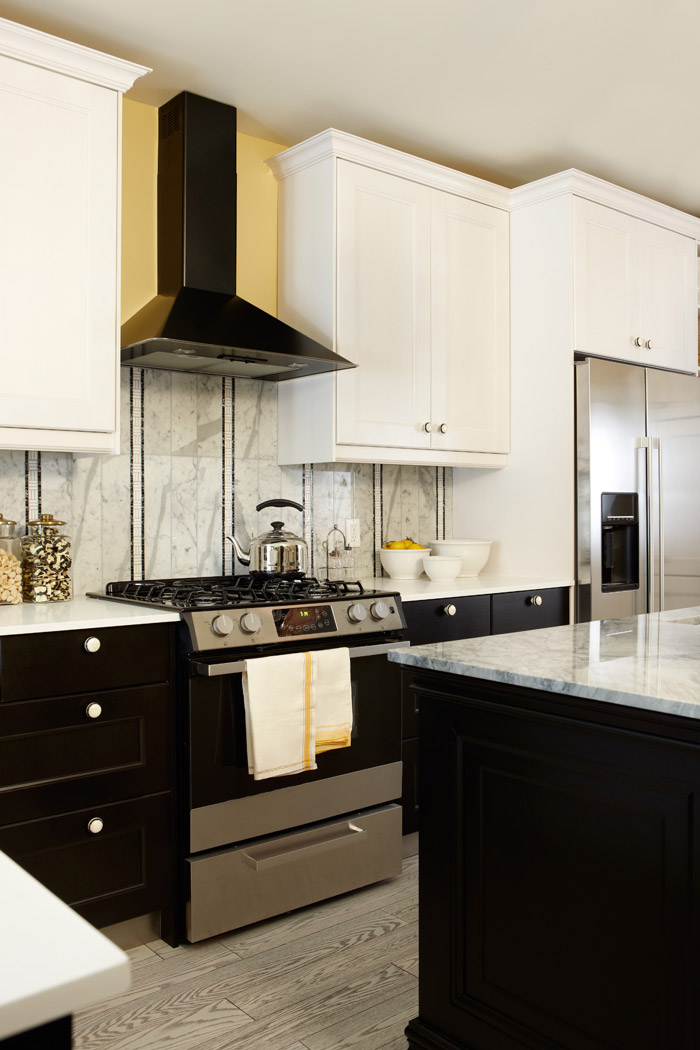
Tuxedo Effect
Luxury abounds in this swanky-to-the-max kitchen designed by Sarah Richardson that sees black contrast white cabinets for some serious tuxedo-wearing attitude. A bold vent and backsplash that incorporate complementary hues take it over the top.
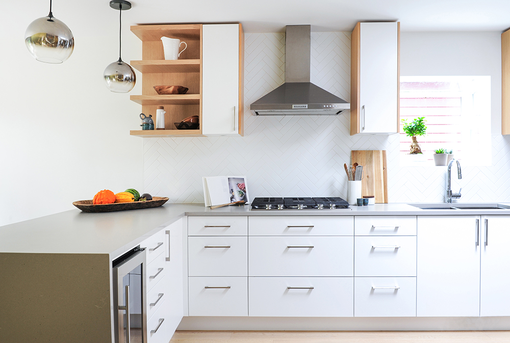
Scandi-Chic
Interior designer Stephanie Durston of Durston Design brought in wood to affect a Scandi-chic feel in this Vancouver kitchen. Layering in pale millwork around the cabinets “adds warmth and interest,” she says.
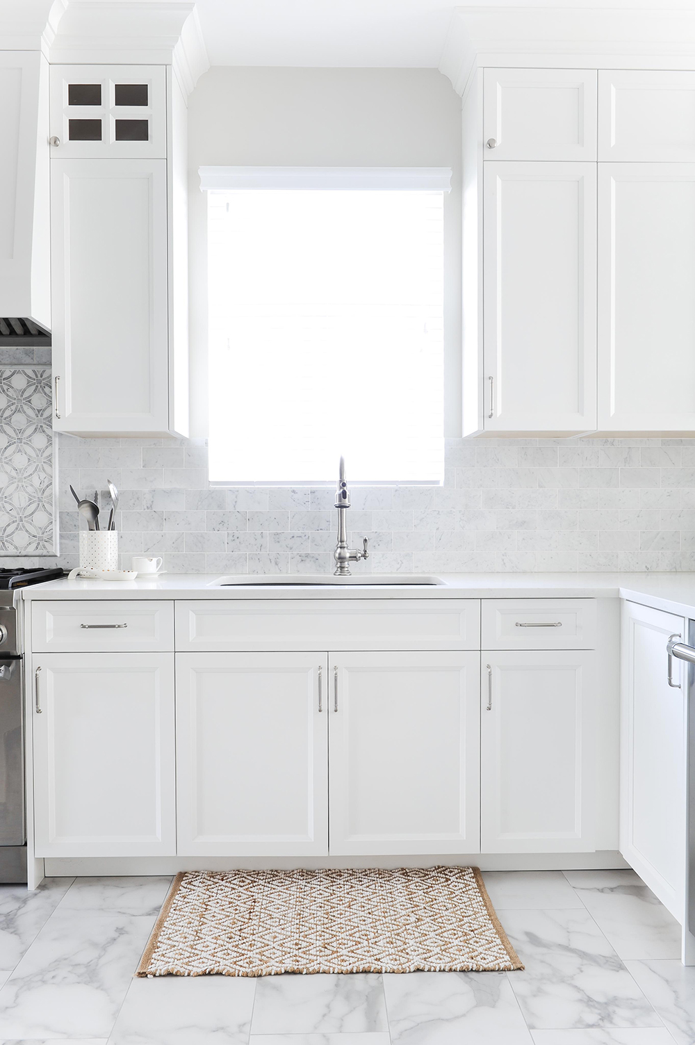
Classic Shaker Doors
Classic shaker cabinets and marble-look tiles (would you believe the floor is affordable porcelain?) give this kitchen a timeless feel. It’s the brainchild of Huong Nguyen, creative director of the interior design and furniture boutique The Spotted Frog, who was after a glam-coastal vibe for this West Coast family home.
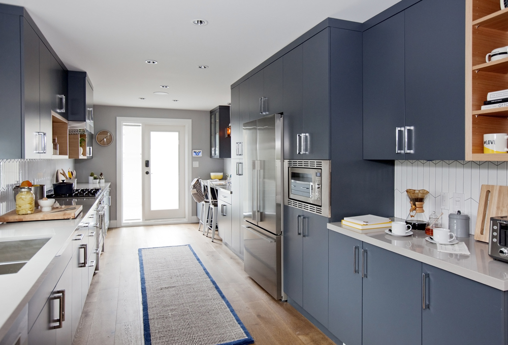
Feeling the Blues
Step away from the white door samples. And while you’re at it, skip the black ones too. Why not go for colourful cabinets? Be sure to choose a hue you can live with, like a trendy yet timeless blue, which is ravishing in this space designed by Jillian Harris. We’re loving the sisal runner with its matching navy border. Well played!
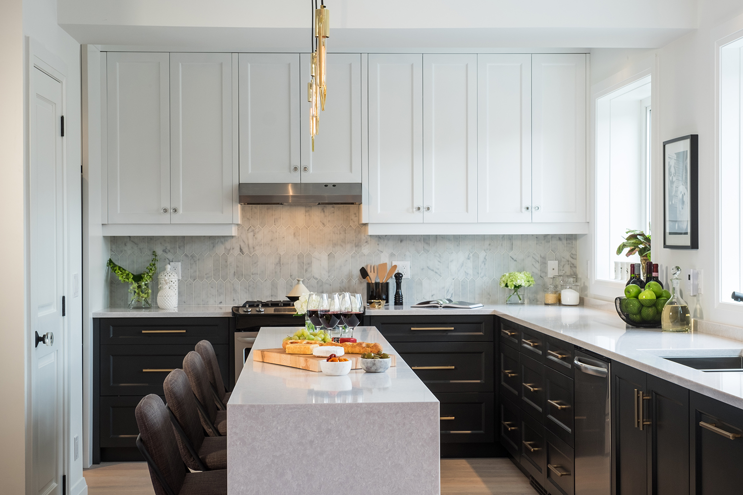
Luxe in Black and White
These look-at-me kitchen cabinets prove that contrast is key if you want to step out of your comfort zone and make a statement. The marble island also echoes the backsplash beautifully, which is a perfect foil against the luxurious black and white cabinetry.
Make a Splash
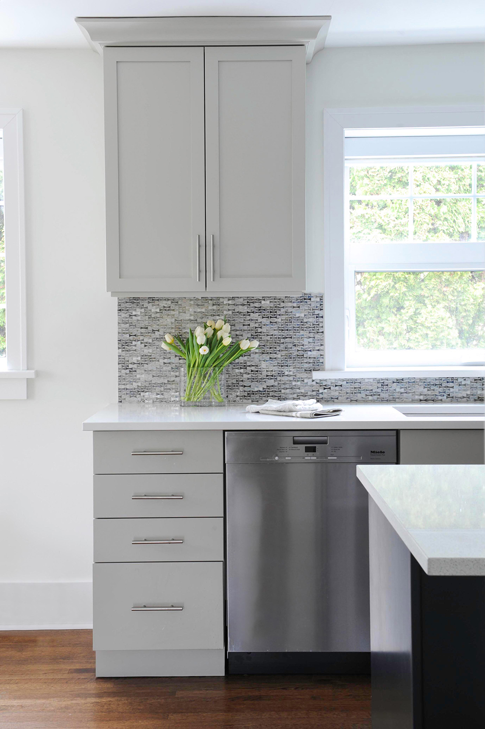
Never underestimate the power of tile. This grey kitchen, which sports simple stainless-steel pulls, shaker doors on the uppers and flat fronts on the lowers, gets a lift from the luminous backsplash.
Country Charm
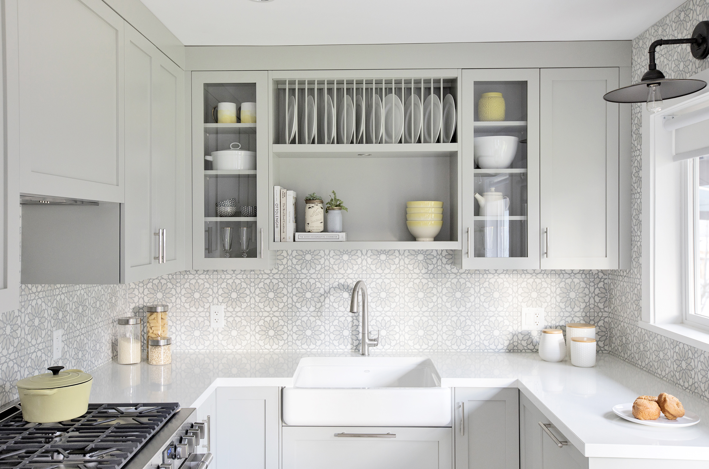
Plate racks, a recessed nook for holding pretty earthenware, as well as glass-fronted kitchen cabinets lend a modern-country feel to this kitchen designed by Jillian Harris. To keep the look cohesive, Harris incorporated a white apron sink that’s perfectly in tune with the shaker cabinets.
Pull Power
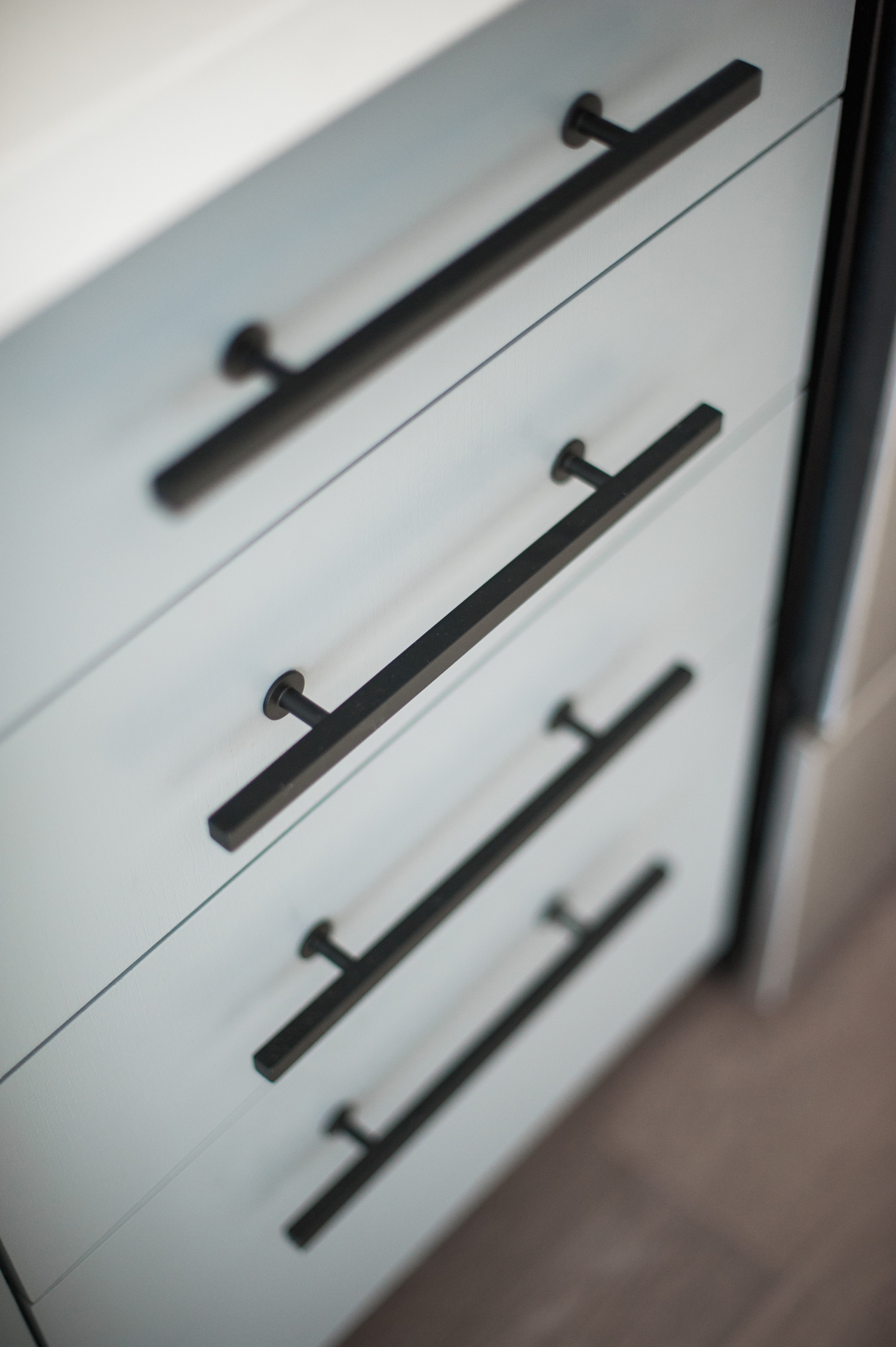
If you don’t have the budget to replace your kitchen cabinets, follow Jacquelyn Clark’s lead. The talented designer painted out the cabinets in this galley kitchen and added a backsplash and stunning new hardware.
Minimalist Marvel
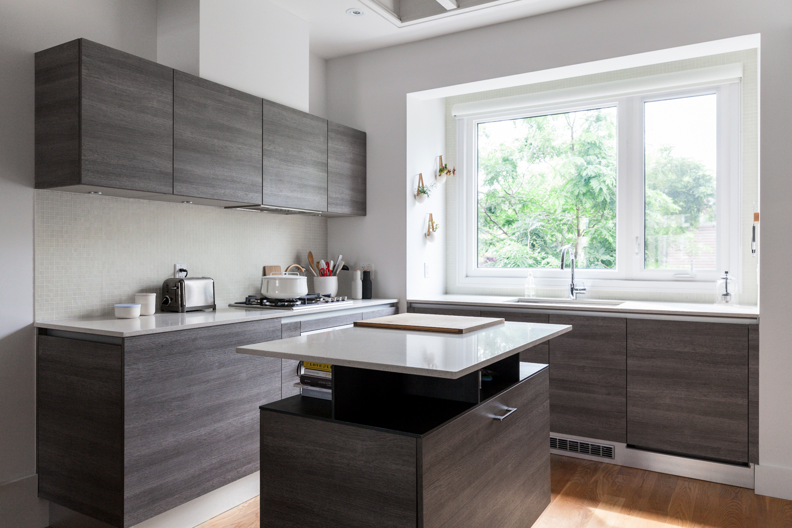
Want to achieve a super-minimalist look in your home? Then skip the hardware like stylist/designer Trish Papadakos did. The Scavolini kitchen creates a decidedly zen feel and features an island on casters that perfectly matches the dark-stained kitchen cabinets.
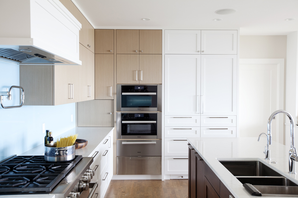
Mixed Matter
Vancouver’s Kirby Armstrong, principal at Devise Design Inc., went modern in this kitchen that doesn’t feel sterile thanks to the warm wood on the uppers. Pro tip: The floors don’t match and that’s just fine. A mix of woods is much more interesting than a matchy-matchy palette, as this playful Vancouver home proves. We also love the seamless back-painted glass backsplash – very contemporary!
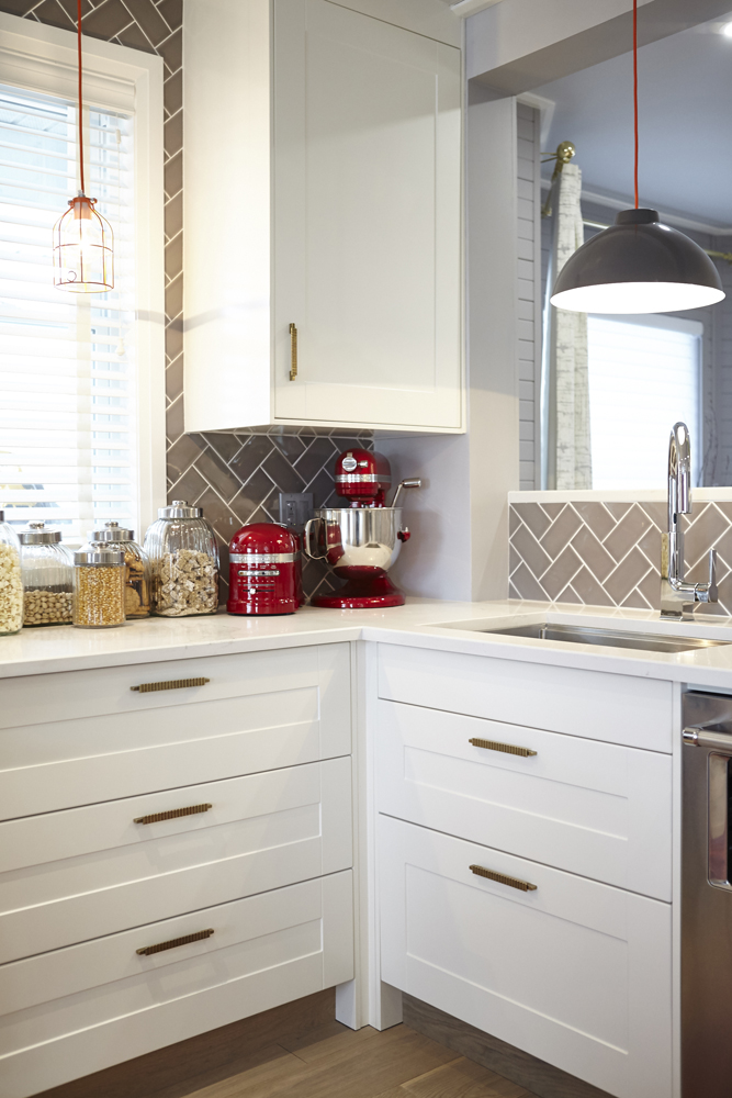
Brassy Beauty
Adding linear brass handles and unexpected grey subway tile set on an angle give this kitchen a whole lot of oomph.
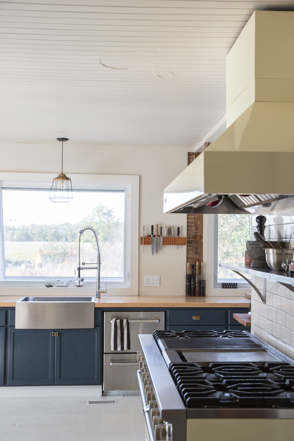
Farmhouse Chic
This converted farmhouse is loaded with charm. The blue cabinets have a homespun feel against the mile-long wooden countertops. (Pro tip: If you’ve got great views, skip the uppers.) And if that stainless sink, gooseneck faucet and Viking oven look professional (and not at all country bumpkin) that’s because restaurateurs live in this house – one of them is a chef. Tour the entire 1840s farmhouse here.
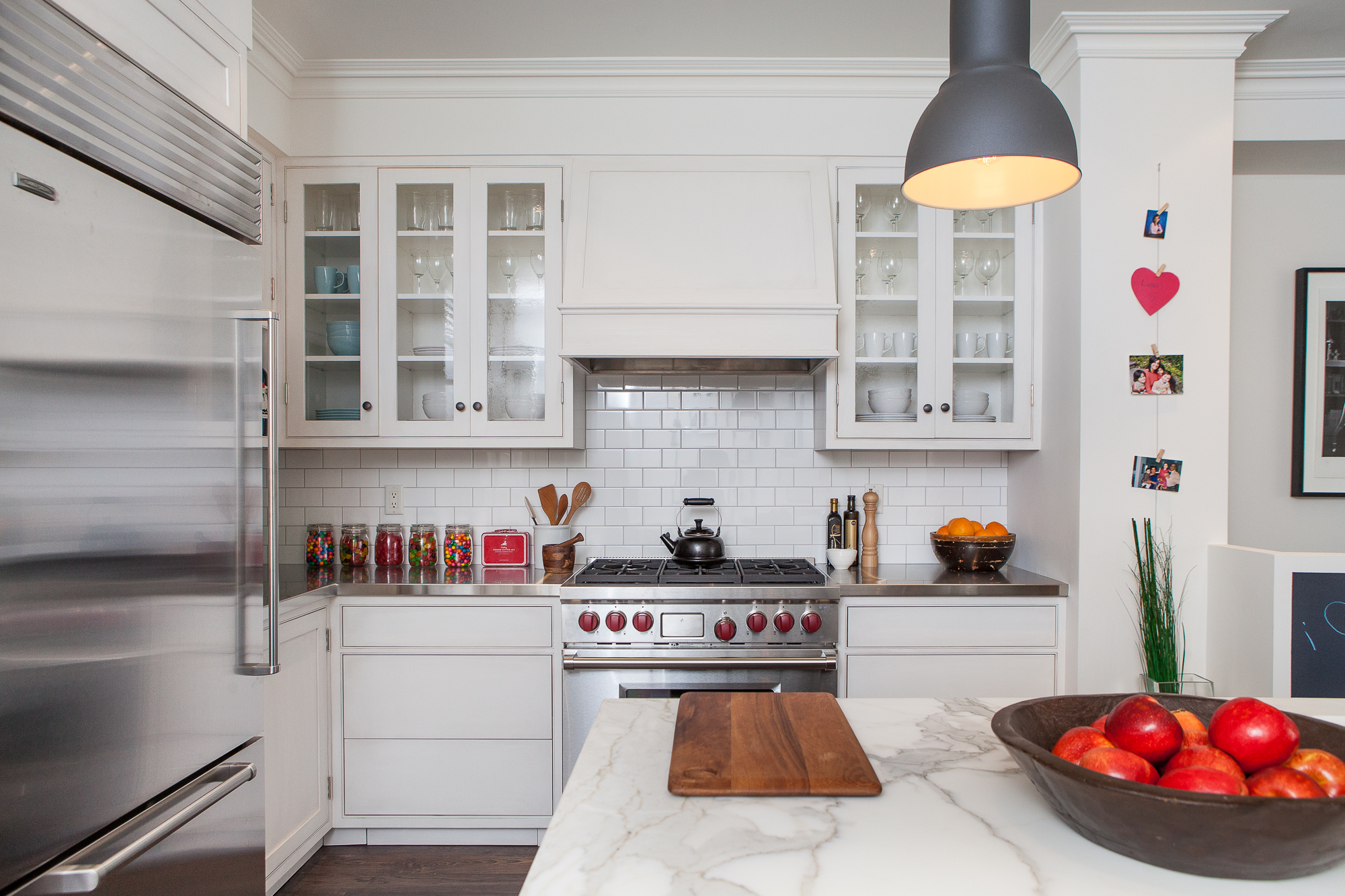
Display it With Glass
In this timeless kitchen designed by Danielle Bryk, the white cabinetry on the lowers is hardware-free for a fresh take on a classic. Glass-front doors break up the white and allow the homeowners to show off their stash of pretty dishware.
Home Network your inbox.
By clicking "SIGN UP” you agree to receive emails from Home Network and accept Corus' Terms of Use and Corus' Privacy Policy.


