Faced with decorating a 400-square-foot bachelorette studio as a surprise for its renter, Toronto designer Natalie Chong had to make some strategic design choices. The designer worked with the renter’s mother (who reached out to the designer with the master plan to decorate and surprise her daughter) to transform the tiny space using neutral tones, airy decor and a few luxe vignettes. The finished space is the ultimate in Pinspiration for all small space inhabitants, and home to one lucky (and surprised!) lady.
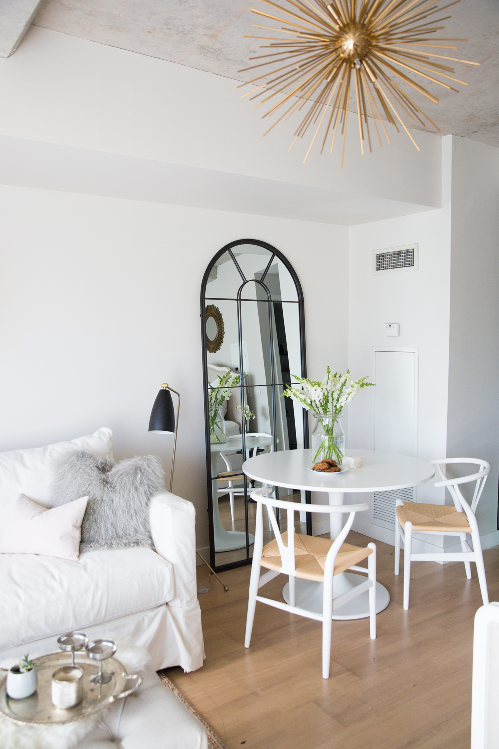
Surprise: A Sweet Studio Apartment
When Natalie Chong of Nest Design Studio received a call from a mother, asking the designer to decorate her daughter’s newly rented studio apartment, Natalie jumped at the chance. Sure, the 400-square-foot condo in Toronto’s Thompson Hotel would be a challenge to furnish and style (it’s a complete open space, with a major lack of storage), but Natalie embraced the opportunity to create a feminine retreat that would surprise and delight its lucky new tenant.
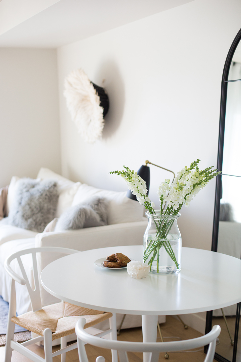
Small Space Challenges
The first step in furnishing and decorating the tiny condo was to delineate zones: a dining area, living area, and a bedroom (all within the same open space!). Because the space is entirely open, Natalie also needed to ensure the zones felt cohesive. She achieved this with a shared palette of neutral tones: white, black, dove grey and hits of gold. The overall look is utterly dreamy, while still offering the renter an entirely practical space to enjoy.
Living in compact quarters? Try these 12 tips to maximize square footage.
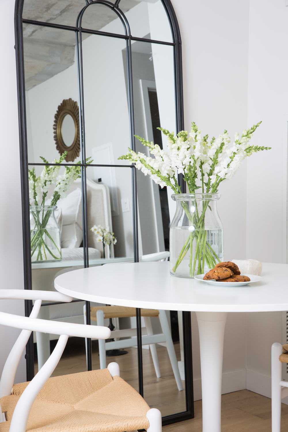
A Bistro-Inspired Dining Nook
A modern tulip-inspired table from IKEA fit perfectly in one of the four corners of the studio. Natalie paired it with two wishbone-inspired chairs from Elte MKT and reflected the elegant-meets-California cool scene with a floor-to-ceiling mirror from Homesense. The mirror is the finishing touch on the dining area, and serves to open up what would otherwise be a plain, little corner.
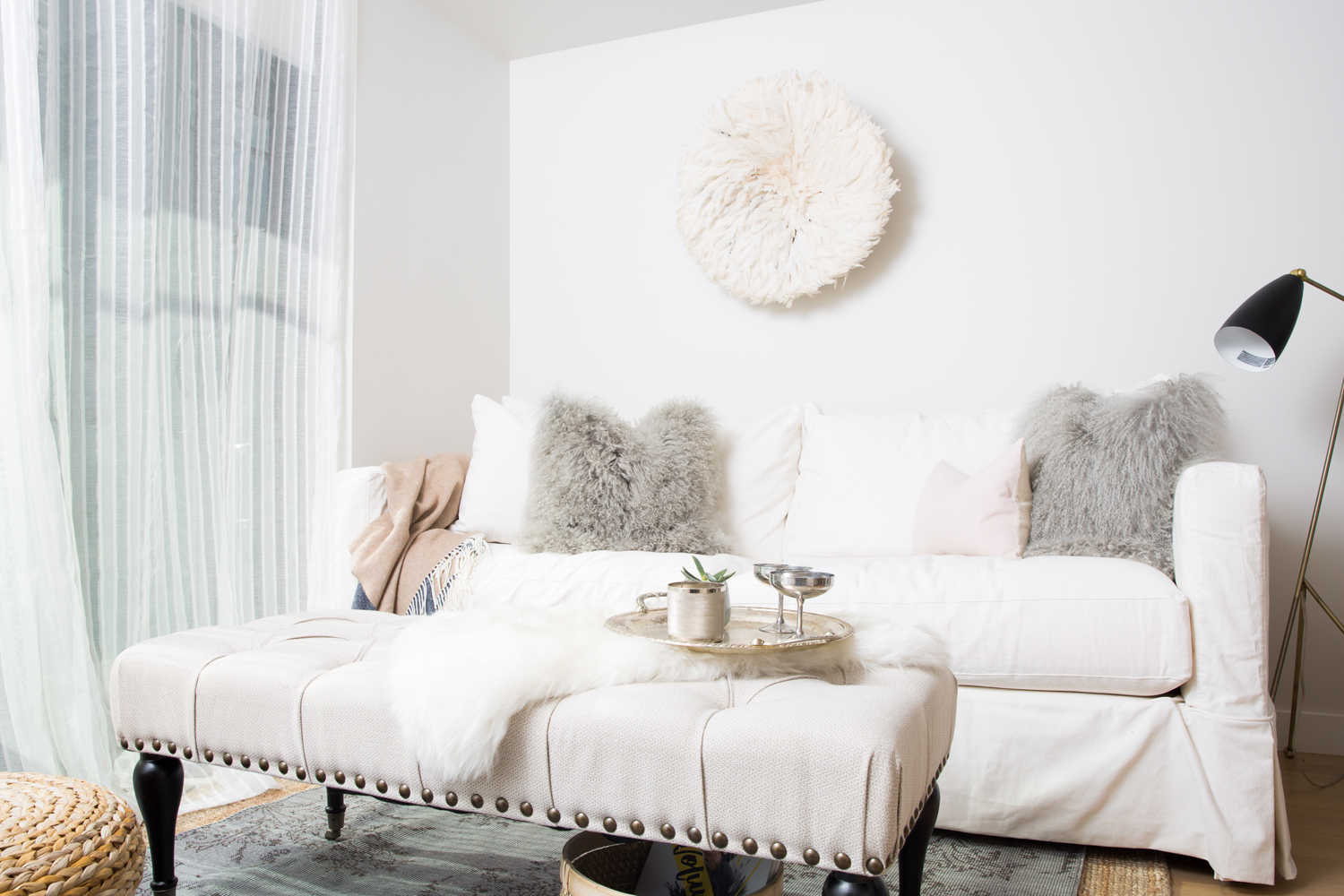
A Lush Living Room
The living area spans the entire back wall of the studio, starting with a couch and ottoman on one side that are piled high with mohair pillows, sheepskin throws and luxe throws.
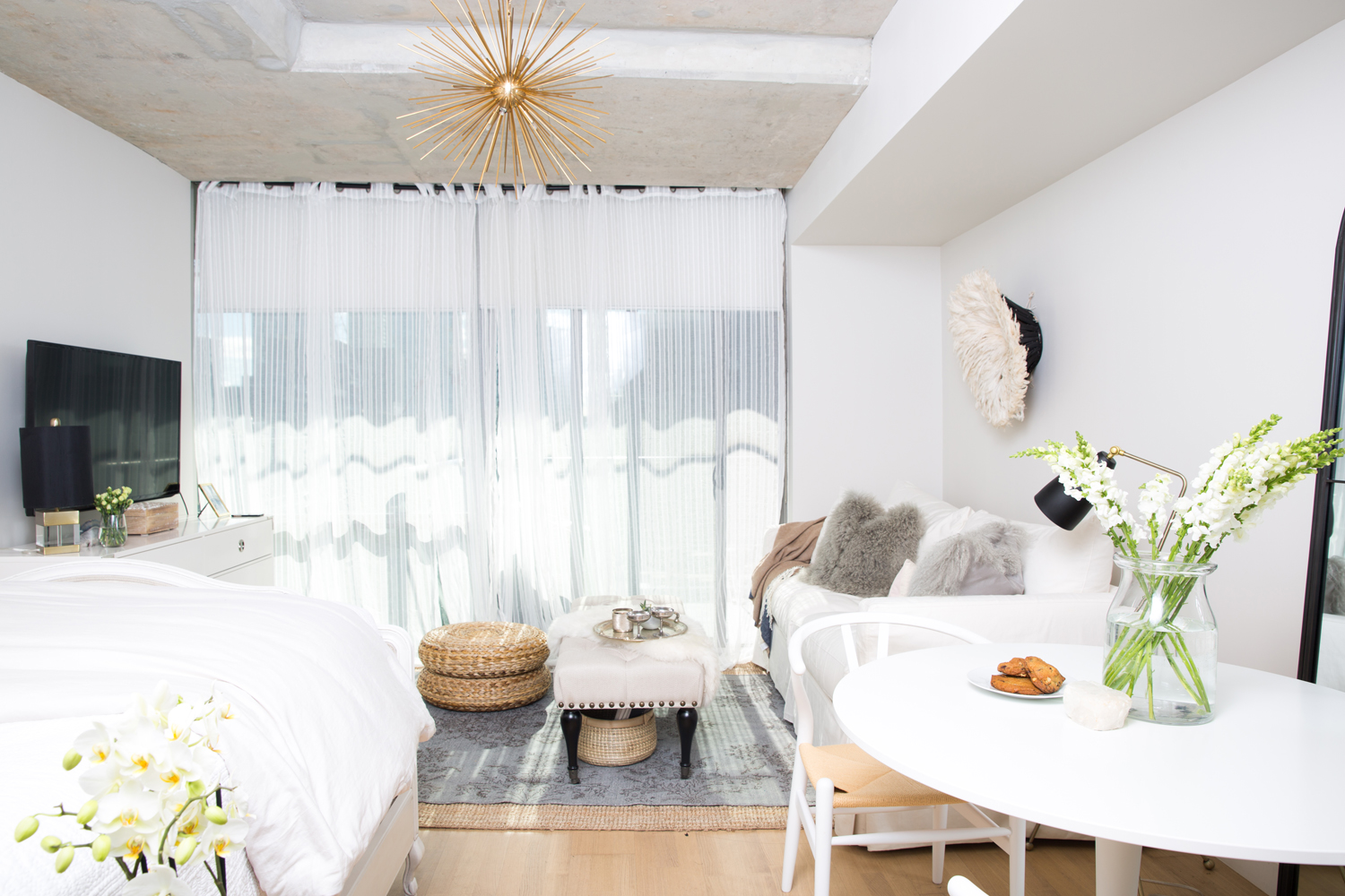
The Sweet and Petite Studio
Here you can see just how small the space was that Natalie was working with. A dresser in the living room provides storage while also acting as a mount for the television, and the ottoman doubles as a coffee table or extra seating for visitors.
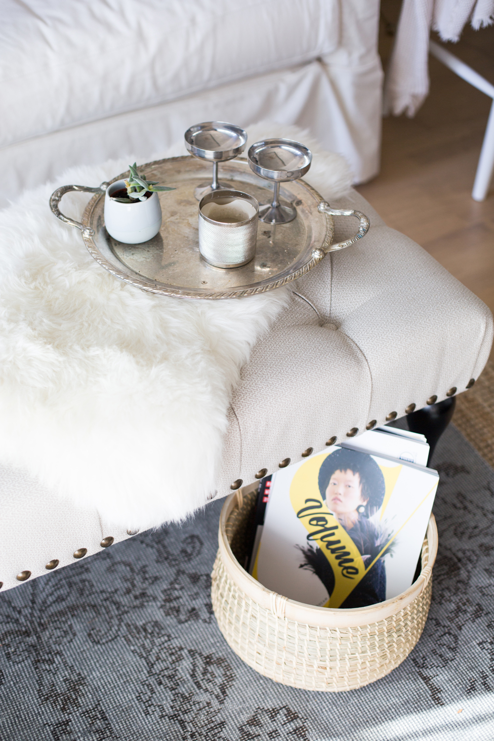
Secret Storage Baskets
Decorative baskets tucked under the ottoman provide additional storage for magazine and blankets, while an antique silver tray and Champagne coupes atop the ottoman give the living area a glamorous appeal.
Having a hard time creating storage solutions in your home? Stop making these common storage mistakes.
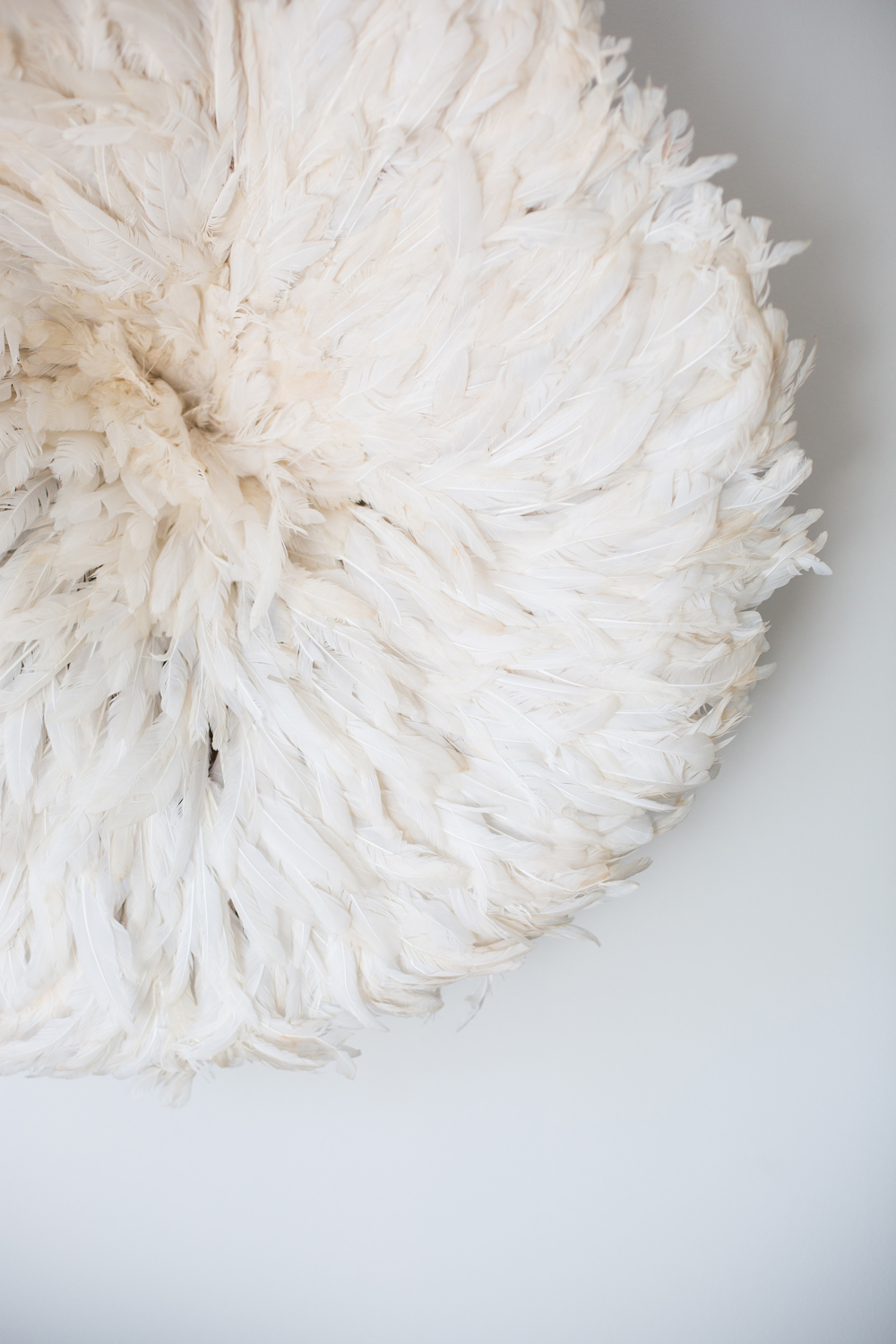
Fit for an Angel
A Juju hat hung over the sofa adds to the dreamy quality of the space, thanks to its delicate array of textured plumes.
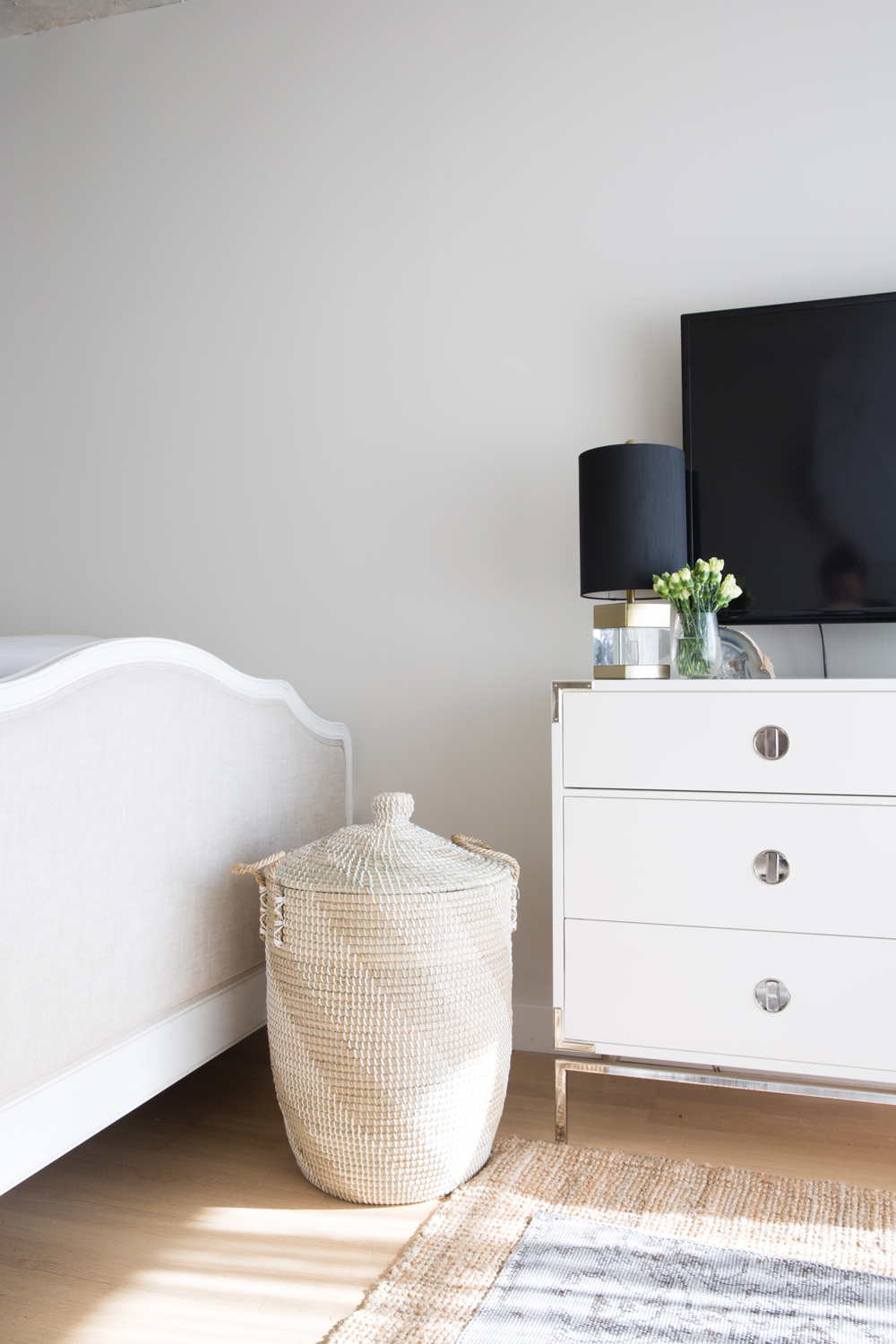
Where Grain Meets Gloss
A woven hamper marks where the living room meets the bedroom and introduces a softer palette of colours and texture.
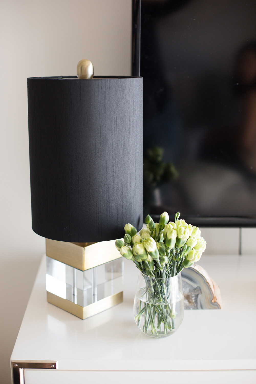
Little Luxurious Accents
Natalie used black sparingly in the space, which allows it to pop when featured. Here, a little black lampshade paired with a gold and lucite base adds a sophisticated touch to the white and chrome dresser.
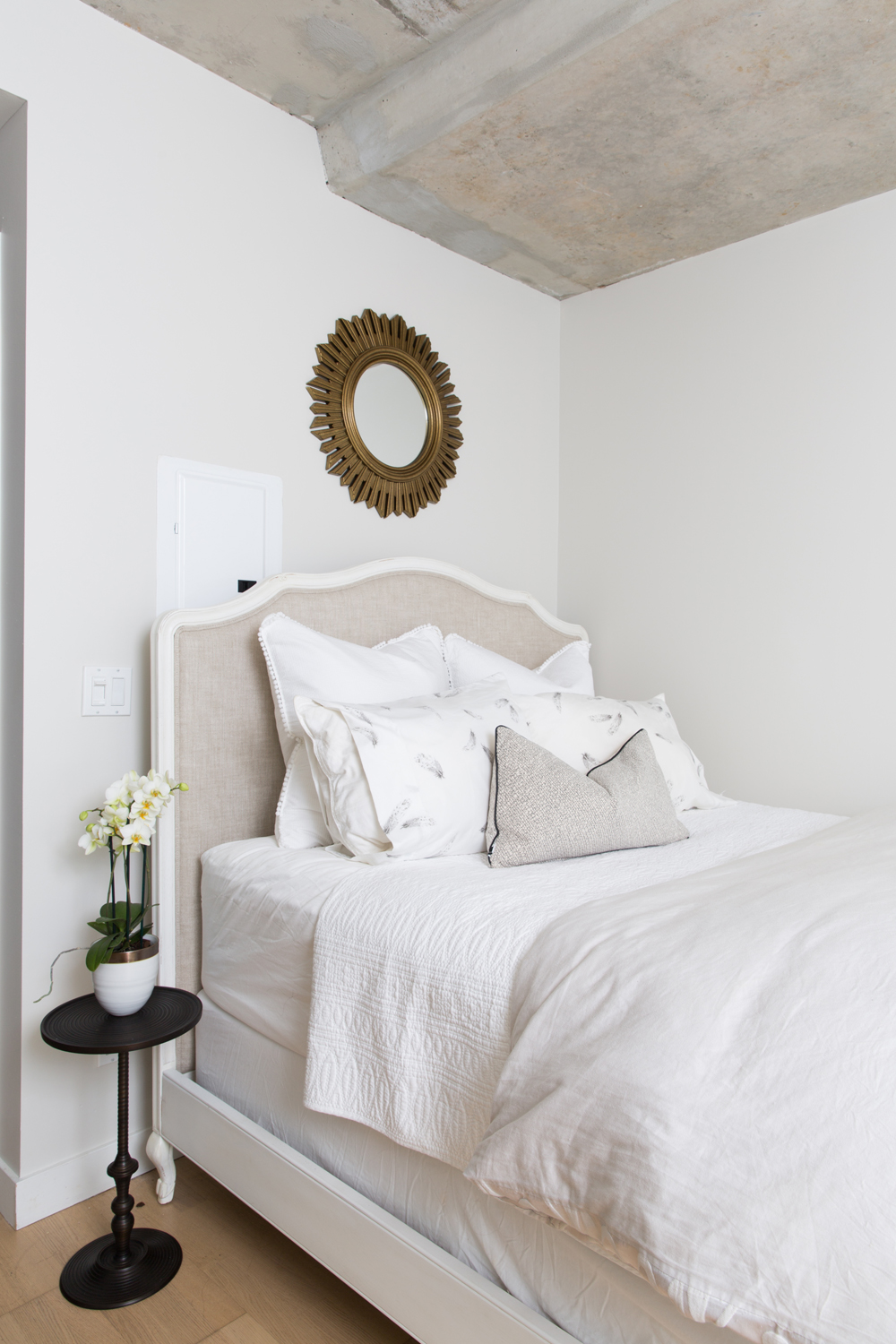
The Beautiful Bedroom
This regal bed was found at Restoration Hardware, and offers perfect elegant lines to blend with the feminine studio. A small black pedestal table fits snug beside the bed, and balances the pops of black in each of the zones.
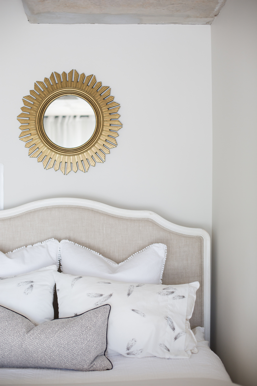
Design On Repeat
Just like the little black side table, Natalie repeated other motifs throughout each zone, like the pop of gold in the mirror over the bed, and the feather print on the pillows. All of these little details add up to create a studio space that’s bright, beautiful and cohesive.
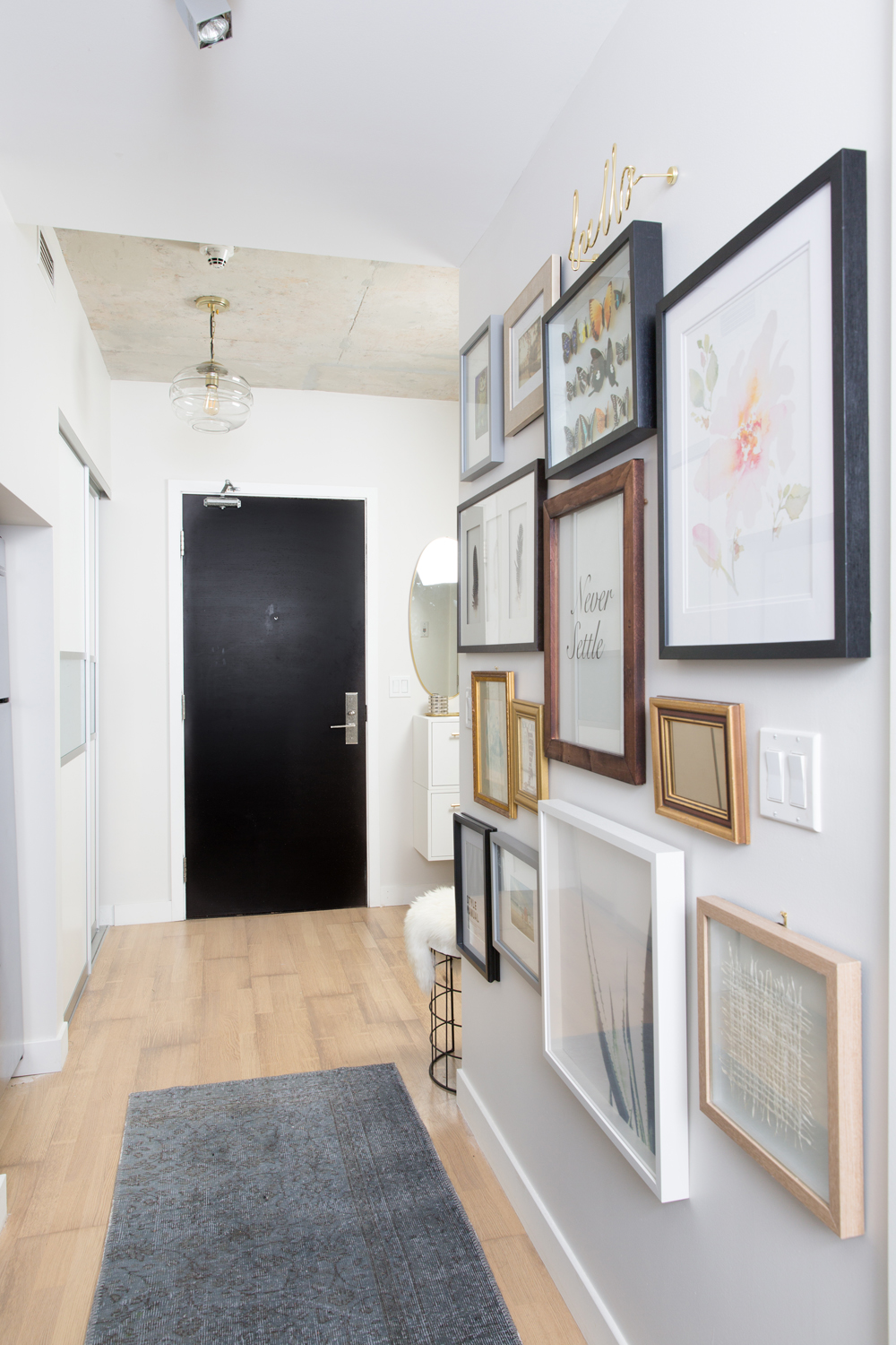
The Small Studio Entryway
A look back from the main area towards the entryway shows off a gallery wall Natalie created to lend some colour and life to the wall opposite the kitchen. It leads to the entryway where a black door anchors the room and contrasts nicely with a glam-meets-industrial glass pendant.
Grand Plans for a Small Foyer
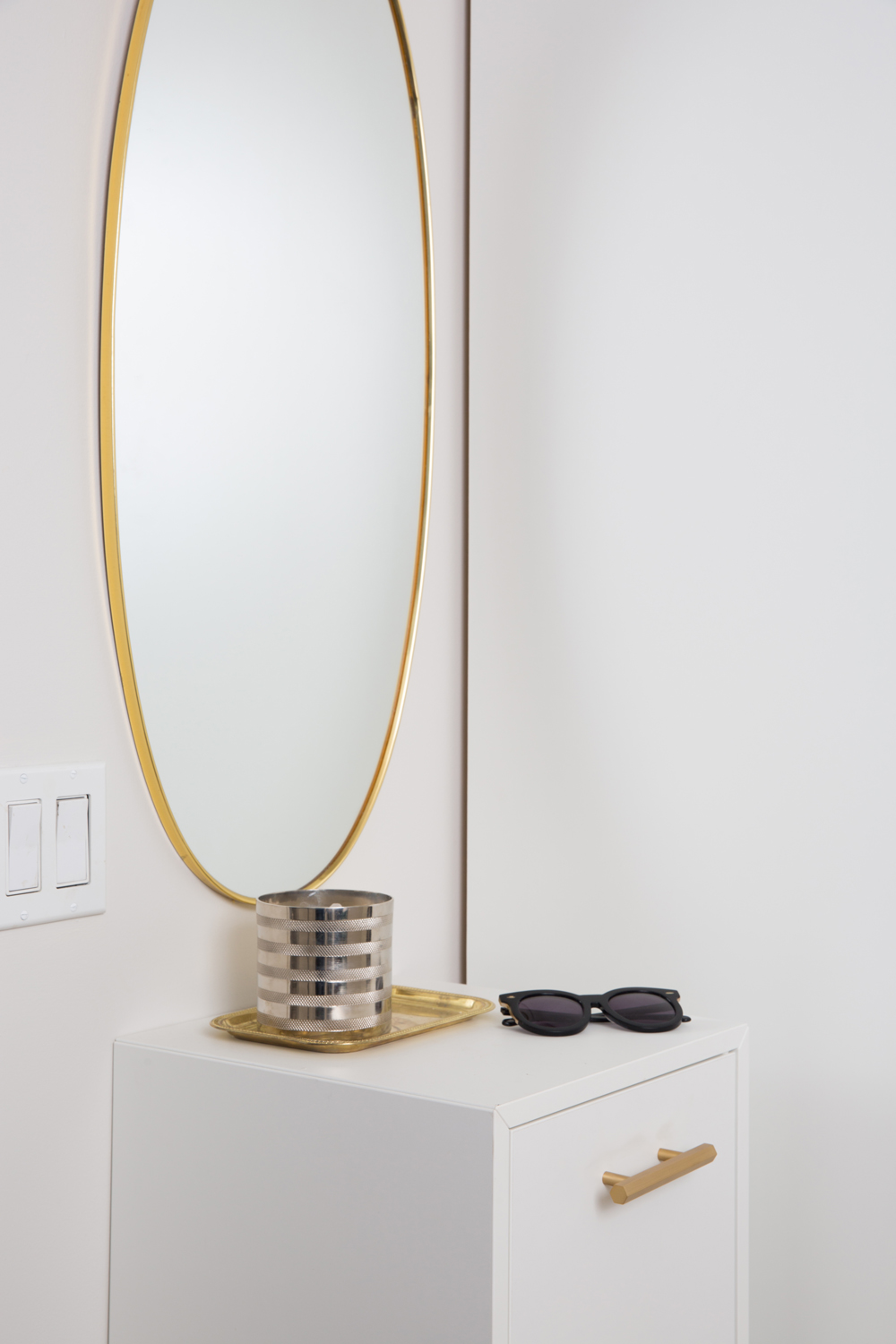
With the tiniest stretch of wall space to work with, Natalie still managed to sneak in an entryway console with surface and hidden storage. She mounted a gold oval mirror above a floating cabinet (an IKEA hack with new gold hardware) and staged it with gold and silver accents. Hidden storage is key for Canadian entryways. When the cold weather hits, it’s vital to have a space to stash mittens, hats and scarves!
A Sweet Little Seat
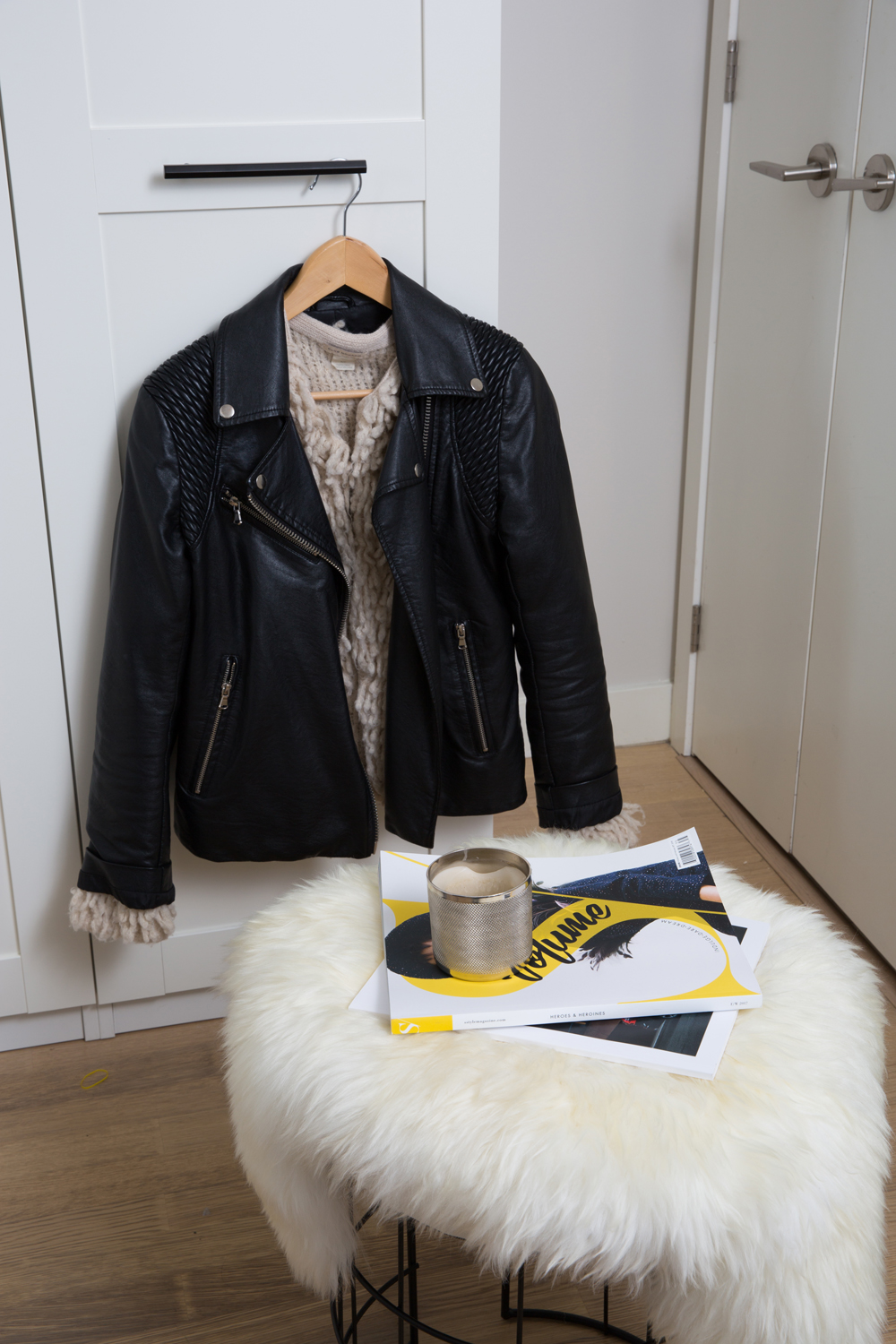
A small round stool topped with a sheepskin throw sits in the entryway. It can be used for taking shoes on and off, or tucked under the floating console.

A Round of Applause for Natalie Chong
Natalie’s design was well received by the studio’s new tenant, who was thoroughly surprised by her mother’s sneaky plans! Congrats to Natalie for pulling it off, and thank you for sharing this beautiful studio in Toronto.
Home Network your inbox.
By clicking "SIGN UP” you agree to receive emails from Home Network and accept Corus' Terms of Use and Corus' Privacy Policy.


