Entrepreneurial mother-and-son team Elli and Clark loved their remote family cabin in Ontario’s Haliburton Highlands. With its forests, lakes and rivers, it was a dreamy, water-filled escape. But then, life got in the way, they rarely used their vacation property and water damage began running up the bills. It was either sink or swim, and they needed a serious life raft. Enter Scott McGillivray, and the Scott’s Vacation House Rules team. They transformed this water-logged cabin into a dreamy double vacation home. Now, this four-bedroom, A-frame cabin offers calming water vibes, and a ton of potential income stream.
An Outdoor Homage
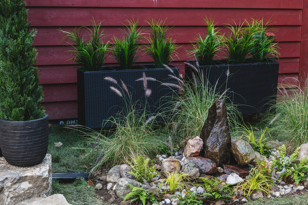
To really drive home the theme from the inside out, Scott had Elli and Clark join him to construct this natural water feature. The piece was easy to put together using rocks the family found from around the cabin and it requires very little maintenance and upkeep. That makes it the perfect kind of embellishment that renters and owners alike tend to love.
Tranquil Living and Dining Space
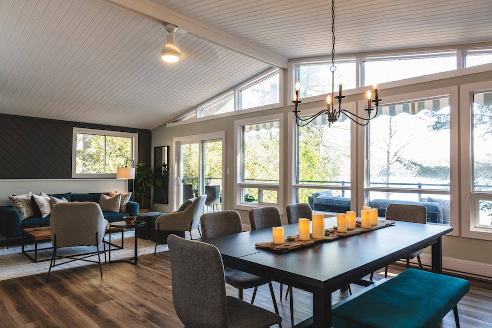
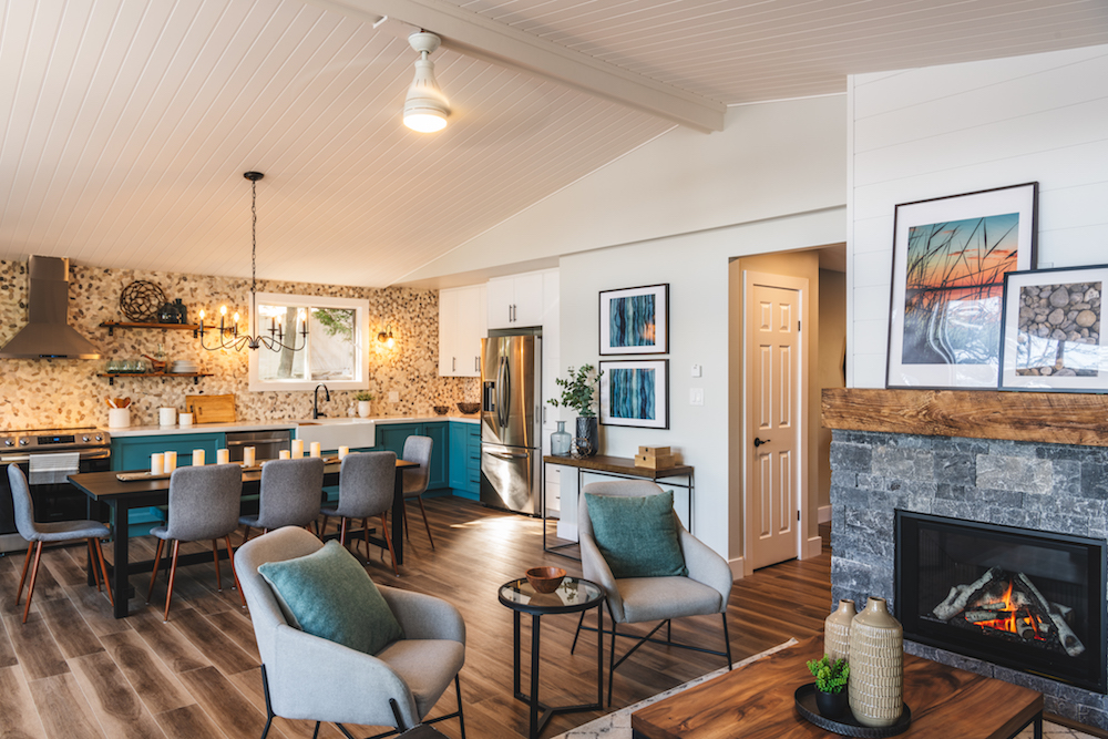
This cabin already had great bones thanks to the open-concept great room. However, the space was in need of some serious retooling in the colour and design department. That included new floors and a redesigned kitchen that maxes out on function while taking up minimal space. Because it’s a vacation home, there’s no need for a ton of kitchen storage, but this design still offers plenty. As for the river rock tiled backsplash and green-blue custom doors on those cabinets? They trickle into the home’s new whimsical waterfall theme seamlessly.
A Room With a View
Scott didn’t want to mess around too much with the generous layout of the room, which also features floor-to-ceiling windows and a generous view. So he and Debra painted the wood beams a bright white to reflect even more light, and cleared away all of the family’s many (many) knickknacks. After all, the last thing a renter wants is to feel like they’re crashing in on the owner’s personal space.
A Renter’s Nightmare
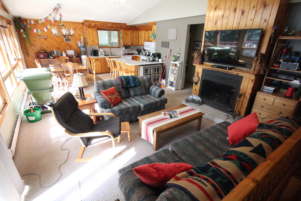
In the before shot you can see how this would be a cozy family space to escape to, but it definitely didn’t have enough appeal to nab the area’s $250 a night rental average. There are compost worms in a green bin in the kitchen (yup, worms), entirely too many personal objects, and the room itself feels cluttered and dark thanks to all of that wood trim.
Related: 10 Things You Should Know Before Buying Your First Cottage, According to Scott McGillivray
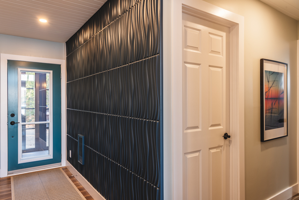
A Flowing Entrance
Everything about the new design is meant to appeal to potential renters while offering up a calming water theme. In the front entrance that meant making an impact right away with these inexpensive, textured wall panels, which remind you of a waterfall. Paired with a statement door you immediately feel as though you’re vacationing somewhere special. Plus, according to Scott, themed properties rent out that much faster online.
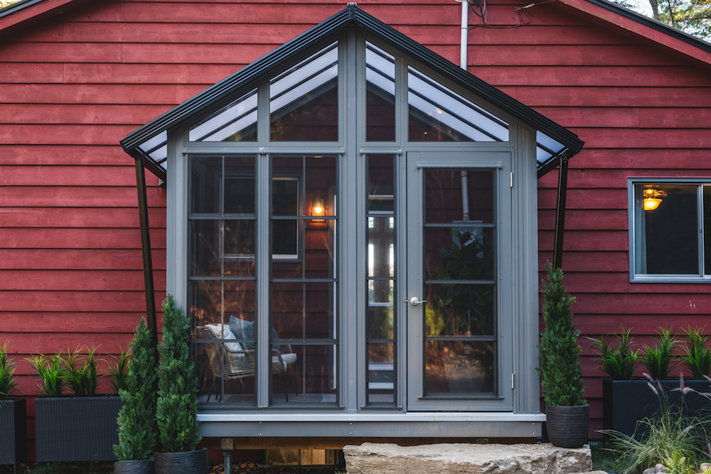
Adding Light and Extra Space
On the other side of the cabin, Scott extended the living space even further with this quaint and quiet screened-in porch. It adds a nice area for potential renters to sit outdoors in a bug-free space. Having a tranquil space for reflection is always a great idea when you’re trying to rent out a property, and Scott delivered that in spades with this addition.
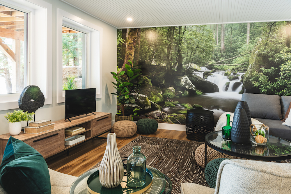
Falling For This Den
In the basement, Scott and Debra went all-in on the waterfall theme by printing out a mural of the actual waterfall featured on the property. The result is a rec-room space that’s bursting with personality but that also feels completely on-brand with the rest of the redesign. It’s a great space for kids or even a second family, instantly upping the rental potential when two families decide they want to vacation together.
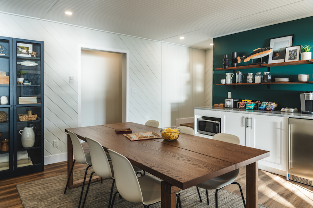
Maxing Rental Potential
To really max out on that double rental potential, Scott also designed this kitchenette, which is great for a second family or group of teens. It’s got the basics (coffee station, microwave, sink and bar fridge), which means that even if only one family is enjoying this space people don’t have to go up and down the stairs in order to fix themselves a drink or a snack. Add in extra shelving and a colour scheme that’s totally in line with the rest of the cabin’s theme and you’ve got a bonus living space that unlocks all kinds of income potential.
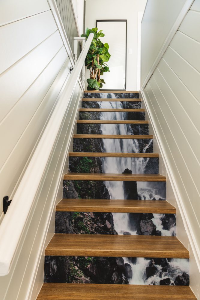
A Cascading Staircase
Because it’s always fun to play with design, Debra also created these unique stair risers that feel and look like an actual waterfall. They’re a special addition that adds tons of personality without feeling totally kitsch, especially since the walls are painted a neutral white. They’re also like a fun secret feature of the cabin, since you can only really see the riser design when you’re at the bottom of the landing and looking up.
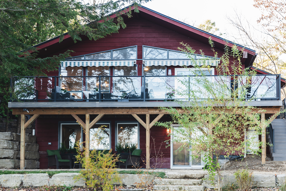
Jazzed Up Outdoor Living Space
Design appeal aside, your cabin isn’t going to last long if you don’t fix any structural problems you may be facing. Scott permanently sealed the spaces where water was leaking in and creating havoc, while also cleaning out and freshening up the outdoor living space below and above the deck. The addition of new glass panels above safely extend the view, maxing out on income potential at every turn. Now this property could easily go for $550 per night during the high season, giving Elli and Clark a sound investment that can carry them through to the day when they can finally use this family cabin again for themselves.
Home Network your inbox.
By clicking "SIGN UP” you agree to receive emails from Home Network and accept Corus' Terms of Use and Corus' Privacy Policy.


