After years of dreaming, Jackie and Teresa put it all on the line by investing in a vacation property on Ontario’s Trent Lakes. With its unique system of locks and waterways, the area is an ideal spot for all kinds of vacationers. The structure they invested in though? The layout was compartmentalized, the roof was poorly patched and the exterior had seen better days. Luckily, Scott McGillivray and the Scott’s Vacation House Rules team was able to transform this awkward vacation spot into a game-filled nautical retreat that families will want to return to year after year.
A Light-Filled Retreat
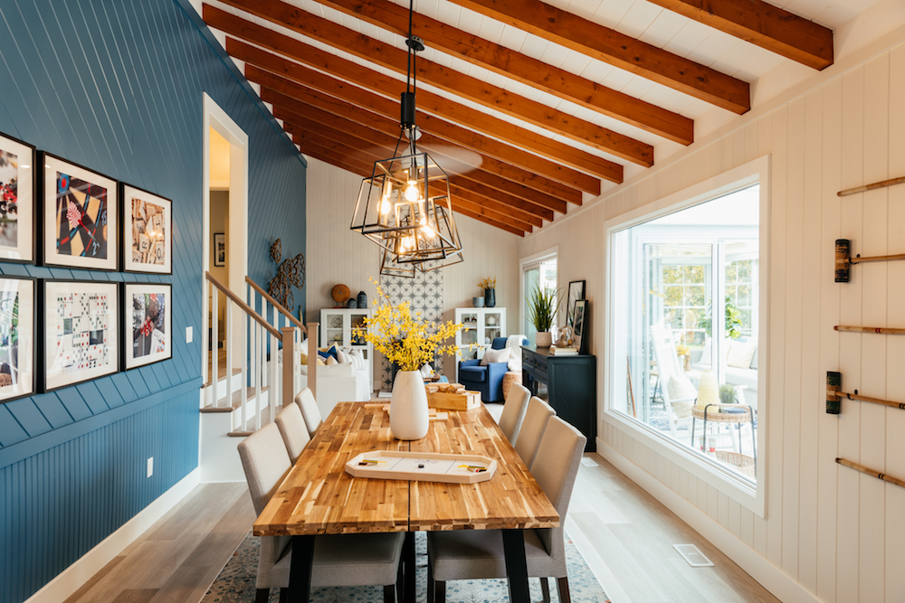
In order to make the most of the gorgeous lake views and to help the cottage feel like a cohesive property, Scott’s first order of business was transforming the structure’s main living area into the actual main area, with access to living, dining and kitchen space. Before, this room was dark and drab, but thanks to new flooring, freshly painted walls and a ton of coastal colours and accents, this space is a beautiful spot where vacationers will want to congregate together for hours and hours.
Taking Out the Drab
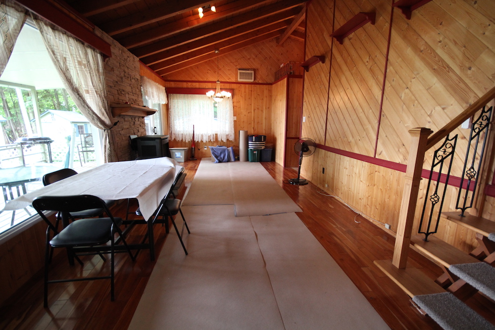
It’s hard to imagine this was the same space. The wood panels are overpowering and the lack of delineated areas make this elongated room look like a glorified storage space. Not exactly the vibe you’re going for when it comes to a family-friendly cottage.

Restructuring the Kitchen
When you’re considering the main living space in a cottage, you always want to make sure the kitchen is a factor. No one wants to be cooking away from the action, so an open concept is key. Scott delivered by moving the kitchen to the back of the cottage and extending it along one wall, creating an open but galley-like effect complete with a coffee bar. Because what screams “vacation” more than “coffee station?

A Dreamy New Primary Room
Rooms in a vacation property don’t need to be extra large in order to be dreamy, and Scott certainly delivered with a primary bedroom that offers a fun touch of colour and function. The cut-outs are the perfect little night table replacements, and the overall colour scheme completely ties into that relaxing, coastal vibe featured throughout the rest of the home.
Maximizing Function… and Income Potential
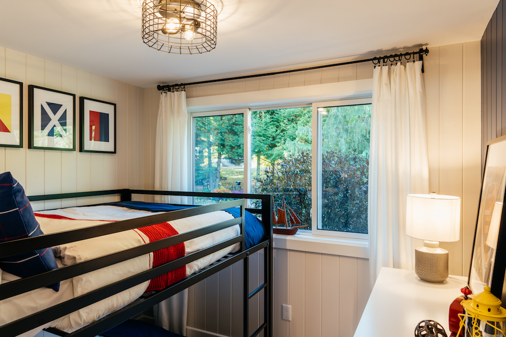
Where the old kitchen used to be at the front of the cottage, Scott gave Jackie and Teresa a third bedroom and put more heads in beds with a compact bunkbed set. The room is still breezy and features bright colours like the rest of the house, but more importantly it adds nearly $100 extra per night in potential rental income.

Creating Smart but Spacious Amenities
Before, the bathroom was hard to access and it also ate up space thanks to a large corner-unit soaker tub that no one was ever going to use. So Scott relocated the washroom between the first and second bedrooms and decked it out with sleek finishes. Finishes like the beautiful white-tiled shower with a river-rock inspired base, and a double sink vanity offer just a touch of splurge.

A Brand New Look
Even the exterior of the cottage benefitted from a complete overhaul. Scott switched up the façade with a bolder, coastal look. The porch is warm and welcoming, but thanks to new siding this structure will be solid and water-free for years and years to come.
Soaking in the Sunlight
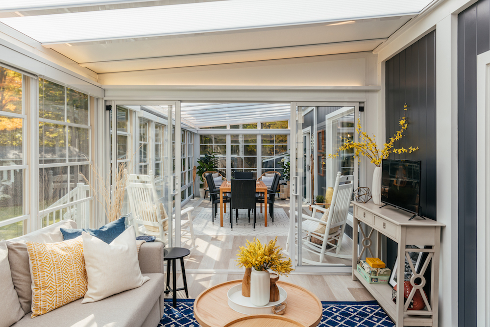
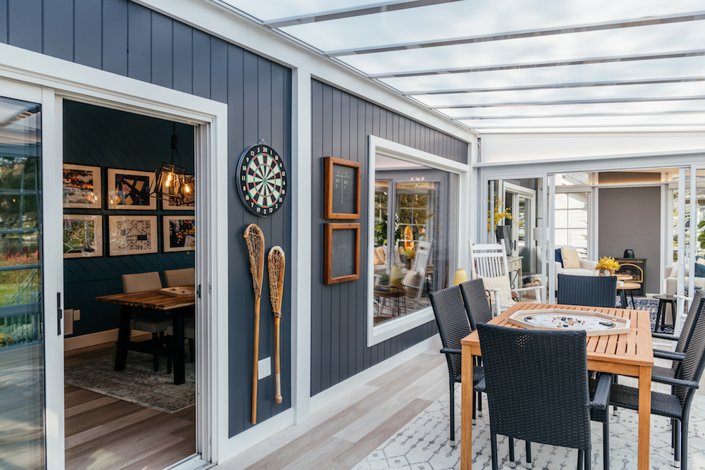
When Scott went to reconfigure the sunroom, he realized there wasn’t much to save since the roof needed a complete overhaul. So, he gave the family even more living space with an extended sunroom that can be used all-year round in one section thanks to dividers and an insulated floor. The unbreakable windows easily open and close so that renters can let in the breeze or keep bugs out, and the translucent panels above protect from UV rays while also letting in a ton of light.
Branding the Vacation Home With Games
In the three-season outdoor dining space you can see where Jackie and Teresa worked with Debra and Scott to incorporate lots of vintage gaming elements. This cottage is all about creating memories and fun, which is what families will fall for when they’re seeking out their next rental. Everything is designed to minimize screen-time while upping potential rental income, including those vintage lacrosse sticks and the games-inspired art on the walls.
Check Mate
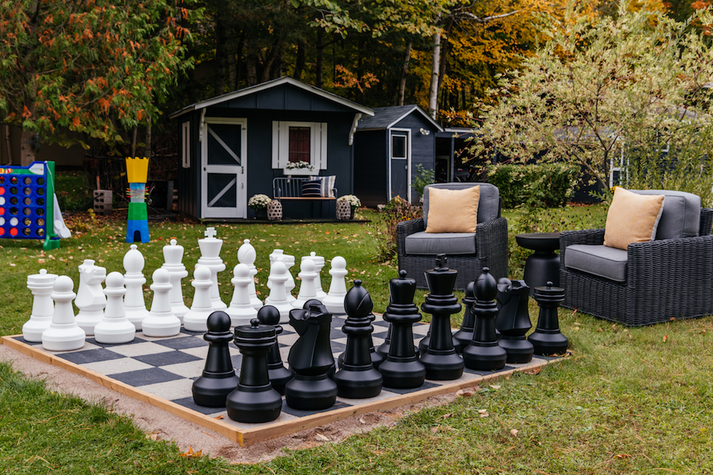
Last but not least, Scott extended all of that fun to the spacious yard, which he saw as a kind of sports field. The family worked together to create this giant chess set, helping with the cottage’s branding and creating strong imagery in terms of online listing potential. Add in some other oversized games and a ton of free space, and it’s no wonder that by the time Scott and his team were done with this property he estimated that the owners could get up to $400 a night from renters during the high season. Check… and… mate.
Home Network your inbox.
By clicking "SIGN UP” you agree to receive emails from Home Network and accept Corus' Terms of Use and Corus' Privacy Policy.


