When John and his three sisters inherited the family cabin in Muskoka from their parents, they were looking forward to making more family memories while also renting the place out to help with some of the maintenance costs. The only problem is the cottage had never been renovated. So John and his wife, Julia, called Scott McGillivray, designer Debra Salmoni and the Vacation House Rules team for help. See how they transform a tired cabin from the 1950s into a classic Muskoka rental with tons of charm and potential.
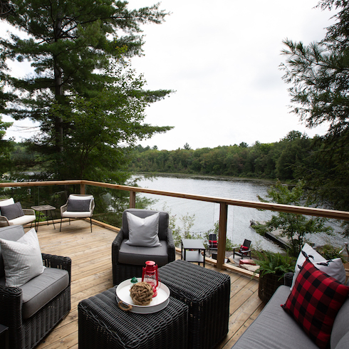
A Cottage With a View
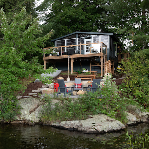
It’s hard to nab property in this area of Muskoka, where plenty of celebrities now cottage. And you can see why, what with this beautiful view. Scott and Debra made sure the entire family and any potential renters can make the most of this idyllic spot with an updated deck, see-through glass railings, and plenty of outdoor seating for lazy summer days.
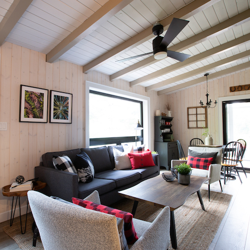
Freshening Up the Space
Inside, Scott and Debra stuck with neutral colours in order to maximize the cottage’s original charm. They put up new, low-maintenance walls and gave the high ceilings a fresh coat of paint for a bright and airy feel. Some new furniture pieces and a few photos bring it all together for a chill and welcoming vibe.
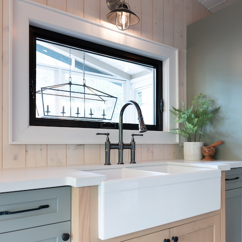
Reconfiguring the Kitchen
While the cabin features an open-concept feel, Scott and Debra designed this galley kitchen to maximize space and add a few updated finishes that will appeal to renters. The updated cabinets are fresh and inviting, the black trim feels cozy but modern, and the double sink is handy for owners and renters alike.
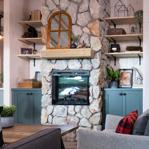
A New Feature Wall
In the living room, Scott and Debra sourced an electric fireplace for additional warmth and coziness (because what’s a cottage without a fireplace?). Then they created a feature wall for interest with stones and built-in shelves, and decked it out with minimalist but thought-out design pieces.
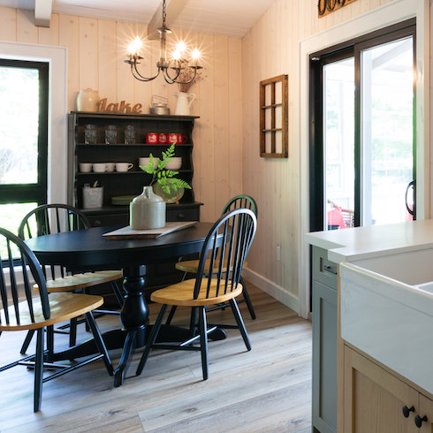
Dining Nook
Small cabins can have big dining energy too with circular tables, which take up less space but encourage people to gather around for a meal. Debra and Scott designated this corner of the cabin as the dining room, complete with a hutch for storage and an on-theme chandelier.
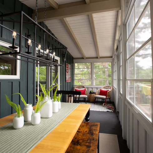
A Coveted Covered Porch
One of the best features of this cabin is the covered porch, which extends the rental space through to the fall and gives these homeowners even more rental potential. There’s a dining table to seat even more guests, plus a cozy sitting space where you can watch the sun rise or set over that gorgeous lake.
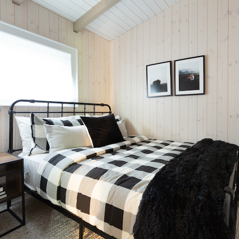
Updated Bedrooms
Scott and Debra also reconfigured the bedrooms with updated walls and layouts in order to maximize sleeping potential throughout. The simple black-and-white décor is universal and practical for the changing seasons, while small finishes, like the nightstand and photos, add instant comfort and charm.
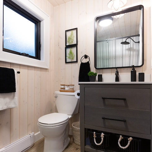
A New Bathroom
Before the renovation, the bathroom was a small and tired space that hadn’t been updated… well, ever. Thanks to a new vanity, mirror, toilet and large shower, the space feels fresh and inviting — two positives when it comes to a bathroom you plan on renting out. Pops of black continue the design theme from the rest of the cabin, and a couple additional baskets under the vanity add even more practicality and storage.
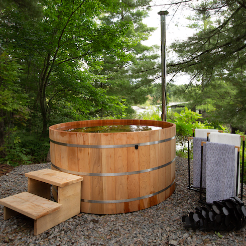
Going Old School
If you want your rental to get noticed, you need to include notable features renters won’t find in other listings. Enter this old school hot tub, which heats up by fire and easily fills with lake water for a relaxing, lakeside soak. It’s the perfect example of what can happen when new meets old, and it adds a ton of value to this cabin rental.
A Brand New Space
By keeping some of the original features but updating this cabin in the places that really matter, Scott and Debra added a ton of rental potential to this family cabin. Now, the family can enjoy the cottage when they want but still rent it out for a whopping $650 a night.
Home Network your inbox.
By clicking "SIGN UP” you agree to receive emails from Home Network and accept Corus' Terms of Use and Corus' Privacy Policy.


