Sarah Richardson is taking on her biggest project yet: A luxury vacation rental, across the country in Whistler, BC! She’s facing all new obstacles, tackling a renovation in the mountains, with a brand new team, and creating breathtaking spaces in a style that’s all new for Sarah (mountain chic!). Check back each week to see how House Heidi is transformed into a chic, vacation retreat.
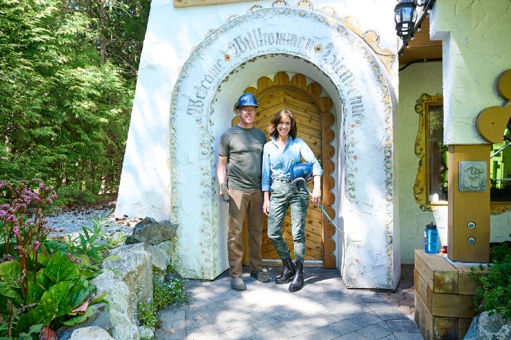
Demolition Derby
Sarah Richardson is at it again, this time in Canada’s West Coast mountain oasis: Whistler, BC.
Always up for a challenge, Sarah has set her sights on a local landmark: House Heidi. She’ll be transforming this quirky Bavarian-inspired chalet into a swanky vacation rental. Leave it to Sarah Richardson to see past the quirk and tap into the potential!
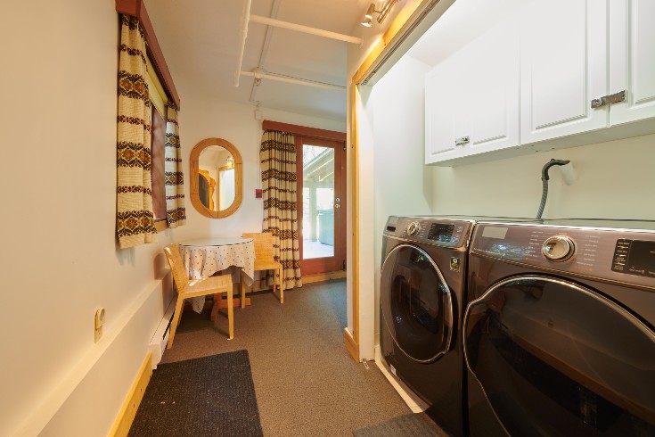
All Washed Up
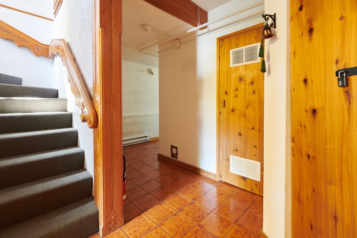
This dull, orange and awkward hallway was a sad excuse for a laundry room. Sarah reimagined this space and with a flick of the wrist (if only it were that easy) reconfigured the main floor to include a chic hallway coffee bar, a small and functional laundry room, a luxurious and tranquil spa bathroom. If you know anything about Sarah’s past work, you know when it comes to bathroom designs, she’s queen of the Water Closets!
Related: Catching Up With Sarah Richardson
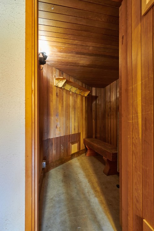
Sweat Equity
The sight of this sauna gave Sarah hot sweats. In an effort to open up the entryway and create a clean and inviting line of sight, the sauna was completely removed. In its place, a spa bathroom was created.
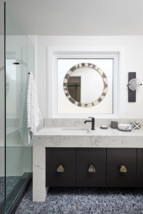
Did Someone Say Forest Bath?
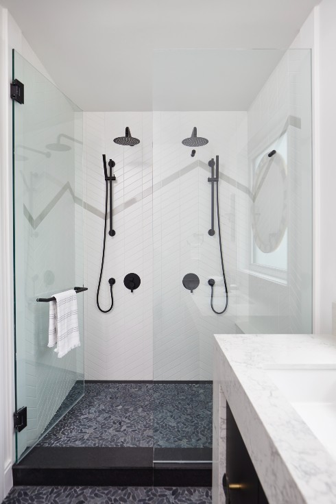
Inspired by the ancient rainforests of the Pacific Northwest, Sarah took a cue from Whistler’s natural surroundings and integrated them into the bathroom. The pebble tiles, stone fixtures and mountain motif in the shower, give an earthy vibe to the spa bathroom that would be an utterly invigorating way to start each day.
Design to Move Mountains
You’re never far from the mountains in Whistler, but Sarah brought them right into the home with a mountain motif made out of tiles in the double shower.
For contrast, Sarah chose matte black hardware to pop against the glimmering white tiles, and an earthy pebble stone floor. It’s truly like showering in the forest!
Orange You Glad Sarah Came to Town?
By removing the staircase and reconfiguring the hallway, Sarah transformed this space to be a laundry room with enough room to functionally serve up to 16 guests! Sarah washed all of the bedding in the vacation rental to prove its functionality. Now that’s a landlord who’s not afraid to get her hands dirty!
Stack ‘Em Up!
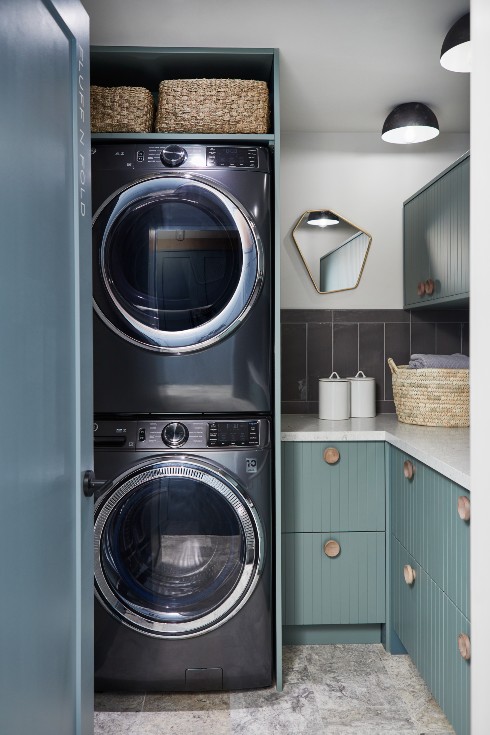
By stacking the washer and dryer, Sarah enhanced the laundry room to allow counter space for folding, ample storage above and below the counter and a sink for handwashing. The earthy tones of green, stone work and wooden fixtures created a calming atmosphere. Who knew laundry could be so meditative?
Finishing Touches
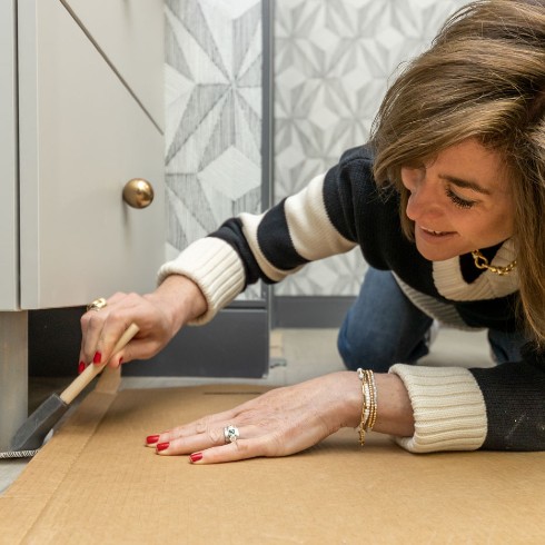
Fabulous materials and dynamic colours on the first floor provided the strong impression Sarah was after. With layered textures and a mix of warm and cool tones, visual interest and depth was established, and immediately signals to renters that this home is unlike other vacation homes. This has all the elements of a home, so guests can fully relax and enjoy every moment of their vacation, whether on the slopes, or putting their feet up at home after a long day on the mountain.
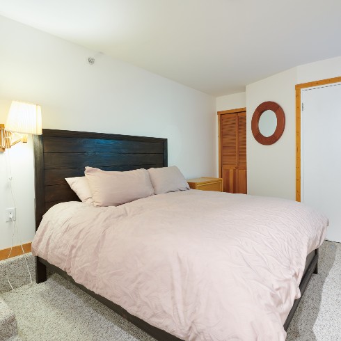
A Not-So-Sweet Cave Suite
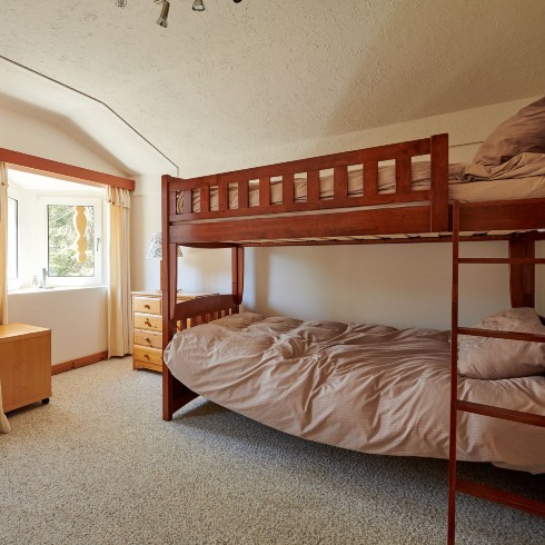
This unappealing bedroom didn’t have much going for it, but it provided much needed room for big groups and families. Sarah knew she needed to preserve it as an extra bedroom, but she had a vision to inject it with a playful energy.
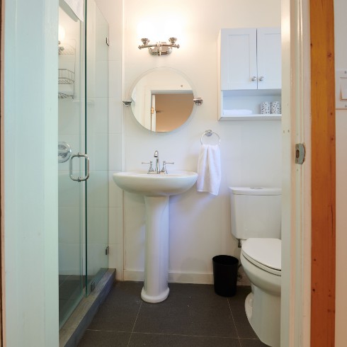
The Boring and Bland Bathroom
Along with a bedroom makeover, Sarah decided to transform the original awkward bathroom by shrinking it down to a simple water closet to serve the bunk room and invite natural light in from the window.
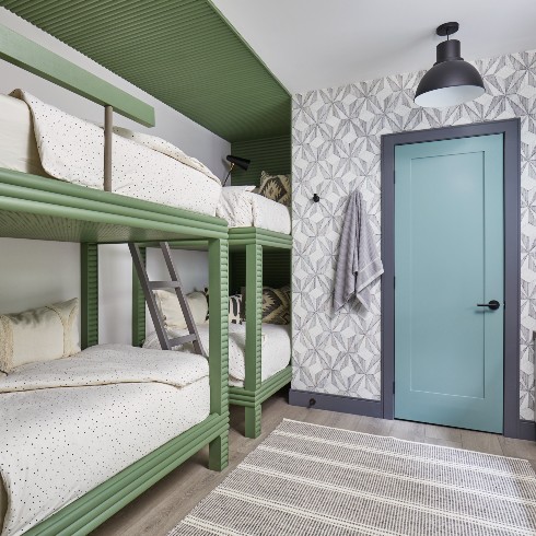
A Bold Boulder Suite
By opening up the home, Sarah was able to maximize the ceiling height to incorporate two sets of bunk beds which provides flexibility for travellers and families. Panel detail that frames the bunk beds was painted a vibrant green, like the moss covering the rocks in Whistler.
The bench provides a designated space to store suitcases underneath, as a functional design element.
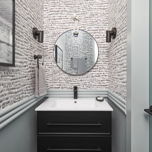
The Boulder Suite Bathroom
The petite bathroom suite has a slim vanity that provides lots of storage without compromising style. The matching black fixtures with the vanity creates a sophisticated and cohesive look. We love how Sarah managed to create a design that’s accessible for young kids, but still chic for adults who get placed in the bunk room!
A Major Media Room
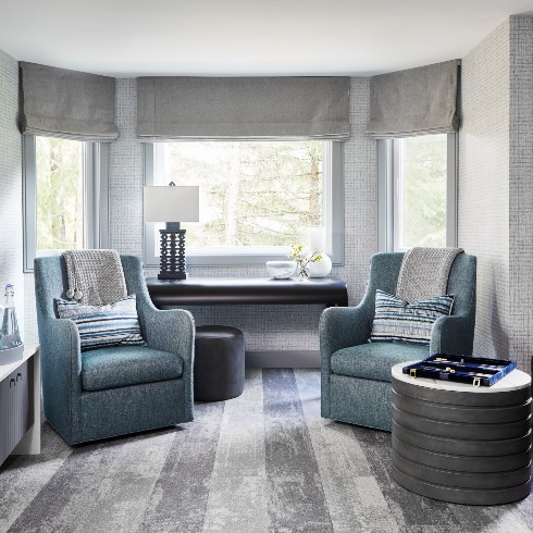
With the addition of the spa bathroom, Sarah was able to shrink the larger bunk room bathroom, and take the extra space to open up the media room. Keeping renters in mind, the room can accommodate two extra guests on large daybeds that can double as sofas. Since this room is also a “kid escape,” Sarah opted for a slightly darker colour pallet and employed durable materials to last over time.
Heidi Gloom
The smallest bedroom of the house might be the cutest of them all and although a small space to work with, it had a lot going for it. With great views and quirky details, Sarah fell in love with this room. Its transformation into the Heidi Room became an homage to the original house and its ski chalet roots.
From Heidi Gloom to Heidi Room
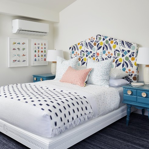
What was once a boring, uninspiring bedroom, is now a playful, funky room brimming with personality. Inspired by the flower boxes that once decorated the exterior of the original house, the Heidi Room headboard pops with a whimsical retro floral design and matching bedside tables that Sarah thrifted and spray painted with a lacquered high gloss paint. Always a fan of a DIY project, Sarah repurposed the chip carvings that not only decorated the handrails, beams, and fireplace of the house but were carved by the original owner! By spray painting them white, the pattern came to life and the carvings were repurposed as a bed frame. Maximizing space is always top of mind for a rental property, so Sarah installed a daybed too, so kids can pile in for a sleepover.
Heidi Blues
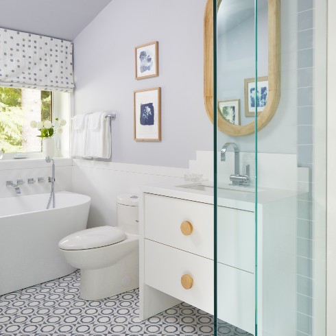
With luxury always top of mind, Sarah outfitted the bathroom across the hall to compliment the Heidi Room with high end materials and a cohesive colour pallet to tie it all together. As a kids bathroom, fun and function were top priority but Sarah didn’t skimp on quality. Sarah used durable slabs of quartz countertop as a sleek wall treatment that can take a splash or two from kids playing in the soaker tub. In the spirit of cohesion, Sarah chose Azul Macaubas quartz, a natural blue stone, as the floor tile as the blue ties back to the Heidi Room. To top it all off, one-of-a-kind blue cyanotype prints decorate the walls.
Hot tip (if you haven’t already noticed): When designing a bathroom to compliment a bedroom, utilizing the same colour palette creates a seamless connection between the two spaces.
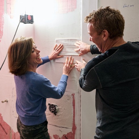
Laughter Really is the Best Medicine
Even though gutting a house and starting from scratch is a huge undertaking, there is inspiration to be found when walls are removed and you can see all the potential a space has to offer. After reworking the awkward hallway, the sightline was improved and with some minor structural revisions, Sarah was able to keep the vaulted ceilings which did wonders to open up the cramped third floor.
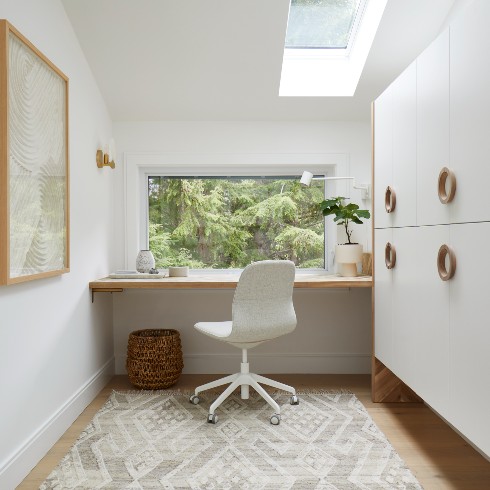
Let There Be Light
Although a vacation property, Sarah knows it’s tough to completely unplug, and since the “work from home” trend isn’t going out of style anytime soon, she found a cozy corner to add a workspace. After knocking down walls and raising the ceiling, the space instantly became lighter and brighter. An added bonus was installing skylights to take advantage of Whistler’s natural surroundings and maximize the airy feel. Skylights are affordable and easy to install and since they are a source of natural light, it was a no-brainer to install them on the third floor and take advantage of the mountain views. With design in mind for the desk, Sarah used acacia wood countertops and cut them to sit directly under the window frame. The tip cut chevron pattern and grain variation add texture to the room and harken back to the heritage of House Heidi’s chevron motif on the front doors.
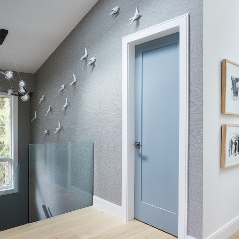
Free as a Bird
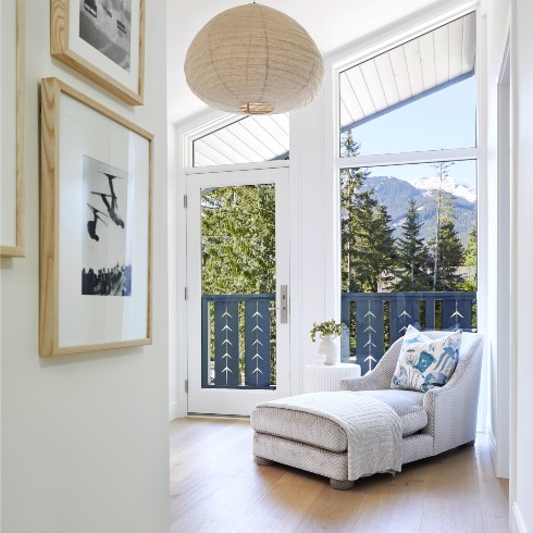
The third floor got a huge makeover through maximizing the ceiling height, and we all know for every tall wall a gallery wall is waiting to be hung! As an ode to the ski and alpine culture Whistler was founded on, Sarah framed archival photos taken of Whistler throughout the years to create a gallery wall and take visitors on a walk down memory lane. What used to be a dark and dated stairway is now a light, bright, and contemporary space, with a professional grade gallery wall to draw you in.
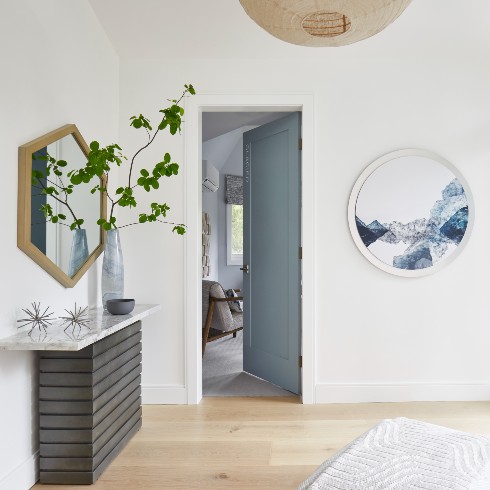
How Suite It Is
Welcome to the Glacial Suite! After some not-so-sweet obstacles due to zoning rules, Sarah needed to recalibrate the space and incorporate a lounge which serves as a landing pad before entering the Glacial Suite. What was a disappointing setback, became (one of many) favourite features of the house.This tranquil corner ended up providing an entry point as opposed to another long hallway. The custom floor-to-ceiling windows and doors may have had their fare share of frustrations but the light they provide created a serene and airy vibe that will leave guests feeling light on their toes.
Room With a View
Envisioning what the landing pad could be came easy thanks to the floor-to-ceiling windows. The lounge is a tranquil space to read and take in the mountain views from a cozy perch. In case you missed it, part of the view are the new and improved railings that Sarah dreamt up to give some curb appeal to the exterior of the house. It’s a contemporary take on the traditional design that originally donned House Heidi.
Suite and Sour
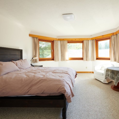
The original room was located in one of the turrets of the house, and had the best views that House Heidi had to offer. Looking out to Whistler and Blackcomb Mountain, the opportunities to improve the room were sky high. Speaking of height, Sarah reached new heights in the room. After some light demo began, she discovered the ceilings were vaulted and was able to raise the height of the room by two feet. This suite was definitely taken to the next level!
The Suite Life
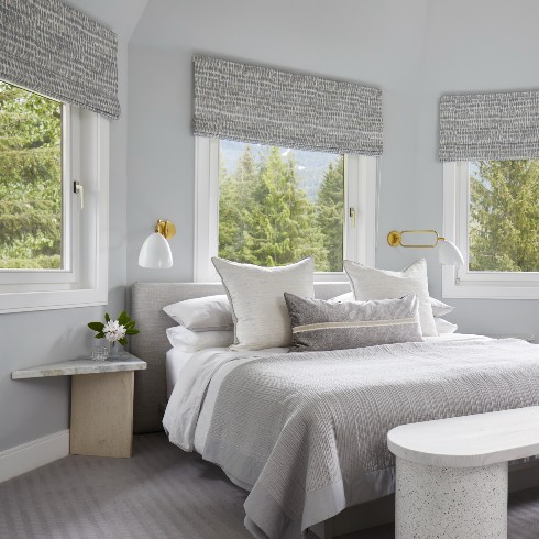
Did someone say mountain views, turreted features and vaulted ceilings? Sounds like a room fit for a king (bed). After gaining two feet in ceiling height, the room was dramatically opened up and architectural interest was created in the space. To serve as a year-round room while maintaining cozy appeal, Sarah utilized two toned neutrals (warm and cool tones that work together). For the colour palette, Sarah drew inspiration from the icy glaciers and snow capped mountains that characterize Whistler. Utilizing hushed, calm, relaxing and soft tones there is a quiet serenity that cloaks the room.
Calm, Cool and Luxe
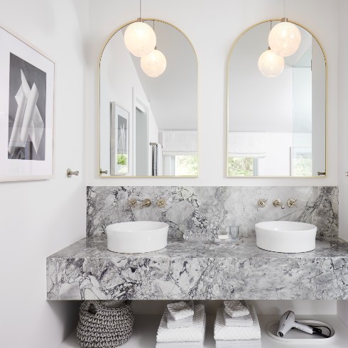
After reconfiguring the awkward hallway, Sarah and the team were able to move the ensuite to a bedroom that was no longer needed and create a luxe five-piece ensuite. For consistency between the two rooms, Sarah made design decisions to continue the cool and light, glacial theme in the bathroom. The counter and backsplash is a thick edged gray marble, resembling glacial ice. With clean lines, a double sink and wall mounted faucets, it’s a chic and contemporary ensuite. The pendant lights were hand blown and designed by a local artisan to resemble snowglobes and they truly anchor the room. Ever a fan of themes, Sarah selected tiles consistent with the glacial theme. The gray and white floor tiles are arranged in a sleek chevron pattern to resemble the mountains, and the white shower and bath tiles are a simple stacked subway tile that resemble snow blowing in the wind. To top it all off, there’s a soaker tub with a view to thaw your weary bones after a long day on the slopes.
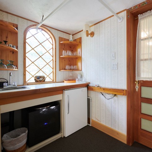
A Dramatic Transformation
Focusing on the heart of House Heidi, the most ambitious transformation occurred on the second floor. The kitchen was originally located in the turret and while it had its charms, it was an awkward location and needed to be reoriented. The old kitchen could barely handle Sarah’s family of four and if House Heidi was going to become the luxury rental of Sarah’s dreams, it needed to accommodate bigger groups. To make space for the new kitchen, the kitchen was relocated to the back of the house which required an overhaul of the entire second floor.
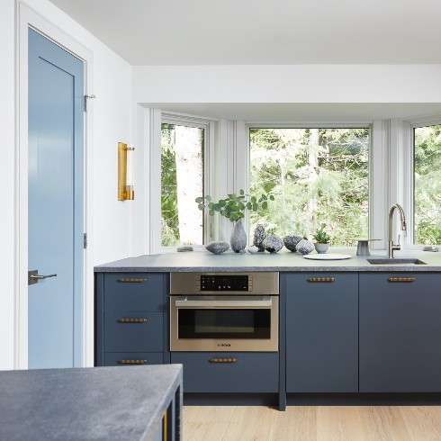
A Sink with a View
Never skimping on the details, Sarah created a multi-use coffee bar/baking station in a bay window. With laser focus on every single detail, Sarah and the team thought through all the appliances, fixtures and placement of each item as though they were guests.
In order for guests to take the guesswork out of navigating such a large kitchen, Sarah installed fridges with glass doors and kept the dishwasher and fridge un-paneled for ease of use. With six prep stations in the kitchen, important functions are tucked away and all have a place and purpose.
Related: The 15 Top Kitchen Trends for 2023
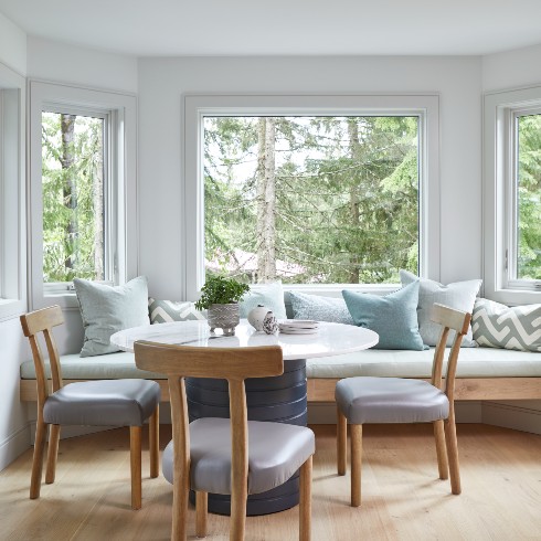
Time to Tuck In
Tucked away at the end of the island is a seating area where guests can hang out and stay out of the high traffic zones. With the massive windows, nature can come into the room along with the glorious natural light. The bench seating creates a laid back atmosphere with textured accents that invite guests to relax over a hot cup of coffee.
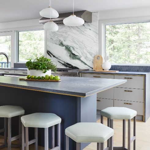
The Heart of the House
Sarah turned to nature as inspiration for the kitchen and all she had to do was look outside the huge new windows installed on the second floor. Not only did Sarah completely open up the second floor and improve the sightline from every direction, new windows were installed to let in the natural beauty of Whistler. With the overhaul, the kitchen shifted to the back of the house which provided the space required for the open-concept kitchen. For time’s sake, Sarah ordered cabinet components to assemble onsite with the option to customize and elevate with fixtures.
The focal point of the kitchen is the stone work that Sarah moved mountains for…or at least transported 4,500 km from Toronto to Whistler! With a 14-ft long kitchen island, Sarah needed two pieces of quartz. Measurements were critical to get right and although the waterfall feature was slightly too long, they were able to fill it with gab and avoid re-cutting the stone. As a design element, the backsplash creates harmony and brings all the tones and colours of the kitchen together.
Powder Room Perfection
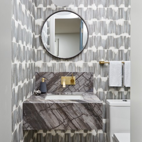
Sarah was very proud of the placement of the powder room as it’s tucked away off the kitchen. It’s discreet and a functional necessity with no shortage of style. A mountain riff on the floor with beautiful tones, a floating vanity and textural wallpaper feels like a “jewel box.”
Yikes Factor
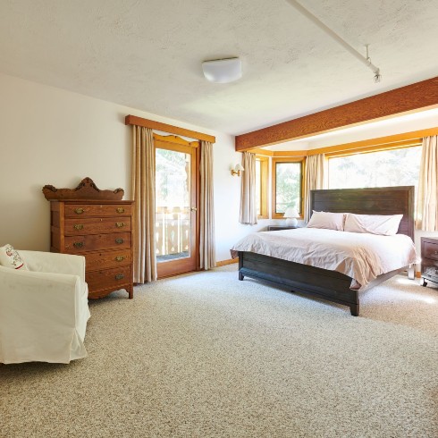
After completely reconfiguring the third floor and removing a massive chimney, Sarah added two suites to the back of House Heidi, the Woodland Suite and the Nimbus Suite. Although the original rooms didn’t provide the “wow” factor characteristic of a luxury mountain rental, the light streaming in and natural forest surroundings offered tons of potential and inspiration to work with.
Green Goddess
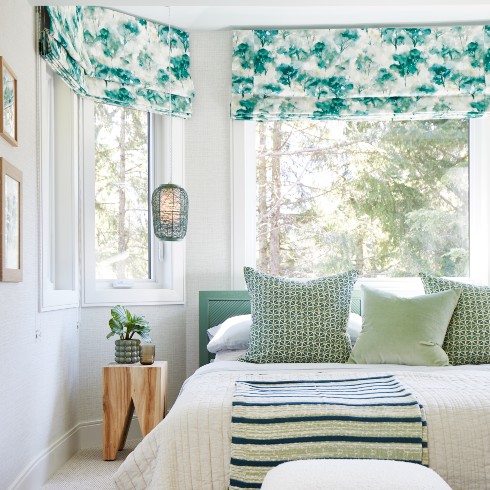
The palette of the Woodland Suite is a focal point and compliments the natural surroundings that truly transcend the room. Equipped with huge sliding doors and bay windows, guests can step outside and breathe in the fresh mountain air. It’s a quiet space that offers up privacy, as it’s secluded on the backside of the house, and guests can enjoy their own tranquil patio.
The low headboard meant Sarah could tuck the bed underneath the bay windows so there was no compromise on natural light. The green pendant lights are a functional design feature that showcase the ceiling height and help the room feel more spacious. Although a controversial topic, the closet is perfectly placed for guests to stash away belongings with space on the side to conveniently hang and tuck away items.
So Fresh and So Green
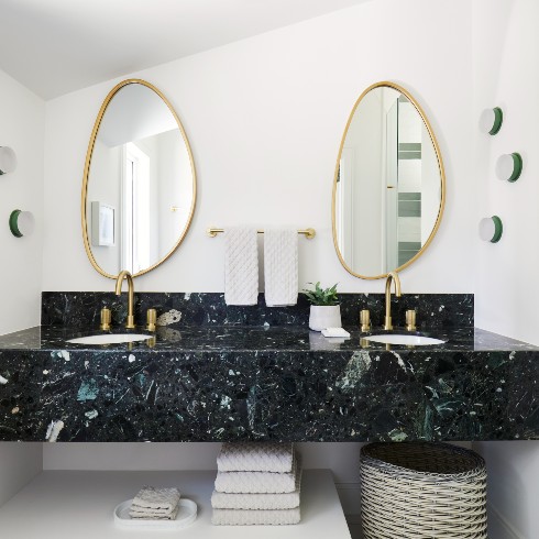
Carrying the fresh green colour palette into the ensuite of the Woodland room was easy given the beautiful green and white marble Sarah had been holding onto for its perfect moment. Unfortunately, the marble had a dramatic entrance and arrived cracked after its cross-country journey but there’s nothing a dab of epoxy can’t fix. After some TLC, the marble was ready to shine.
The floating vanity allows guests to store towels and belongings underneath while looking modern and fresh. The sconce lighting gives a fresh hit of green and pulls together the marble and deep green shower tiles. It’s a fresh monochromatic ensuite that’s not afraid to embrace colour and bold character.
Sleeping on a Cloud
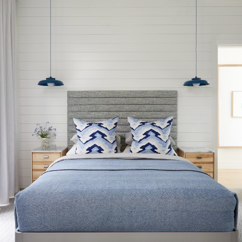
Sarah took inspiration from the blue sky and deemed this room the Nimbus Suite, after a family rendezvous to the glacier. The starting point for designing the room was the geometric-mountain-inspired pillow fabric. Once the fabric was chosen, it guided the design direction for the rest of the room. The blue and white tones work with the theme and the graphic wallpaper resembles ice fragments found on the mountains.
Although the layout of the room was tricky to work with, Sarah and the team opted for narrow side tables in order to provide necessary bedside storage for guests without wasting space. The Nimbus Suite also has a forest view and private patio that can be taken in from the massive sliding doors which enhance the space. The big doors were a huge value-add to an otherwise small space which means guests don’t have to go far to take in the natural surroundings.
Another design element that opens up the space and has an important function are the blue bedside pendant lamps hanging from the tall ceiling. Not only do they showcase the ceiling height but they pull together the variety of blue hues in the room.
From Yuck to Luxe
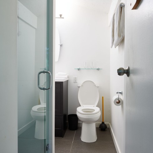
Sarah proclaimed this bathroom to be “dysfunction junction” and transformed it into an airy oasis that compliments the Nimbus Suite. Reconfiguring the space meant losing a window but with the addition of a skylight, guests can look up to the clouds and enjoy the natural light.
A floating vanity with a double sink was added as a modern touch, as well as lighting underneath it to guide guests in the right direction during a midnight visit. Floating vanities were utilized all over the house as they are easier to clean and maintain — an important element for the upkeep of a rental. What was once the smallest ensuite has been completely opened up, with a double sink and a huge geometric faceted bathtub. It’s now an airy sophisticated bathroom with lighthearted energy.
Awe-Worthy
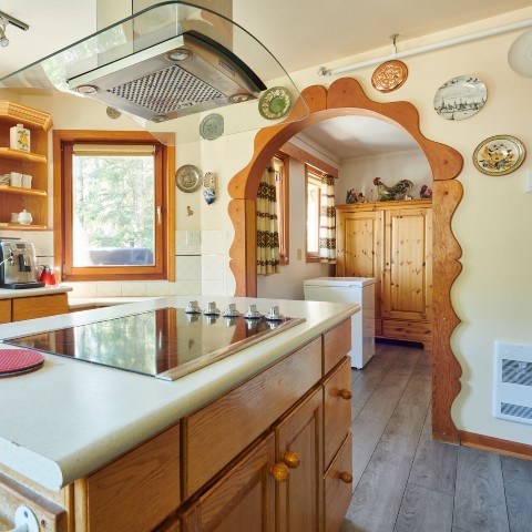
With a never-ending list of to-do’s and obstacles (pandemic, floods, and fires, to name a few) the last pieces of House Heidi’s second floor came together with the goal of creating an epic gathering space, dubbed the “Super space.” Turning around all the awkward clusters of closed off rooms revealed a beautiful space with a lounge, living room, dining, and last but certainly not least, a bar.
Related: How to Build a Self-Serve Bar
A Lounge for All Seasons
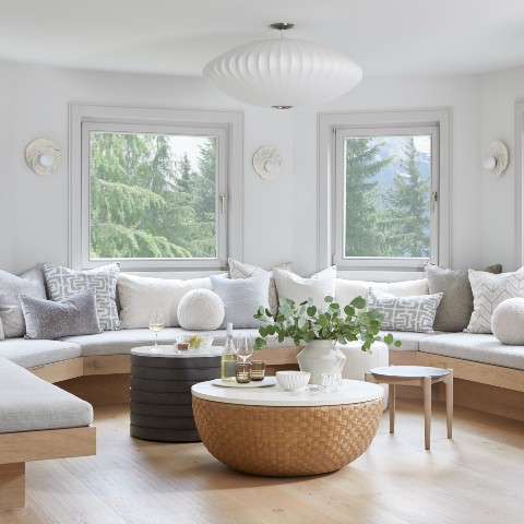
After moving the kitchen to the back of the house, Sarah and the team were able to take advantage of the prime real estate in the turret. When designing the house, Sarah asked herself how they could achieve the greatest good, which meant creating a chill lounge in the turret, where everyone could take in the beautiful views of Whistler and Blackcomb mountains. Once everything was stripped down, Sarah envisioned low bench seating so as not to obstruct the views, and to enhance the ceiling height. What they pulled off was a 360-degree banquette seating lounge with cozy textures and lush greenery as its backdrop. Although there was a lot of “out with the old, in with the new,” Sarah opted to keep the tilt-and-turn windows but updated the trim for a contemporary and crisp look. The nelson bubble fixture is a classic design touch and warms up the cool gray and natural tones of the room.
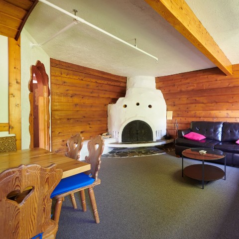
Out with the Old
This space was one of the many dated rooms that needed to be completely overhauled in order to open up the second floor. The main goal for the second floor was to be the principal room used by everyone, but with enough space for 16 guests and their friends and family to gather. One of the first things to go was the unsightly fireplace that ran through the house. The new focal point is a sleek three-sided fireplace that can be enjoyed from various angles. Sarah went with a warm white on the wall to compliment the warm and cool neutrals that bring to life the open and airy gathering space of her dreams.
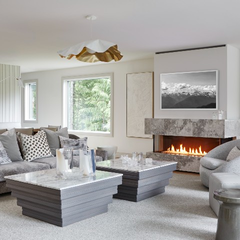
Stuck Between a Rock and a Fireplace
The zones Sarah envisioned came to life in an elegant, contemporary and cozy second floor for all to enjoy. The low furniture was a conscious choice to trick the eye into thinking the ceilings are higher. The swivel chairs are intentional so guests can turn around and take in the views or check out what’s happening on the television. The textured carpet, furniture, and pillows work with the cool neutrals while warming up the space. The custom statement light fixture is simple but bold, and even though it’s made out of a hard metal, it looks soft, floaty and fluid.
Although Sarah had a few bumps in the road with the cladding of the fireplace, her perseverance paid off and the new focal point fireplace brings the room together. Sarah chose a three-sided linear fireplace to make the biggest impact for guests. The look and feel of the fireplace was important to Sarah, but the stone originally chosen for cladding the fireplace had crumbled. Luckily, there was unused marble tile and Sarah dug deep to figure out how to turn a challenge into a big win.
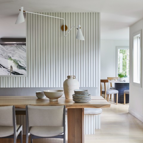
Dine and Dash
In the middle of the room sits a custom-made dining table with vintage chairs to add character to the space, while being cost effective. Behind the table is a beautiful custom feature wall. The vertical wood paneling is another trick to add height to the room. It’s a cool design with a practical use as it also acts as an enclosure for a support post and plumbing stack that were in the middle of the room when the floor was opened up.
The wall separates the dining area from the kitchen and supports bench seating. The kitchen side houses cabinetry, the main fridge and bar fridge with passage on both sides for traffic flow and an opening in the middle for sightline. The artisanal wood table captures the spirit of the house and connects it to the landscape. Sarah and her family will always have a seat at the table with the addition of racing stripes down the middle. Two stripes of walnut, one stripe of cherry and one stripe of ash represent Sarah’s family as a little homage and tribute to all their hard work.
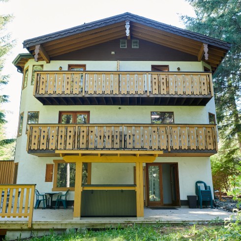
Weathering the Storm
The weather wasn’t the only obstacle to completing the exterior portion of the back of House Heidi. The backyard was unkempt, wild and unruly. There was a mess of dead trees and tangled underbrush that Sarah and the team needed to take from neglected mess to dress to impress. The pressure was on, not only due to time constraints from Mother Nature but from guests who were expecting luxe accommodation inside and out. In order to be competitive in the rental market, House Heidi needed to offer beautiful amenities inside and outside. With a huge area to work with, there was so much potential and all it took was a little imagination and heavy lifting from a crane.
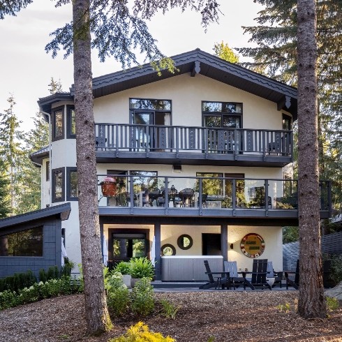
Dressed to Impress
Sarah applied her indoor philosophy to the exterior of House Heidi and created multiple zones for guests to enjoy. On the second floor, the deck was completely reimagined and extended, complete with glass paneling for unobstructed views. The extension also improved the ground floor deck by creating a cover for the hot tub and sauna, so guests can indulge in a little spa time care of House Heidi, no matter the weather. Who needs the Scandinavian Spa when you can come home to Spa Heidi? Another zone was created around a fire pit for guests to enjoy a cup of hot cocoa and chill out while enjoying the outdoors. The Adirondack chairs add a minimalist and sleek look to the outdoor zone while embodying a low maintenance philosophy. Since they don’t require cushions, they are super easy to maintain which is an important feature for a rental. Another chic change to the exterior was losing the brown window trim and streamlining the colour palette.
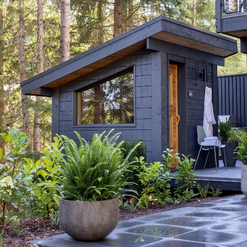
Flora and Sauna
Things really heated up when the original plan for the sauna was denied by the municipality but that opened up a whole new vision in Sarah’s brain for a bigger and better sauna. With the extension of the second floor deckx, the overhang provided coverage for the hot tub and the structure covering it could be reused for the sauna. The landscaping for the backyard is simple and compliments the natural surroundings of the house. The decision to keep things simple was intentional since House Heidi is a rental, the grounds can be easily maintained.
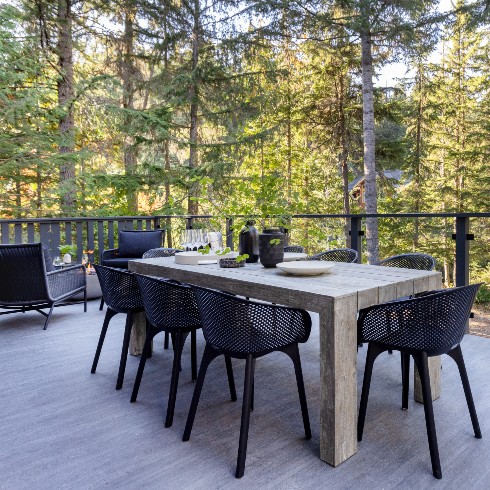
All Hands on Deck
Extending the second floor deck was a no brainer because it meant Sarah could create multiple zones. Complete with a dining area, fire lounge, barbeque and smoker, the new deck is ready to host!
The fire pit is super contemporary and creates a cozy, laid back vibe that’s visible from the other end of the living room, inviting guests to come outside and take in the fresh mountain air. The deck acts as an extension of the living space and creates an easy flow from the inside to the outside. Opening up the railings by installing glass panels on the second floor deck meant guests could have a better view of the new and improved backyard.
Related: 55 Beautiful Backyard Ideas
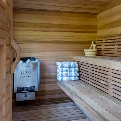
Spa Heidi
Using the existing roof structure over the hot tub for the sauna was a great idea in theory but in reality it wasn’t as easy to pull off as Sarah had hoped. The roof was extremely heavy but the team really started to sweat when they discovered the pitch of the roof and window did not match up. This was an unforeseen bump in the road that was easily navigated by extending the window trim to create the illusion of an angled window to match the pitch of the roof (a little fake it till you make it, if you will). The juice was definitely worth the squeeze because the end result is a chic, Nordic inspired sauna, complete with a perfectly pitched window to take in the view while sweating and maybe even singing it out.
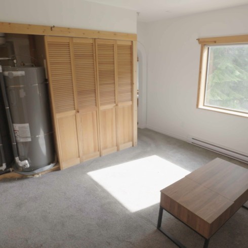
TLC for the Caretaker’s Suite
The caretaker’s suite was the final piece of the puzzle for the challenging jigsaw that is House Heidi. It had worn many hats over the years, from a garage to a caretaker’s suite and mechanical room. Sarah wasn’t sure what to make of it, but knew it wasn’t going to be easy. It was a cramped studio-style suite, that was completely lacking in charm and function (and that’s being kind). To open the space up, the team took it down to the studs and were able to raise the ceiling. The new plan included enclosing the bedroom, reconfiguring the bathroom and kitchen, and amplifying storage and efficiency as much as possible for the small space. The finished product was a whole new layout that is beautiful and livable. It’s hard to believe it’s the same space with no additional square footage.
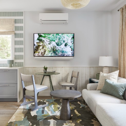
The Hills are Alive in the Meadow Suite
It’s hard to believe, but this area of the makeover was the most challenging to pull off based on the budget and space constraints. Originally, it was cramped and uninspiring, but now? It’s a light and bright enclave to come home to. Not only were walls knocked down between the kitchen and living room, but the ceiling height was opened up which did wonders to create the effect of more space. Sarah and the team were able to fit a full-size seven-foot sofa, a table and two chairs, and an outfitted kitchen with all the fixins’. Ever a fan of efficiency, the TV is wall mounted on a bracket that can swing out towards the couch. The cedar wall was painted one colour and then sanded back. The DIY cedar wall brings all the spaces together with one material finished in three ways! When you’re budget-constrained, it can open up a whole new world of creative possibilities.
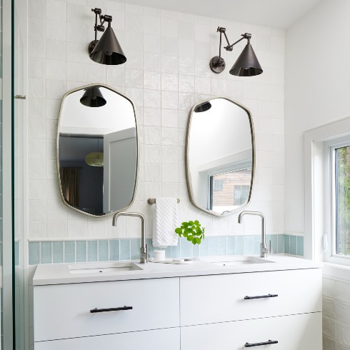
Double Take on a Double Vanity
What was once a dingy kitchen, is now an open, light and extremely functional bathroom. Using leftover tiles from the main house, Sarah used a palette of white, light gray and greens with black and chrome fixtures, for an airy yet contemporary look. The floating vanity features a double sink with plenty of storage that is functional and maximizes space, while still maintaining a floaty vibe. Sarah even managed to fit a stacked washer and dryer, so the suite could continue to be self sufficient. The budget might have been tight, but this suite is overflowing in style.
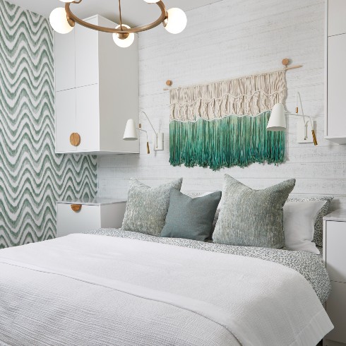
Suite Dreams
Taking a cue from the bathroom, Sarah brought through the fresh mint and white colour palette into the new and improved bedroom. For not adding any square footage, it’s miraculous that Sarah was able to fit a king size bed and two full size bedside tables. Although the recalibration of the suite was a huge win, Sarah had to overcome a hurdle in bringing in some ventilation and natural light to the bedroom since it has no window. As contentious as the idea was, Sarah decided to install a little window between the bedroom and the kitchen with a sliding door, that way anyone staying in the suite could slide open the window and be greeted with natural light and fresh air. Sticking a little coffee station under the window perked up the space and is a serious pick-me-up in the morning. The cedar wood feature wall behind the bed is part of a DIY series that Sarah came up with to tie all the rooms together. This particular wall was primed in green then painted the same colour as the wall and then sanded back which enhanced the cozy cabin vibe.
Love this transformation? Shop the look here!
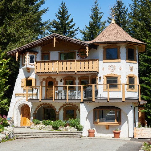
Ye Old House Heidi
One of the most important features of a rental property is the curb appeal, as it makes the first impression. Although quirky, there was something charming about the exterior of House Heidi that Sarah was determined to maintain as a way to honour this Whistler landmark. The only thing in Sarah’s way was, well…everyone else’s opinion! After polling members of the community and a local Whistler architect, the overwhelming belief was that House Heidi needed a total facelift on the exterior too. To some extent this was true but time and money doesn’t grow on trees so Sarah needed to come up with simple and effective updates because once the exterior was done, House Heidi could be listed for rent. Cha-Ching!
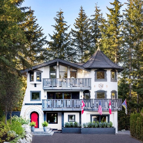
From “Campy Hodge Podge” to Contemporary Chic
Sarah was able to maintain House Heidi’s charm by removing some of the gingerbread house-inspired trim around the doors and windows and adding a new coat of paint. The new windows and doors also updated the appearance, as well as improving the view to the outside. Once the trim was removed, Sarah chose a contemporary yet simple charcoal as the paint colour. This was an easy choice given it’s a neutral colour while still making a statement that the new and improved House Heidi was modern and chic. Sometimes it’s as simple as a high contrast paint colour to give a whole new look and feel to a home.
Another simple update was painting the front door a warm coat of red that welcomes guests through the iconic archway and draws the eye to the hand painted artwork that has been welcoming guests since the 1970s. Since the door is off to the side, the red colour stands out and guides guests to their mountain oasis.
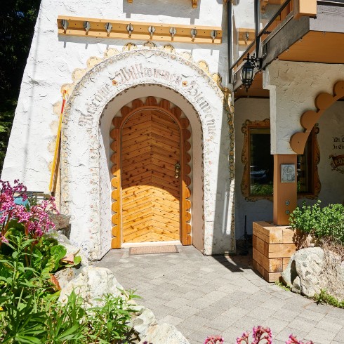
From Kitschy to Contemporary
The original house featured lots of archways and cute eclectic trim but to convert House Heidi to the luxury rental Sarah had envisioned, they needed to go. However, when push came to shove Sarah knew there was a balancing act of protecting the history and uniqueness of House Heidi while still updating the appearance. Sarah decided to keep the unique and iconic archway at the front door which has been welcoming people from around the world for 40 years. The two archways to the right were completely straightened out and painted charcoal which shifted the house towards a more modern aesthetic.
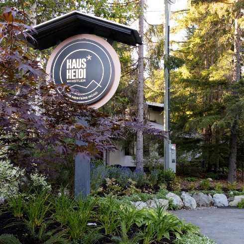
So Sleek and So Chic
House Heidi wouldn’t be complete without a new sign, but not just any sign would do. After working with a graphic designer and incorporating some LED lights, the sign is the cherry on top of the House Heidi reno. Complete with new landscaping, a new home for the Japanese maple, and a new sign featuring an eye-catching logo, the exterior of House Heidi is LIVE! Widening the driveway for more parking and improved sightline to the front door helps guests make a grand entrance to the more functional and contemporary entryway.

Teamwork Makes the Dream Work
After over a year of renos, House Heidi has been tweaked, trimmed, lifted and painted (to name a few) and although it got way worse before it got better, the end result is an outstanding luxury retreat that Sarah and the team had been dreaming of. The house still has the character and charm that Sarah was hoping to maintain but it’s been transformed to a chic mountain getaway. The whole project came full circle when Fran, the original artist, came back to restore her artwork on the exterior of the house. It may have been Sarah’s vision guiding the team all that time but it truly took a village and lots of love, sweat and tears to bring House Heidi into the 21st Century.
Love this transformation? Shop the look here!
Home Network your inbox.
By clicking "SIGN UP” you agree to receive emails from Home Network and accept Corus' Terms of Use and Corus' Privacy Policy.


