Brigus, Newfoundland is all about extremes: from the unpredictable weather to the breathtaking (and, occasionally, whale-filled) ocean views, island life on “the rock” is an incredible experience – and third-generation builder Randy Spracklin is creating spectacular homes worthy of the stunning locale. Working alongside his father and a team of experienced craftspeople (and one rookie), Randy and the Rock Solid Builds team navigate the challenges of the rocky terrain to build and renovate stunning homes.
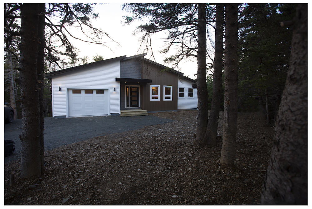
Mom’s Cabin in the Woods
Sometimes, the best building projects are the most personal – like the stunning cabin-in-the-woods-style home that Randy designed and built for his mother, Betty. With a budget of $200,000, Randy, Scott and the Rock Solid Builds team built Betty’s home in the forest from the ground up.
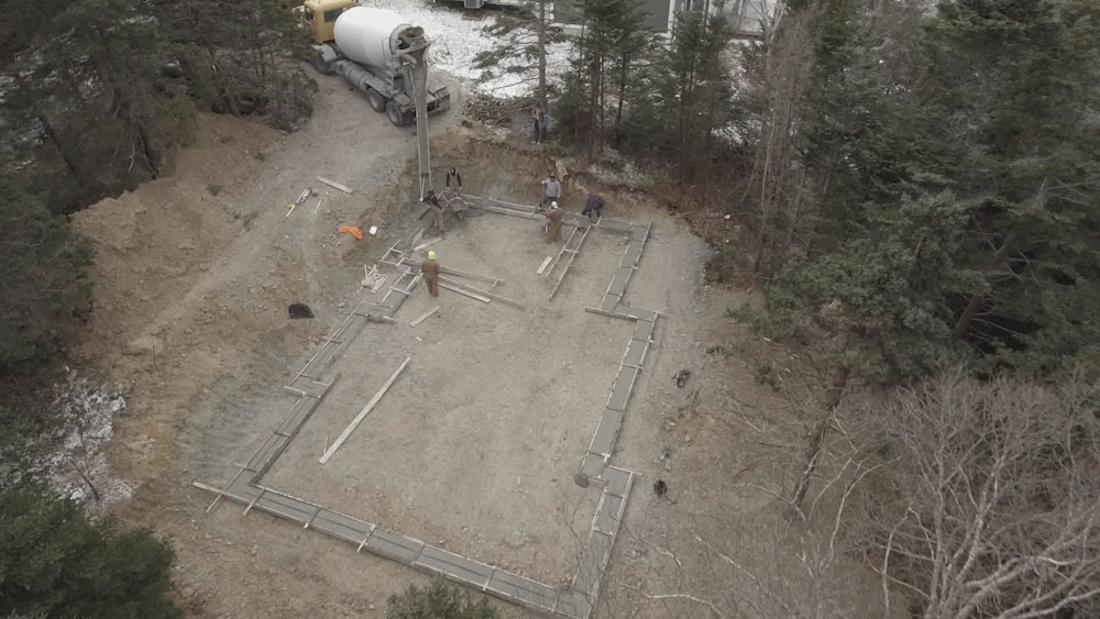
New Build for Nan
While Randy often renovates existing and historical homes, the team started from scratch to create a totally custom new-build home for Betty. Initially, the lot was covered with trees, which had to be cleared. The team then laid the foundation, but had to contend with an incredible snowstorm that slowed down their pace.
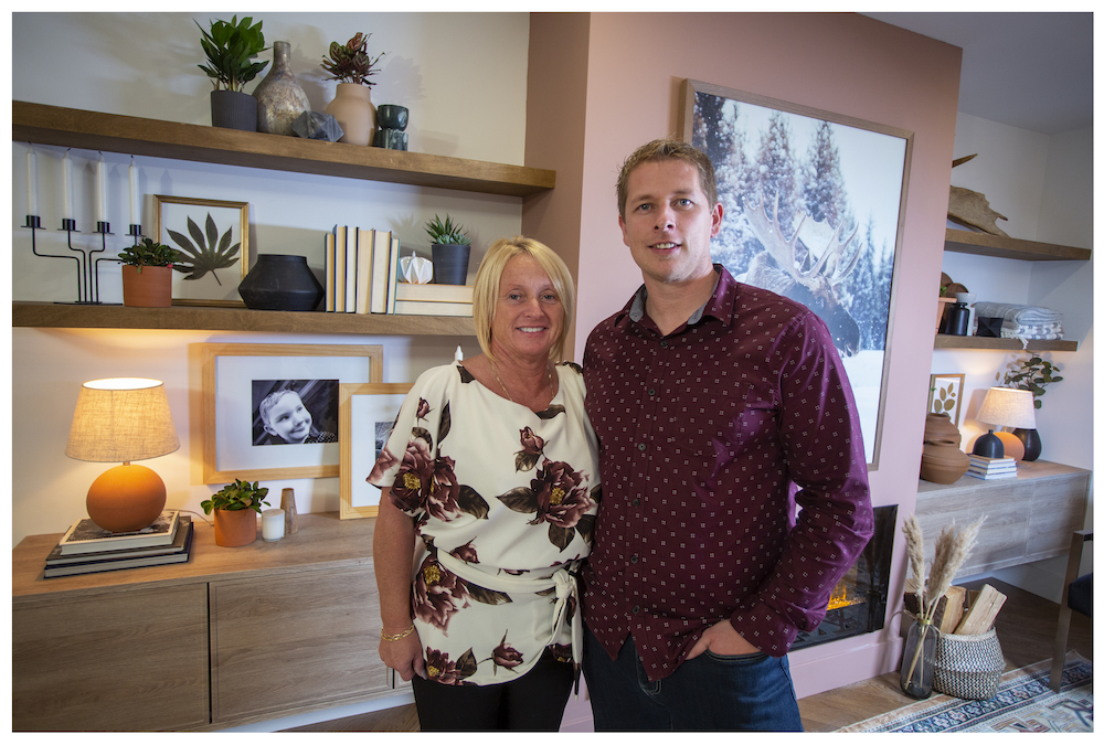
Family Matters
The completed two-bedroom home is a stunning, comfortable space that’s perfect for Betty to call home – and for the whole family to gather together. Inside, the living space is bright, airy and open-concept, with lots of natural materials and wood to play up the woodland surroundings.
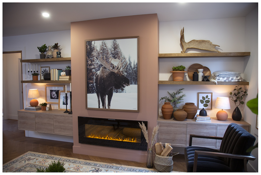
Float On
In the living room, the main wall is a gorgeous focal point featuring floating wood shelves, a modern electric fireplace and a bump out painted in a warm peachy tone to accent the earthy wood tones. Here are more living room shelving ideas to keep your space organized and stylish.
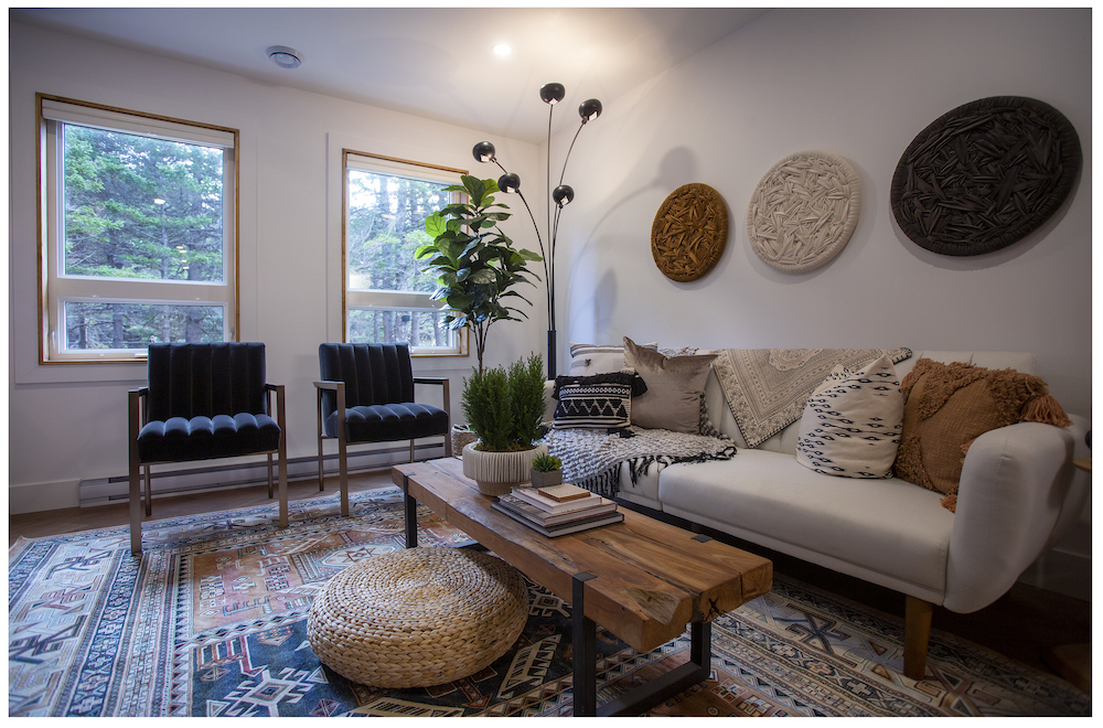
Take a Seat
Comfy seating in neutral hues completes the living room, while a patterned area rug grounds the space and brings in a punch of subtle colour. Custom wood-trimmed window boxes further the natural feel in the interior.
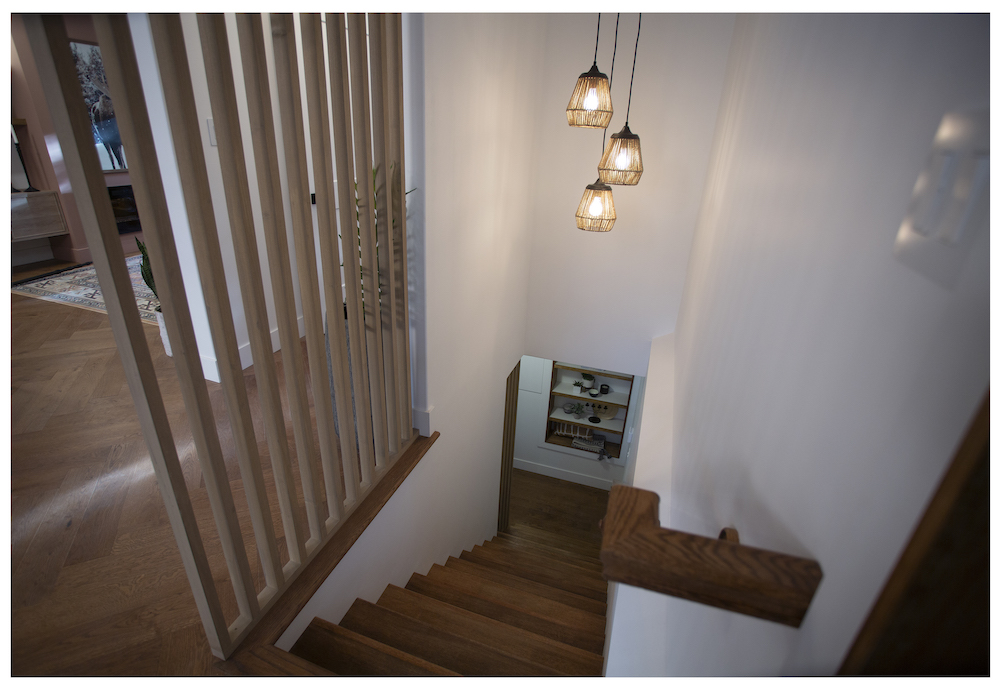
Floor-to-Ceiling Fabulous
For Betty’s home, it’s all about the special, custom elements – like the floor-to-ceiling wood railing at the staircase, which was built by Randy’s dad, Scott. The distinctive detail looks “catty” and adds dimension to the space, without breaking up the open concept of the living space. Another stylish choice? The hardwood flooring, which is laid in a herringbone pattern for a cool and unique look.
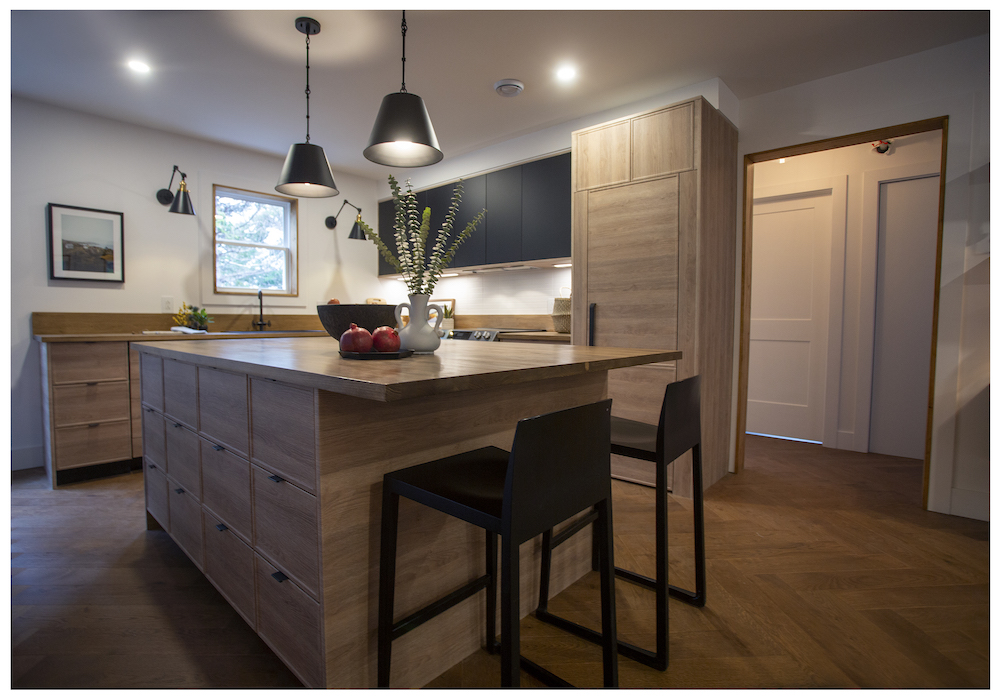
A Mint Kitchen
With an open, airy design of Betty’s new kitchen proves that less-is-more can deliver a real wow factor. Randy chose wood for the lower cabinets and large centre island, while a row of black upper cabinets creates an elegant feel that highlights the black-tone light fixtures. To keep the look cohesive, the fridge door matches the wood cabinets for a sleek feel. Want to make your own appliances more discreet?
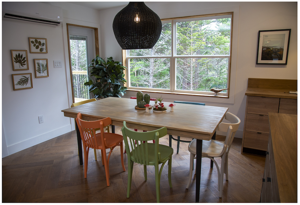
Forest Views for Breakfast
Perfect for sharing big meals together, the dining room is complete with a custom-built dining room table. For a pop of freshness and. as a subtle nod to the colourful houses found in Newfoundland’s famous Jellybean Row, the team painted each of the dining room chairs in a different colour. Large surrounding windows will allow Betty to take in the tranquil view of the forest while enjoying her meals.
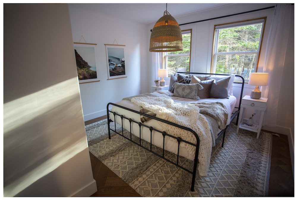
Betty’s Beautiful Bedroom
For Betty’s bedroom, the goal was to create a comfortable retreat. To echo the natural feel of the rest of the home in the bright, light-filled primary bedroom, the team used wood-trimmed windows and the same herringbone-pattern flooring.
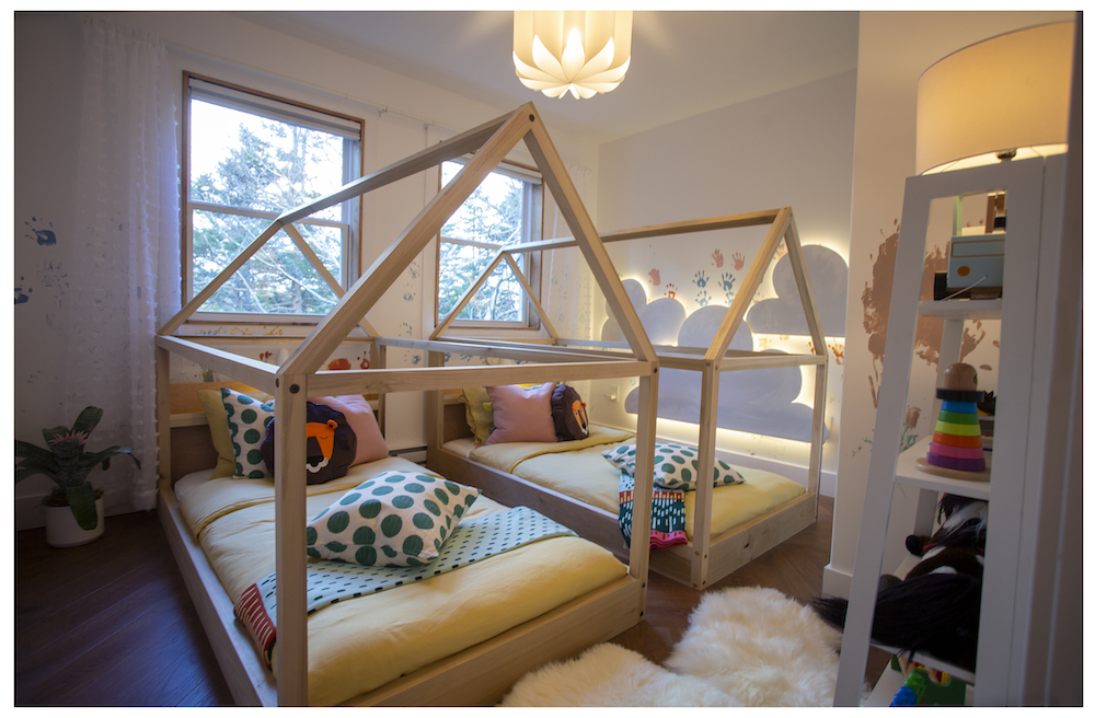
Glow On
Family is the focus for Betty, so it was important to her that there be a room for her grandchildren to enjoy for visits and sleepovers with Nan. In the home’s second bedroom, Randy created an adorable room for the kids, complete with tent-inspired beds and custom-made cloud-shaped LED wall night lights. For a personal, sweet touch, Randy also helped his little ones paint the walls with their hands.

St. John’s Jellybean Row
Randy and the Rock Solid Builds crew take on jobs all over Newfoundland, and one of the most iconic places on the island is the bright and colourful area in St. John’s known as Jellybean Row. Located in the heart of Jellybean Row, Krista’s home is at least 100 years old, and the kitchen was in need of an upgrade.
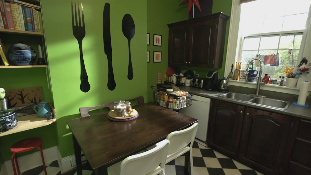
Storage Stumbles
Krista had lived in the home for a decade, but hadn’t been able to figure out what to do to refresh the kitchen, which has a serious lack of storage and needed a more functional layout. With a $30,000 budget and three weeks to complete the renovation, Krista trusted Randy and the team to create a dream kitchen – while still respecting the character of the century-old home.
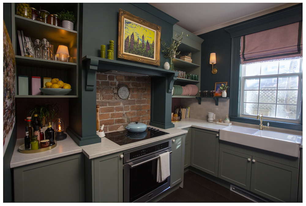
Hidden Gems
The transformed kitchen offers a stunning balance of chic functionality and character-rich features – like the statement-making stove wall. One of the best parts of renovating and restoring older homes is uncovering unique original features – like the gorgeous red-brick chimney that had been hidden behind a wall. The team made the brick the wall’s focal point, which they then surrounded with a custom range hood and shelving built by Randy’s dad, Scott.
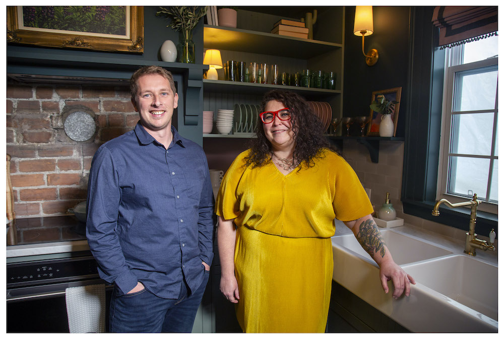
A Mint Space to Cook
In addition to the new stove wall, the team also added custom upper open shelving, new cabinets and counters that run all around the kitchen to boost the kitchen’s storage and prep space. A beautiful white farmhouse sink below the window adds to the luxe – yet a touch rustic – feel.
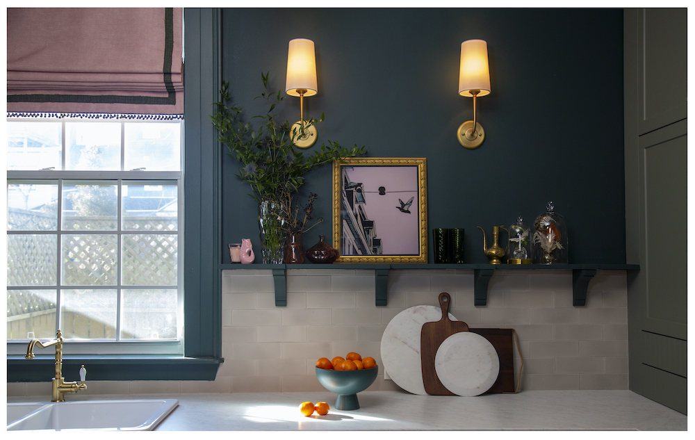
Bright Ideas
You can never have too much light in a kitchen, so – for additional lighting and a touch of modern-vintage charm – the team added brass wall sconces. For the backsplash, brick-patterned concrete echoes the brick behind the stove. A functional (and stylish) shelf tops the partial backsplash for a custom look.
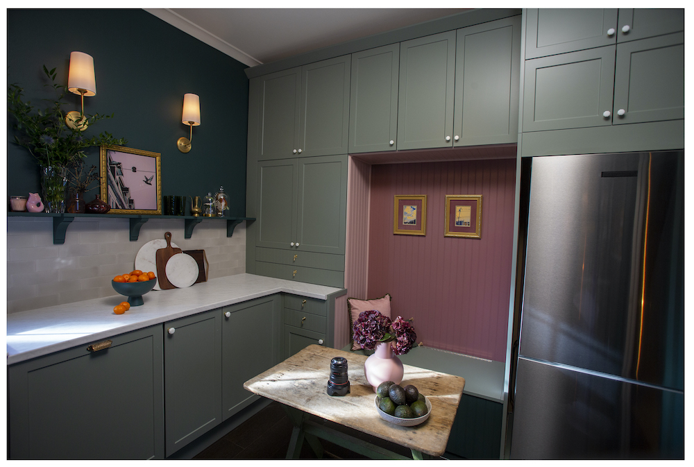
Built In Style
In order to maximize the kitchen’s space, Randy and the team closed off the second doorway to make space for a wall of cabinets, which frame in a clever new built-in bench seat. Behind the bench, a pop of classic mauve perfectly complements the sage green cabinets. The unexpected combination of rich, moody colours creates an elegant space – while also calling back to the colourful style of the home’s Jellybean Row location.
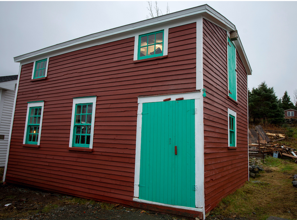
Bringing Back the Barn
Restoration jobs can be challenging, but Randy and his Rock Solid Builds team aren’t afraid of some hard work – and they love to preserve history. Preserving – and saving – historic structures was the name of game when it came to renovation homeowners Cory and Leo’s century-old barn.
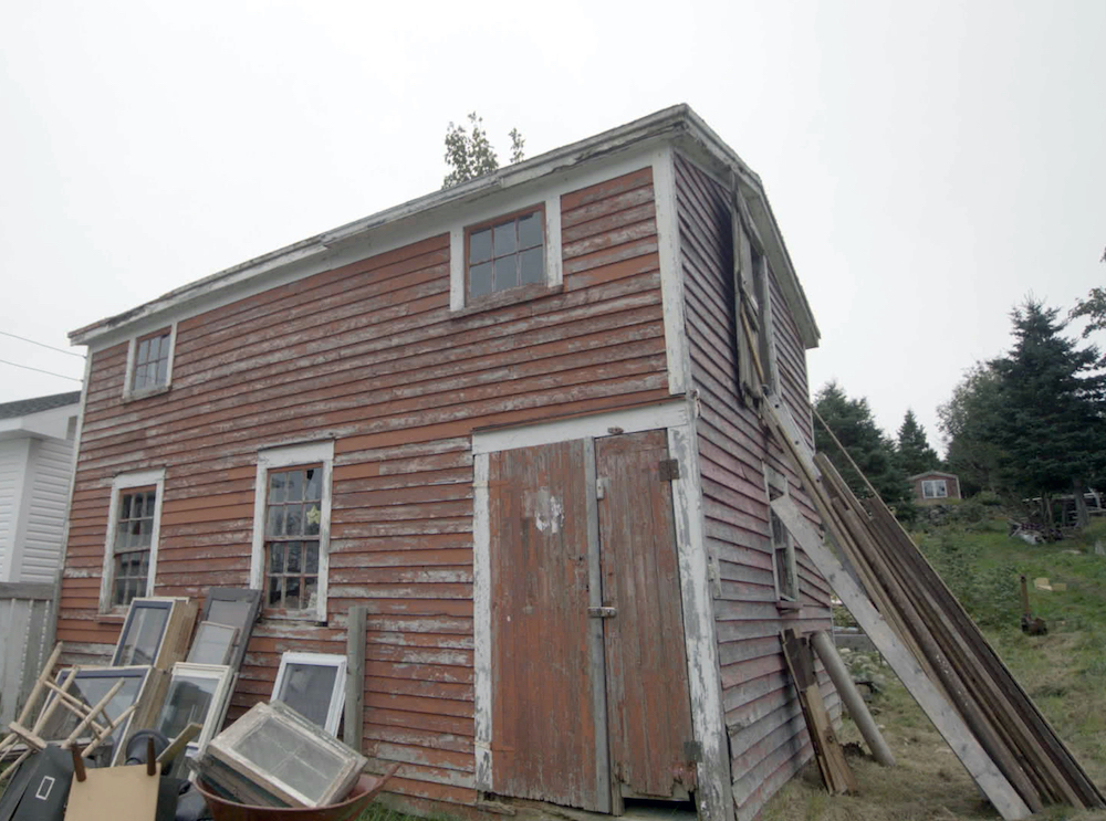
Last Legs
Located in Bay Roberts, just outside Brigus, Cory and Leo’s barn had suffered a lot of wear and tear over the past hundred years – but especially after a particularly harsh winter “Snowmageddon” a few months before. With the roof barely holding on, the homeowners feared that the barn wouldn’t last another winter. More than that, they felt that the historic barn could be revamped from run down into a rocking space for entertaining friends and family.
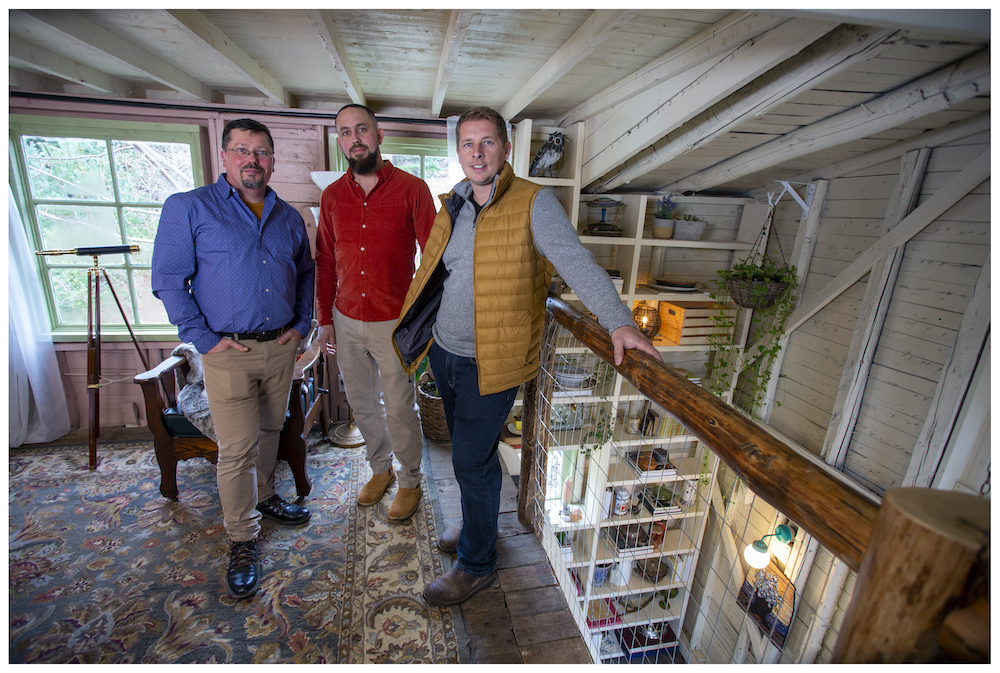
Barn Beauty
With a budget of $60,000 the Rock Solid Builds team completely transformed the space. In addition to necessary structural fixes, the crew renovated the interior to create a spacious main floor for entertaining and a comfortable loft space for sleeping, reading or just relaxing.
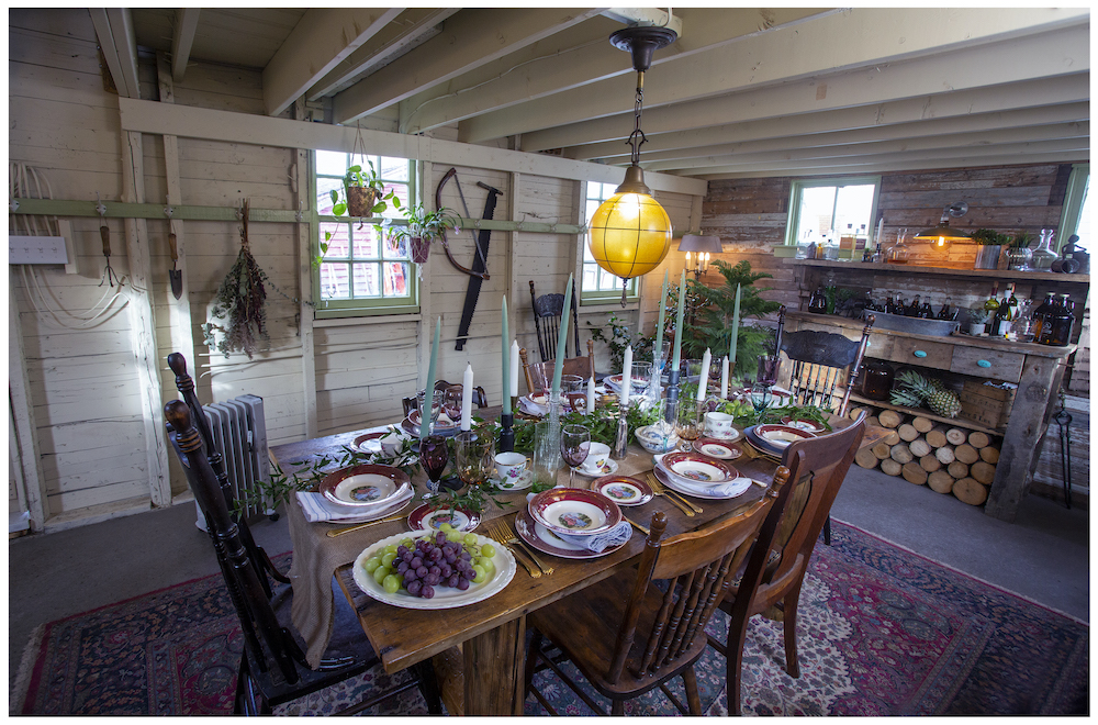
Solid Footing
The lower-level entertaining space is grounded with a new concrete floor that’s finished with a dark tint for a historic feel that blends with the original details and aged accents throughout.
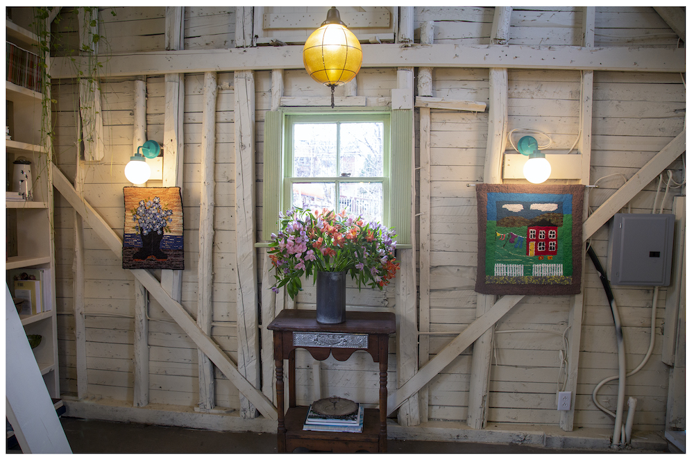
Simply Rustic
You can’t buy a home’s character in a store, so – instead of insulating and covering the walls – Cory and Leo opted to keep the character and texture of the old log walls. Painted with just a sheer wash of warm colour, the finished walls instantly convey the barn’s longevity – while furthering the cozy ambiance of the space.
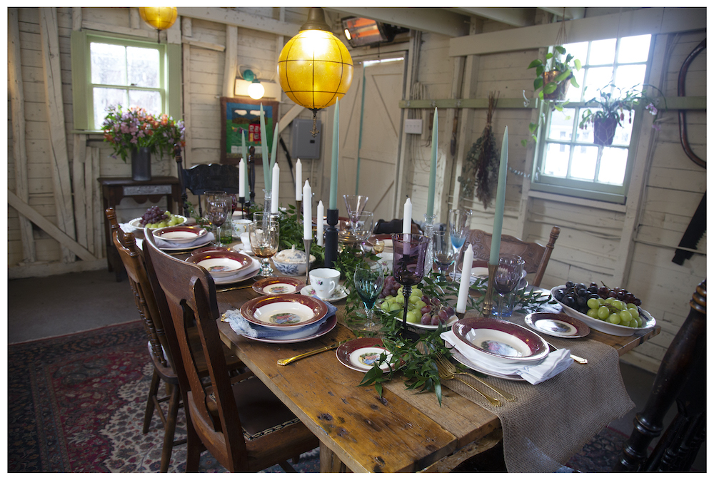
Reclaiming History
Combining the homeowners’ love for both entertaining and preserving history, Randy and the Rock Solid Builds team built Cory and Leo a gorgeous custom harvest table from old reclaimed lumber – as using reclaimed wood is a beautiful way to add character and history to a home’s decor. Want to give it a try in your own cooking space?
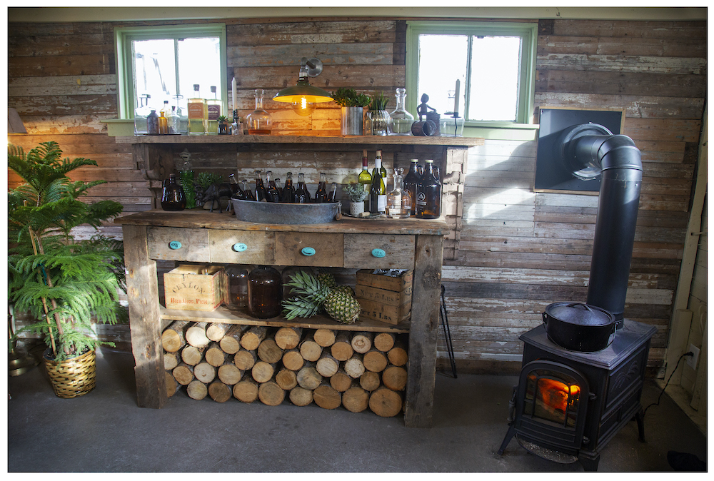
Raising the Bar
Custom touches can take a space from functional to fully a dream. Because Cory and Leo envisioned the main floor of the barn to be a place for entertaining, the team added a custom bar – also crafted from reclaimed lumber. Complete with a classic tub “sink” to keep drinks cold, it’s a touch of character and convenience for the homeowners. And, because the homeowners want to enjoy the barn on chilly days as well as sunny, the team installed a solid cast-iron vintage wood stove to bring some heat.
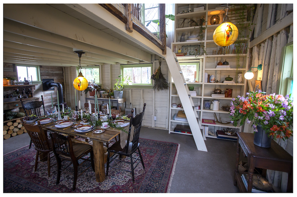
Floor to Ceiling Charm
To add character to the space leading up to the loft, the team built a custom floor-to-ceiling bookcase – the perfect place to display special pieces while adding a touch of storage. Bookcases are a smart way to add style to any space.
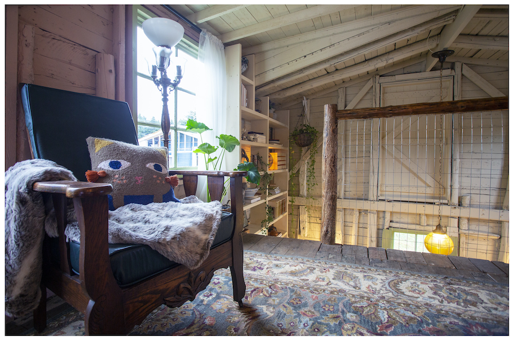
Handmade Handrail
At the top of the stairs, a one-of-a-kind custom handrail – made by hand from collar ties by apprentice Nikki – lends a unique touch. Another big upgrade upstairs? The team built a new dormer to let in more light and add extra headroom. While the dormer is a new build, they crafted it from rough lumber to match the old roof structure.
Related: How Home Network’s Nikki Spracklin Went From Stay-at-Home Parent to Successful Tradesperson
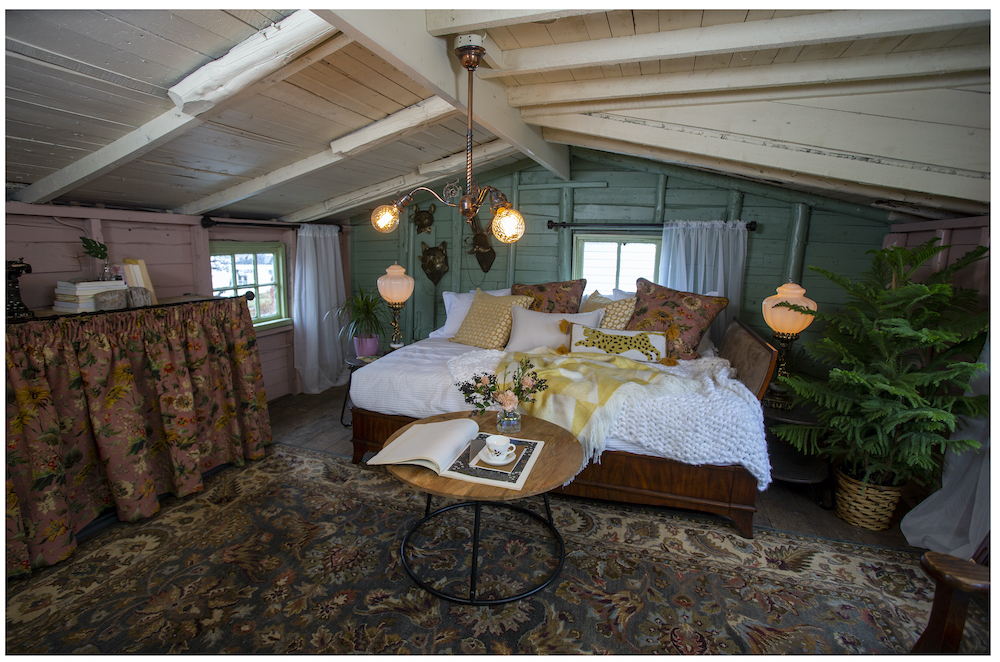
Lofty Living
The new loft area is a dream with a deeply hued accent wall, comfy daybed and artful vintage touches. Paired with the added natural light afforded by the new dormer, the loft is now a bright, comfortable place to crash or relax. This is an incredible space and one of our favourite barn transformations ever! Well done!
Home on the Hill
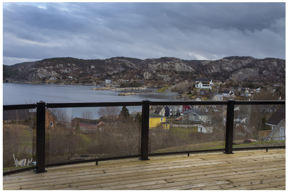
Randy and the Rock Solid Builds team are experts at creating dream homes for their clients, as they showed with the incredible transformation of Dave and Deana Mitchell’s home. Located at the top of the hill, the Mitchell house had some of the best views of Brigus and the bay, but it was cramped and a bit outdated. With a $450,000 budget, the team made the home look and feel new – with the help of two additions, lots of hard work and some stunning finishes.
A Tight Fit
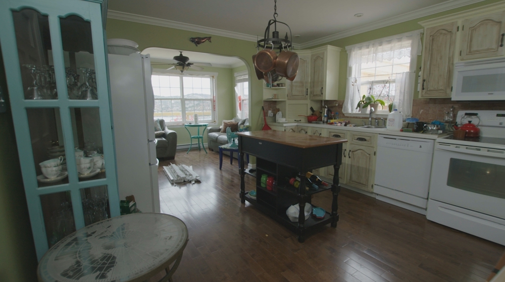
Before, the Mitchell home lacked a proper entryway and had a tight, cramped kitchen that wasn’t ideal for entertaining. To open up the space, the team added a new mudroom and a large addition to the kitchen.
Sunny Space
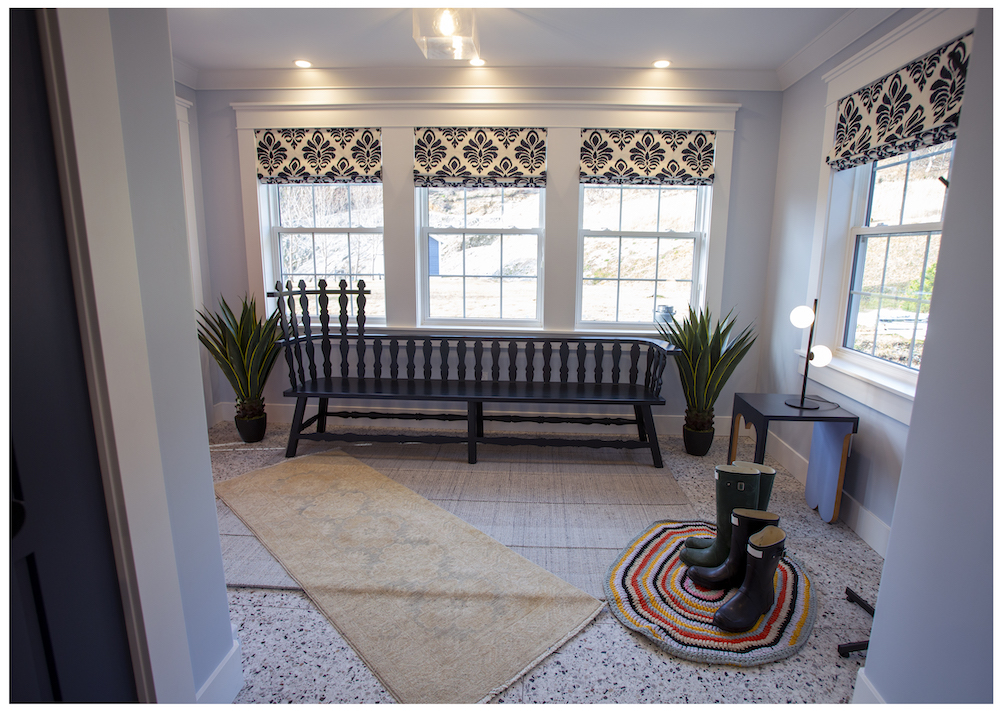
The new mudroom is both practical as a spacious new front entrance, and pretty spectacular when it comes to the details. With plenty of windows and stylish roman shades, the room lets in enough natural light to double as a warm, inviting sunroom. Underfoot, large-format tiles and heated floors are functional and comfortable for coming in out of the notorious Newfoundland weather and kicking off your boots.
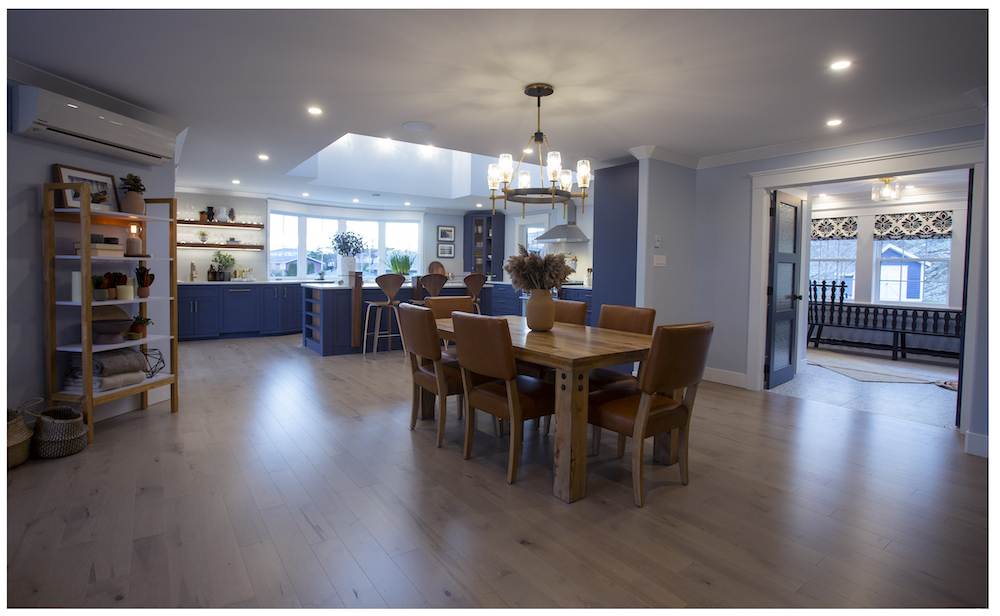
Fine Dining
The Mitchell house’s new dining space is a master class in open-concept design. Grounded by beautiful hardwood floors, the dining room flows into the new kitchen – making it perfect for entertaining. Light blue walls deliver soft contrast and help establish the modern coastal character of the home.
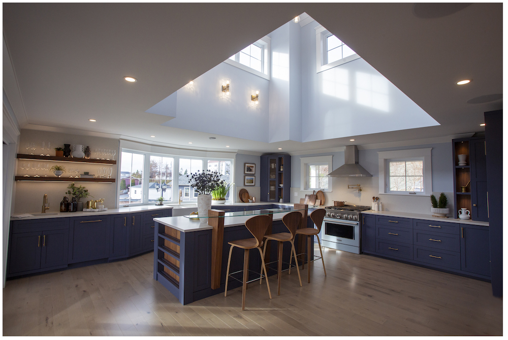
Blue Beauty
The kitchen, which was a totally new addition, is bright, spacious and stunning. The custom-designed expansion features a vaulted ceiling to let in light while creating a dramatic focal point. Sophisticated navy cabinets and warm walnut wood accents are an elegant contrast to the light blue tones in the space, while a custom island adds space for entertaining and gathering for a kitchen party. Over the sink, the large windows let in even more light – while also making the most of the incredible views of the water.
Related: These Drool-Worthy Kitchens Make a Case for Colourful Cabinets
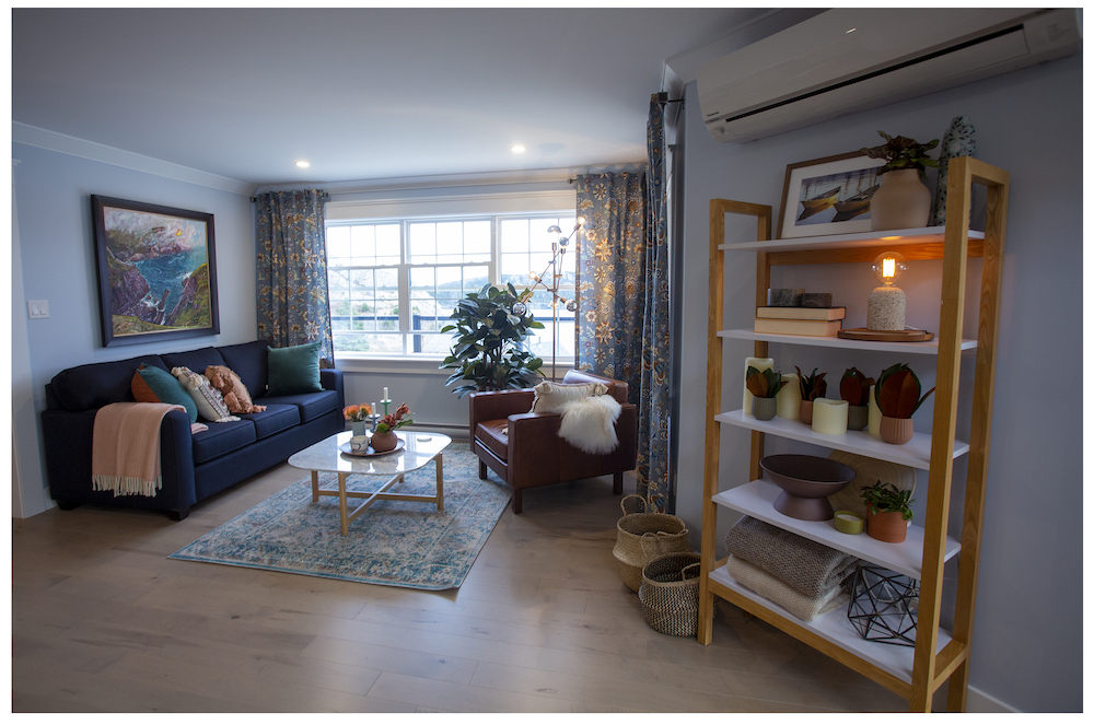
Cozy Seating
Off the kitchen, Randy and the team removed the archway to open up the sitting room – transforming the small space into a cozy, light-filled nook to read, knit or just take in the view.
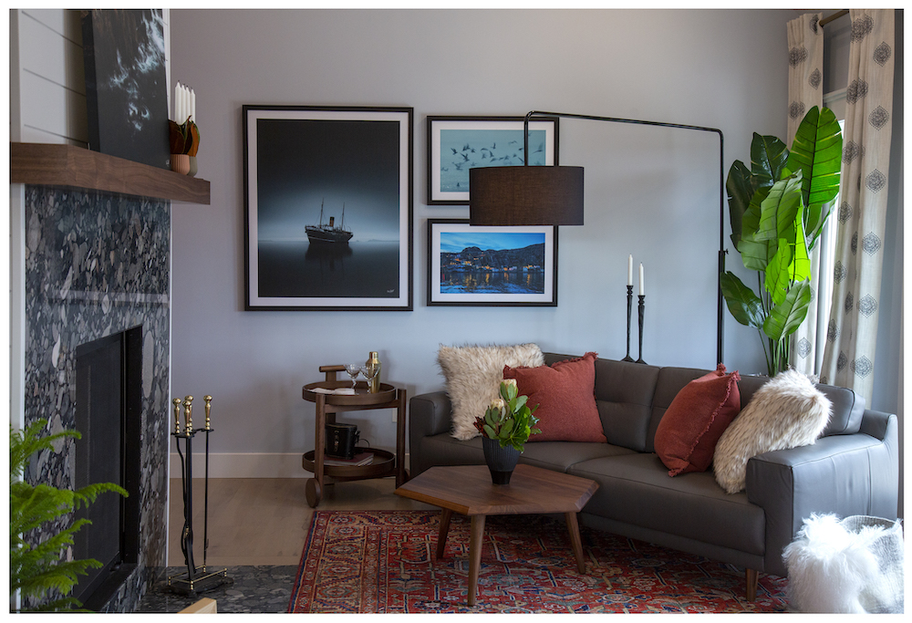
Modern Living
While it wasn’t part of the original renovation plan, the new fireplace in the living room makes a spectacular addition to the cozy, coastal living room. The team swapped the old, asymmetrical fireplace with a linear, wood-burning fireplace finished with a pebble-like granite surround, a modern walnut mantel and an incredible shiplap-detail column.
Ocean Dreams
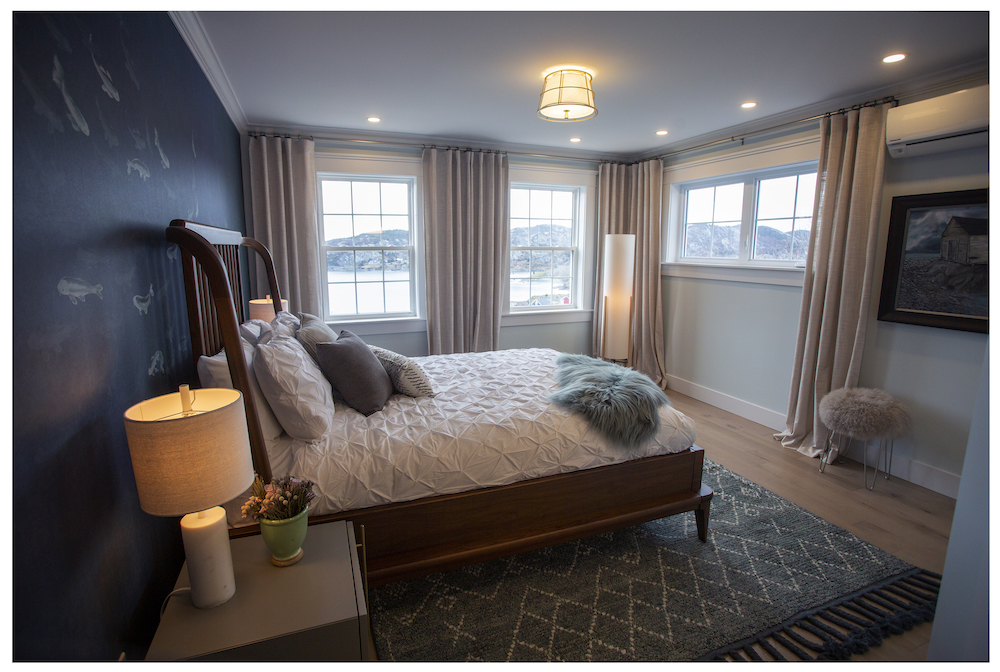
The renovated primary bedroom captures the elevated coastal feel of the home to create a comfortable retreat for the couple. Behind the bed, a mural-like wall evokes ocean themes, while natural wood details tie in the house’s overall aesthetic. The team also added a window to the primary room to let in even more light and, again, to showcase the incredible views of the water.
A Coastal Spa
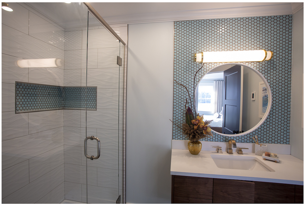
To make the primary bathroom as luxurious and stylish as the rest of the home, the team revamped the space with a coastal feel in mind. The old bathtub was swapped for a new walk-on shower (complete with a blue penny-tiled shower niche for a pop of colour and space to keep toiletries organized), while a new floating vanity brought in the walnut wood finishes found throughout the home. The team also added in a sun tunnel to allow a touch of natural light to stream in.

Land Meets Sea
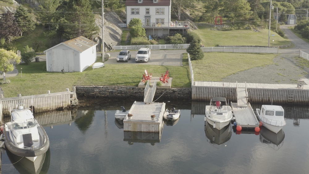
Brigus is a close community, so Randy and the Rock Solid Builds team are always ready to take on a project from a repeat customer – especially when it’s a fun one on the water. Take the case of the Ladha property: the team renovated the family’s house a few years ago, so they were happy to help create a unique duo of docks at the home’s waterfront.
A Duo of Docks
Homeowner Justin and his family are avid sailors, and they wanted make it easier to get their dinghy from their home to their sailboat in the channel. The solution? Randy and the team built a dock on land, and connected it to a floating dock, which they had anchored to the ocean floor by a team of divers. To connect the land dock and floating dock, the team also created an aluminum bridge.
Waterfront Fun and Function
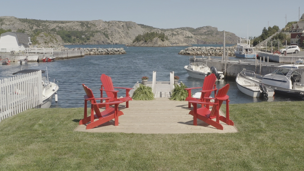
While the family initially conceptualized the project as purely functional, the completed job became a focal point on the property. The floating dock made it easier for the family to get to their boat, while also serving as a fun spot for fishing and kayaking. The land dock serves as a great place for sitting, relaxing and enjoying the ocean views.
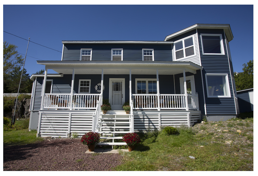
Navy Days
Randy and the team are experts at restoring historic Newfoundland homes to modern times, all while adding custom touches and features that honour the area’s history – and that’s exactly what they did when they renovated Tim and Val’s 150-year-old home on the Brigus waterfront.
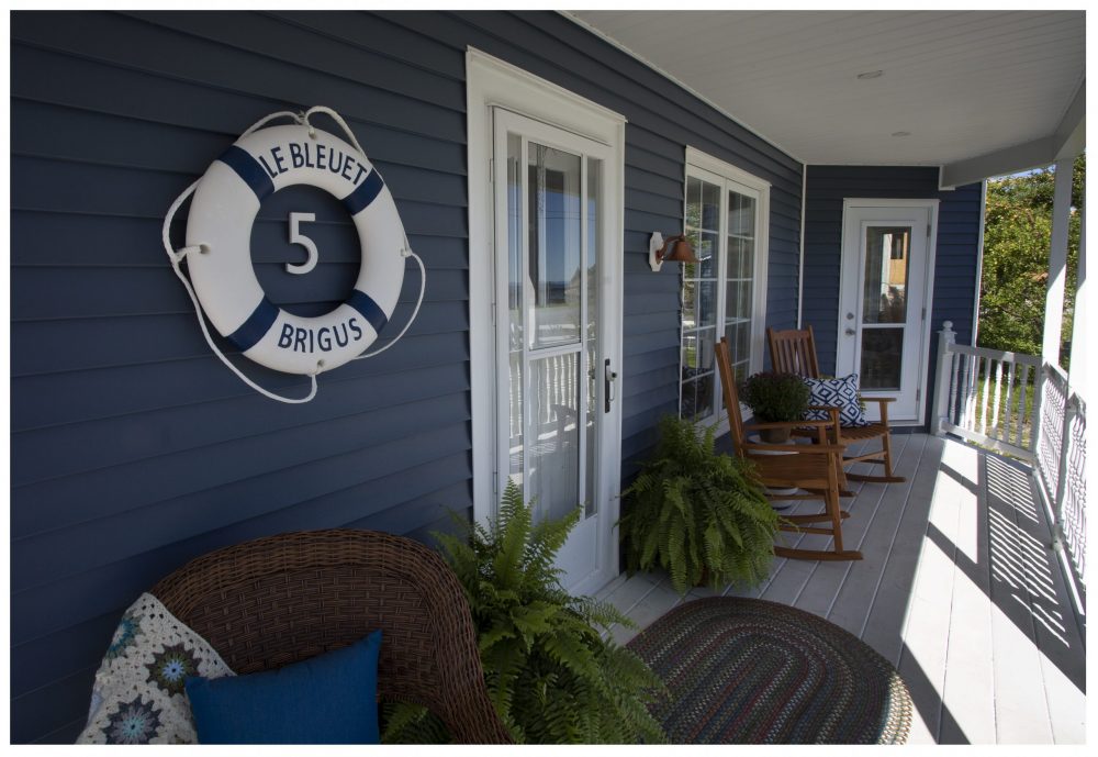
The Front Bridge
Tim likes to think of the house as their landlocked ship, so it’s fitting that he refers to the front porch as the front bridge. After the renovation, the brand-new front porch is in ship-shape condition with crisp white trim providing contrast against the blue exterior. Because the community is famous for blueberries, Tim named the house “Le Bleuet Brigus” as a nod to its strong roots in Brigus.
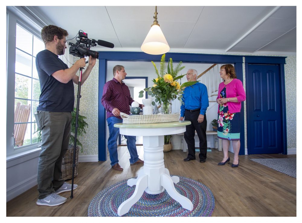
True Blue
Inside, the front entrance and living room needed some TLC, but the team wanted to uphold the house’s original character and charm. Randy restored these spaces while using the home’s blue trim as a highlight. The unexpected pop of colour is simultaneously boldly now and a beautiful nod to the past.
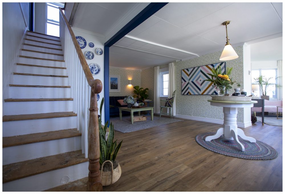
Step by Step
Restoring the staircase was important to the homeowners for more than just aesthetic purposes – Tim had lots of memories of sliding down that bannister as a child and hoped to see the stairs preserved. Randy and the team made it happen, bringing the stairs back to their original glory so that Tim and Val could step up and make beautiful new memories.
Related: Old Carpet on Your Stairs? Here’s a DIY Makeover to Bring Them New Life
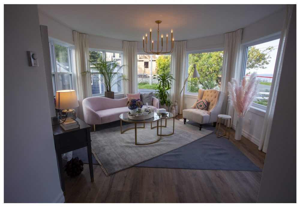
An Elegant View
Along with restoring and refreshing the existing spaces, Randy and the team also installed a unique addition to the side of the home. Inspired by Newfoundland lighthouses, the addition brought in two new rooms – a downstairs sitting room and an upstairs study – with incredible all-around ocean views. Downstairs, the sitting room was designed with Val’s taste in mind. Styled with soft finishes, a neutral colour palette and a stunning curved sofa, the sitting room is an elegant space for Val and the family to take in the view.
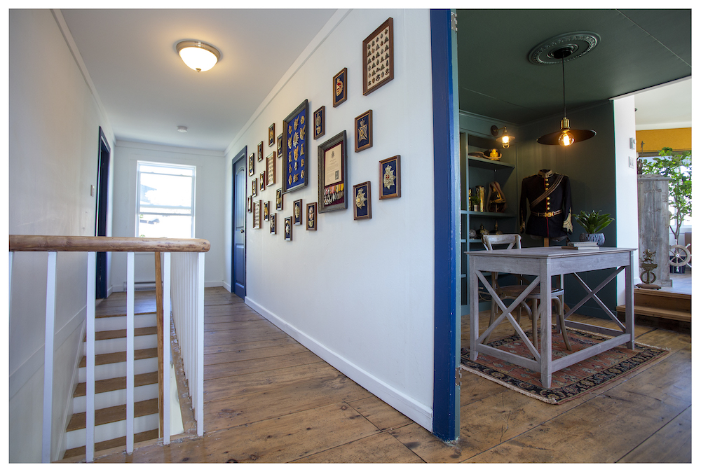
A Classic Landing
Upstairs, Randy ensured that history was beautifully brought into today by preserving many of the home’s original finishes (like the wide floorboards and railing). The team also created an impressive gallery wall to display Tim’s memorabilia – a fitting welcome to Tim’s spectacular new study.
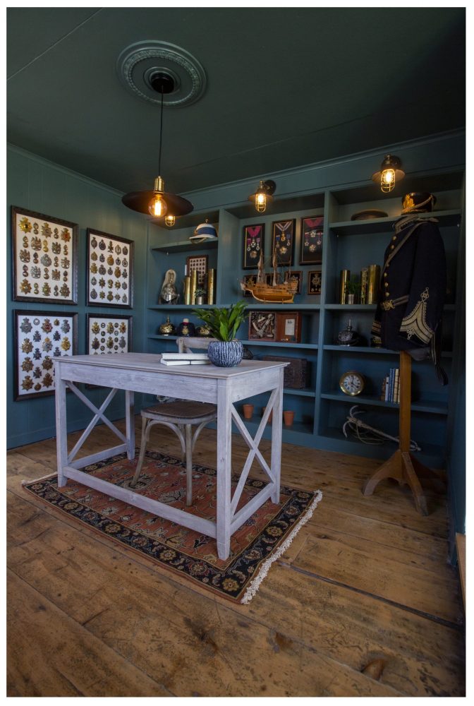
A Ship-Shape Study
Painted in a luxurious deep green, the bedroom-turned-study serves as an incredible setting for Tim’s collection of nautical artifacts and special pieces. Custom built-ins serve as storage and display shelving, while nautical-inspired light fixtures illuminate every detail to perfection.
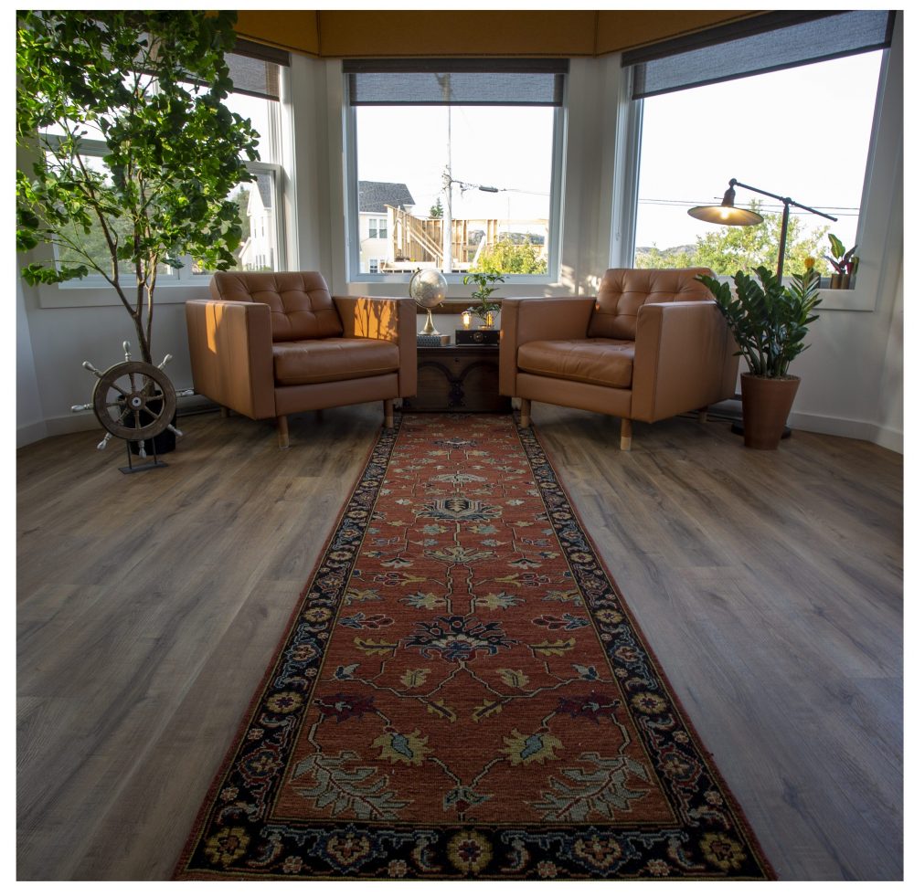
Captain’s Quarters
Tim’s study opens into the upstairs addition: a comfortable sitting area that’s fit for a captain. The all-around windows let in lots of light and allow Tim to surround himself with the incredible Newfoundland views.
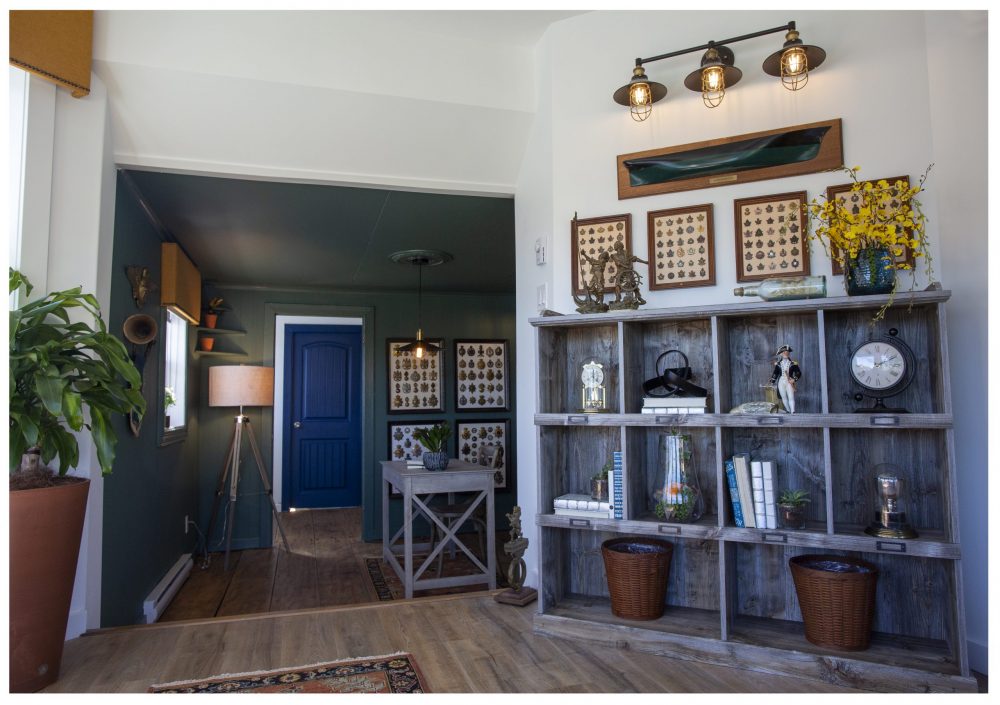
Nautical Charm
While the addition’s views are the space’s show-stopping feature, the team also added nautical-themed lighting and more storage for stylish flow (and function) that fits with the rest of the home.
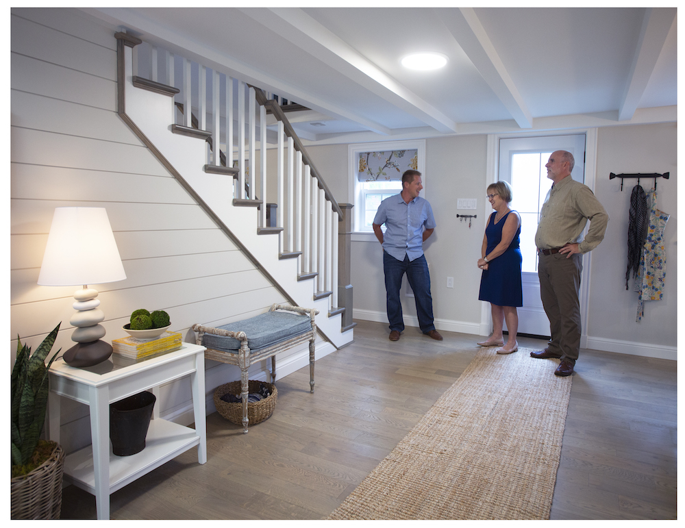
Old House, New Outlook
Older houses take more work to renovate, but updating historic properties to make them stylish for the next few centuries is Randy’s specialty. Take the Earle house: at 200 years old, Pam and Fred’s home was cramped, tight and in need of a revamp.
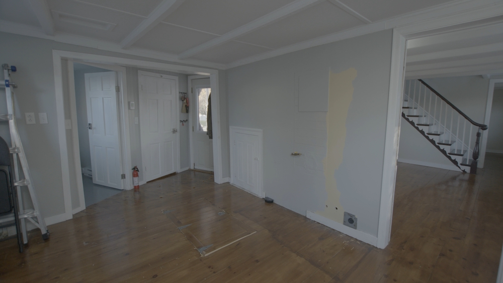
Raising the Roof
One of the biggest changes that the Randy and the Rock Solid Builds team made was to lower the floors to add height to the space which was a measly six feet tall. The crew dug down 10 inches to gain ceiling height and a more spacious feel for people living in the home today – and in the future.
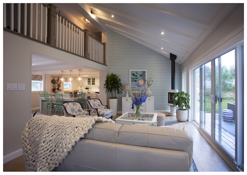
Space for Living
Another huge change to the Earle home was the new 340-square-foot addition to the back of the home, which is framed with a new wrap-around deck for indoor-outdoor living. The new living room is incredibly bright, with a blue shiplap feature wall and plenty of windows evoking an airy ambiance. For a subtle but modern touch, a sleek fireplace brings warmth to the corner of the room.
Related: 20 Tips for Arranging Furniture in Your Living Room
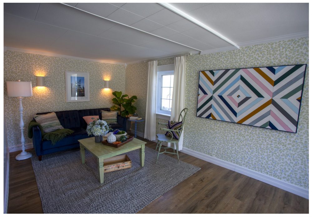
A Berry Stylish Living Room
The updated living room captures the spirit of the home: it’s bright, comfortable and full of thoughtful touches. In addition to new wall sconces and furniture, the living room is framed with a gorgeous blueberry-motif wallpaper by designer Kate Golding – another stylish, subtle detail that calls back to the community’s connection to blueberries.
Related: 20 Bold Print Wallpaper Ideas That Will Transform Your Space
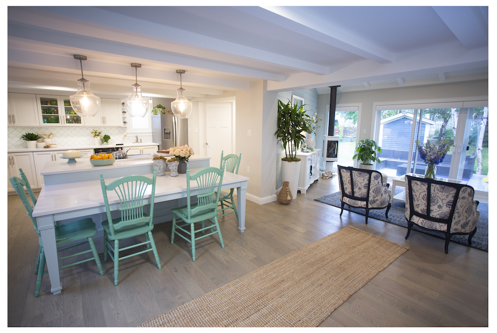
Kitchen-Party Perfection
Now big enough for a kitchen party, the open-concept kitchen is much more spacious and is full of stylish details like a new backsplash, metallic fixtures and a trio of pendant lights. To enhance the room’s personality, the team painted the island’s antique chairs a vibrant teal for a statement-making pop of colour and charm.
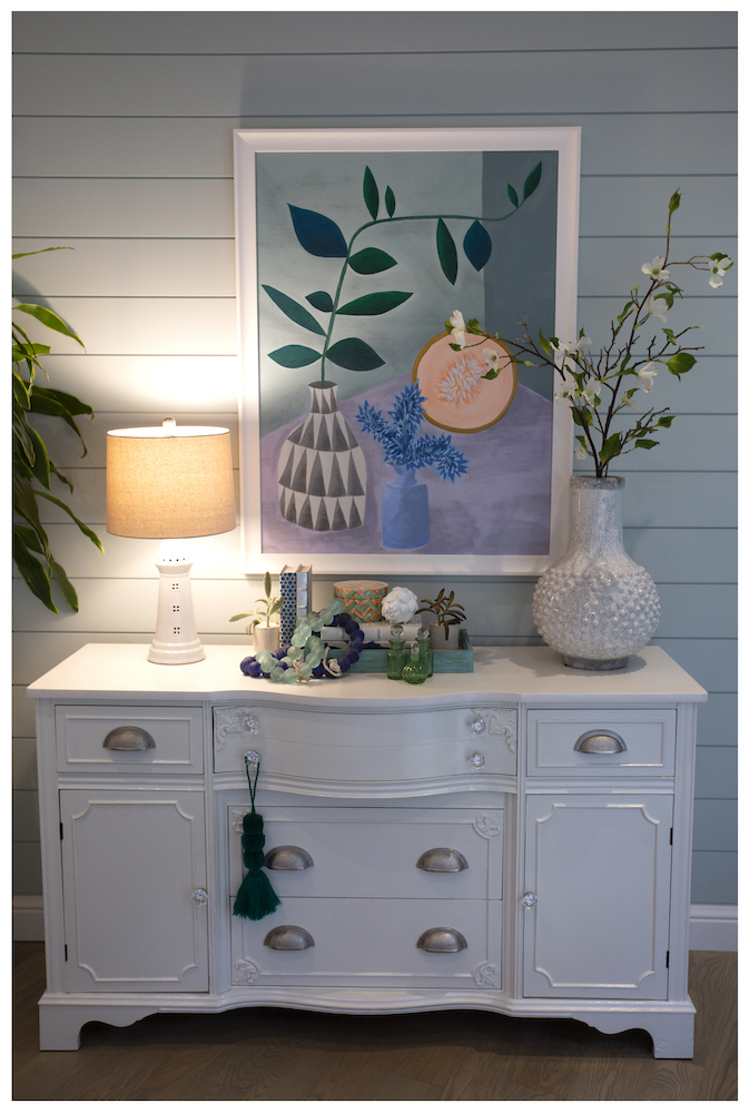
Designer Details
To ensure the decor in the Earle home was truly “mint,” Randy turned to interior designers Sam and Sasha for help. The designers created a look inspired by Pam’s elegant taste (and love of robin’s egg blue), contemporary comfort and nods to the area’s character. In the living room, for example, this vintage hutch lends instant classic charm to the room, while colourful wall art and a curated mix of pretty books and vases give a fresh feeling.
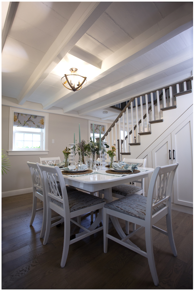
Stepping up the Storage
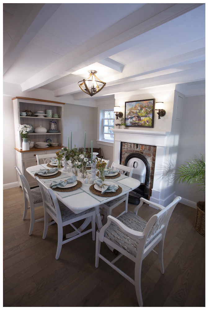
The home’s updated dining room is a stylish place to share a meal with friends and family – and it has a secret bonus, too. To take advantage of wasted space under the stairs, Randy and the team installed clever built-in storage.
Brick by Brick
Before, the dining room’s fireplace was covered with an unsightly metal plate. By removing the metal, Randy and the team unearthed the fireplace’s beautiful aged brick, which they left exposed as a cozy finishing touch to the dining space. Earle’s place is now Pam and Fred’s dream home come true. There’s lots of room to entertain and Pam has the kitchen that is a baker’s dream.
A Spa-Like Surprise
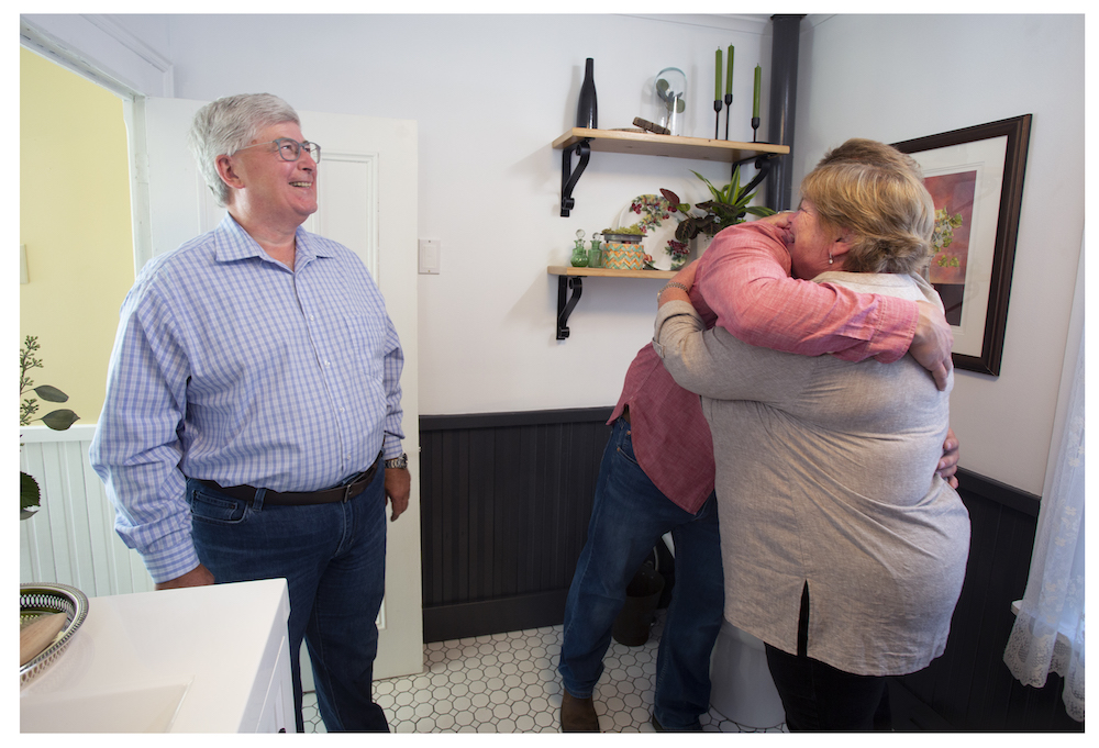
When a friend and returning client calls, Randy answers. So, when a former client, Glenn, wanted to upgrade his Brigus home’s bathroom as a special surprise for his wife, Martha, Randy was excited to take on the task. Spoiler alert: Martha was thrilled with the surprise.
Simple Swaps
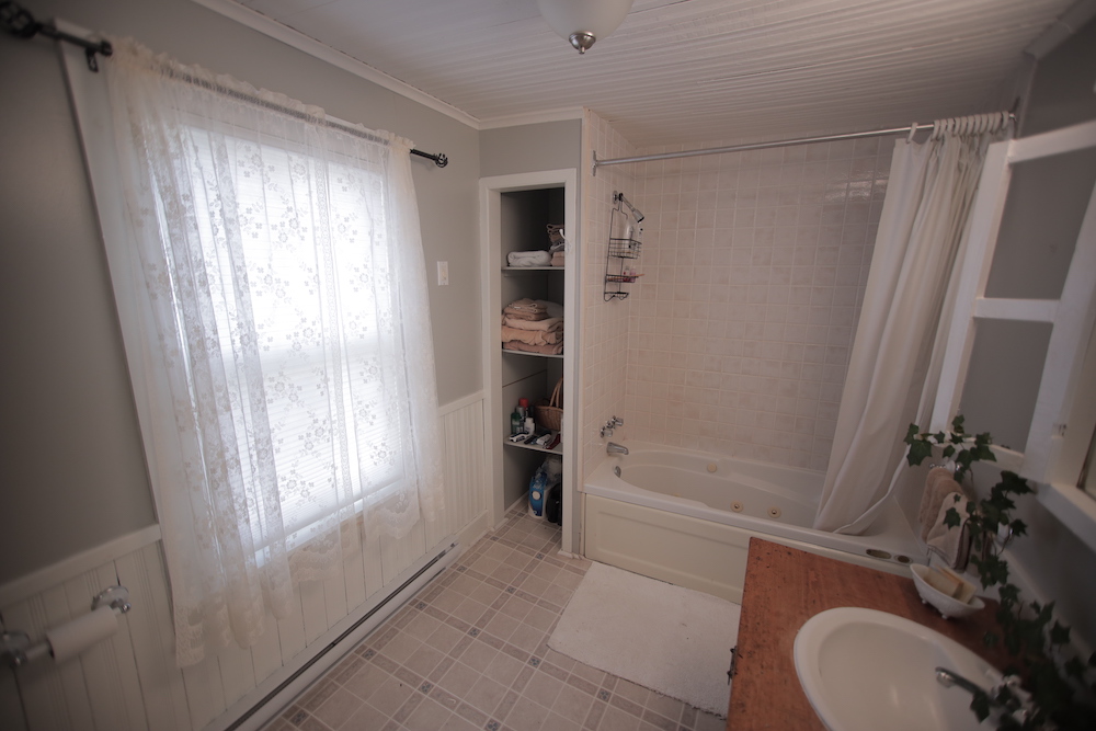
Because Glenn had worked with Randy and his crew in the past, he trusted the team – and gave them creative control over the bathroom update’s design. The plan? Make this small bathroom feel larger by swapping out the oversized wooden vanity, replace the old flooring with new tile, update the tub and surround and freshen things up with a coat or two of paint. Take a look at the next slide to see how it turned out!
A Fresh Start
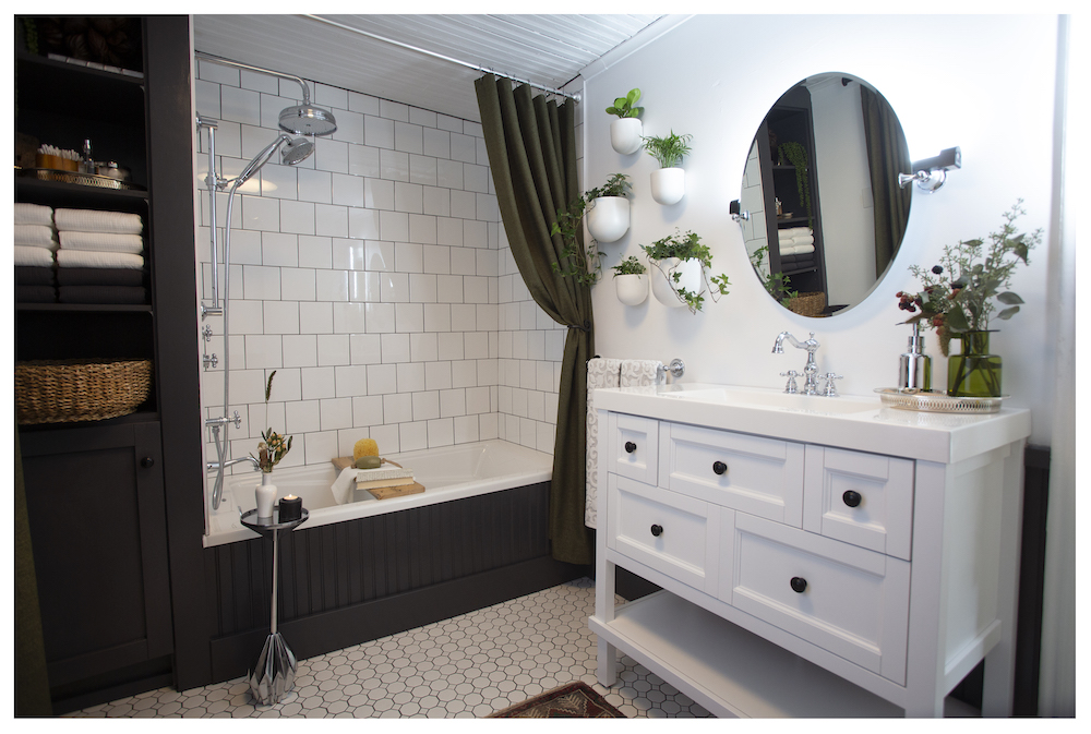
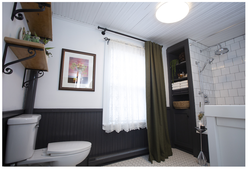
By keeping the bathroom’s footprint and plumbing the same, Randy and the team saved on time and budget – but the transformation is still incredible. New vintage-look floor tiles, custom built-in shelving and a more space-efficient vanity revamp the space, while a few plants on the wall add the perfect pop of freshness and green. The homeowner wanted to add more of the wainscoting look from the walls, so Randy gave rookie team member Nikki the opportunity to create a custom tub surround with a wainscoting-style finish. The results? Nikki came through, and the overall look is cohesive, stylish and sophisticated.
Character-Rich Details
In old, historic homes, it’s important to find ways to pay homage to history and local culture when modernizing the design. To add a special touch to Glenn and Martha’s bathroom, Randy crafted a duo of custom shelves from salvaged 200-year-old wood. To mount the shelves, he called on the local blacksmith to forge custom brackets, a beautiful detail that further ties the home to the community and its history.
A Craft Room That Shows Family Matters
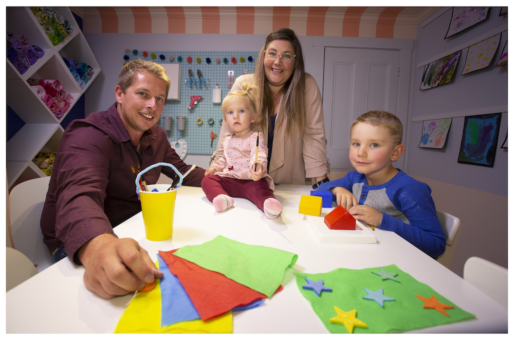
No matter how many projects the Rock Solid Builds team has on the go, family always comes first – so Randy makes time to use his skills to make his family’s home the best it can be. Last year, for example, Randy renovated his own home just before the birth of his baby daughter. As much as the family loved the renovated home, there were still a few rooms that were a work in progress. To create a special space for Melissa and the kids, Randy transformed one of those rooms into a colourful craft room.
Colourful, Crafty and Creative
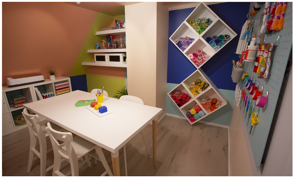
With a little help from his mom, Betty, Randy finished the family craft room and surprised his wife, Melissa, with a fantastic space for her (and the kids) to get creative. Thoughtful details like floating shelves, designated kids’ storage boxes and a unique peg-board organizer add to the room’s charm – and its organization (which is essential with small kids around).
A Blank Canvas
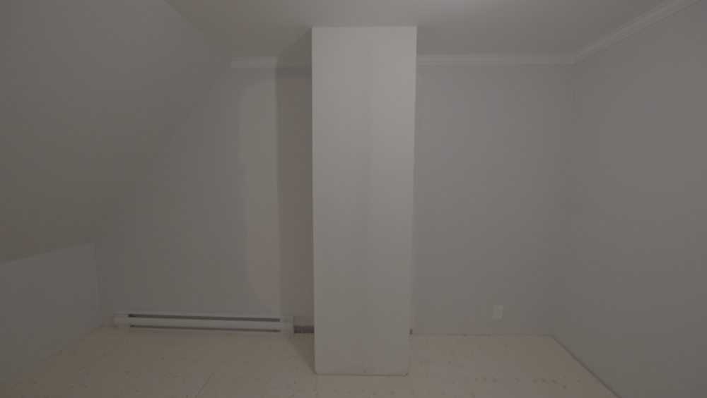
Before, the room was totally bare – which made it ripe for adding plenty of fun accents, bright colours (six on the wall, to be precise, inspired by the colourful array of homes in Newfoundland) and lots of clever organizational details.
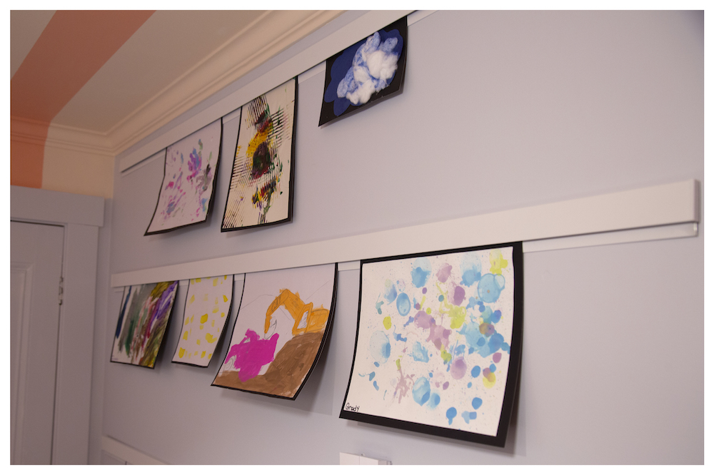
Petite Picassos
On the wall, Randy’s design incorporated a playful display area that’s perfect for easily putting up (and swapping out) kids’ drawings and paintings – which is ideal for rotating kids’ new art and creations as they make them.

A Picture-Perfect Setting
Newfoundland’s temperamental climate presents many challenges for Randy and his construction team – who both renovate historic homes and build brand new homes in the Brigus area throughout the year – but the views of the Atlantic Ocean are amongst the most stunning in Canada.
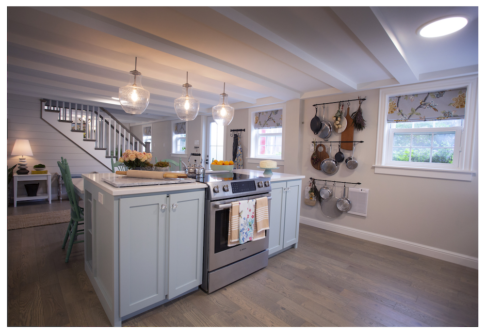
Cooking up a New Kitchen
By removing a few interior walls (and adding in a metal beam for structural security), Randy and the team completely opened up the once-cramped kitchen and living space. In the new kitchen, the focal point is a pale-blue kitchen island with a two-tiered design. The island is ultra-functional with a higher counter for baking and food prep, and a lower level with seating for casual dining.
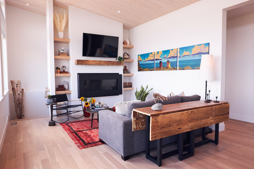
Old Meets New
The “catty” (aka “awesome”) ocean views play a big part in the designs of the new homes that Randy and his crew build – like this stunning two-bedroom in Adam’s Cove. By blending contemporary design and historical touches (like the custom-made fireplace mantel crafted from 140-year-old salvaged wood that Randy crafted for the living room), the team creates stylish spaces that still maintain the Newfoundland culture.
Related: Turn Scrap Wood Into a Gorgeous Piece of Art With This Simple Save My Reno DIY
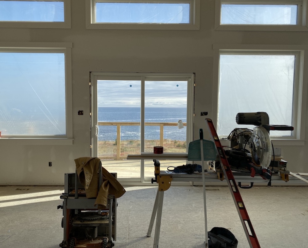
Custom Views
While Randy is an expert and renovating old homes, he built this stunning 1,200-square-foot house from the ground up. Working with the homeowners, Randy and the crew took about eight months and a $250,000 budget to create an open-concept space that’s contemporary – but still fits with the unique landscape and other homes in the area.
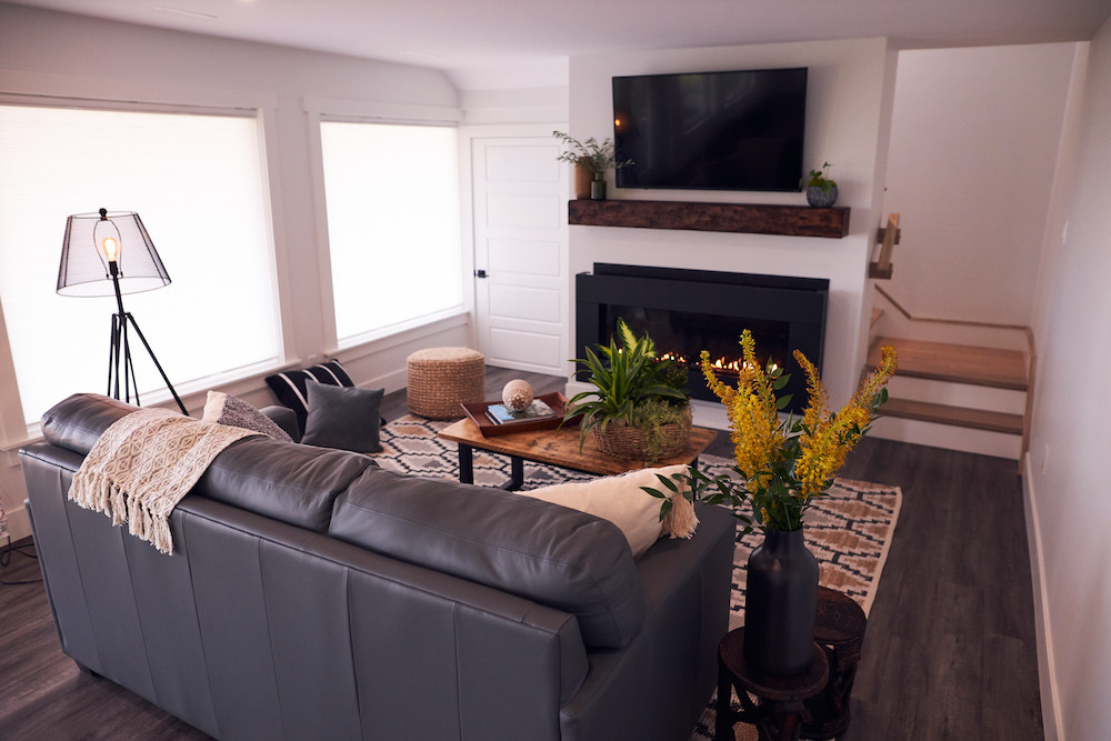
Cozy, Comfortable and Cohesive
Downstairs, Randy created a custom wood mantel that harkens back to the one-of-a-kind salvaged-wood piece he used upstairs. He didn’t have enough of the antique wood to make a matching mantel, so he created a new one – and artfully distressed it to ensure it matched the custom, old-world tone of the upstairs fireplace.
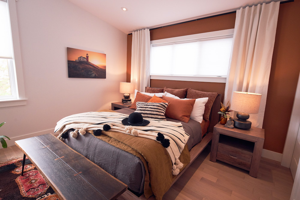
A Restful Retreat
The home’s primary bedroom is simultaneously cozy and bright with a painted feature wall in a warm, earthy tone. Layers of wood – from the flooring to the nightstands to the bench at the end of the bed – tie together the natural inspiration that runs throughout the home while also incorporating items from the couple’s extensive travels.
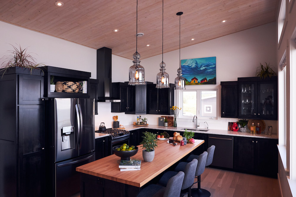
The Light Meets the Dark
The home’s kitchen is inviting while maintaining a sophisticated charm – thanks in large part to the L-shaped design of dramatic, dark-toned cabinets. To balance the richly pigmented cabinets, the team used light countertops and white walls for a light-filled look.
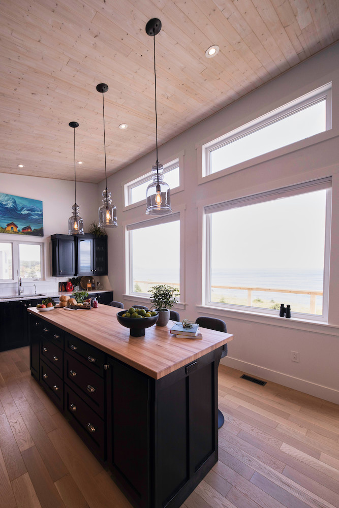
Dinner With a View
Of course, the most spectacular feature of the kitchen is the ocean view. By building the house to allow for a wall of windows along the kitchen, Randy and his team made the most of the natural surroundings of the home. Soaring high ceilings and statement-making pendant lights over the island don’t hurt the bright, breath-taking feel, either.
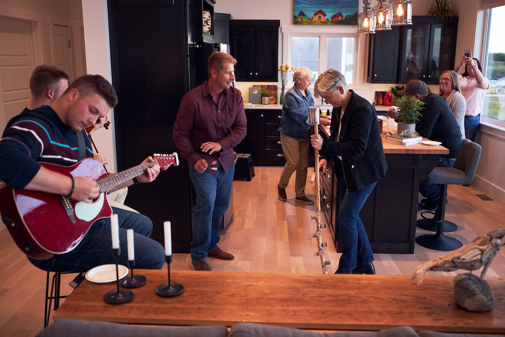
Kickin’ Up a Kitchen Party
Once Sharon and Sharon were settled in, Randy and his team visited to celebrate with a housewarming – and a good old-fashioned Newfoundland kitchen party complete with music, food and plenty of dancing around the large island in the spacious new kitchen.
Home Network your inbox.
By clicking "SIGN UP” you agree to receive emails from Home Network and accept Corus' Terms of Use and Corus' Privacy Policy.


