Stepping into the front room at The Roadhouse, it was unclear the use of the room. Pamela used it as her office while writing her memoirs, but it also served as a home for items that she didn’t know where to put, making it a chaotic space that was hard to enjoy. Now, the front room serves as a coffee and seating area with a blast from the past reminder of the storefront it used to be. Read on to see how Francesca’s design brought Pamela Anderson‘s quirky and sexy personality to life in this boudoir-inspired space.
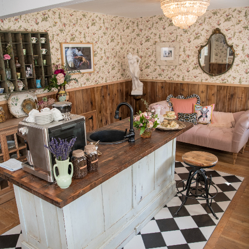
A Lovely Homage
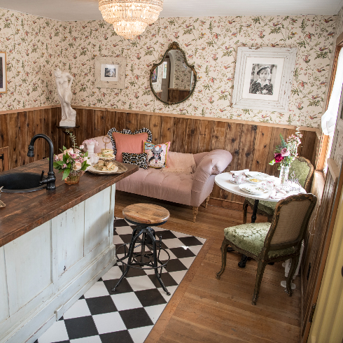
The front room of The Roadhouse was originally a storefront run by Pamela’s grandmother (and later, her father). Pamela had been using the space as an office, which made little sense for a front room. Francesca’s latest design transformed it into a beautiful and functional homage to the former storefront, complete with a coffee island in place of where the front counter and cash register used to live.
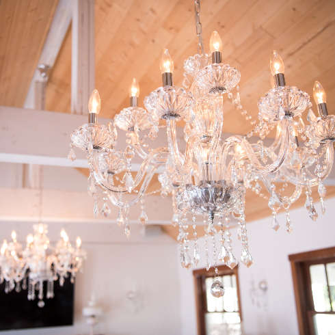
Lights, Take Two!
Francesca was able to use the room’s existing lighting features, elegant crystal chandeliers which perfectly suited the bougie, boudoir-esque feel that Pamela wanted to achieve in the space.
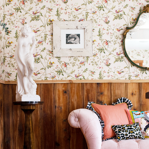
Vintage-Inspired Wallpaper
Pamela instantly fell in love with this vintage-inspired hummingbird wallpaper that Francesca choose for the room. Combined with sensual details like the Aphrodite bust and a teardrop-shaped antique mirror, the room leans into the coquette design trend.
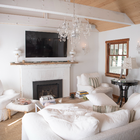
Chill Out Couches
Nestled in the corner is a perfect area for chilling out and watching television (as long as you’re careful not to spill any coffee on those pristine white couches!). The painted fireplace adds a cozy yet modern touch.
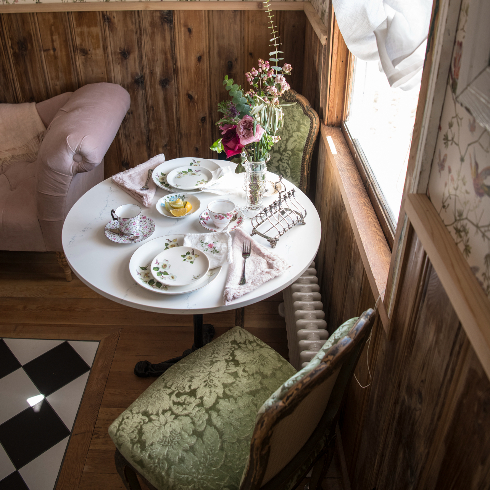
Coffee Corner
Adding to the elegance and functionality of the space is a perfectly cozy coffee or tea nook where Pamela and her family can enjoy a cup (they are self-proclaimed coffee people) with a vegan cookie. The green-patterned chairs and pink velvet chaise lounge make the room feel ready for royalty.
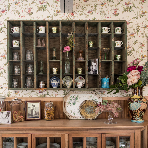
On Full Display
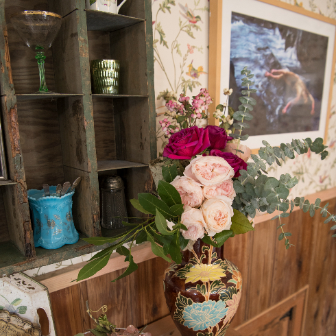
The rustic open shelving is the perfect place to display Pamela’s favourite dishware. After travelling all over the world, she’s amassed an impressive collection of beautiful things, but they were stored in crates and storage boxes for years. Now, they can be put on full display to enjoy and spark conversation as visitors enter through the front door.
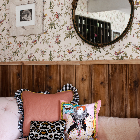
Not Your Grandma’s Room
While the room has a heavy hand of vintage influence, quirky details keep it from feeling dated. Just look at these animal print and cartoon Marie Antoinette pillows and you’ll know—this definitely isn’t your grandmother’s sitting room.
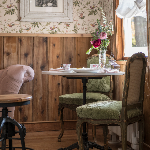
Wainscotting Wins
Pamela was able to bring another piece of her girlhood to the space by upcycling wood from the walls of her childhood home for the wainscoting. The wainscoting was one of the biggest design risks for Francesca, who had moments of apprehension with it, but Pamela loved it and they went full steam ahead with the installation. It paid off, giving the room a lived-in feeling that’s packed with memories for Pamela.
Diamonds Are Forever
Another bright design idea from Pamela was the black and white checkered tile accent in the centre of the room. There was some back and forth upon installation with it initially giving more diner-chic than sexy boudoir, but after trying nearly every pattern combination, the renovation crew and Pamela landed on a classic diamond formation that suits the space well.
Tasteful Sensuality
To Pamela, sexy just means enhancing one’s best features, so why wouldn’t she do that with her home? Pamela sought to bring some sensuality to her “classy brothel”-esque space by including artwork from one of her favourite photographers, David LaChapelle, who she collaborated with in numerous photoshoots throughout the years. Now you can say with absolute certainty, this definitely isn’t the artwork your grandma had up.
Home Network your inbox.
By clicking "SIGN UP” you agree to receive emails from Home Network and accept Corus' Terms of Use and Corus' Privacy Policy.


