The kitchen is the heart of any home—including vacation properties. So having a standout kitchen with unique features and room to entertain or hang out is always key. Plus, as per Scott McGillivray, it’s something that can get you noticed in a listing.
Scott and designer Debra Salmoni have renovated and designed some pretty memorable kitchens over the past four seasons on Scott’s Vacation House Rules. From modern masterpieces to historic updates, here are 10 of our favourite kitchen transformations.
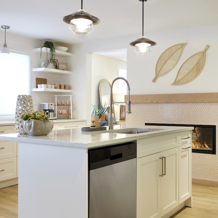
A Beachy Dream
This fourth-season reno was all about highlighting a beach vacation, and Scott and Debra nailed it in the kitchen. The sand-coloured penny tile backsplash and coral accents make this a dreamy, beachy space. Plus there’s lots of room for potential renters to cook and hang out thanks to the large island and easy, breezy flow of this space.
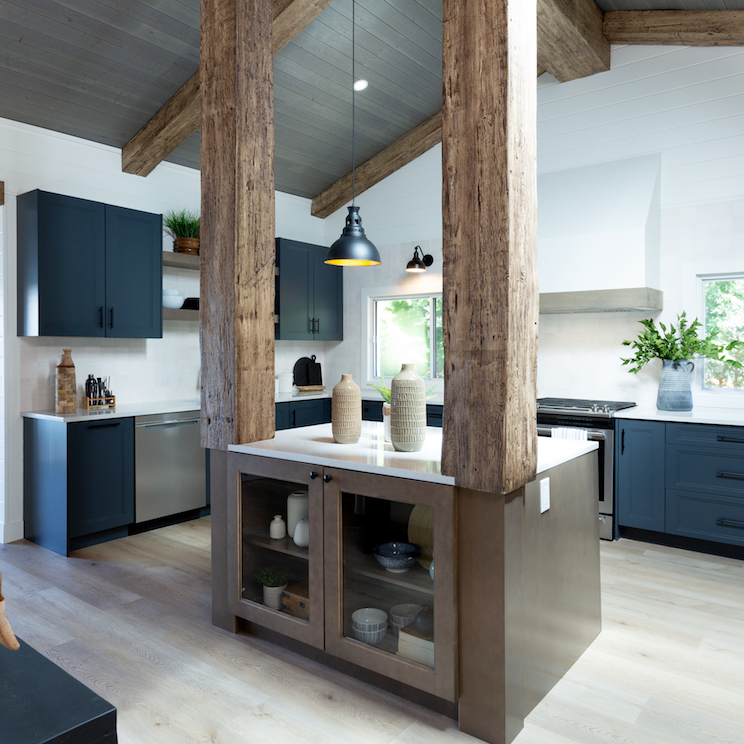
Sky’s the Limit
This limitless lake house from season 4 features memorable wood pillars that completely set this kitchen apart. The natural, brown island feels modern thanks to the white countertop, while calming blue cabinets and a gorgeous range pull the whole design together. As for that ceiling? It features more of those beautiful beams and a grey stain you won’t forget about anytime soon.
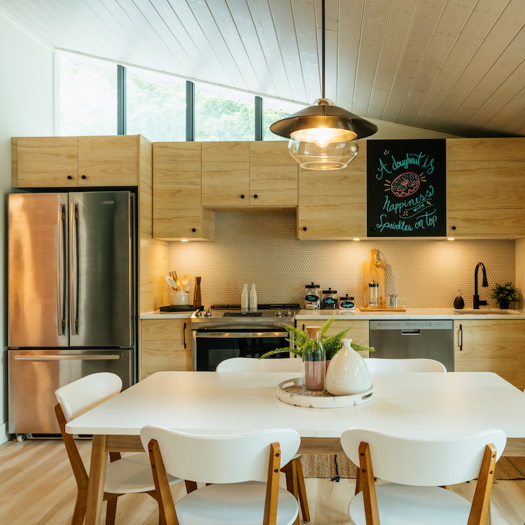
A Family Escape
In season 2, Scott and Debra transformed this lakeside cabin into the perfect retreat for parents with young children. That included this gorgeous kitchen, which is one of the first things you see when you walk in. It features natural wood finishes that feel right at home in all of the exposed natural light, plus all of the modern conveniences (like a dishwasher!) that a busy young family may need.
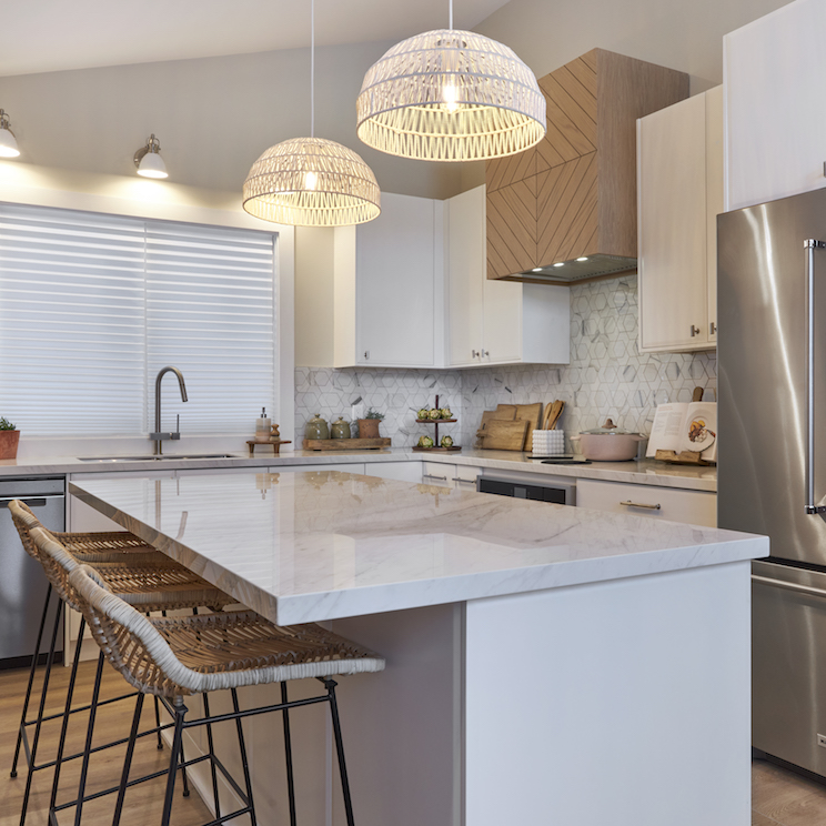
Coastal Vibes
This fourth-season kitchen reno was all about coastal elements, like the wicker chairs and matching hanging lights. It’s a lighter kitchen design with a few well-chosen elements, such as the custom range and the backsplash with the perfect hint of grey. It’s also a large and functional space that immediately puts you at ease, as you should be while on vacation.
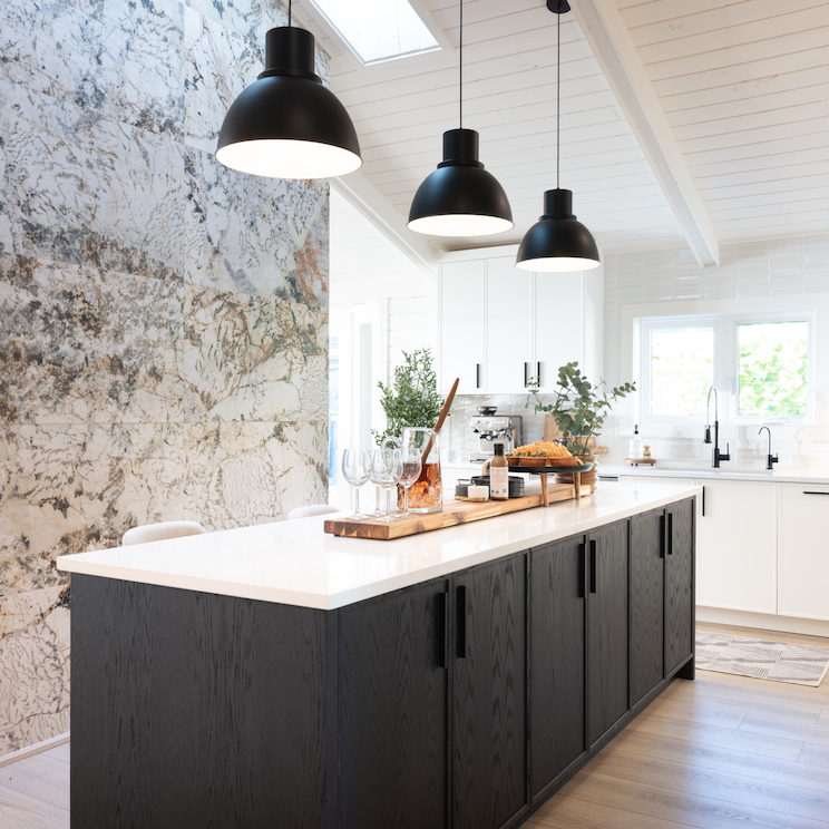
A Bayside Bungalow
This smart kitchen design made the most of a small space in season 4, as Debra and Scott maximized angles to easily fit more people. The long island doubles as seating space for renters and feels completely modern thanks to the dark finishes and accompanying feature wall. Meanwhile all the kitchen elements you need are nestled along the back wall, while the angled ceiling keeps it open and airy.
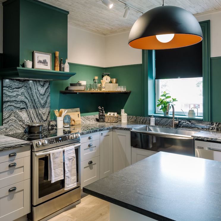
A Historic Carriage House
This green beauty is back from the show’s first season, when Scott and Debra transformed a historic home to recapture its original glory. In the kitchen, they embraced the small design with big features like the jewelled green paint and wood features above and below. They also opted for this marbled countertop, which serves as a major focal point and adds a modern flair.
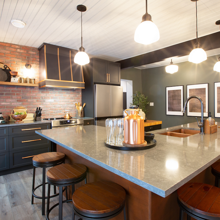
Exposing the Bones
In this fourth-season reno, Scott and Debra wanted to bring inn-like features to a vacation rental. In the kitchen, that meant embracing tavern vibes like these stools and the exposed brick wall, and pairing them with modern elements such as the slate countertops, dramatic cabinets and dark paint.
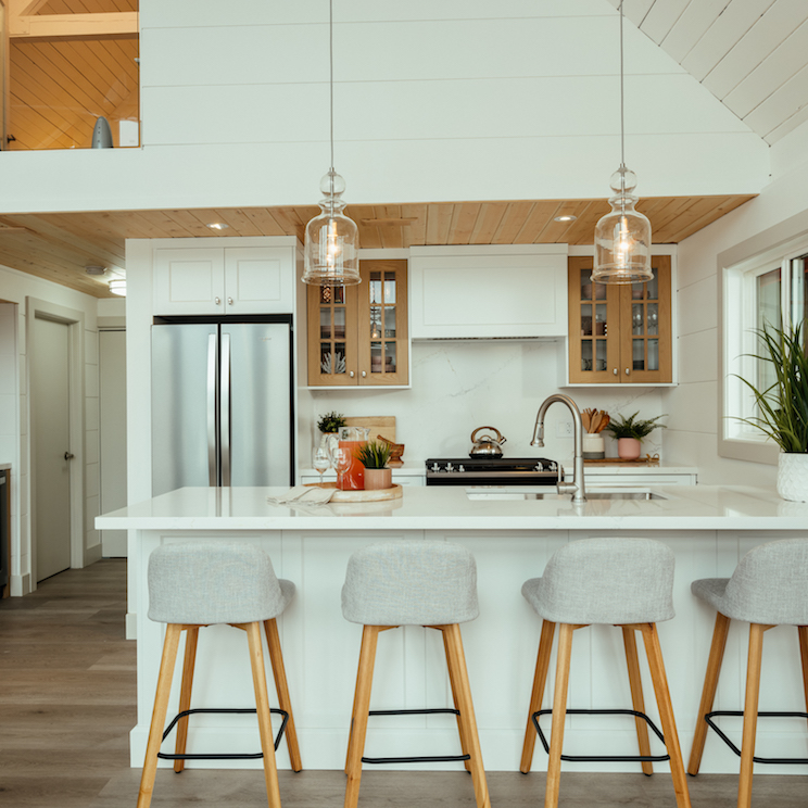
Light and Airy
You don’t have to have a huge kitchen space to make the most of your rental property, which Scott and Debra demonstrated in this season 3 reno. In order to maximize the view in this loft-like space, they incorporated essential features, like an extended counter with a sink and extra cupboard space, into this bright and airy kitchen.
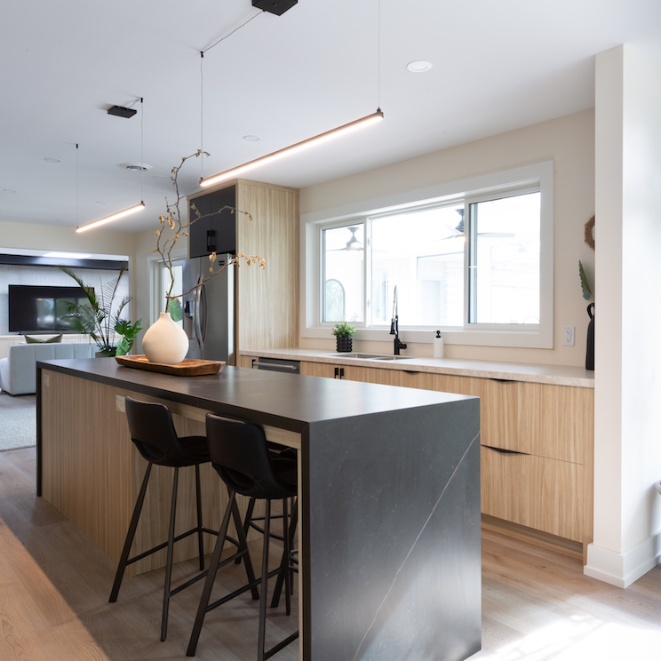
Modern Features
Vacation rentals don’t need to be rustic to be charming, and this fourth-season design is proof. Scott and Debra embraced modern elements in this contemporary kitchen, which features clean lines and dark features. The sleek design maximizes the small space, making this rental feel more like a modern hotel room with all the amenities techies could ever need.
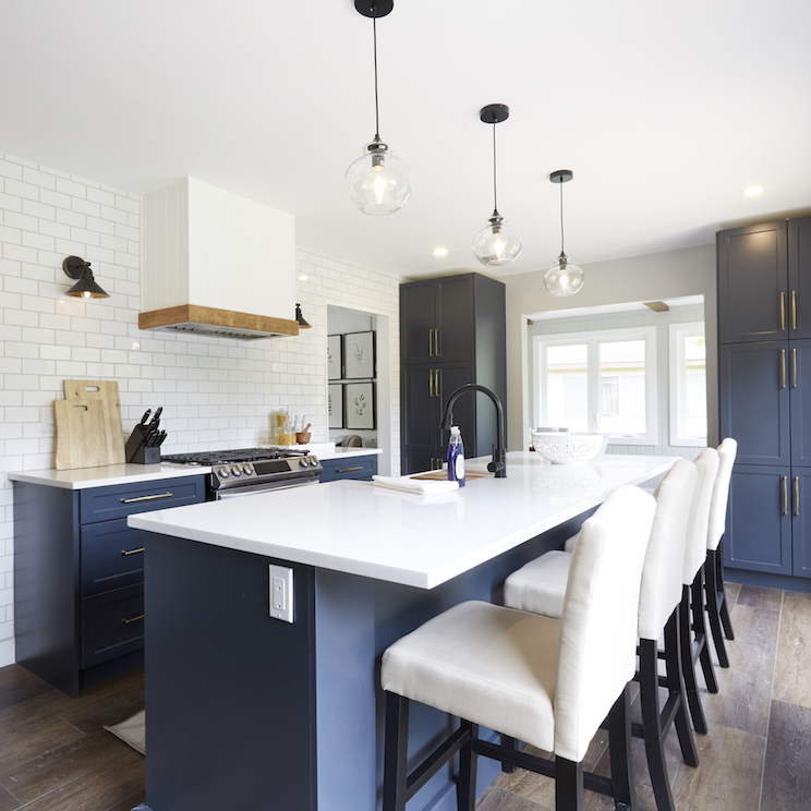
Blue Hues
In season 2, Debra and Scott embraced a country club theme and transformed a beige box into a colourful vacation rental. In the kitchen, that meant embracing a somewhat nautical theme, with bright whites and rich blue cabinetry that adds lots of storage space.
Home Network your inbox.
By clicking "SIGN UP” you agree to receive emails from Home Network and accept Corus' Terms of Use and Corus' Privacy Policy.


