Everyone loves a good throwback, but when it comes to your vacation home, it has to be up to today’s standards. That stuck-in-the-past syndrome was a major setback for one brother-sister duo: The Wasaga Beach cottage they’d inherited was trapped in the 1960s and in serious need of a modern revival. Using his rules for a successful vacation rental property as his guide, contractor and real estate expert Scott McGillivray transformed the outdated space into a chic retro-themed retreat that vacationers will be lining up to rent now, and in the future.
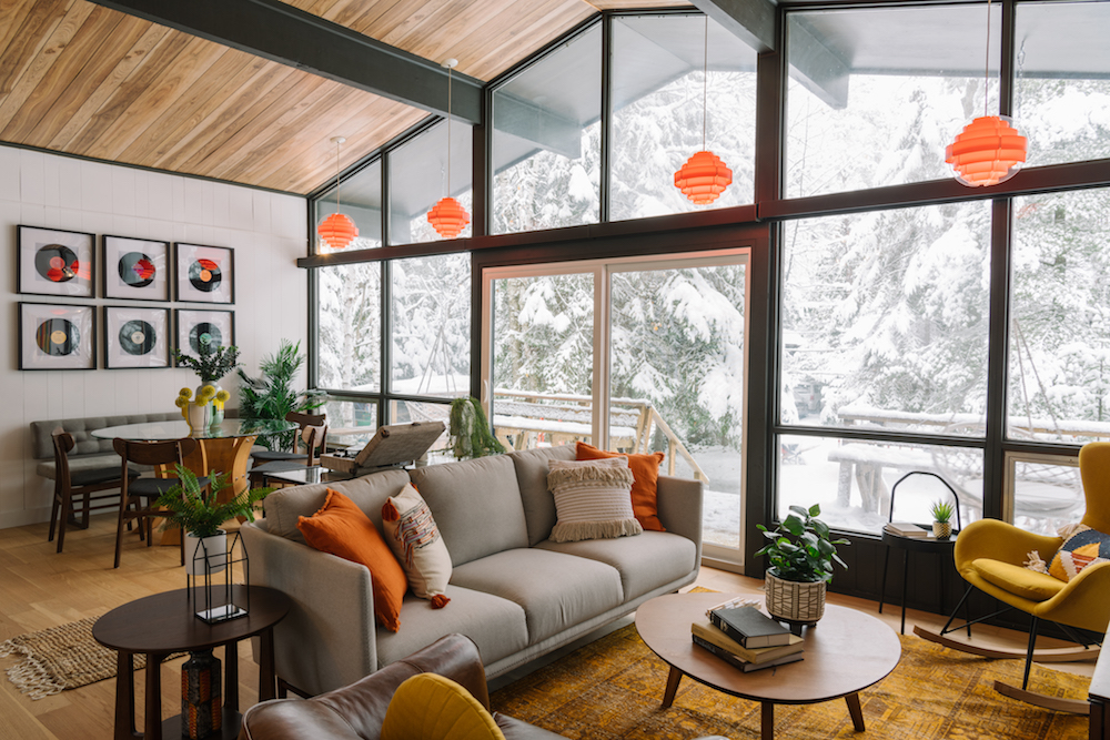
Mid-Century Monstrosity
When Dawne and John inherited the family cottage, they were happy to preserve the memories and traditions – but nervous about how they’d afford to keep it. Though they hoped to rent it out to offset the costs, the house hadn’t been updated since it was built by their grandparents 50 years ago. Full of orange-on-orange accents, horrendous patterned carpet and duct-taped repairs, the cottage wasn’t ready for renters. To bring the property into the present and garner top dollar from vacation house renters, Scott planned a thoughtful retro-themed renovation with the help of their $75,000 budget.
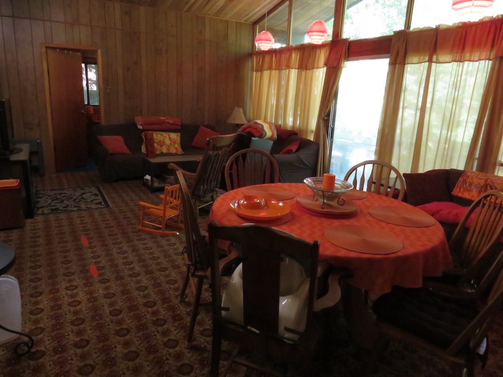
Before the Scott McGillivray Touch
Scott used his first rule, “Do Your Research,” to assess the market opportunity and best determine how the family’s vacation home could stand apart from other comparable listings. The Wasaga Beach area is a popular tourist destination (thanks in large part to its famous freshwater beach), and a standard four-bedroom vacation rental in the area garners about $300 per night – which meant that with smart updates and upgrades, the retro cottage had the potential to bring in a steady stream of rental income during busy season.
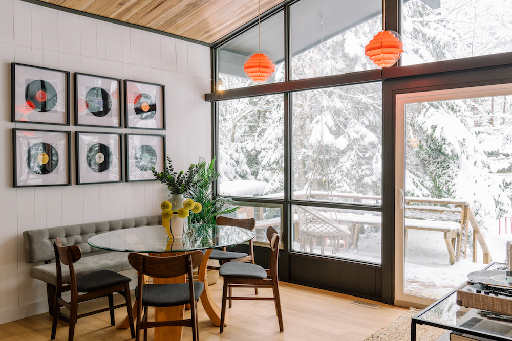
A Retro Retrofit
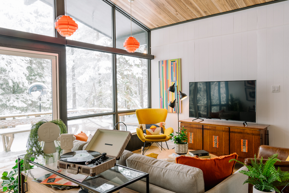
For the retro-themed renovation, Scott and designer Debra Salmoni played up the fun character of the original architecture using Scott’s second rule, “Plan Your Design.” In the central area, Scott flipped the living and dining areas to maximize useable space and make a big impact the moment you walk in the door. Inspired by a vintage record player, Debra incorporated themed details throughout, including a feature wall of framed records in the dining room.
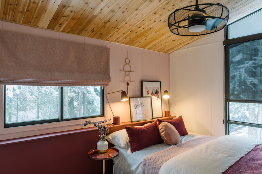
Sweeter Dreams
The vacation home had four bedrooms, but all were in need of a full design makeover. While keeping the nostalgic vibes via a mid-century colour palette, the team refreshed all of the sleep spaces by replacing the garish carpeting with new hardwood, refinishing the ceilings, painting the walls and adding new furniture.
Kitschy Kitchen
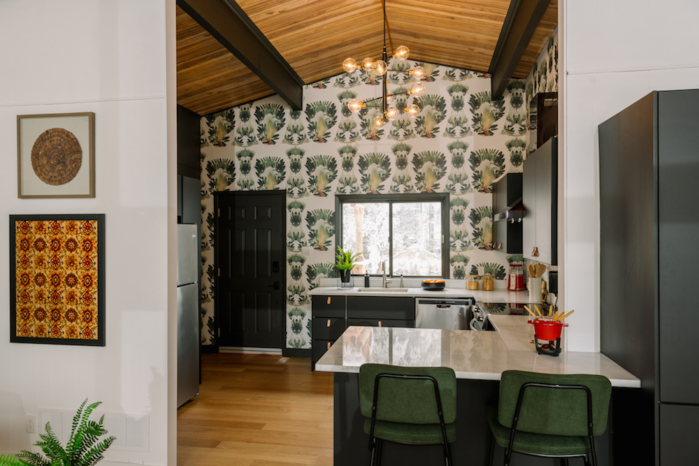
The kitchen is always the centre of a home, especially with this cottage as it’s the first thing you see when you walk in the door. With that in mind, for a wow-worthy design impact, Debra chose a bold wallpaper feature wall for the kitchen – a sophisticated, modern nod to ’60s nostalgia. To make the space more functional and renter friendly, Scott rearranged the room’s layout and added a peninsula for prep space and seating. And, because the kitchen lacked storage, Scott also installed a pantry to give renters a better experience.
Bathroom Beautification
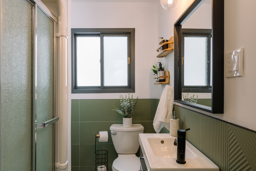
The bathroom was one of the only spaces that had been updated in the cottage, so it didn’t have to be gutted – it just needed an upgrade to match the design theme of the rest of the space. Scott used textured wall tiles and terrazzo porcelain floor tiles to bring a touch of retro coolness to the bathroom.
Party Paradise
Planning a successful vacation home renovation means thinking of ways to get your property some attention so it can get booked – which brings us to Scott’s next rule, “Get Noticed.” To get attention online, Scott and the team evoked a fun, nostalgic theme indoors and out. Inside, the retro feel and bright colour palette with kitschy pops of yellows, teals and greens stands out. In the backyard, Scott created a unique, party-ready oasis: Complete with a custom tiki bar, lounging deck and games area, the backyard became an epic holiday playground that renters would be eager to return to after a day at the beach.
Game People Play
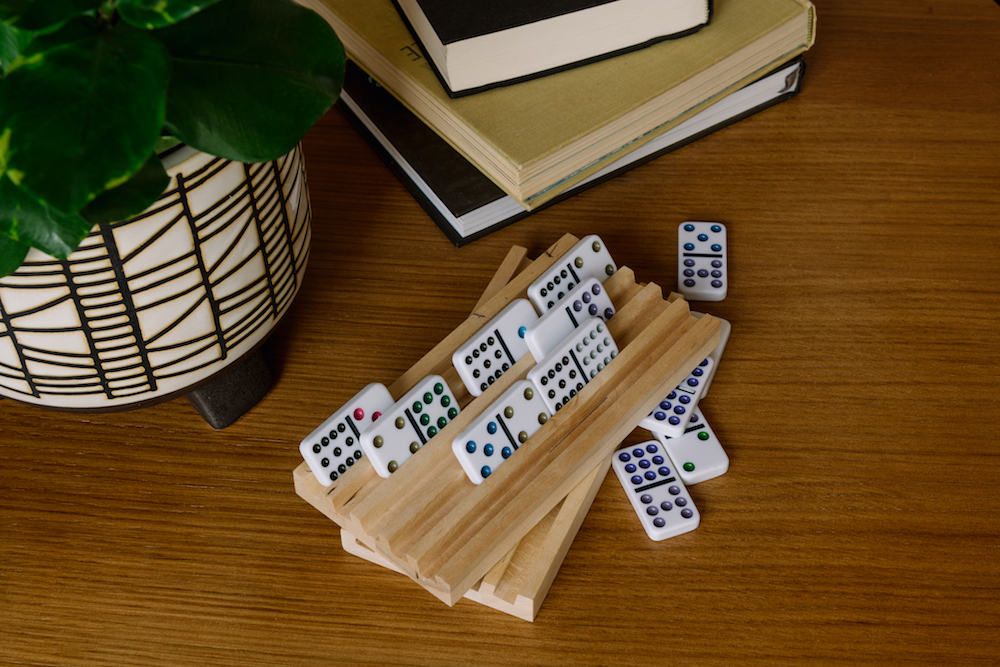
The idea of a playful vacation experience was key to the distinctive retro theme of Dawne and John’s vacation home. To help bring together the games outdoors and amp up the fun factor, Scott got the siblings to use his fourth rule, “Roll Up Your Sleeves.” Taking on non-skilled tasks during a renovation keeps overall costs down and ensure you feel more involved with the experience. To help, Dawne painted a unique checkerboard on an outdoor table, while John hung outdoor lights.
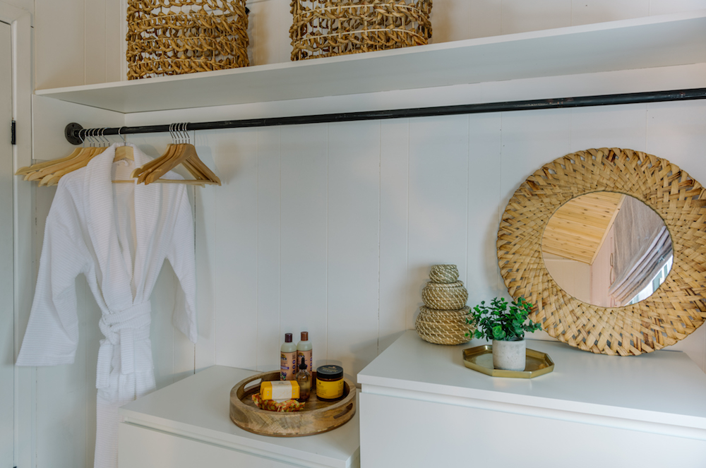
Open Closet
Finally, Scott’s last rule, “Be Your Guest,” came into play when thinking about the finer details from the renter’s perspective. As the rule suggests, it’s important to always think about things that can make the experience for enjoyable for your guests. For example, an open closet system makes smaller spaces feel more open, and is ideal for vacation rentals – because people don’t bring as many things when they’re only staying a few days or weeks.
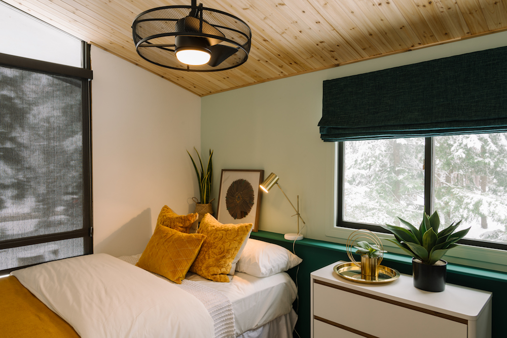
On The Ledge
Even in compact spaces, there are small ways to make your guests feel more comfortable and welcome. In the bedroom, for example, Scott added a subtle feature ledge behind the bed: Without the space for a bedside table, it’s still important to give guests a place to put stow their essentials before bed.
Related: 10 Design Tricks to Make a Small Bedroom Look Bigger
Home Network your inbox.
By clicking "SIGN UP” you agree to receive emails from Home Network and accept Corus' Terms of Use and Corus' Privacy Policy.


