In a world that’s often full of basic neutrals, Gabriella Nassief Borg isn’t afraid of a little colour in the home – especially if it makes you happy. “People sometimes worry they’ll get ‘sick’ of a colour because it feels too loud,” she says. “But, if you love bright yellow, I’d say try it out in accents. If it makes you happy, keep going and incorporate other colours, too.” The founder of House of Borg, Gabriella specializes in finding creative design solutions – as she showcases in her own bright-meets-beautiful, perfectly organized, plant-filled home in the west end of Toronto.
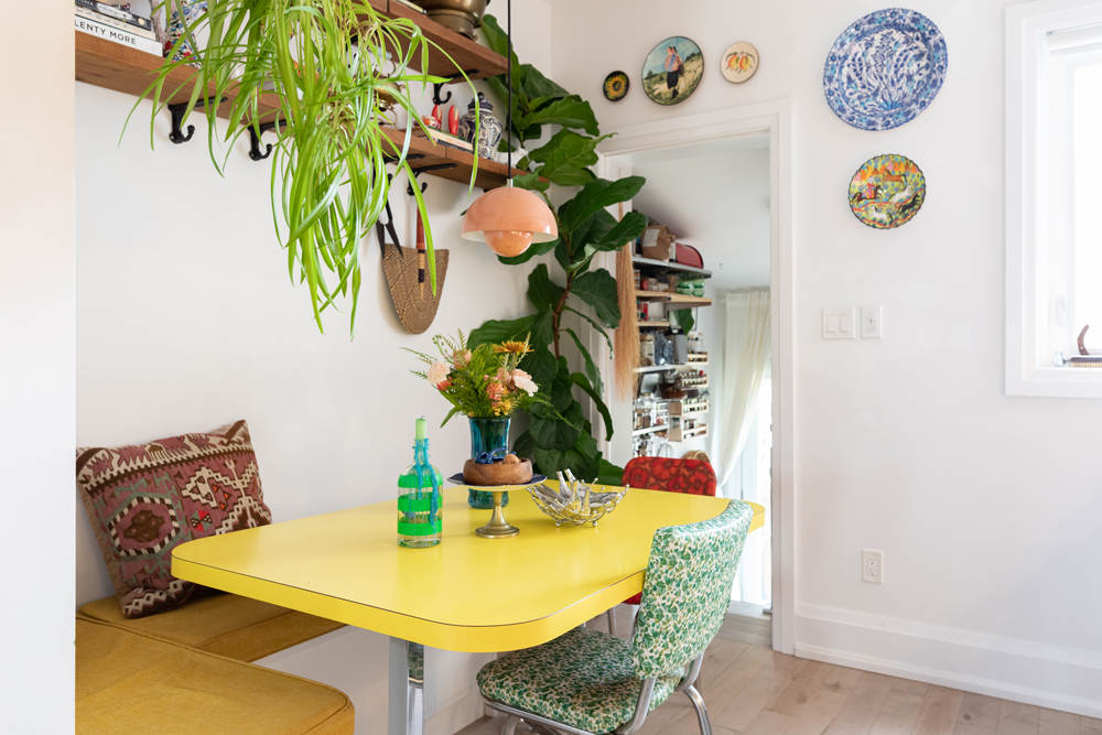
Power-Clashing Perfection
The kitchen is the hub of any home, and the perfect place to showcase some personality – as Gabriella does with this vibrant, cheerful kitchen that’s artfully layered with pops of colour, texture, and vintage treasures. “Our kitchen is eccentric, and it’s my power-clashing haven,” she says. “When I found our bright yellow table through a vintage dealer (Shipyard Vintage) on Instagram, I gave myself full permission (with the consent of my partner) to go all out.”
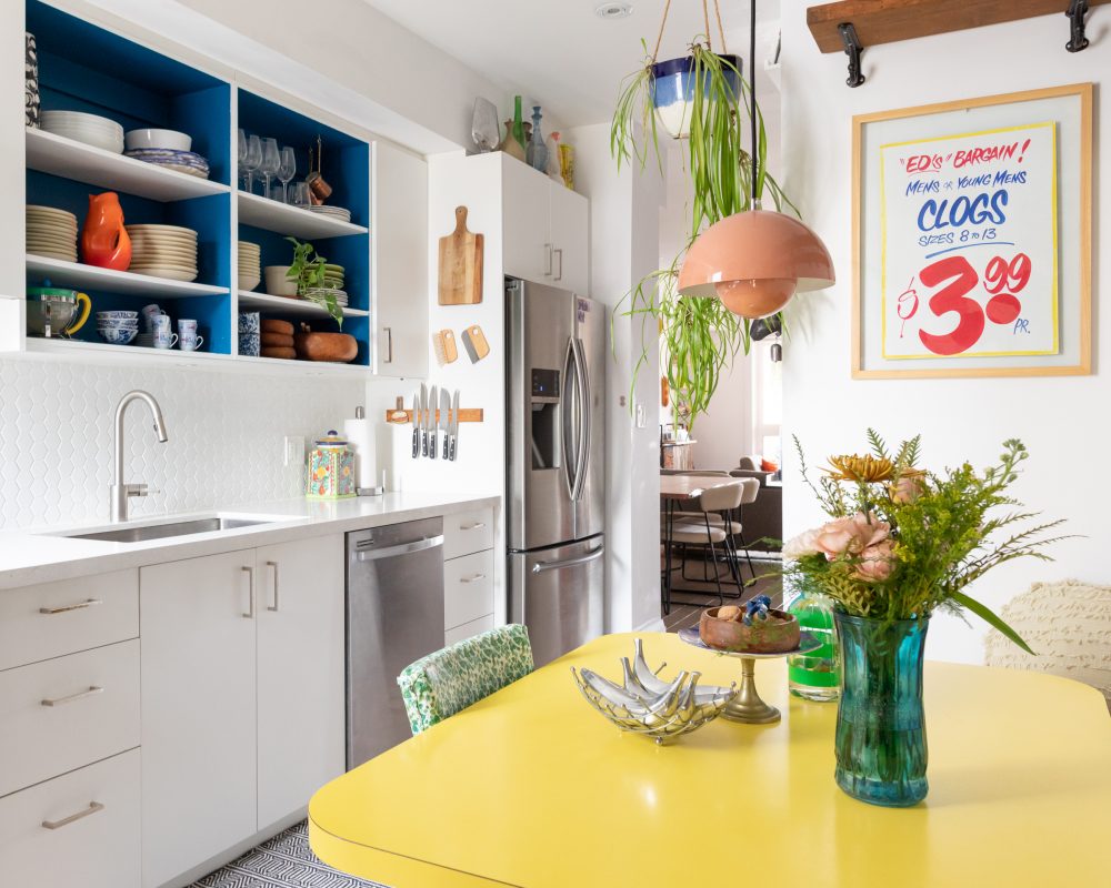
Kitchen Kitsch
The white kitchen came renovated, which made it an open canvas for Gabriella to layer in signature vibrant and vintage touches. “While I’m very grateful for a new kitchen, I wanted to start incorporating less generic finishings,” she explains. Case in point? A charming framed antique sign for a throwback touch. “The vintage Honest Ed’s sign is actually from the original store. When they (very) sadly closed, I lined up to get one.”
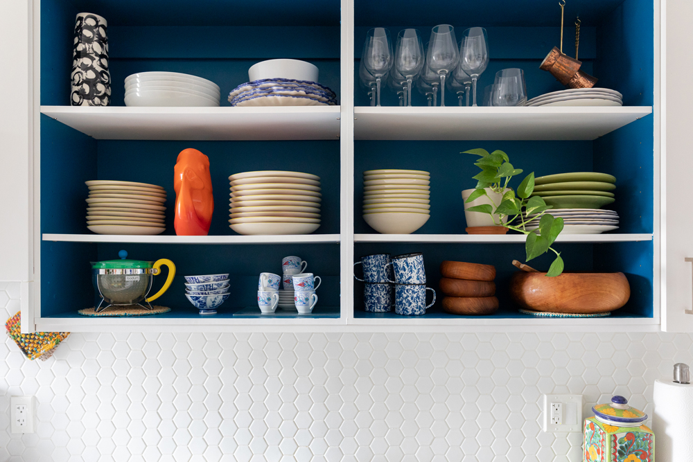
Blue Mood
The bold zing of classic blue inside the open upper cabinets was an impulse-decision addition that brought colour-pop contrast and character to the kitchen’s clean aesthetic. “I love open shelving, and while trying to re-envision the space, it dawned on me that I could simply take off the cupboard doors and have what I was looking for,” Gabriella explains. “I added a deep accent colour to offset our dishware.”
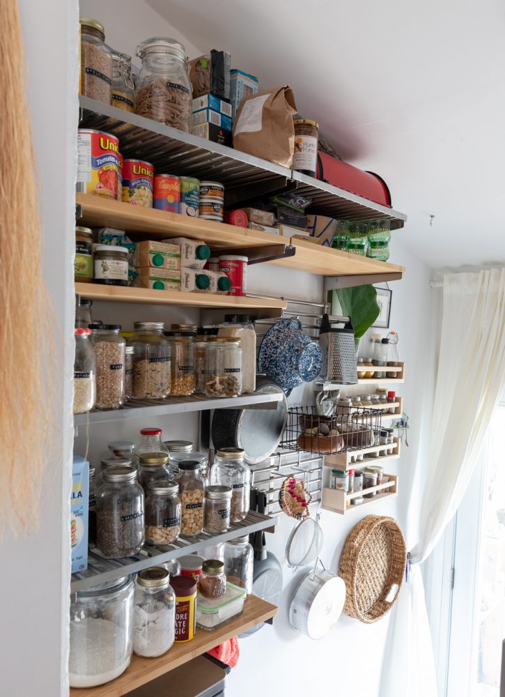
Pantry Goals
For kitchen organization, Gabriella and her partner transformed unused space into an ultra-functional pantry. “We previously had built-in shelving in our kitchen, but it was taking up a lot of our already limited floor space, so we demolished that and purchased a simple kitchen shelving system from IKEA that is customizable,” Gabriella says. “The mudroom was perceived as dead space, but we repurposed it to be our new pantry. My strategy for the organization here was to limit the depth of the shelving to ensure that everything can be seen. We also use lots of reusable glass jars and label everything.”
Hang Time
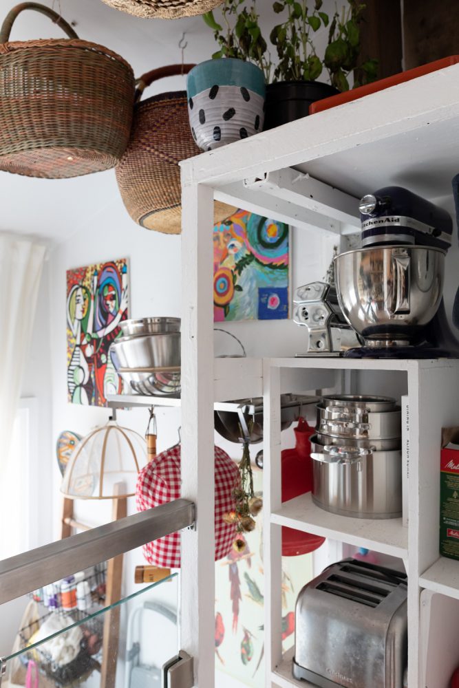
Hanging baskets further the theme of function-meets-fashion, for a playful touch that’s both useful storage and a nod to old-world style. “I took inspiration from the old salumerias that hang baskets and panettone, around the holidays, on their ceilings,” Gabriella says. “It combines the functional with the romantic.”
Going With the Flow
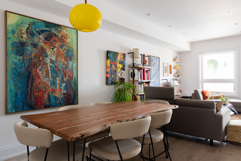
The home’s light-filled living room and dining spaces are fresh, airy and open by design. As Gabriella explains, “The goal for this space was to make it as open as possible and social in its set up.”
Artful Arrangement
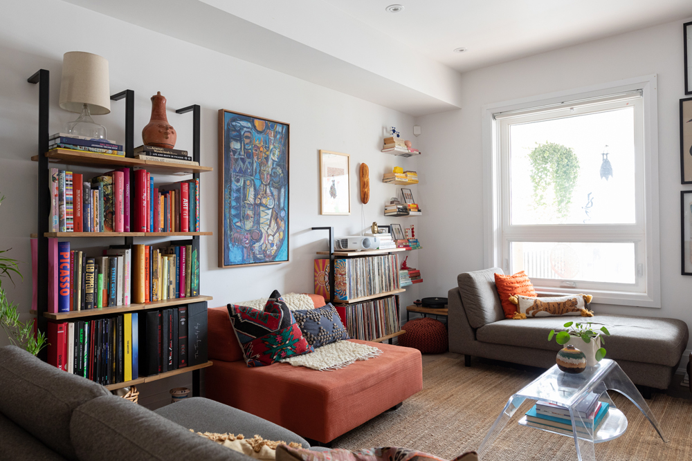
To balance the open feel of the space, Gabriella arranged the living room furniture with intention. “I played with this space a lot – our couches were previously a couch,” she says. “I unhooked them one day and realized I technically had a chaise lounge and loveseat to play with. This changed the whole room, and I purposefully put the ‘loveseat’ with it’s back to the living room to create a partition.”
Shelf Style
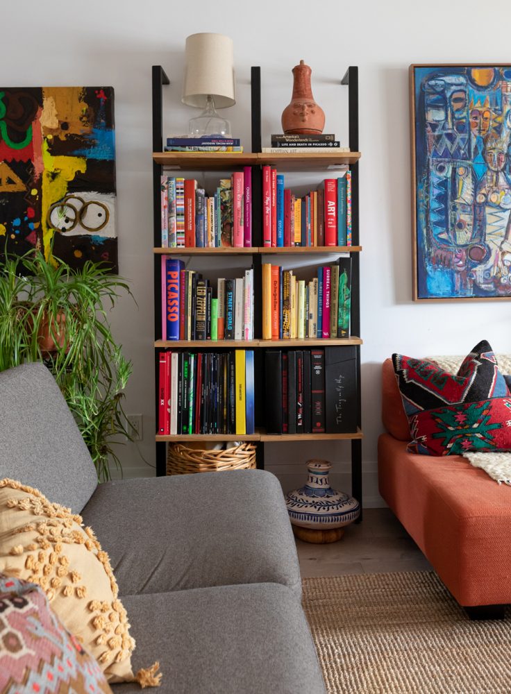
On the living room’s walls, ladder shelves from EQ3 create a stylish foundation to display curated collections of colourful old records and tomes. Gabriella was an Art History major, so her array of aesthetically pleasing art books become works of art in themselves.
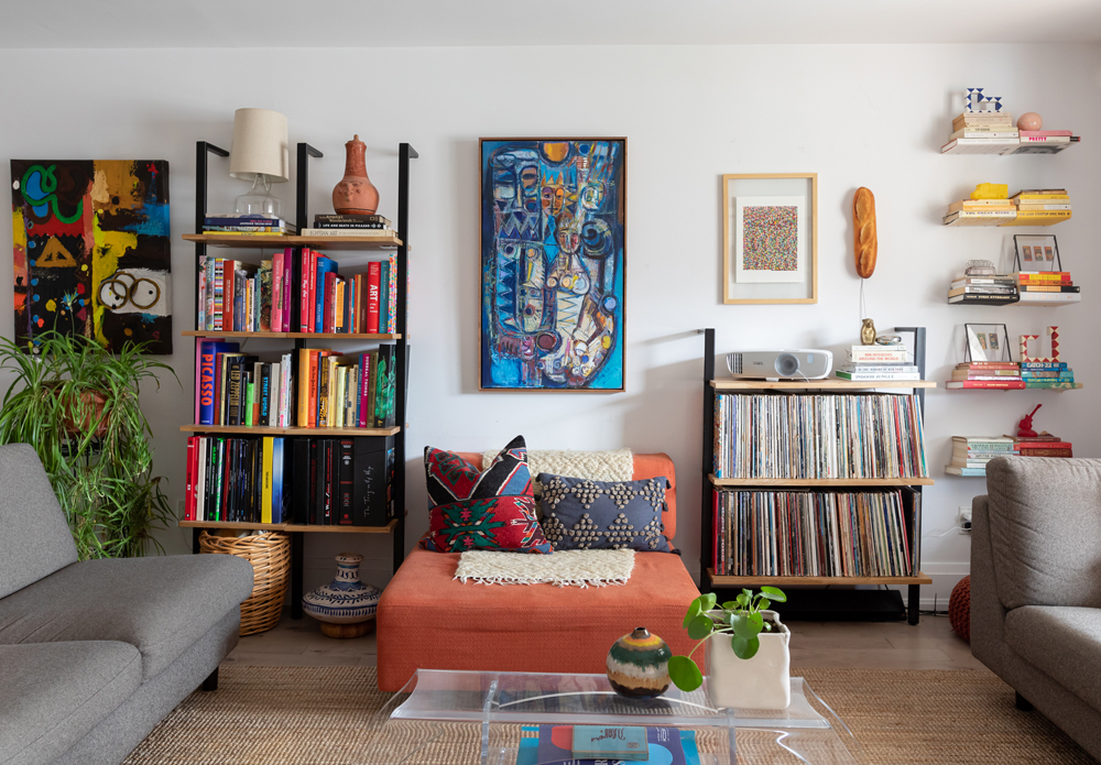
Vibrant by Design
The living space serves as a showcase for Gabriella’s striking design aesthetic. “I describe myself as a multidisciplinary design lover,” she says. “I love modern forward pieces, I love old-world decadence, I drool over Danish design and if it’s plastic and brightly coloured I need to have it.”
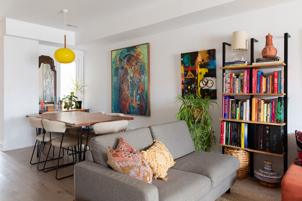
Perfect Paintings
With collections of secondhand treasures and colourful details populating the shelves in the living spaces, equally striking wall art – like these energetic, colour-rich paintings – creates pleasing symmetry against crisp white paint. “The colourful paintings are from Readytex Art Gallery in Paramaribo, Suriname where my mother is from,” Gabriella says.
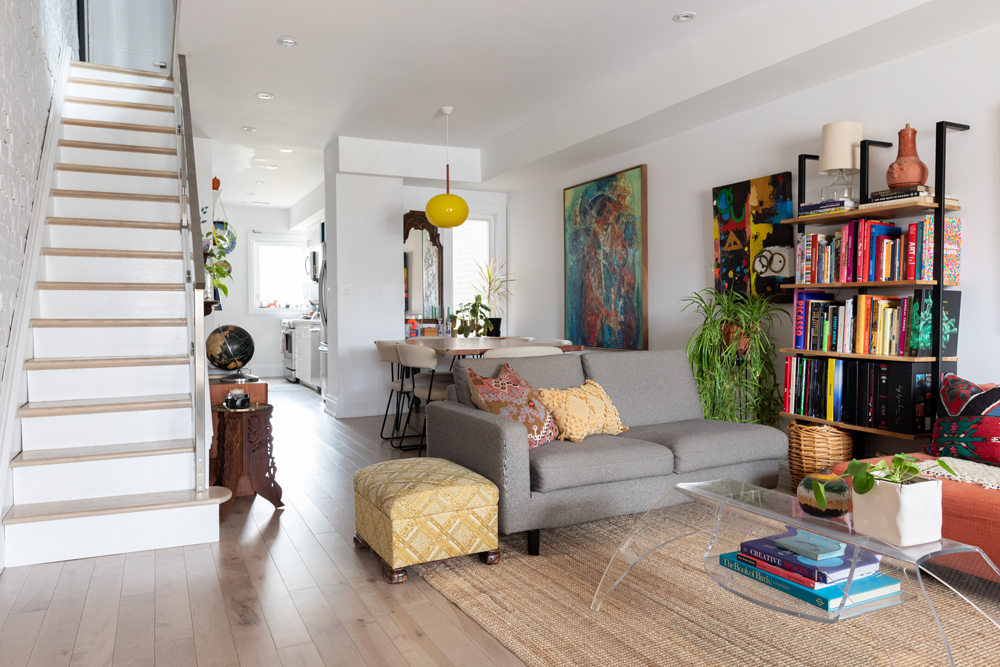
Light Bright
Lighting is another opportunity to add personality to a space, as the sunny yellow pendant light in the dining room shows. Here, again, Gabriella shows that decor doesn’t have to be new to be impactful. “The lamp is from one of my favourite vintage stores in the city, Zig Zag.”
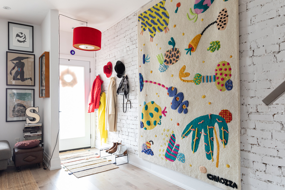
Warm and Welcoming
The entryway sets the tone for a home, so Gabriella styled the space to be fun, functional, and bright. “I wanted to break up the traditional entryway coat rack so I went with individual hooks. This allowed me to stagger the heights of jackets and hats. I think the result is a lot more playful,” she says.
Related: The Homemade Pegboard Entryway Organizer That’s Surprisingly Simple to Create (You Can Do It!)
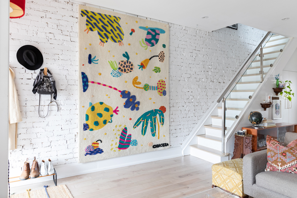
A Lucky Find
“The wall hanging is an IKEA and Chiaozza rug collaboration that was created for the 2019 Ikea Art Event,” Gabriella says of the vividly coloured entryway detail. “Each IKEA location has a limited number of rugs and participants are given an entry to a day-long raffel wherein ‘winning’ is the opportunity to purchase a rug. I was very lucky and my number, out of hundreds, was called third. I purchased the rug, and then my friend at SSTTUUFF custom mounted it for me.”
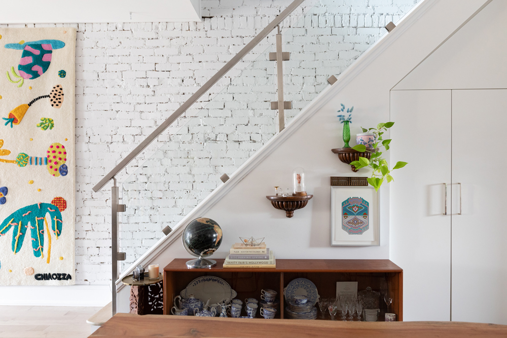
Clear Vision
Looking towards the stairs, Gabriella created a space that’s an eclectic blend of modern and classic sensibilities. “I love the glass railing because it doesn’t hide the brick wall, but to offset it I found a great low MCM hutch at Guff that I filled with china,” Gabriella says. “I’ve always loved china cabinets. They’re so traditional and bulky, so this is my slimmed-down version. The best of both worlds.”
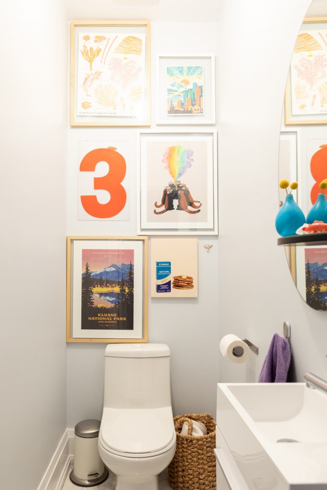
Powder Play
The home’s powder room provided a design challenge because of its compact blueprint, so Gabriella decided to embrace the size and make it a positive. “I wanted to go more maximalist in the powder room because it is a very small space – almost to double down on how small it was,” she explains. “The one thing it has going for it is height, so I thought it could be a nice opportunity for a crowded gallery wall. The art is a mix of artist prints and posters. The number 3 is an old number from a gas station sign that I found thrifting.”
Related: Picture Perfect: A Foolproof Guide to Hanging Your Pictures Perfectly, Every Time
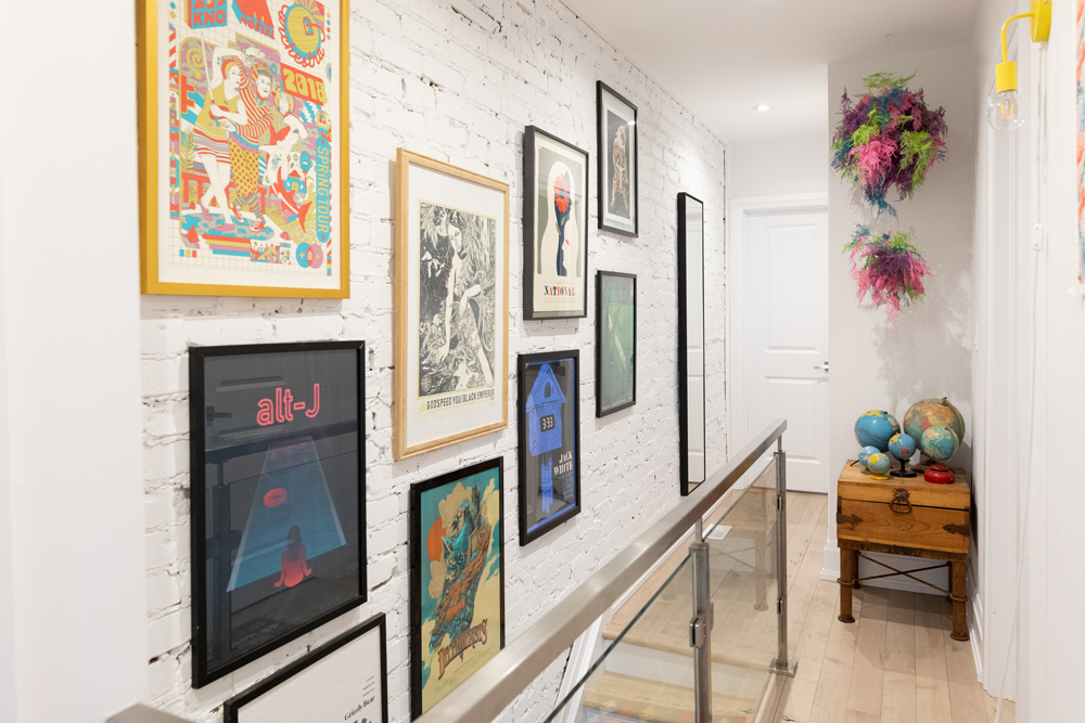
All the Right Notes
At the top of the stairs, a gallery wall brings colour to the space, while offering a personalized ode to concerts and bands that Gabriella and her partner love. “A lot of our dates are centred around music (or were previously) and picking up a poster is something we like to do together,” she says. “I like the screen prints against the painted brick here, and I puzzled together our collection to creep both up and down the stairs.”
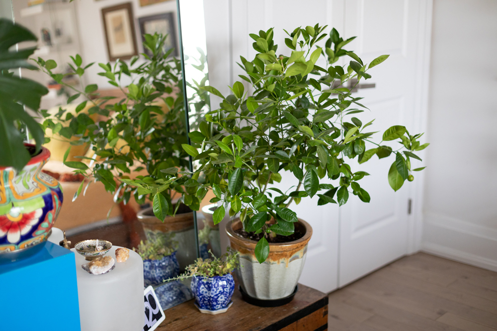
The Green Scene
If colour, texture and personality are the salt of Gabriella’s home, fresh green plants are certainly the pepper that spice up the space. “Plants, to me, are an integral part to any home – if you’re into plant parenthood,” Gabriella says. ”
Related: The 20 Best Bedroom Plants to Help You Get a Better Sleep
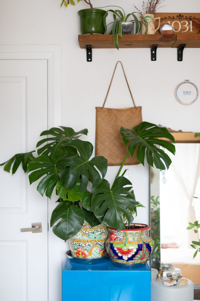
Organic Inspiration
“They are time consuming, but I think they help to ground all the bright colour that we have by matching the vibrance while remaining organic in texture,” she explains. “Plants plus wood plus bright colour is definitely my happy place.”
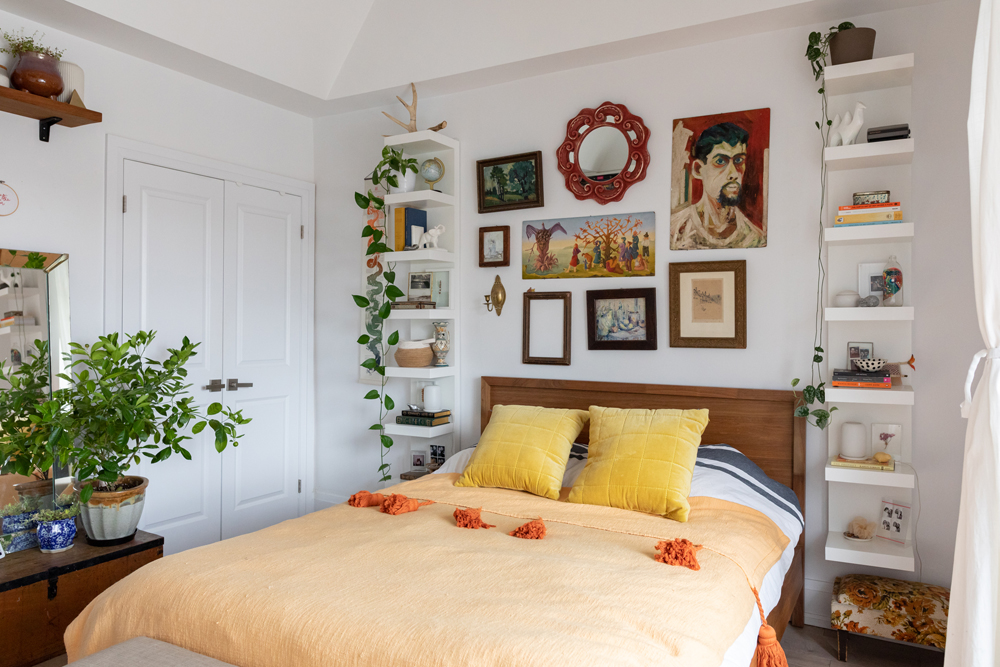
Floor-to-Ceiling Comfort
Designed to complement the character of the rest of the home while creating a comfortable place to relax, the bedroom is artful and cozy. “The goal of the bedroom was to be a toned-down version of the rest of the house,” Gabriella says. “I still wanted it to be reflective of our style, but less.” The room also takes advantage of vertical space. “The open storage commands a little more discipline, but we also have high ceilings in our bedroom, so I wanted to draw the eye up and accentuate that,” she explains.
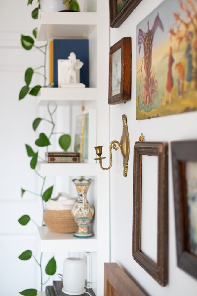
Float On
White floating shelves flank the bed, blending statement-making style and sensible function. “The floating shelving was a solution to the black holes that side tables so easily become,” Gabriella explains.
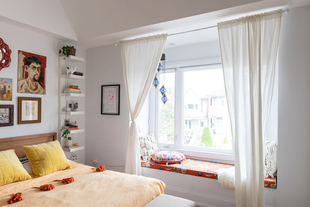
Window Seat
Beside the bed, a large bay window lets in natural light and creates a cozy focal point in the room. “The spot in the bay window was something we were both immediately drawn to,” Gabriella notes.
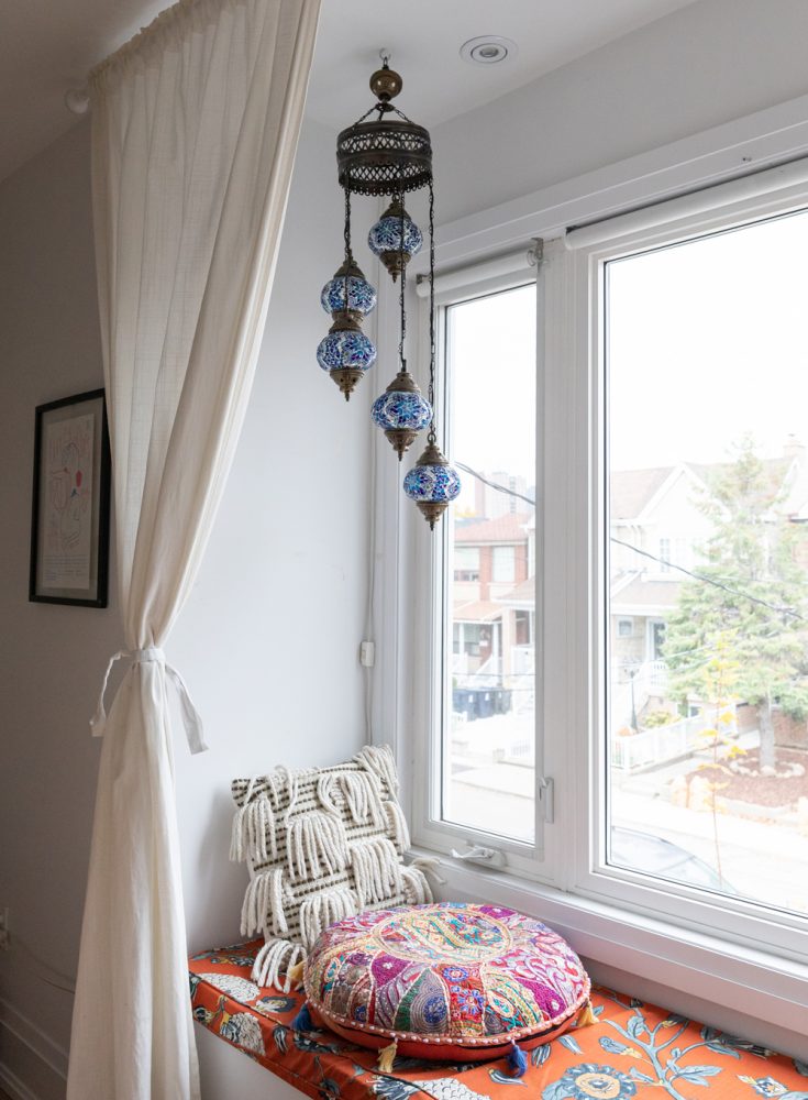
Layers of Pattern and Texture
To highlight the spot, Gabriella created a custom seating area that blends prints and materials for an eclectic look and feel. “We had a custom pillow made by Potato Skins for the bench, and got to pick out this colourful pattern from their curated selection,” Gabriella says. “We then added lots of throw pillows, the large ornate pouf from The Paper Moon, and a lamp we got in Turkey to set the mood.”
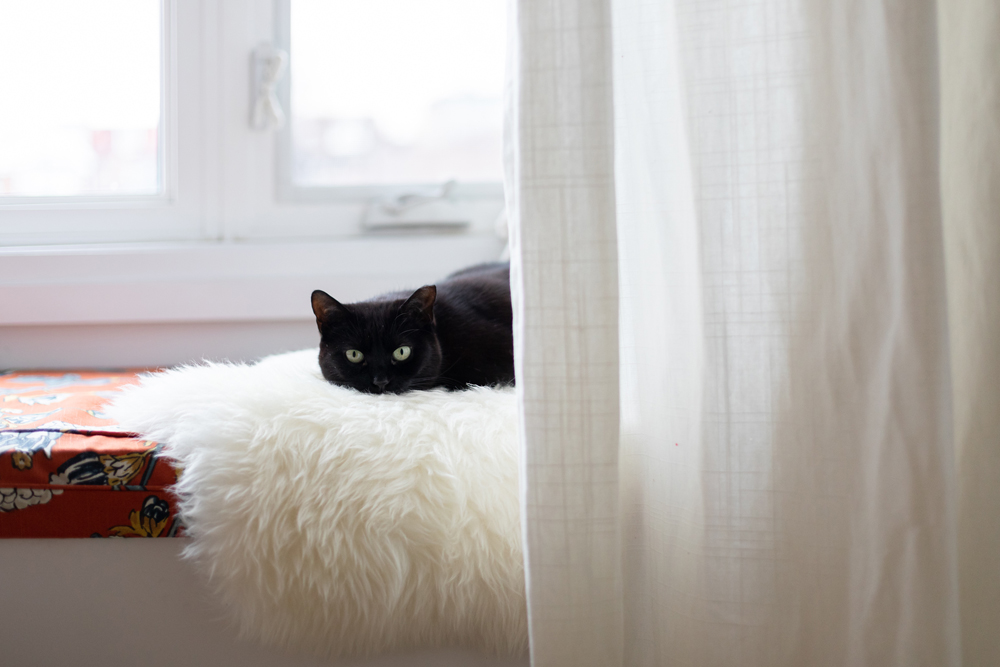
The Purr-fect Place
More than just a stylish look, the patterned window seat offers a cozy spot for relaxing (and for furry friends). “It’s really become our cats’ domain (they have good taste),” Gabriella says.
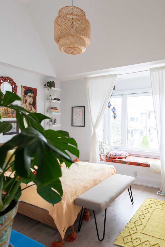
Let There Be Light
“Bedroom lighting, in my opinion, is ideally a space flooded with natural light,” Gabriella says. “Otherwise, I love moody lamp lighting, and then a brighter bedside light for reading in the evening.” Overhead, a woven pendant light (a Facebook Marketplace find that’s originally from IKEA) perfectly matches the room’s tone.
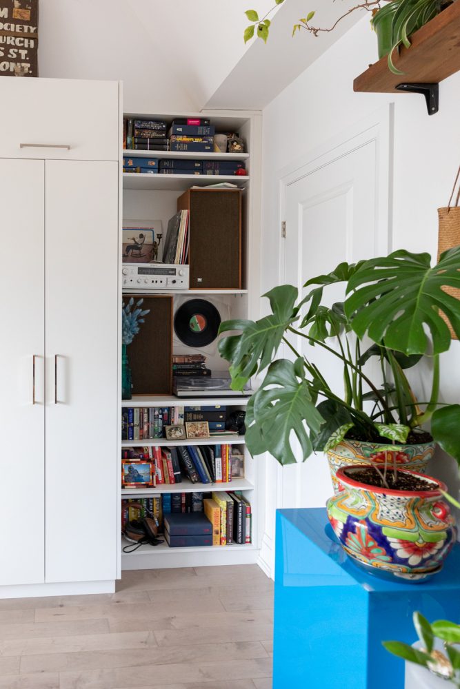
Built-in Style
To create a spot to display and style her record player and speakers, Gabriella customized the bedroom’s built-in storage by removing a few levels of shelves. “Styling for me starts with finding your centrally focused item, usually the largest, and working around and out from there,” Gabriella says. “Creating a styled orbit that then comes together cohesively. It involves a lot of taking a step back and tetrising.”
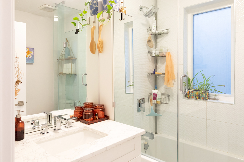
Plant Life
In the bathroom, Gabriella went for a clean look that’s a touch minimal – but still with plenty of plants to stay true to her style. “I love bright and white bathrooms,” she says. “They are the ultimate definition of dreamy to me, and – contrary to the powder room – I wanted things minimal here. I chose plants that were happy with indirect light and humidity. My hope is to add more plants here and emulate a rainforest feeling.”
Related: 15 House Plants That Help Reduce Humidity in the Bathroom
Home Network your inbox.
By clicking "SIGN UP” you agree to receive emails from Home Network and accept Corus' Terms of Use and Corus' Privacy Policy.


