There were those who said it couldn’t be done, but Bryan and Sarah Baeumler proved them all wrong. On the grand finale of Bryan Inc. the couple finally unveiled the Highview home, which had been completely transformed under Sarah’s “green” project management skills. Take a look at this gorgeous, Burlington, Ontario, home with its intricate details, lavish space and rich finishes.
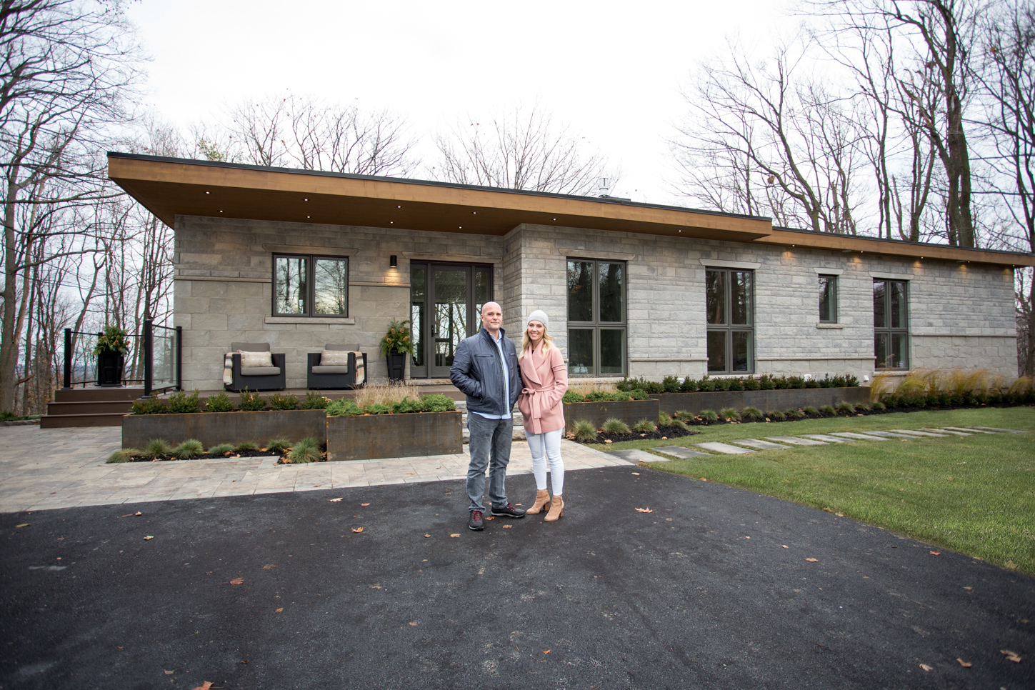
Welcome Home
A soft brick exterior, a large driveway, beautiful interlocking stones leading up to the front entrance and plenty of spotlights work together to ensure that this is a warm and welcoming home. Add in some key landscaping details such as the shrubs and planters, and it’s easy to picture ourselves lounging out here, flipping through magazines or waiting with a cocktail to greet guests.
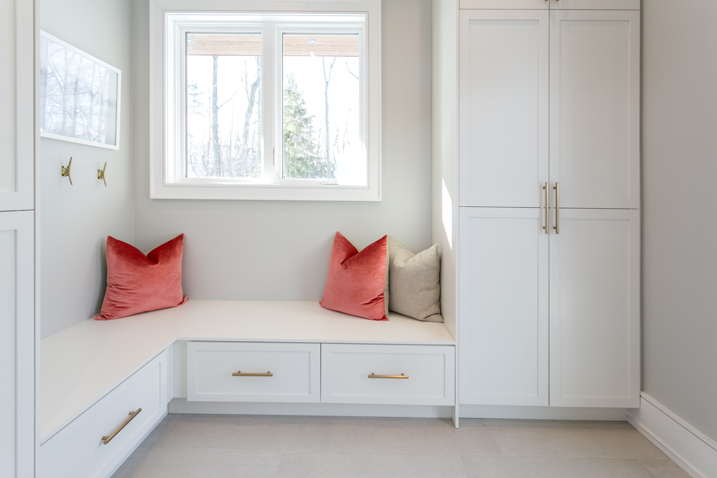
A Magnificent Mudroom
You don’t need a large space for a mudroom, just enough of an area for some functional storage and a pretty bench — like this corner offering. The white and gold finishes keep the room bright and streamlined, while the pops of rose add a modern touch. Add in a few hooks for jackets and a pretty painting, and this is a sunny little space designed for maximum function.
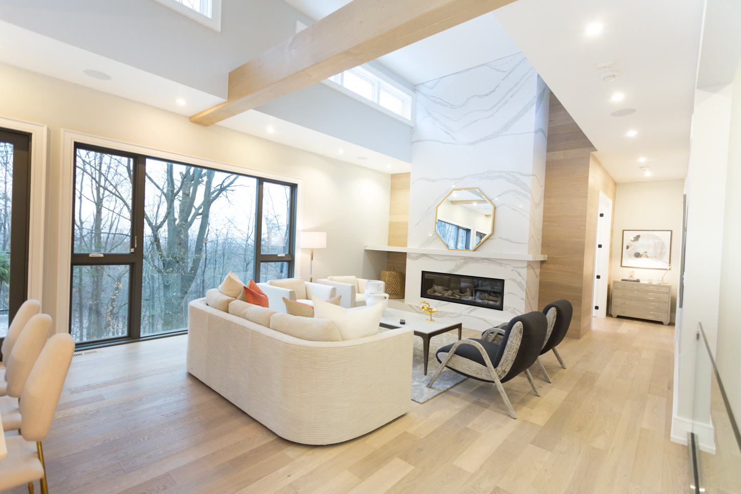
Exposed Living
The open-concept floor plan feels even more open thanks to the exposed ceilings, skylights and oversized windows. A lighter colour scheme, including these hardwood floors running throughout and the quartz fireplace add to the overall effect. Meanwhile the glass railing, cream furniture and spotlights keep the space modern and clean.
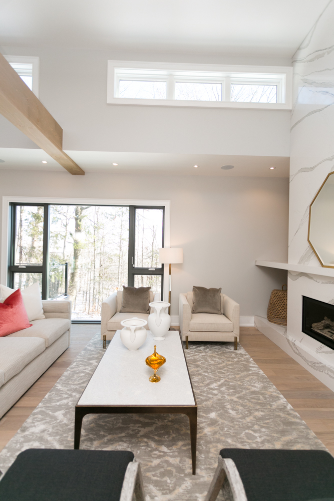
Built-In Function
When you’re going for clean lines and bright whites, it can be hard to make a space feel lived in. That’s where small details, such as the built-in storage beside the fireplace and the pitchers on the coffee table, help to create a cozier feel.
Streamlined Spaces
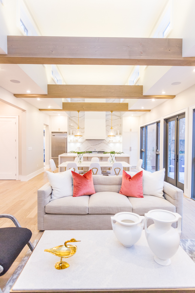
The exposed beams continue throughout the floor plan, drawing the eye down the room to the Cambria quartz backsplash, which compliments the fireplace. Meanwhile the same rose-coloured throw pillows from the mudroom also help create a modern feel here, especially when paired with the gold finishes on the dining room chairs and light fixtures. On the other end, the walkout patio through the kitchen helps to create the illusion of even more space and extended living.
Trim and Tidy
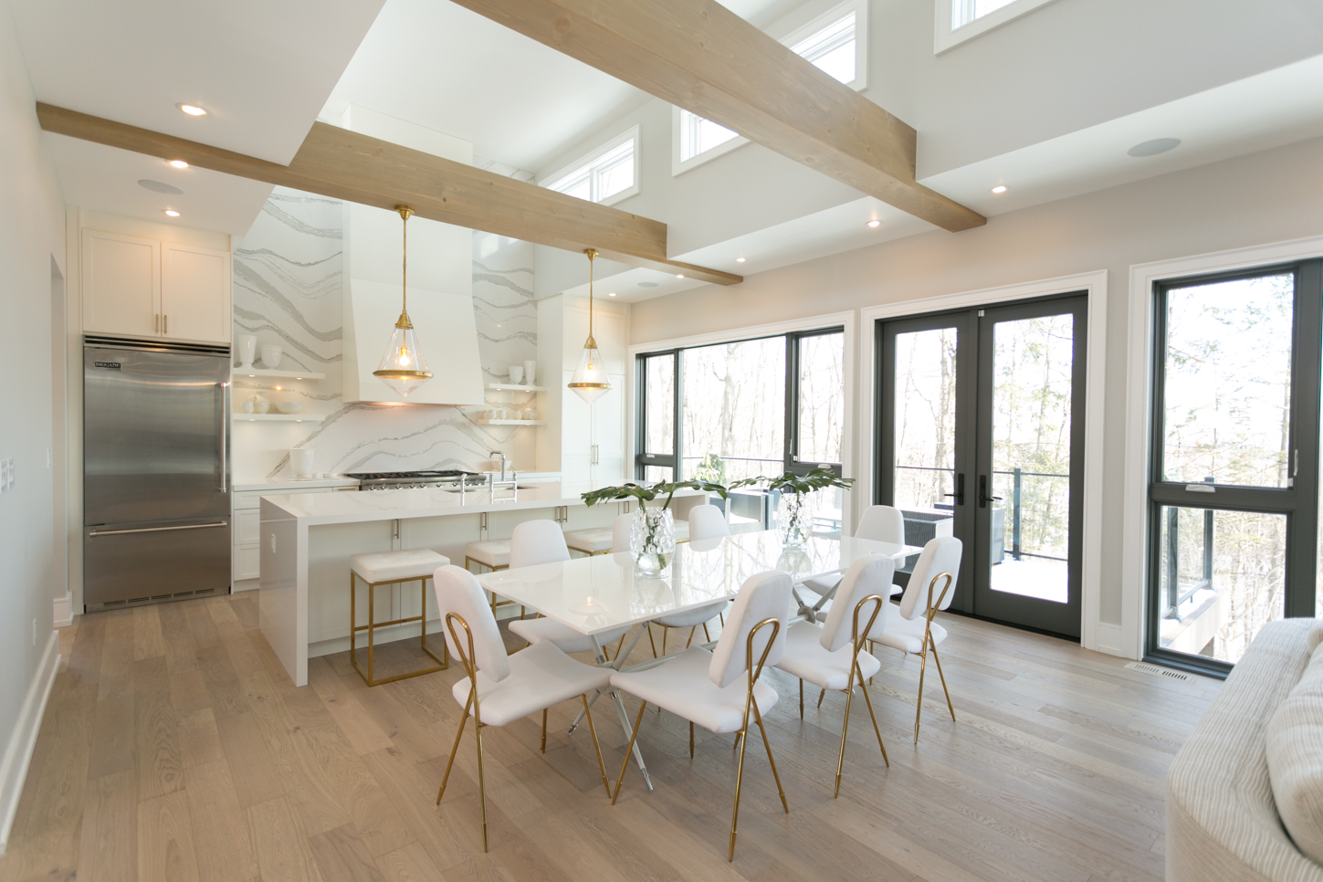
Breaking up the white and gold finishes is this modern dark trim on the windows and doors, which helps add depth to the room. In the centre of the space a sleek dining room table with interesting gold details adds an instant area for the whole family to eat and gives the room even more potential.
Simple Elegance
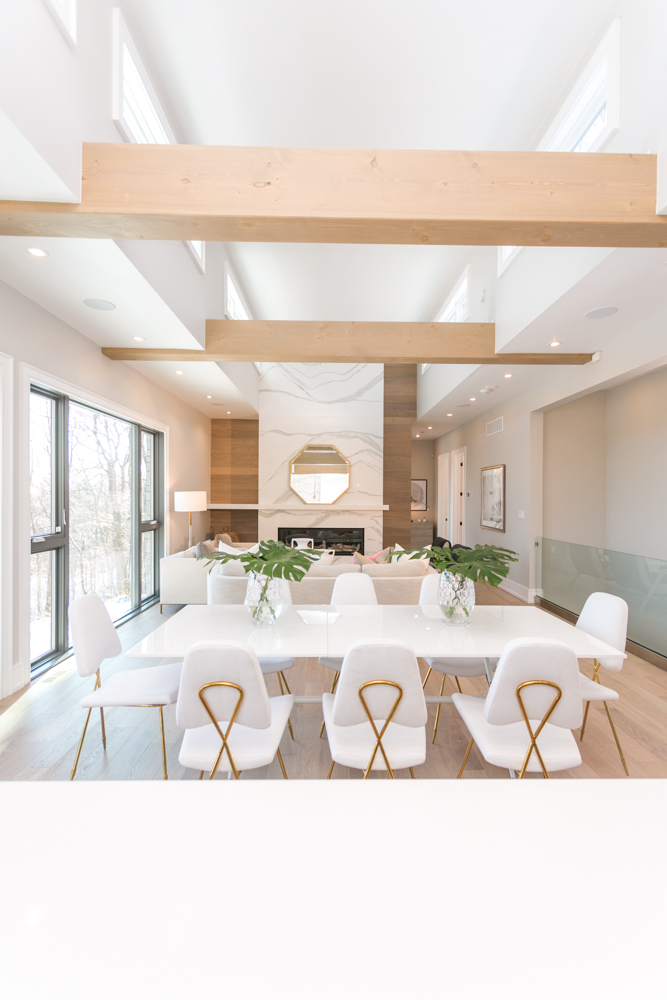
Sarah has kept the decor to a minimum throughout the entire room, which not only helps to grab prospective buyers wanting to personalize the space, but it keeps the eyes locked on some of the more impressive structural details. Such as the light pouring in from the windows above and the amazing sky-high quartz mantle.
Going for Gold
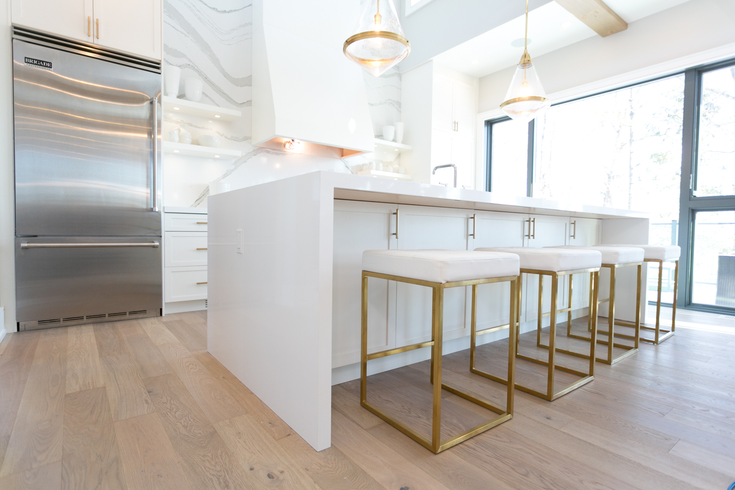
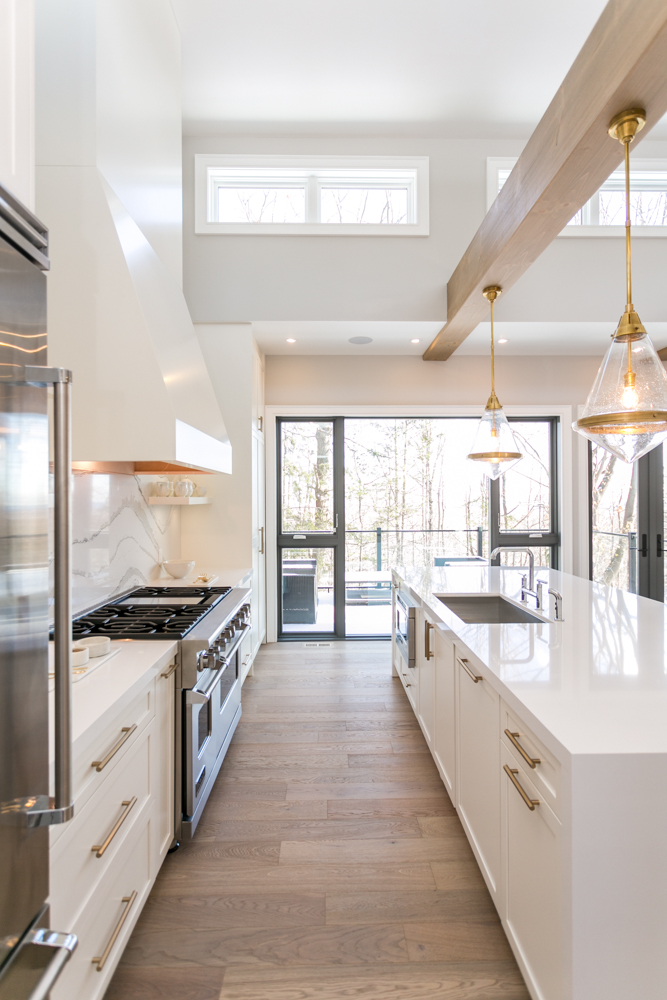
The pretty gold accents continue here with these kitchen island benches, which work together with the light fixtures overhead. Even the cupboard hardware matches, completing the overall look. We also love the built-in storage underneath the actual island, as it gives the room a little more storage and function.
A Crafty Kitchen
We love the electrical wiring that allows these lights to hang from the exposed beam, giving a cozy effect to the island setup. The island sink is equally genius, as it creates more counter space on the opposing wall and allows quick access between the sink and stove while cooking and prepping.
Modern Appliances
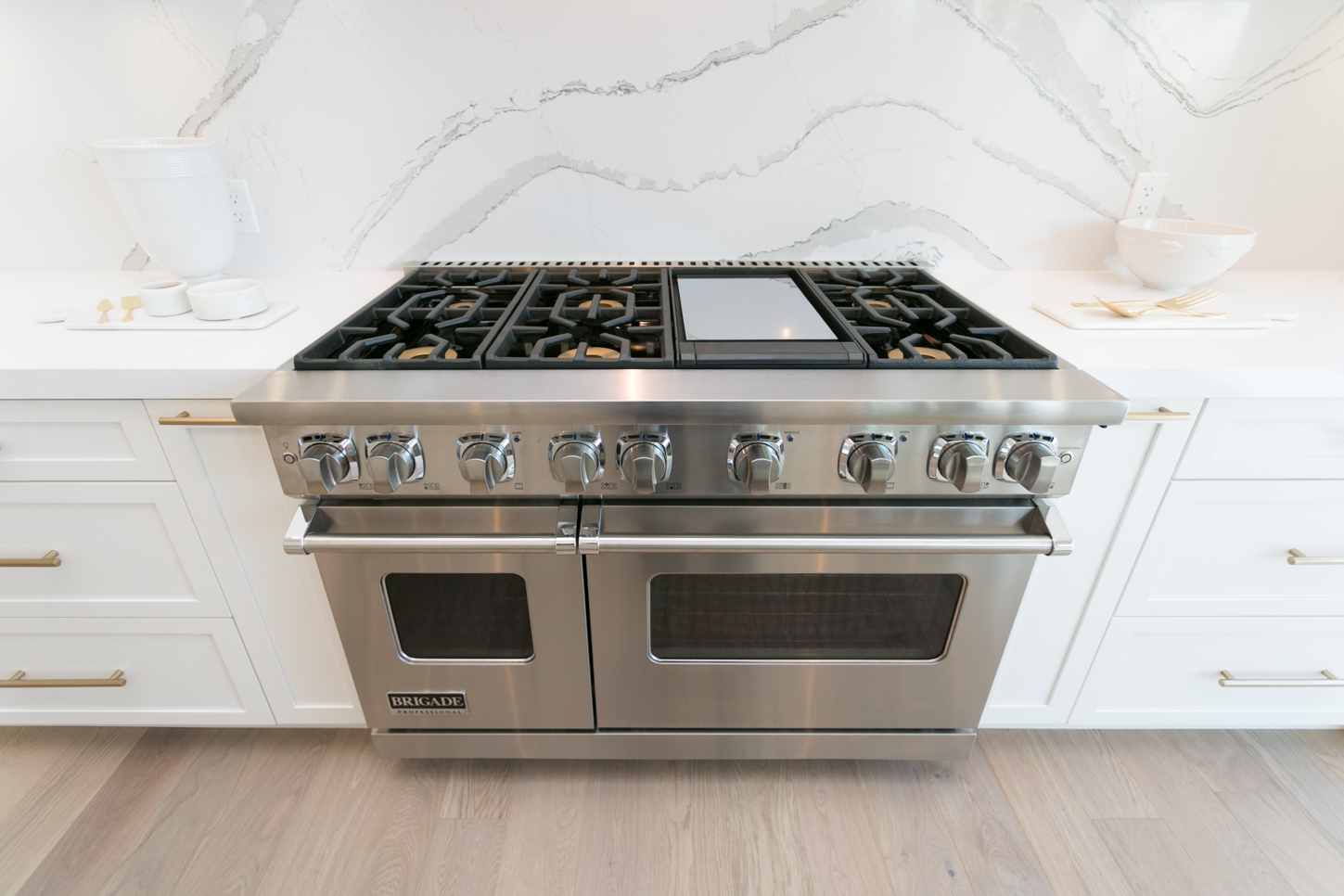
Upgraded, modern appliances help to bolster the home’s overall value. This oversized gas range and dual ovens are the stuff of home cooks’ dreams.
Forever Functional
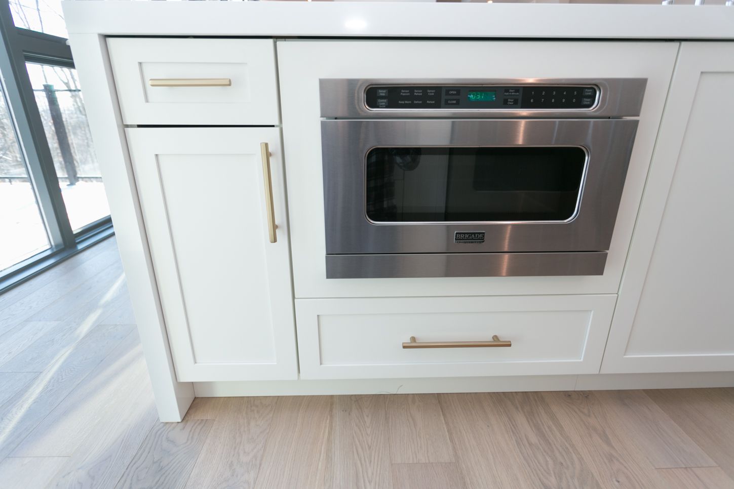
Another built-in unit in the island adds even more function to the small area, creating maximum value. No space is wasted here; drawers and cupboard are built into every possible nook. With so much storage the surface areas themselves can stay clean and streamlined, something that any person with a penchant for organized living can definitely appreciate.
Exposed Shelves
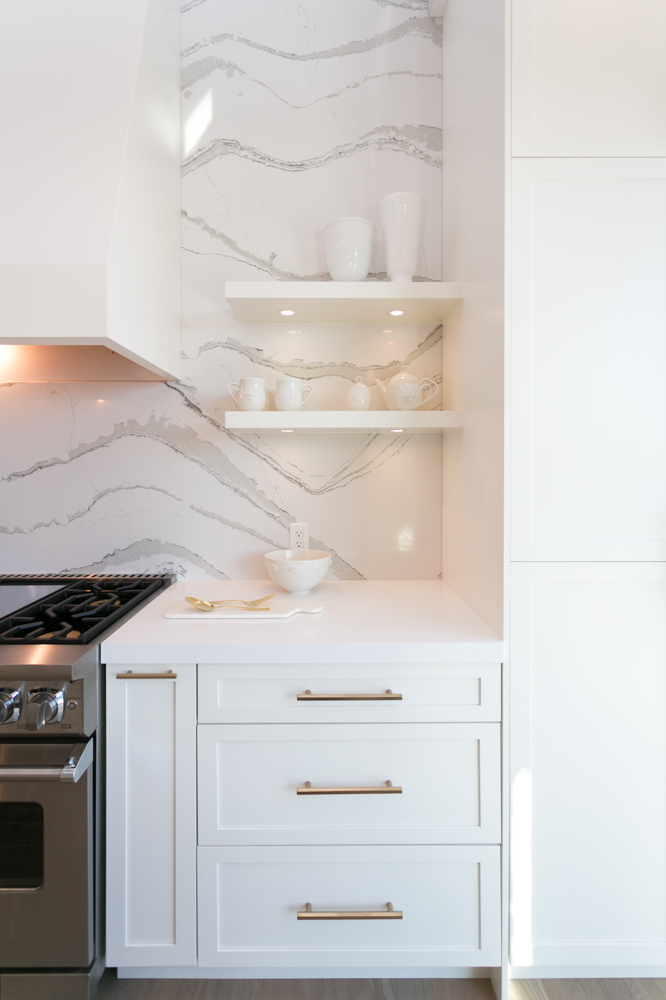
Adding personality to the kitchen are the bowls and serving dishes displayed on these beautiful, built-in shelves and brilliant white countertops below. Under cabinet lighting is skillfully added, keeping the space nice and bright even when the sun goes down.
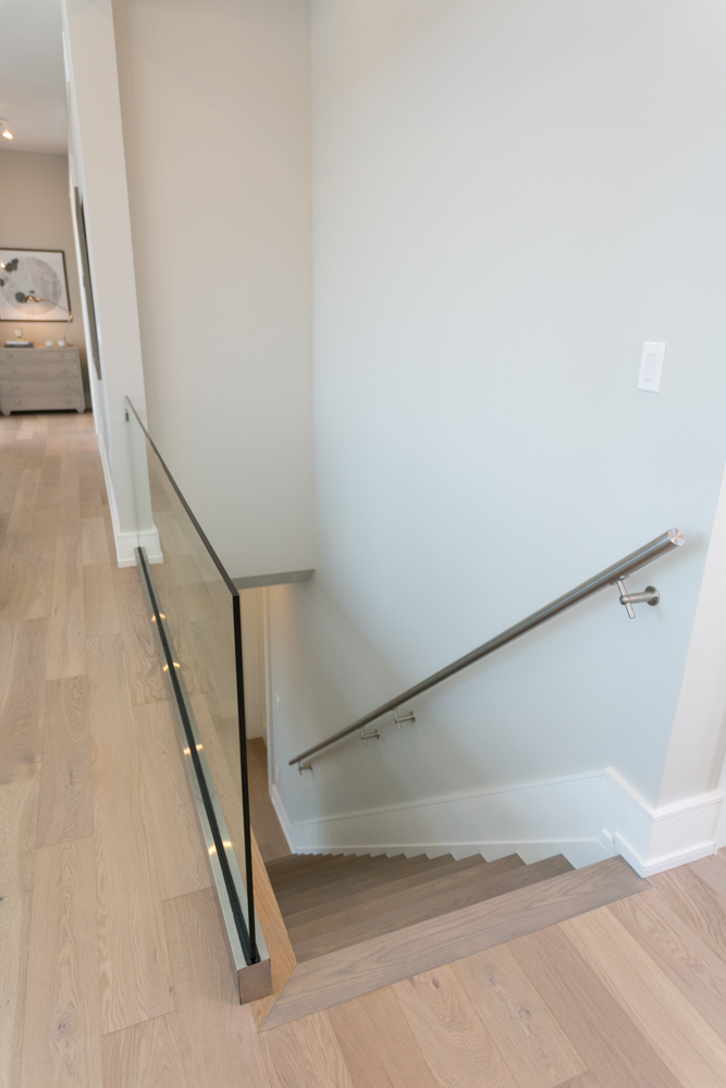
Streamlined Stairs
Even the stairs are updated with modern finishes, like the hardwood throughout, the glass safety feature and the sleek railing. Extra lighting helps to create safe mood lighting at night, and the extra-large trim is polished and pretty.
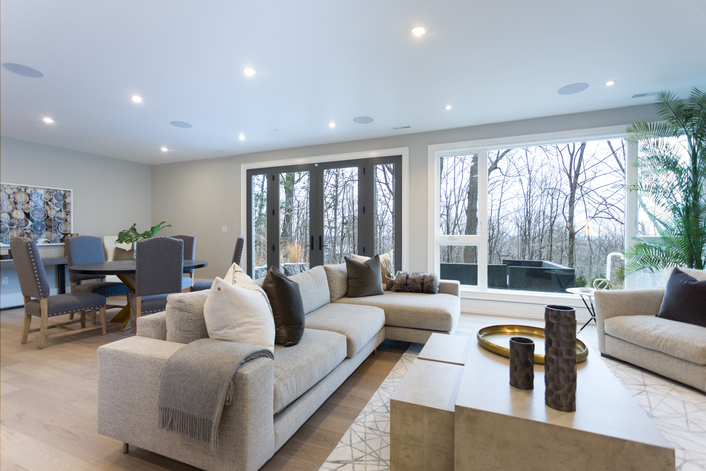
Creature Comforts
Downstairs, this living room and den area is slightly cozier than the upstairs thanks to oversized couches and finishing details like these throw pillows and blankets. It still flows with the overall home design thanks to the soft colour scheme and brass accents, but it feels warmer and more family-oriented.
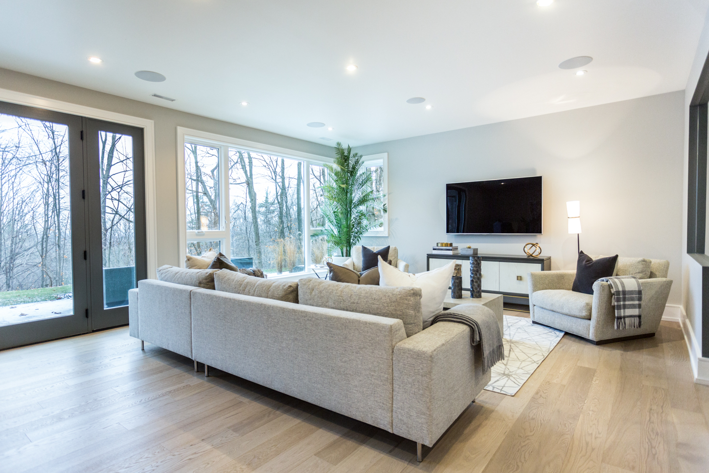
A Happy Place
The hardwood continues here, but thanks to the addition of an area rug and the flatscreen TV it feels cozier than the room above. This is an area we’d love to curl up in and binge watch some of our favourite shows or host a mini movie marathon. It could also double up as a kids’ play space for any families interested in the property, or it would make a great reading area as well.
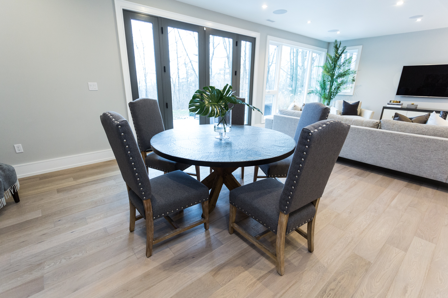
Extra Seating
Sarah added another table here to showcase the entertaining and hangout potential of the room. This could be an informal area for a meal or TV dinner, or it could also be a place for board games and cards. These pebble-grey, high-back chairs add some depth and texture to the room, and offset the cloud grey of the sofa quite nicely.
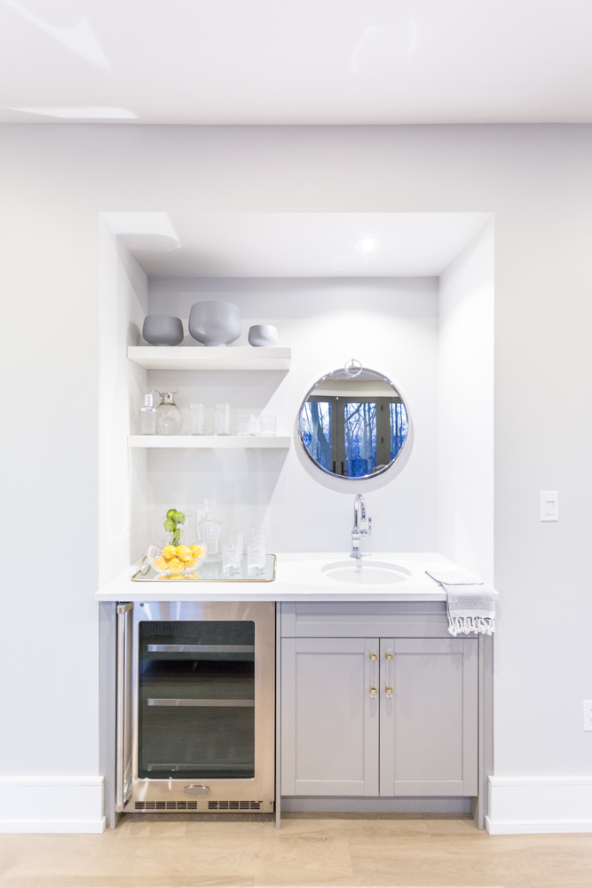
Something Extra for the Adults
Of course no den area would be complete without a fully functioning wet bar. This offering may be small but it has all the essentials: a wine fridge, serving tools and shelves, some storage and a sink. It’s a brilliant way to add detail and function to a wall while adding a little something extra to the overall design.
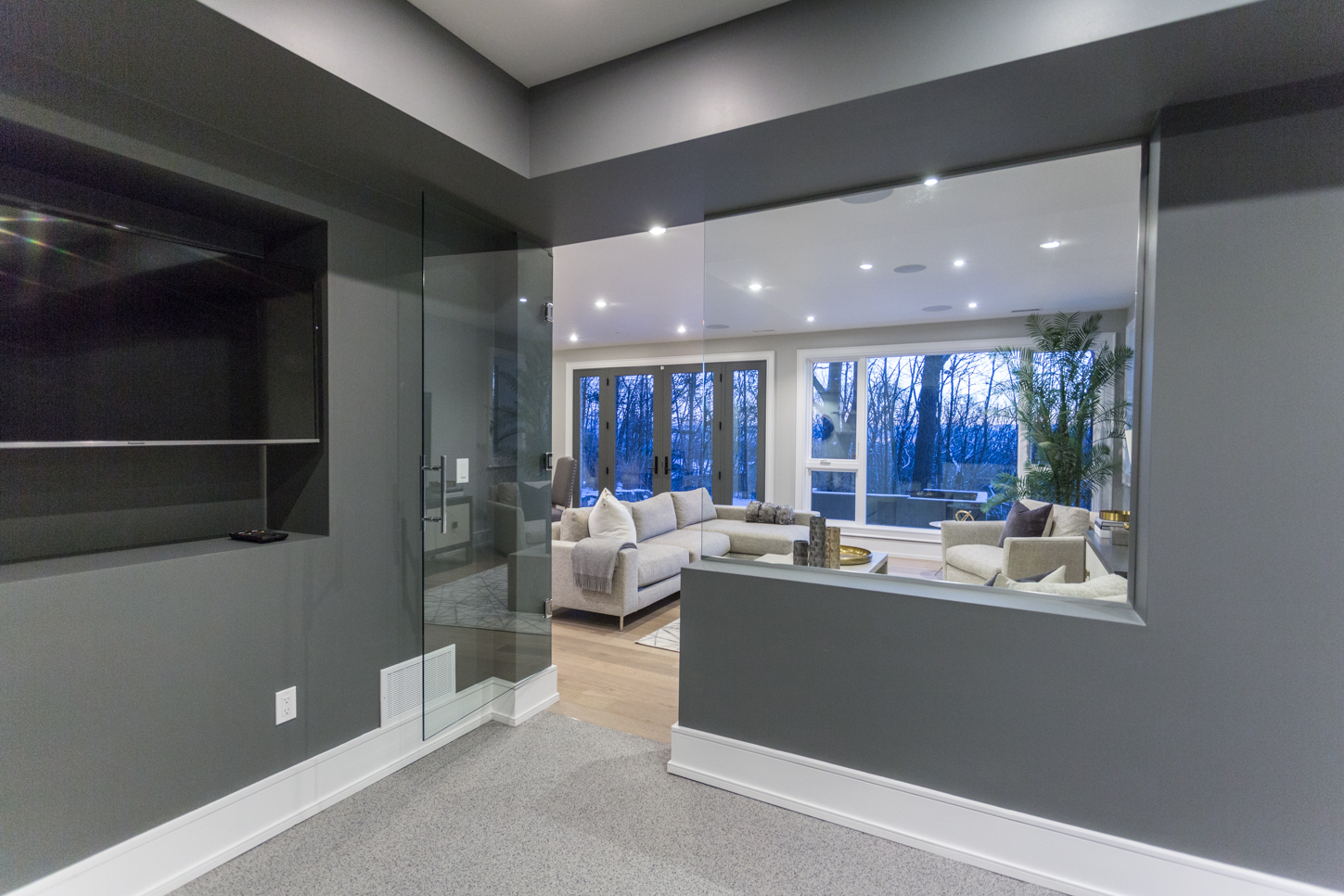
Working It Out
These days we’re all way too busy to get to the gym, so Sarah designed this home with the gym already built in. The glass door and “window” into the living room help the room feel open despite its smaller size, while the mounted television and shelving underneath is perfect for all of those home workout DVDs we always swear we’re going to start using.
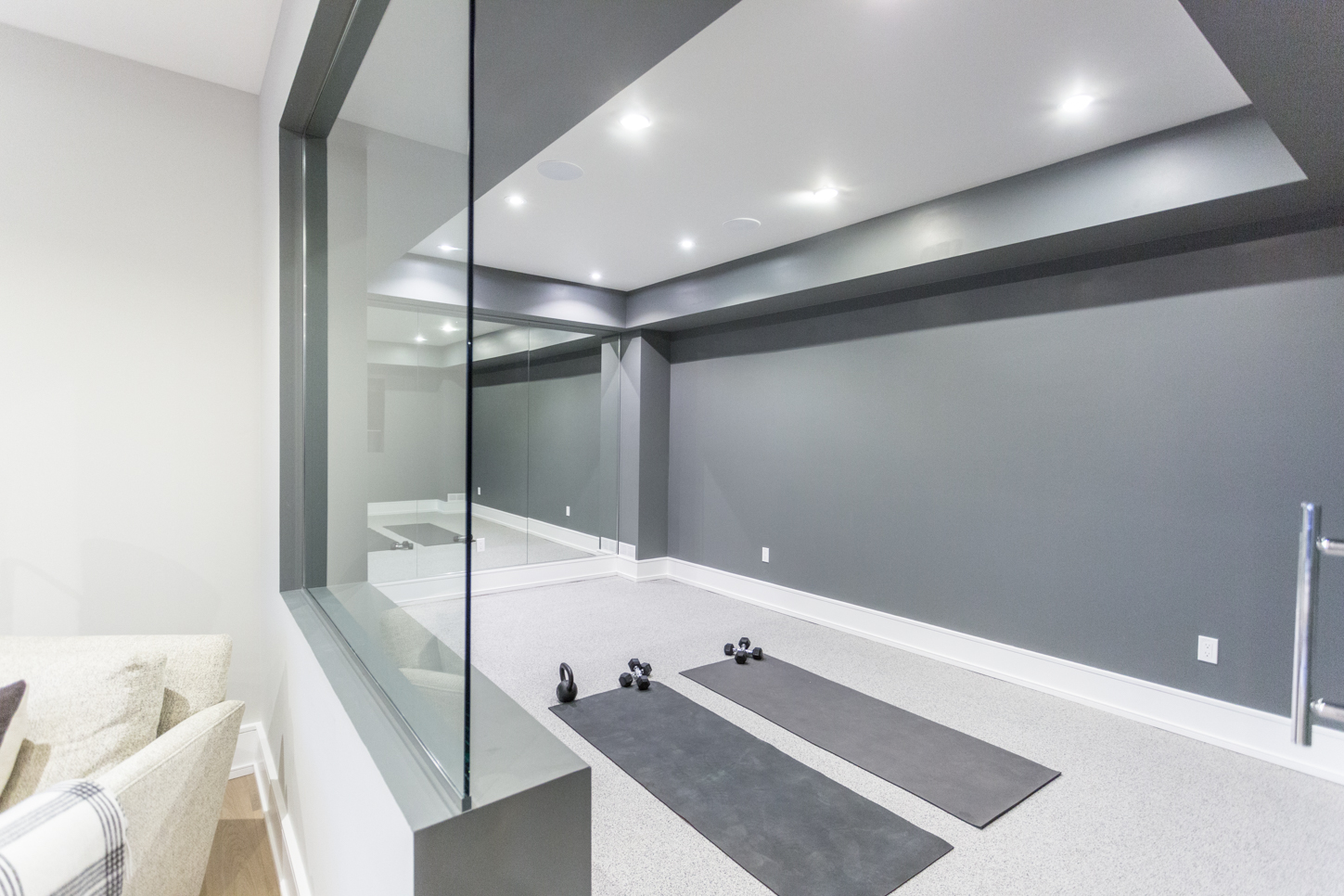
A Better Workout
The mirrored wall on the other side of the room serves a dual function: gym goers can check their form, but it also helps keep the room feeling open and modern. Meanwhile the grey hue on the wall flows with the rest of the layout, and the soft flooring ensures a better workout for those aging joints and bones.
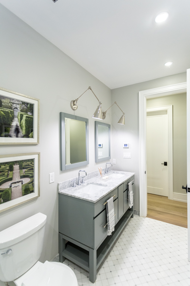
Building a Bathroom
This simple and streamlined bathroom is loaded with high-end finishes. Like the playful tiling and marble countertops on the vanity. The dual sinks and extra storage underneath make this more than your average powder room, and thanks to the lamp-inspired wall lighting the design flows from the main living areas.
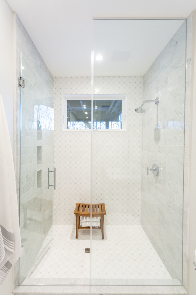
Oversized Shower
An oversized shower adds to the luxury of this bathroom, especially thanks to the continued tiling and glass doors. A modern shower-head is mounted on opposing brick tiles that gives the space more texture, and on the opposing wall built-in pocket shelves mean easy storage.
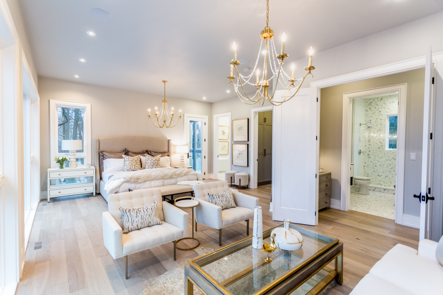
A Romantic Master Bedroom
Now this is how we picture a master bedroom. A large but simple bed, ample seating for romantic talks, foot rubs or your morning coffee, and plenty of space to move around. The gorgeous chandeliers automatically up the romance factor when coupled with the soft hues, and gold accents add a rich finish to the space.
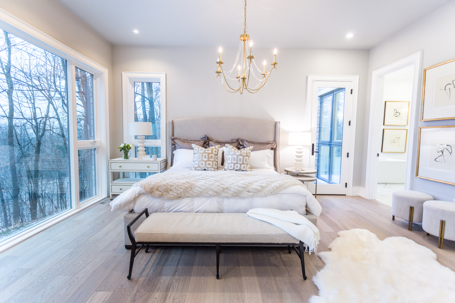
Sweet Dreams
The sleeping area has an almost regal feel thanks to the soft throws and lush pillows. The headboard is sleek and simple, and the opposing, mismatched night tables add extra personality. A plush throw rug warms the space up, while on the opposite side of the room large, oversized windows make sure homeowners will never wake up without a spectacular view.
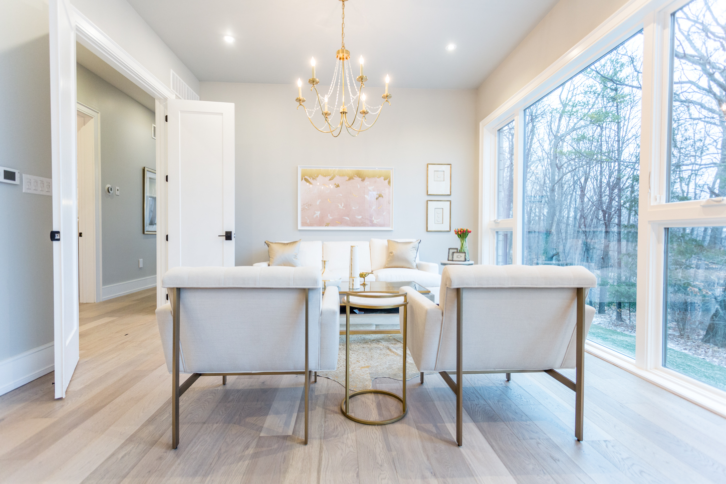
Simple Pleasures
The lighting options are varied in the seating area thanks to spotlights and the aforementioned chandelier. There are also a few seating options to use while enjoying the spectacular view, and pretty pink and chrome finishes lend to a modern but romantic setting.
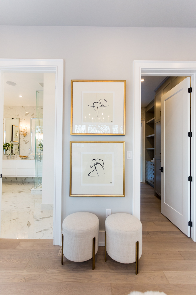
A Neat Nook
The awkward space between the entrances for the walk-in closet and ensuite is even adorned thanks to these pretty framed silhouettes and the matching stools below.
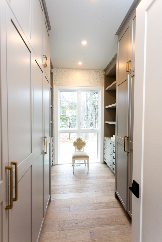
Walk-In Closet
This large walk-in closet is an organizer’s dream. The elongated design means there’s ample room to move around and get dressed, but thanks to the added window it feels bright and airy. As for this elegant chair? Well that’s just a brilliant little bonus.
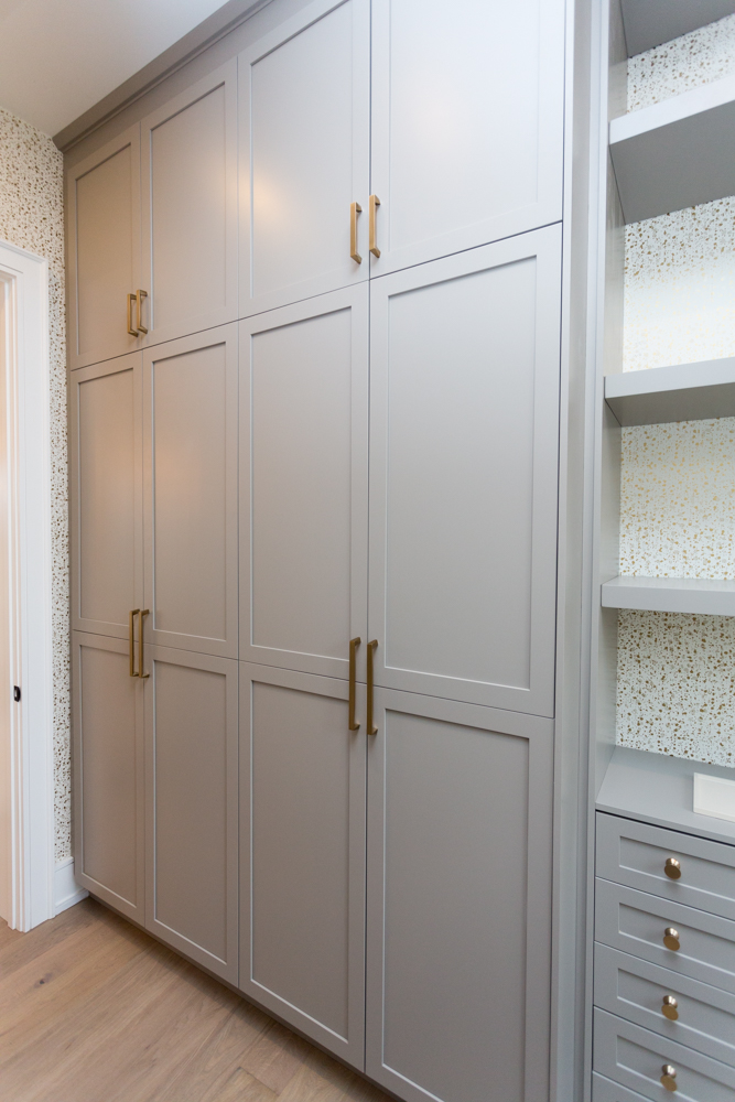
Streamlined Storage
The pretty wallpaper continues throughout, while the storage units are a great alternative to your traditional closet organizers. We love the options for built-in dressers and hangers, not to mention all of the bonus storage that comes from building the units out all the way up to the ceiling.
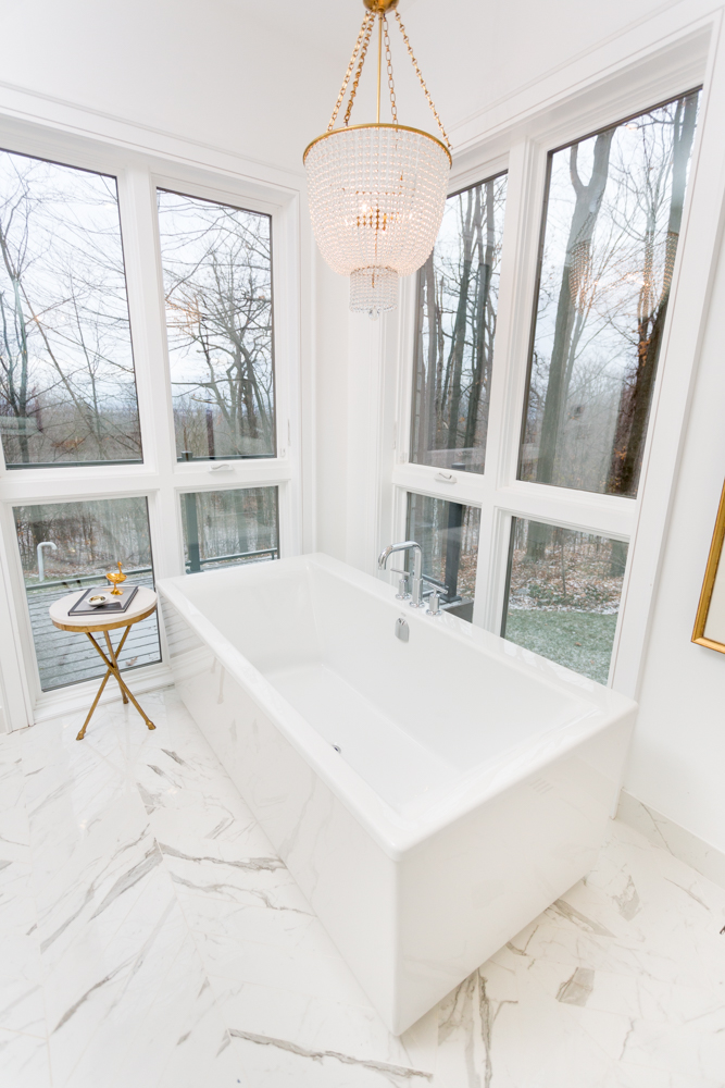
A Bathing Corner
We love this oversized tub in the master ensuite, especially since it’s perfectly situation to capture all of the property’s amazing views. A simple side faucet ensures there’s space for two, while another chandelier adds a regal and elegant finish to the look.
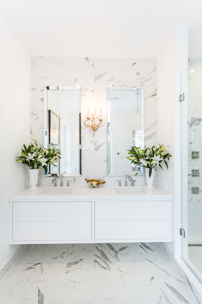
A Touch of Marble
The marbling finish on these tiles carries right up and under the vanity, giving a jewel-box quality to the room itself. The simple floating vanity adds storage but also the illusion of more space, and the dual sink/mirror combo is further highlighted by this gorgeous antler-inspired wall lamp.
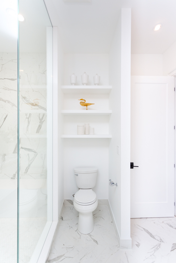
Bonus Shelves
Even here Sarah ensured that no space was wasted by adding these floating shelves above the toilet, automatically giving homeowners the option to showcase any pretty accessories or to stash unsightly bathroom items in baskets above.
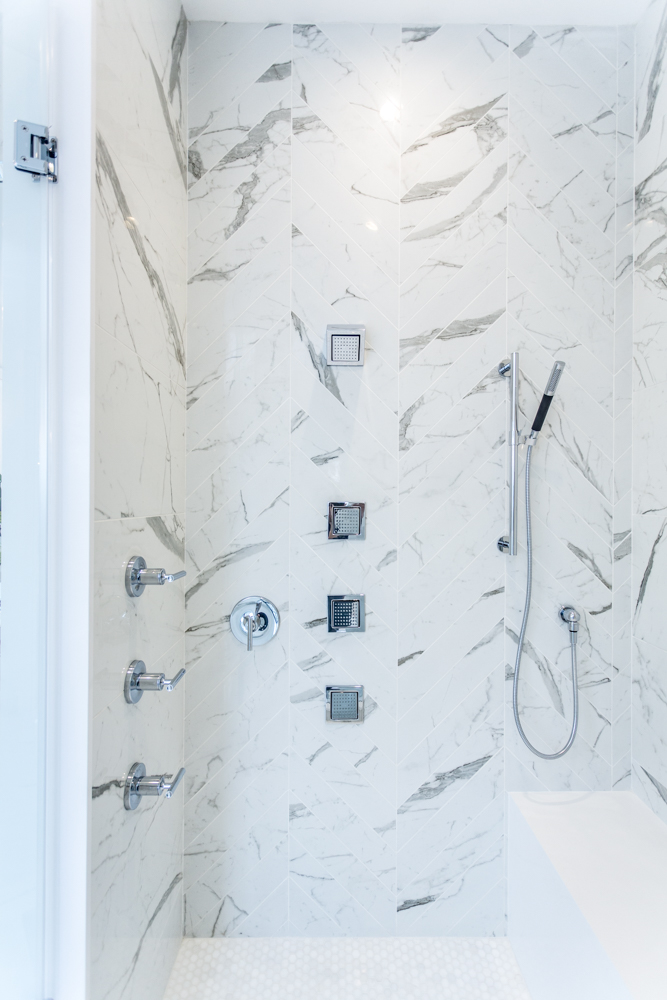
A Steamy Shower
The marbled tiles continue in a herringbone pattern in this amazing shower, which features a ton of different nozzles to find the perfect water pressure. Add in a bench, a detachable nozzle and a handlebar, and we think our daily shower would easily become our favourite part of the day.
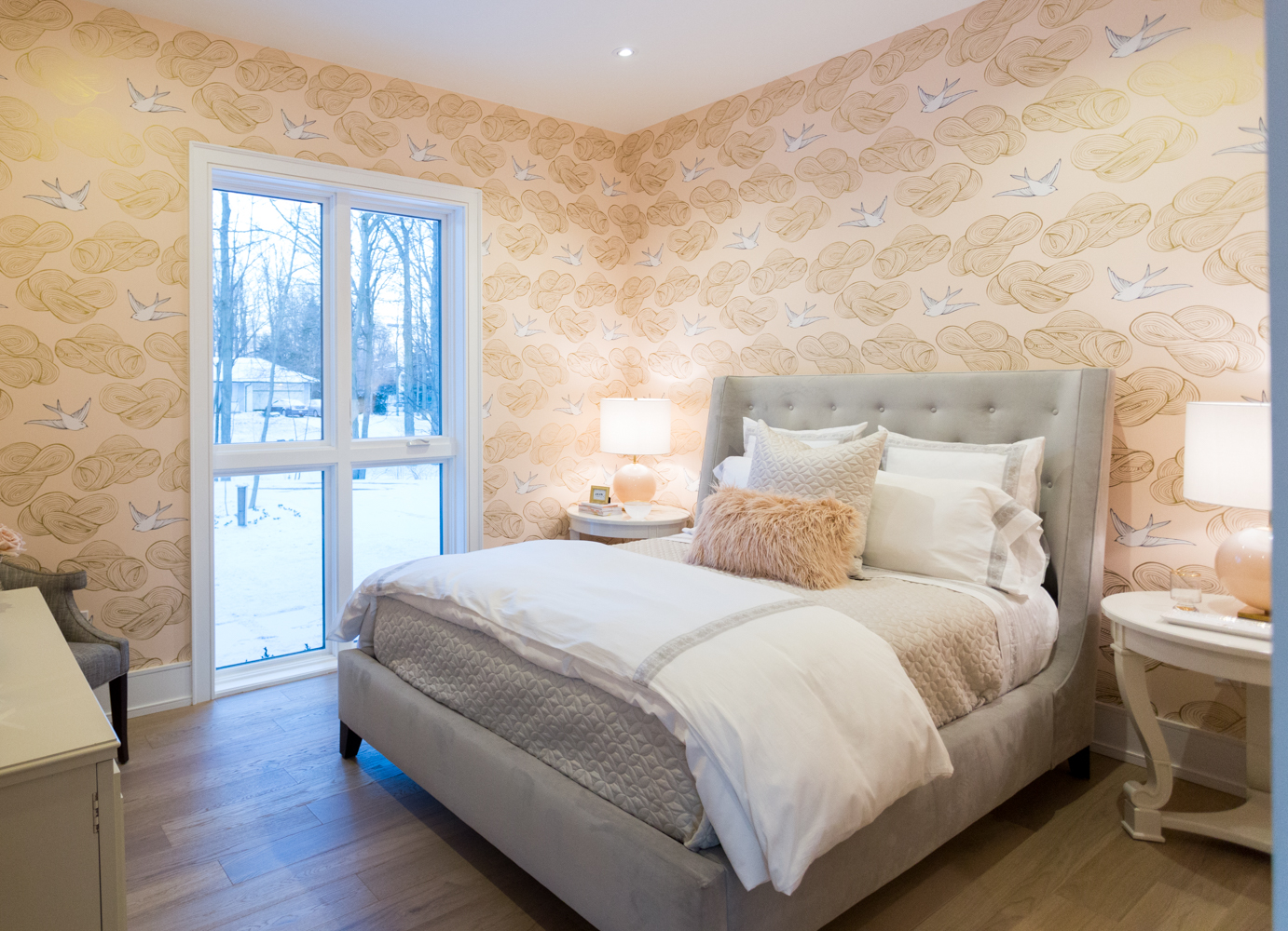
A Touch of Paper
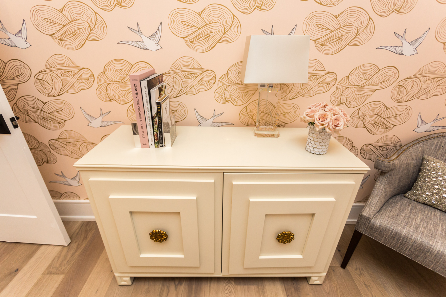
Wallpaper can be a gamble, but we love the effect it has in this guest bedroom. The pretty cloud-and-bird combo transforms this room into a space we’d picture at a bed-and-breakfast. The high-backed bed frame and plush throw pillows certainly add to the look, while the large window ensures plenty of natural light seeps in.
Pretty Finishes
This small chest is perfect for storing extra linens or suitcases, and gives guests a little bit of an area to place their belongings when staying over. The simple lamp and book display adds immediate personality, while our eyes are easily drawn to the custom knobs below. Add in this soft grey arm chair and the room feels complete and cozy.
Guest Bathroom
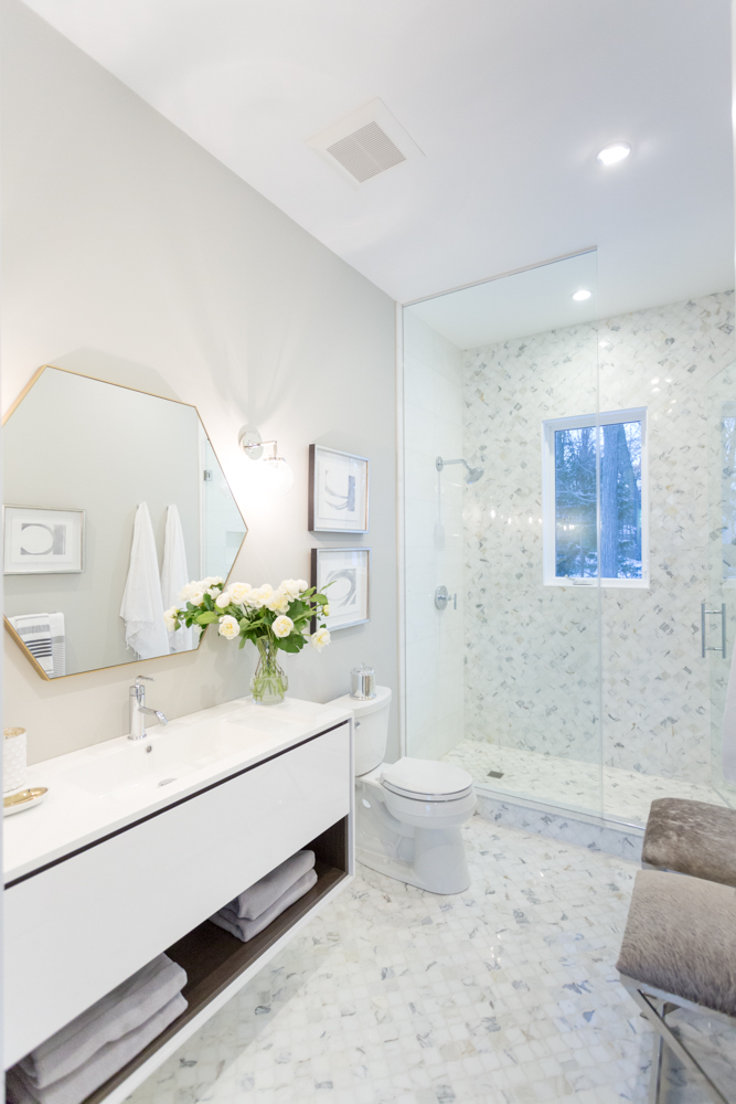
No guest bedroom would be complete without a gorgeous guest bathroom, an this home is no exception. Pretty tiling with flecks of grey add an artsy quality to the room, which is kept open and flowing thanks to the glass door on the shower. Textured, fossil-coloured stools complete the look.
Sweet and Simple
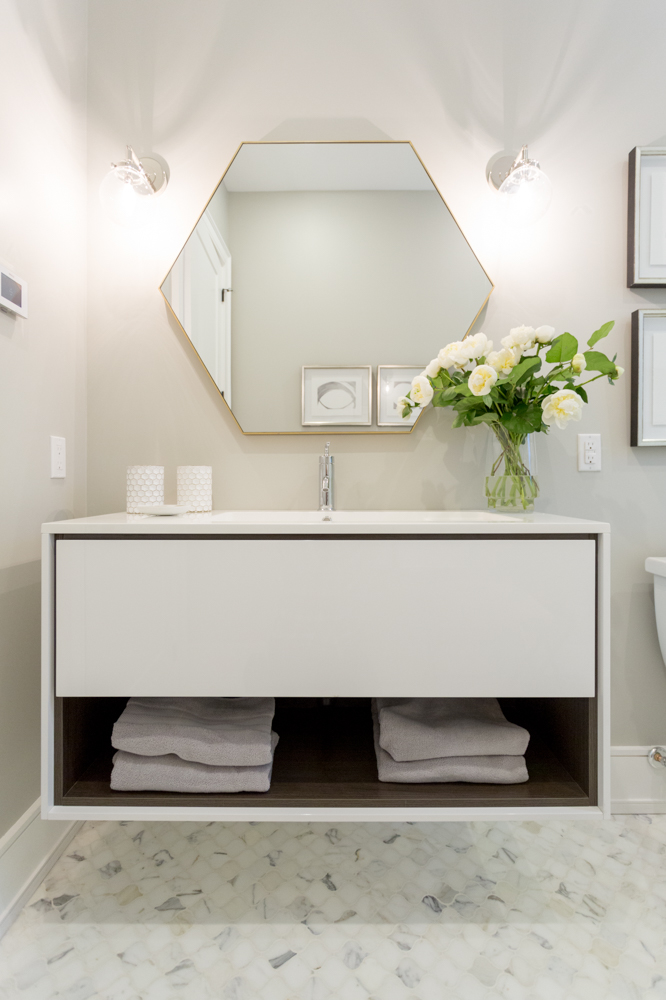
A simple and streamlined floating vanity with extra storage doesn’t overwhelm the rest of the bathroom, but adds a modern touch. The gold-rimmed hexagonal mirror and bulb lighting adds even more modern appeal, while the oversized sink is perfect for one or two.
A Better Laundry
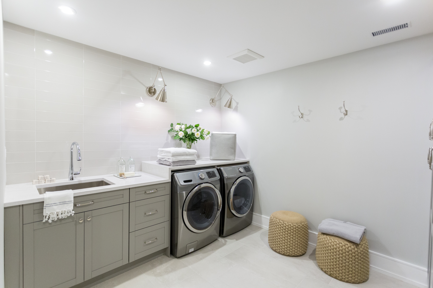
We all know Sarah is big on large, functional laundry rooms — how could she not be as a busy, working mother? So the laundry room in this home hits all the major checkpoints: large, front-loading appliances, lots of storage and an oversized sink, plenty of counter space for ironing and folding, and ample lighting for doing laundry at any given hour. It’s the final room in a gorgeous house that most modern-minimalists would covet, leading us to believe that this property will be snapped up in no time.
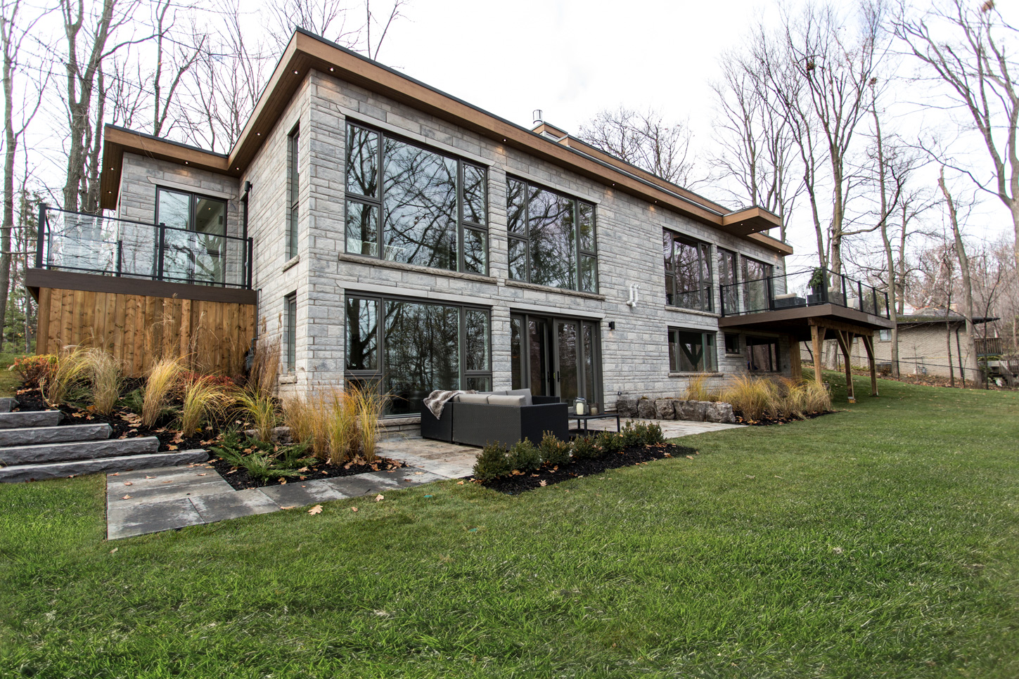
Backyard Beauty
Bryan and Sarah brought the inside out, and made sure there was tons of entertaining space with the right amount of outdoor furniture for lounging. The shrubs and interlocking stone are carried throughout the exterior of the home to give it a warm, welcoming feel.
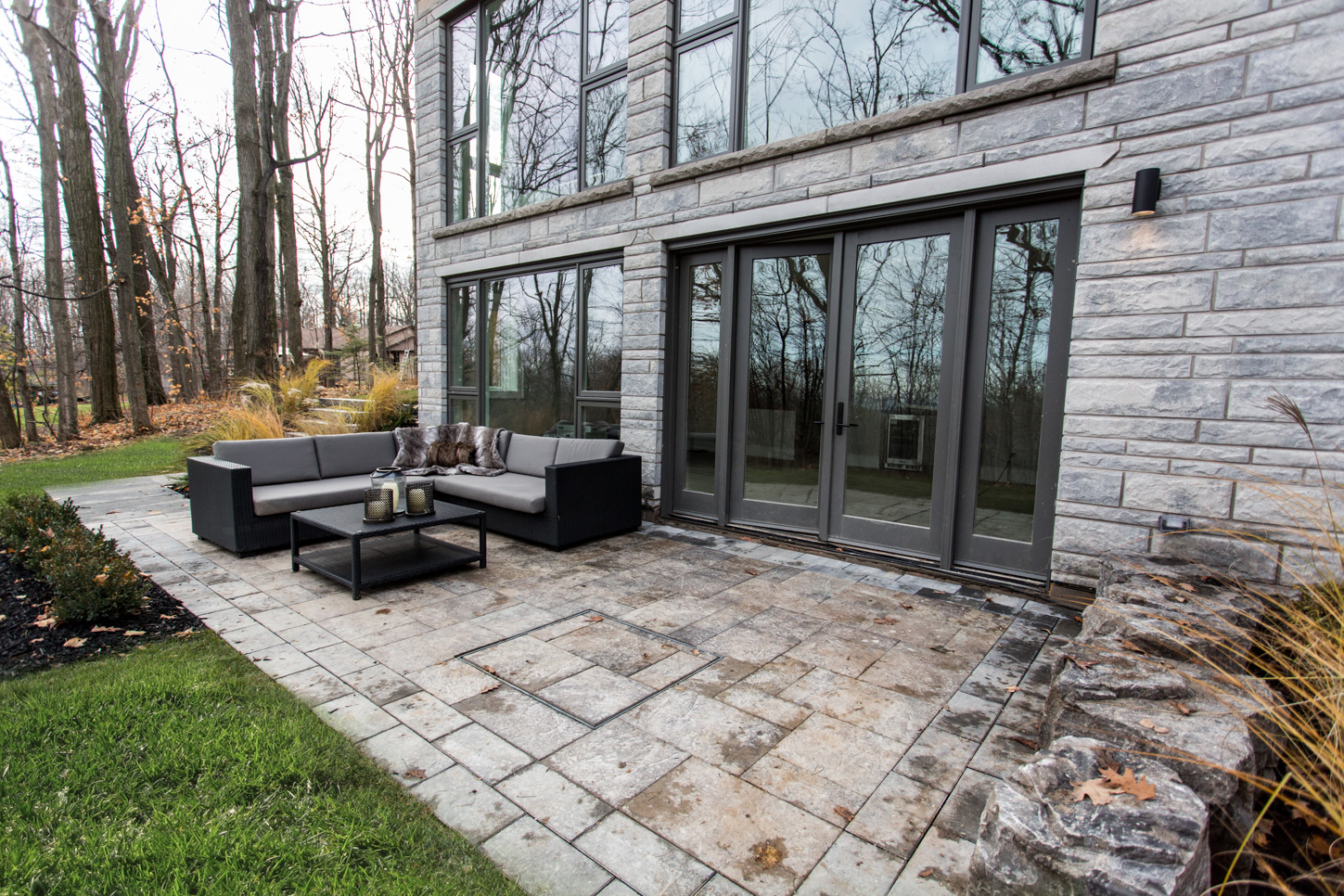
Entertaining Heaven
A large comfy couch, perfect for watching the stars at night with friends.
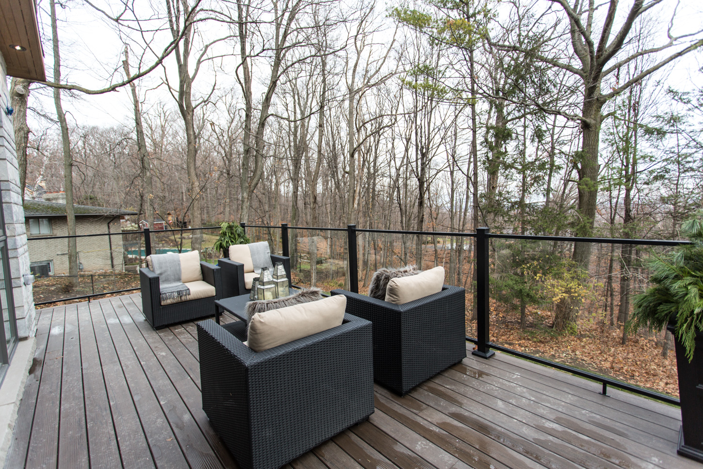
Outdoor Balcony
There’s plenty of outdoor entertaining space, with a balcony off the second level, looking out into the beautiful Niagara escarpment.
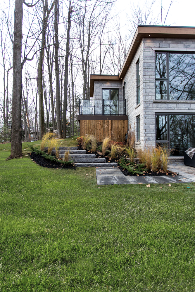
Stones and Shrubs
Sarah didn’t go overboard with landscaping, and decided to keep it simple yet elegant.
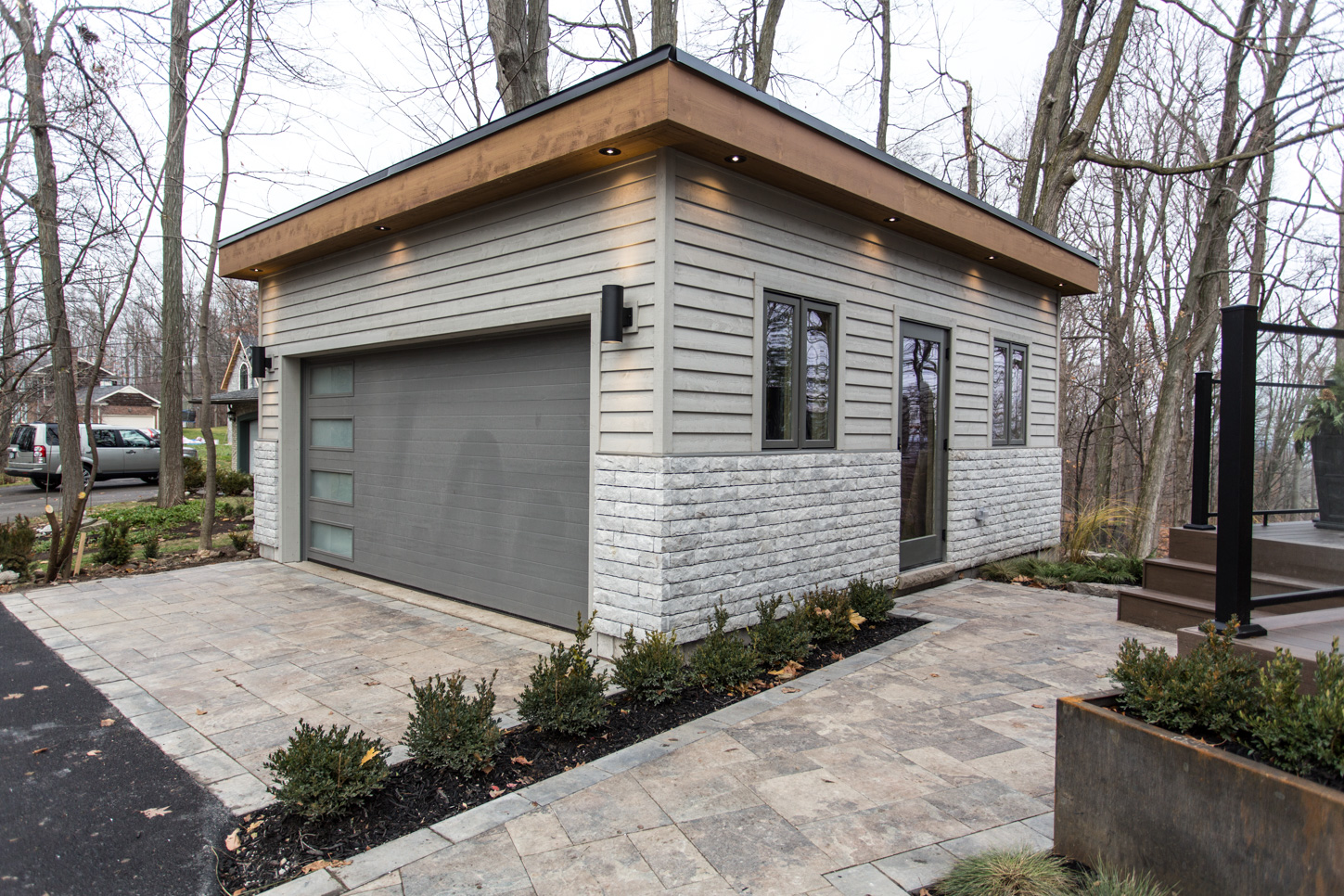
Detached Garage
You can’t go wrong with a garage, and Sarah kept it simple and classy.
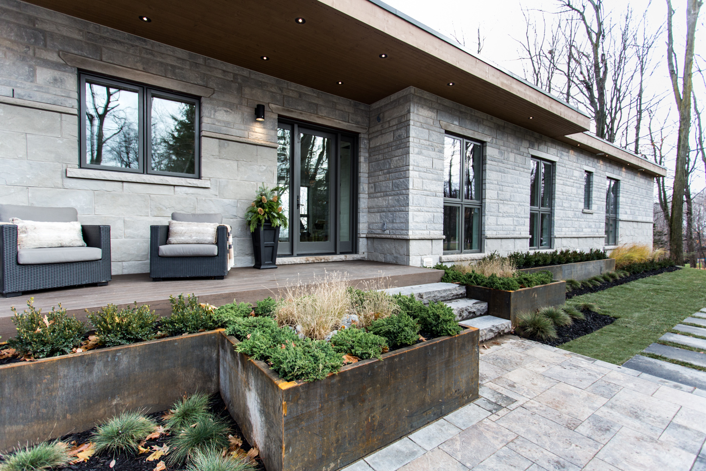
Front Door Curb Appeal
You can sit and flip through magazines or cuddle up with a good book on this front porch. It’s warm and welcoming.
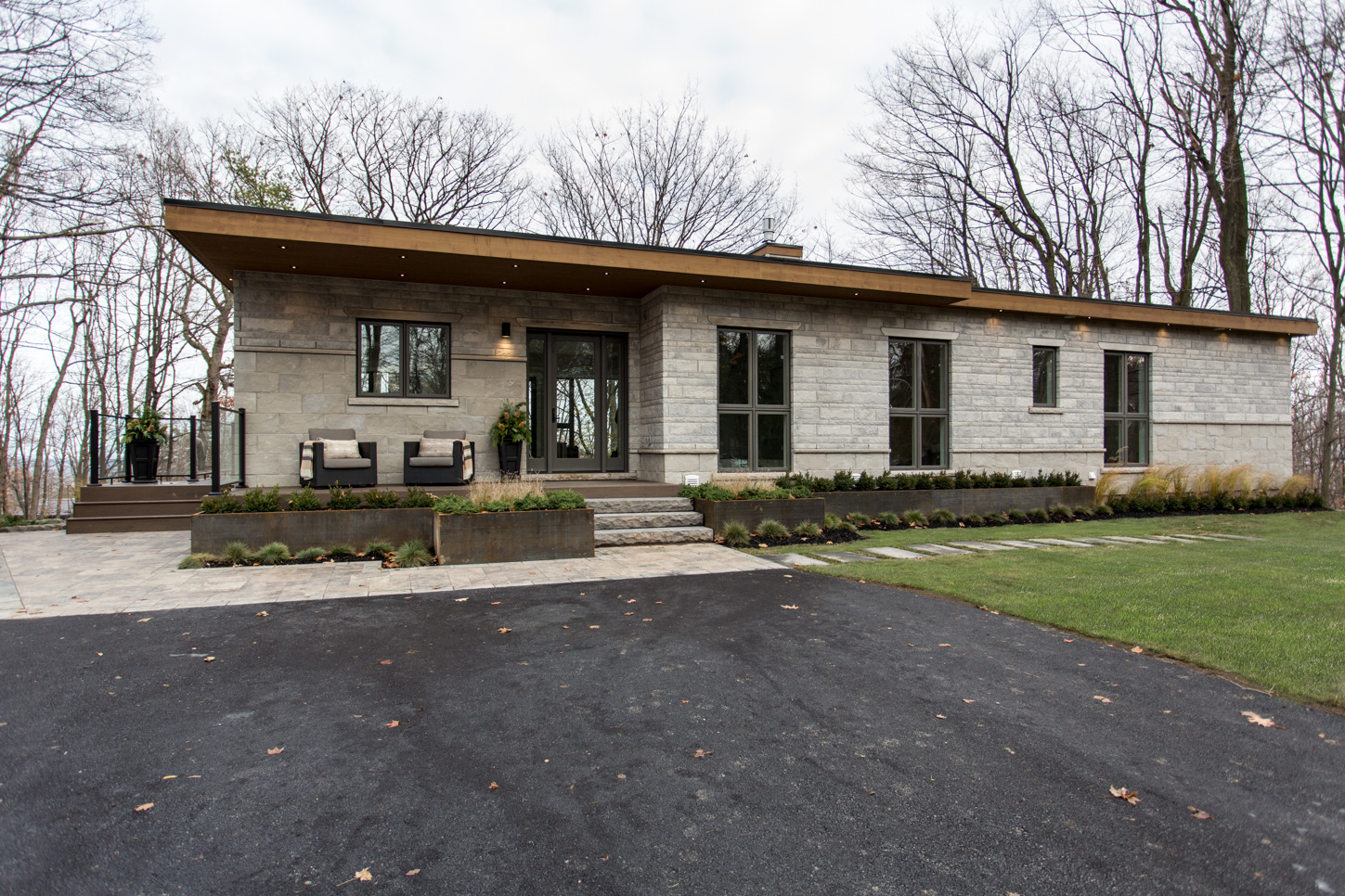
The Front of the Home
The second level balcony wraps all the way to the front so you can enjoy the view from all angles. The big, bold windows let light in from all sides of the house so you can experience the warm and welcoming feel.
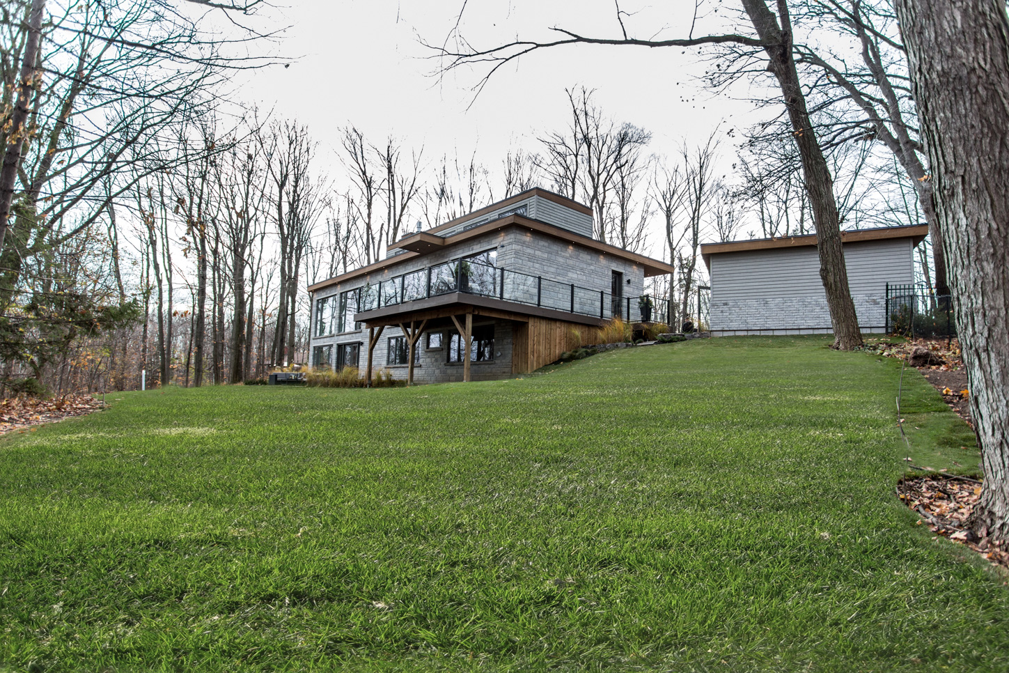
Highview Beauty
Sarah and Bryan did an outstanding job on the Highview home. Watch this episode now!
Home Network your inbox.
By clicking "SIGN UP” you agree to receive emails from Home Network and accept Corus' Terms of Use and Corus' Privacy Policy.


