With season three of Making It Home with Kortney and Kenny in the books, you might be missing your weekly designs. We understand, the week just isn’t as fun without a bit of demo delight. There’s something so satisfying about before and after kitchen remodels and Kortney and Kenny know kitchens. We’ve compiled a list of our favorite Making It Home kitchen designs and what makes them so great.
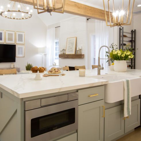
Beam Us Up
Sometimes the wow factor of a space is there even before the demo starts. For this space, Kortney used soft and subtle tones in order to let the architecture of the home serve as the focal point. A muted grey-green tone on the cabinetry, topped with white countertops drew the eyes upwards. The large white farm sink set into the island made for a seamless blend of design and functionality. Lastly, she added gold fixtures in order to tie the light wood tones to the rest of the space. All of which led to a warm, inviting space that wows any guest.
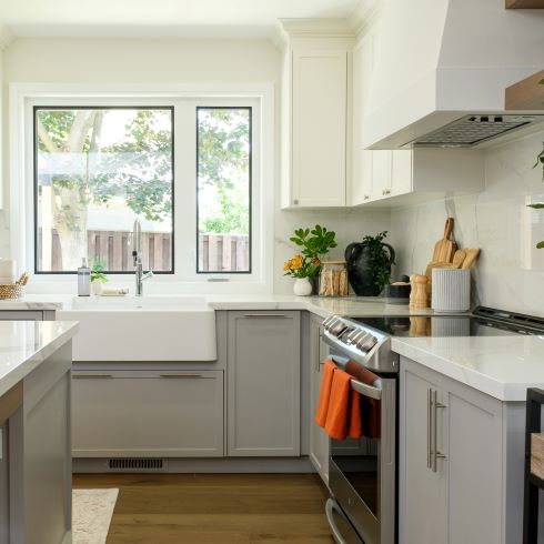
Soft and Subtle
Not all spaces need to blow you away from the moment you first see them. For many, it’s much more satisfying to gradually notice the subtle and tasteful design choices over time. That’s what the Making It Home team pulled off here. With medium-dark wood grain flooring, light grey bottoms and white uppers, the kitchen acts as an upward gradient. This makes for a relaxed space where focus remains at eye level, ideal when entertaining.
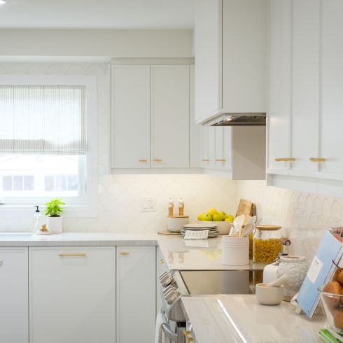
Light, Bright and Just Right
An all-white kitchen may sound intimidating but when it functions right there’s nothing to fear. The key is subtle differences, so the whole room doesn’t blur together. Kortney accomplished this in season 2 by choosing a muted white, with a hint of blue undertones, for the cabinets then breaking them up with a crisp white countertop and backsplash. This creates a subtle yet effective break in the colour scheme. Now this kitchen feels like a soothing space, fit for breakfast alone or a large dinner party.
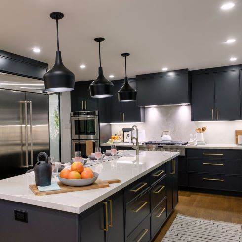
Dark Done Right
Nobody wants their kitchen to feel dark and dreary, but that doesn’t mean you can’t use dark colours. It’s all about creating balance, which is what Kortney and Kenny brought to this kitchen. With extremely dark cabinetry and crisp white counters and backsplash there was a balance of stark contrasts. To blend these two opposites together, they installed gold fixtures to serve as common ground. Finally, they blended and brightened the whole thing together with additional recessed lighting.
Texture Time
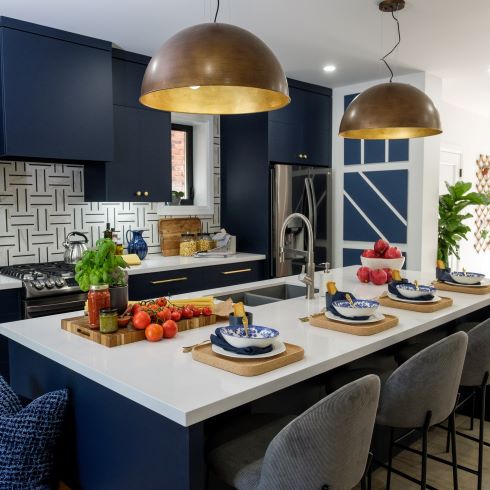
We all love a bit of texture. Textures create intrigue for the eyes and draw you in, even if it is just to touch something fuzzy. The key is to know when enough is enough, which the team clearly does. The tiled backsplash, linework of the small feature wall, and felted seating either give the illusion of, or are, textures. The sleek white counters, simple cabinetry and hardware serve as a break for the eyes. To blend it all together they chose a matte finish on the dark blue cabinets.
The Colour of Envy
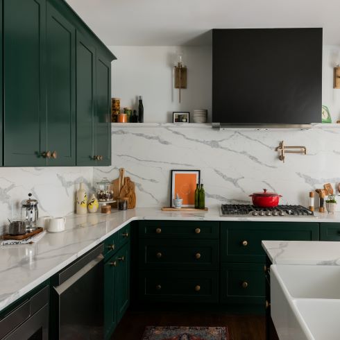
It’s nice to see dark greens getting their moment in the sun, they’ve gone underappreciated for too long. Like with other dark cabinets, Kortney knew that it was best to contrast them. Because they weren’t an extreme level of dark, that left her some room to play with. Rather than go completely white, she chose marble that had beautiful and intriguing runs of grey throughout for the backsplash and counters. This made the design evenly balance before trying it together with gold hardware that complimented the cabinetry.
Two-Toned Up
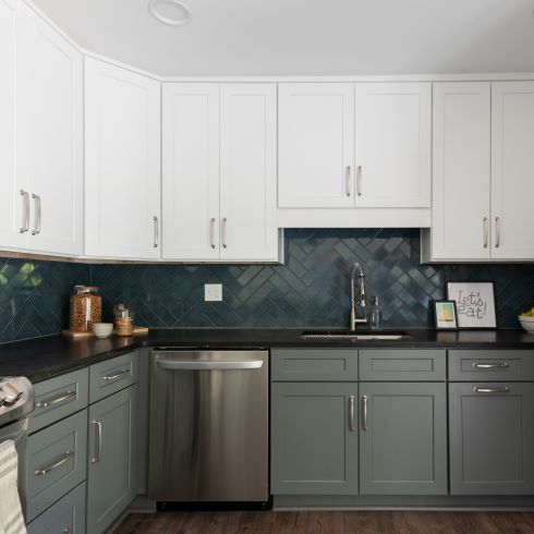
The go-to nowadays is large islands that wow. For this kitchen, the layout was remaining a mostly open floor plan, the interest would have to be focused elsewhere. That somewhere was the cabinets. With the darker lowers and white uppers, the design naturally brings the eyes upward, creating a more social space. Where this design differs is in the backsplash and counter. Normally, these would be used to blend the cabinetry together, but Kortney wanted them to pop and stand on their own. Instead, with a black counter and a subtle blue tiled backsplash, she let them serve as supporting background.
Overhead Intrigue
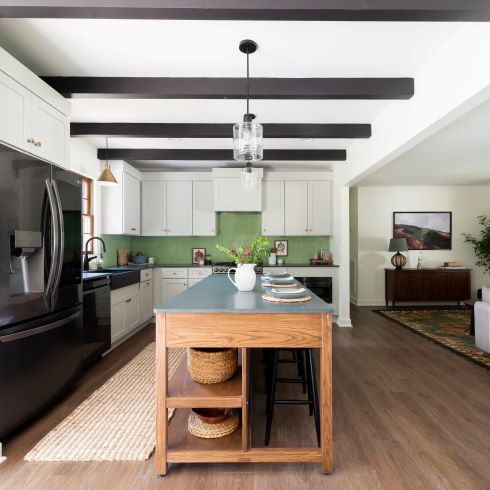
Exposed beams and overhead framework will always make a space feel more grand. Because the room and home were meant to be the focal point of the space, the team opted for a softer design. White cabinetry, light green backsplash and a natural wood-toned island made for beautiful design that didn’t demand attention. The little pops of colour, like the light blue island counter, made for design elements that quietly complimented.
A Dash’ll Do Ya
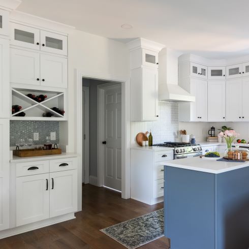
There’s elegance in simplicity. It allows you to be more intricate without appearing cluttered or overdone. By painting the cabinetry all white, the team was able to add in additions such as a wine rack and glass faced panels above the uppers. This created more intrigue and functionality in the space without it appearing as overdone. The rich wood floors made for a healthy contrast against the white of the room. Finally, the addition of a soft blue to the small island added colour without breaking up the design.
Playing With Tones
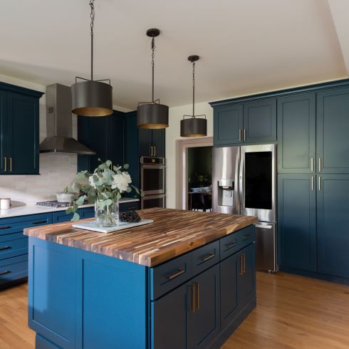
Often in designs we see contrasted colours or textures. It’s not as often that the tones vary as much. That’s exactly what happened in this kitchen renovation. In theory, the cool, white backsplash and countertops, and the warm tones of the wood grain floor and butcher’s block island top should clash. Instead, the soft but cool cabinets bridge the two. This idea only continues through the lighting. With an abundance of cool natural lighting via the windows, as well as the warm soft lighting from the overhead fixtures.
Home Network your inbox.
By clicking "SIGN UP” you agree to receive emails from Home Network and accept Corus' Terms of Use and Corus' Privacy Policy.


