Tara-Lee and Bryan bought a beautiful piece of land on Ontario’s Trent Lakes about 25-years ago. Since then, they’ve cleared the land and built a cottage with a gorgeous view. They’ve rarely used the vacation home so they’ve decided to rent it out instead. But with an unclear front door, an unfinished basement and a design that was brimming with too much pine, this cottage and its owners needed help. Enter Scott McGillivray, designer Debra Salmoni and the Vacation House Rules team. See how they took this piney place and transformed it into a Hawk-inspired retreat with serious rental income potential.
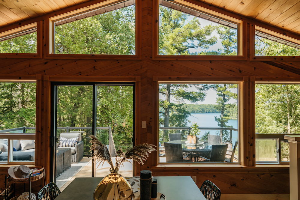
A Cottage With a View
The view is the ultimate selling point of this property, what with the sprawling water and bird’s eye perspective. So Scott decided to capitalize on that with a hawk nest theme, branding this cottage while giving clear direction in terms of design inspiration and overall vibes.
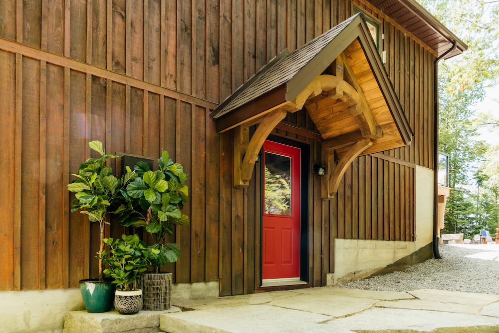
A Memorable Front Door
Before, entering this property was a confusing journey because the front door was hidden by a wraparound deck. It also wasn’t memorable, which doesn’t start anyone’s rental experience on the right note.Now, however, thanks to a few welcoming plants, a bright red door, the removal of the unnecessary deck, and a gorgeous portico, it’s immediately apparent where this vacation starts.
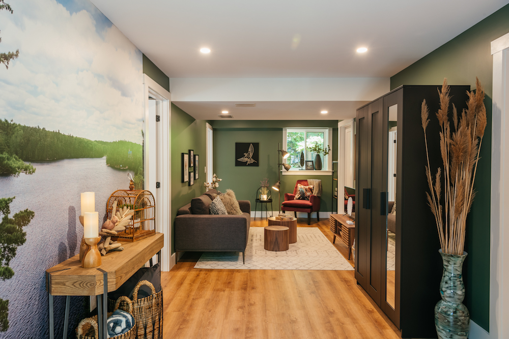
A Warm Welcome
The front door used to lead to an unfinished basement, which isn’t exactly a great first impression. So, Scott finished off the area with two extra bedrooms, a bathroom, and this welcoming seating area which adds extra living space while boosting rental income potential. The hawk-nest theme also begins here thanks to the calming green colour palette, and the custom aerial photo mural of the lake adds a personal touch.
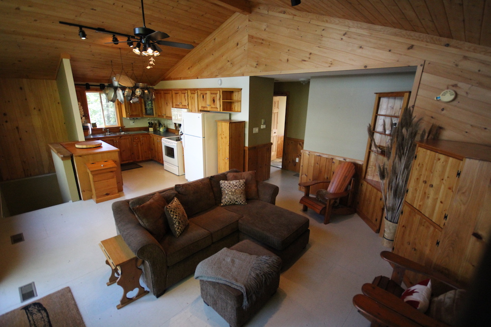
The Old Main Living Space
This is what the main floor of the cottage used to look like. There was a good layout, but with so much pine-on-pine the space felt constrictive and dark. Add in an awkward nook in the living room where a bedroom closet protruded and painted plywood floors, and this isn’t exactly a space that appeals to renters.
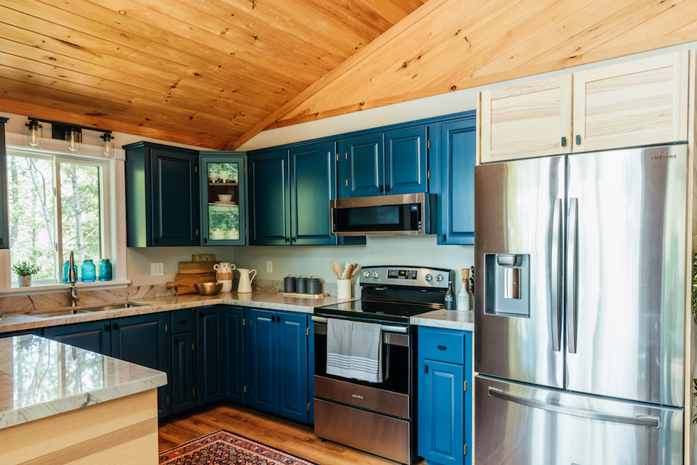
An Anchoring Kitchen
Scott and Debra cut down on reno costs while increasing the kitchen’s overall appeal by painting the pre-existing cupboards a bold blue hue. It’s meant to be an anchoring wall to the opposing picture window view of the beautiful blue lake and forest below. In order to maximize that effect, the duo kept the remaining walls a neutral colour, while also leaving in some of the original pine panelling above.
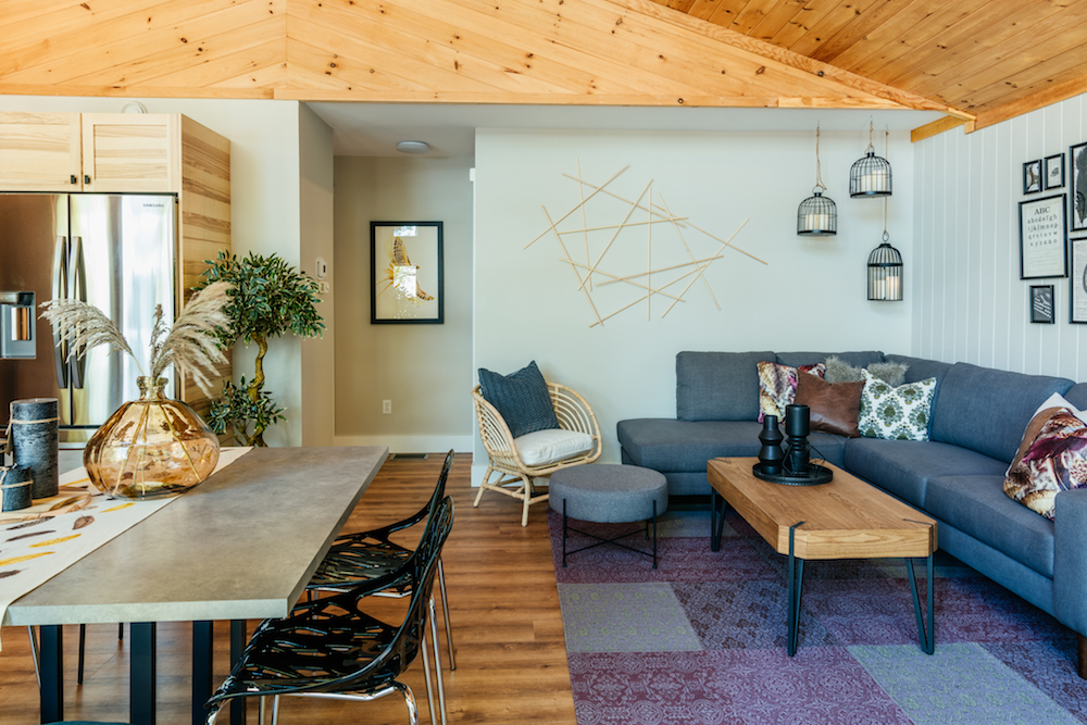
A Place to Congregate
A large table with plenty of room for people to gather separates the kitchen space from the living room. Debra procured this pretty blue sectional sofa that allows for ample seating while also playing off the blues in the kitchen. Gone is the awkward corner and extra pine on the walls. Add in some fresh paint and a new floor throughout, and this space feels brighter and larger, too.
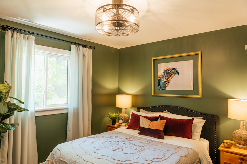
Continuing the Theme Throughout
There are four bedrooms in this property, all of which continue that hawk theme. That branding is definitely apparent in the primary bedroom, where a print of a hawk adds a little art appeal to the space and forest green paint brings in those bold, earthy tones. Even the light fixture is meant to emulate a bird cage, giving renters a cozy but on-theme place to wind down after a day at the lake.
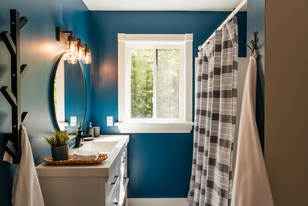
Modern Touches in the Bathroom
Thanks to the basement overhaul there are now two bathrooms in this vacation rental. However the preexisting room on the main floor definitely needed a little TLC. The layout was good, but by incorporating high-end finishes that make renters feel as though they’re visiting somewhere really special, Scott elevated this rental a few pegs up on the competitive vacation rental pecking order.
Extending the Vacation Outside
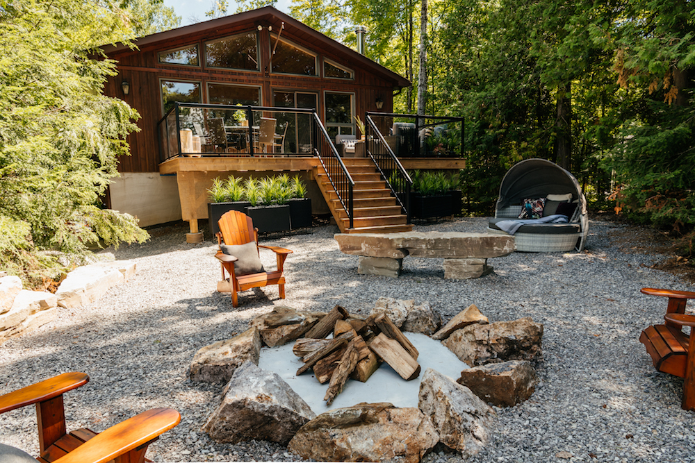
In order for renters to unwind somewhere where they can soak in all of the views from the outside of the property, Scott hauled out the old, unsafe deck and installed this smaller version with glass panels instead. There, renters can find an outdoor eating area as well as a place to lounge – two vital spaces when renting out this kind of property. Then, Scott constructed a welcoming firepit area below, giving potential renters tons of options to enjoy while on their vacay.
Know Your Market
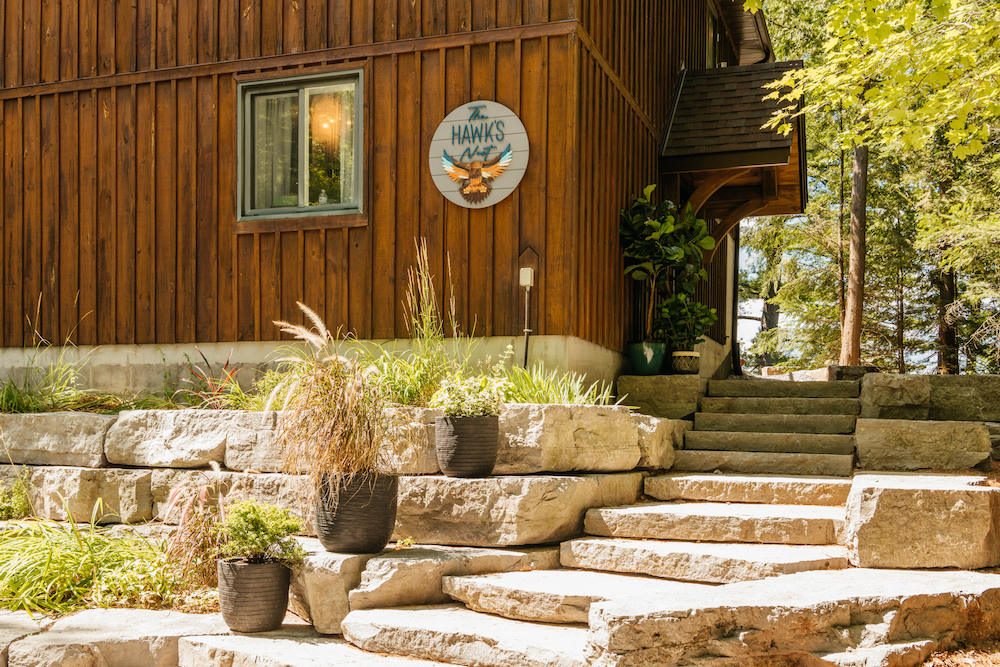
To really increase the marketing and branding on this vacation rental, Debra and Scott had a local artist create this sign. Alongside the newly landscaped exterior (complete with drought-friendly plants for low maintenance), it adds a welcoming and charming feel to the whole rental experience. With so many beautiful finishing touches, double the living space, and a theme that flies high, Scott is confident Tara-Lee and Bryan can easily rent this place out for $430 a night during the peak season. Now that’s one heck of a nest egg.
Home Network your inbox.
By clicking "SIGN UP” you agree to receive emails from Home Network and accept Corus' Terms of Use and Corus' Privacy Policy.


