Sometimes, buying a house in Toronto can be straight-up weird. The homeowner, a civil litigation lawyer, learned this when she and her husband, a consultant, started looking for a home in Wychwood in 2017. They’d been searching for months when they spotted a rickety For Sale sign. Strangely, the house wasn’t listed online. When they reached out, they learned that the seller – an older man – was a bit peculiar. “He treated it as a beauty pageant. He wanted to make sure his beloved home was being handed over to someone he was comfortable with,” the homeowner recalls. The house had its flaws: avocado-green toilets and a totally outdated kitchen. But the couple saw potential. And, for reasons unbeknownst to her, the seller took a shine to her. “We just clicked.” The house was sold off the market and the couple spent the next 10 months fixing it up.
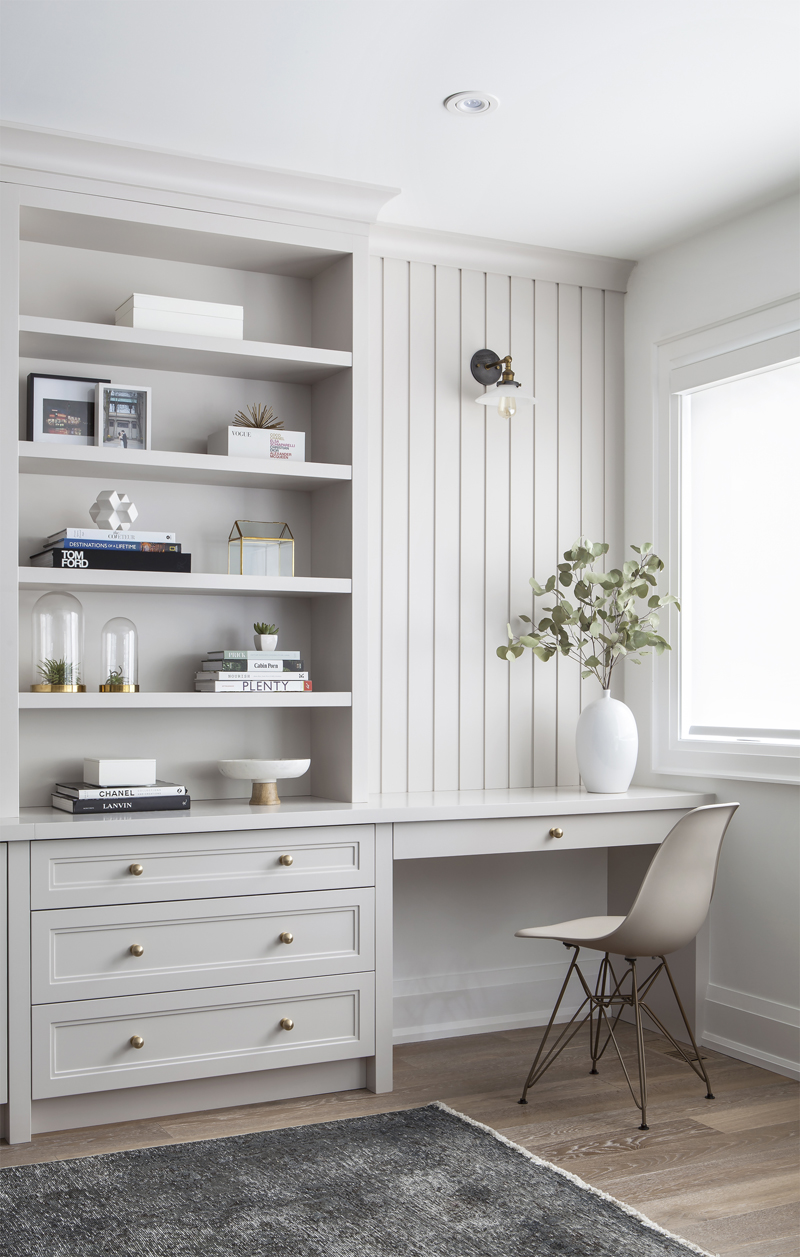
Let it Shine
, a Toronto-based firm, was hired to help with the redesign. The plans were major: they built brand-new additions that more than doubled the square footage. “The approach was to definitely brighten it up to make a family-friendly home,” the homeowner said. The living room, seen here, embodies their airy design approach. A sprig of eucalyptus sits in a vase, from HomeSense and the built-in wall unit profiles some of the family’s favourite books. The off-white desk chair is from Elite Living and the sconce lighting is from Restoration Hardware.
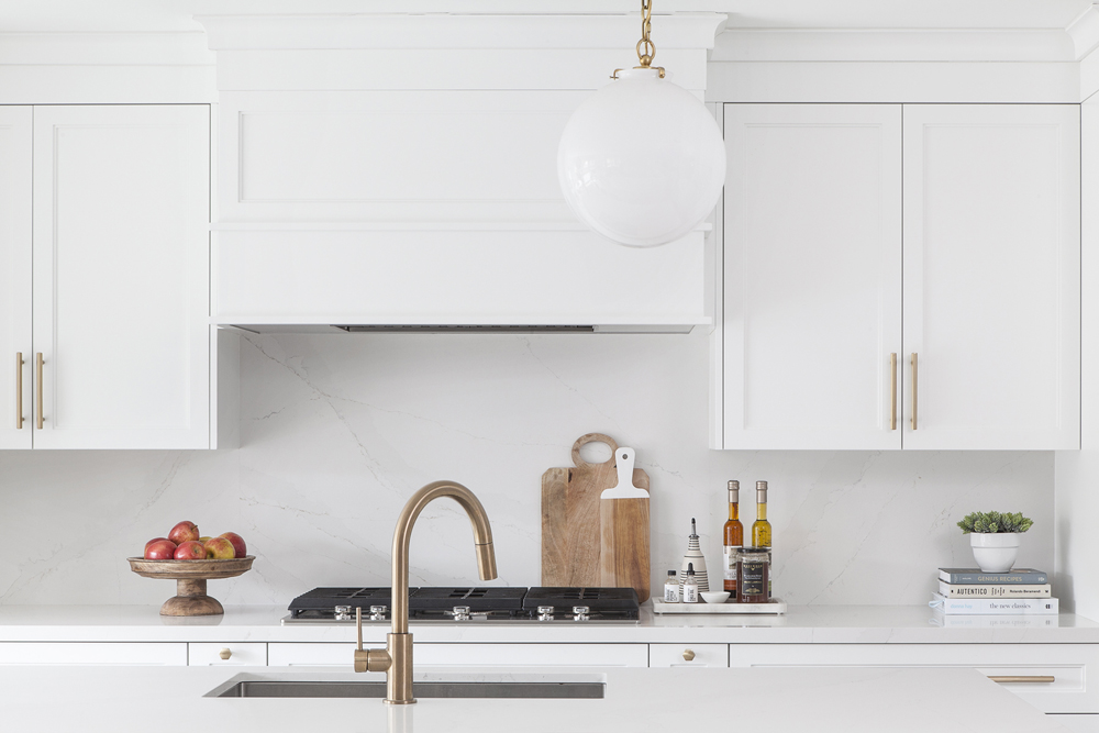
Stay Golden
The homeowners entertain a lot and they wanted the kitchen to be both stylish and inviting. They opted for brass hardware and globe pendant lighting to add a metallic pop to the all-white kitchen.
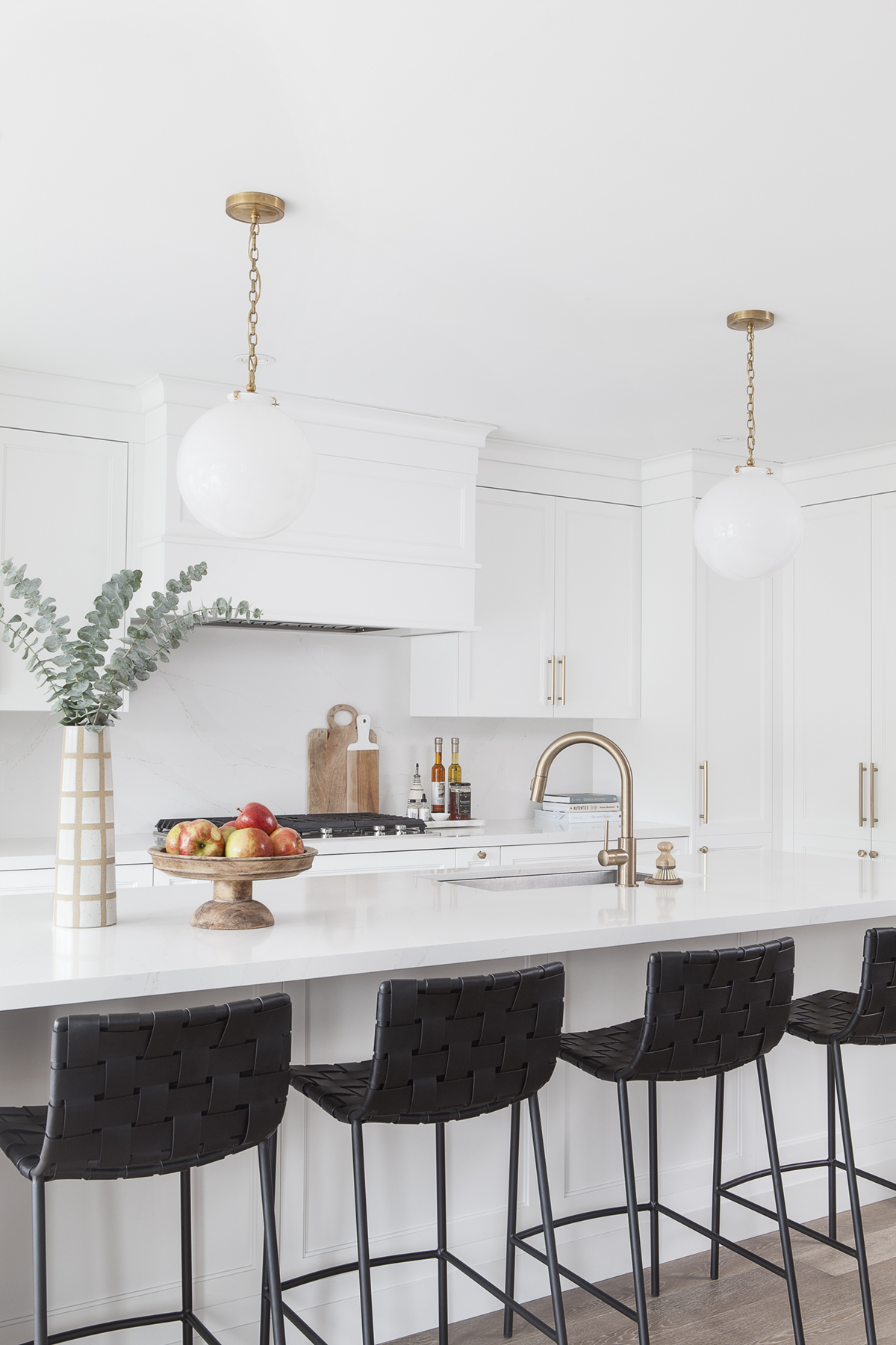
Perfect Balance
The kitchen backsplash, from Silestone, strikes the perfect balance of neutral and warm.
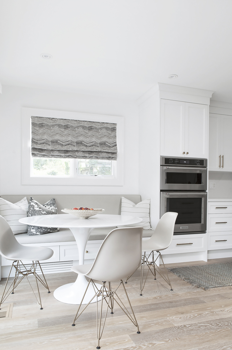
Storage or Light?
The breakfast nook is flooded in natural light thanks to a south-facing window, which almost wasn’t there in the first place. The homeowner wanted the wall for storage, but her father convinced her to punch out a window. “That was a great decision,” she said. The cushions on the bench are custom-made by Collective Studio and the tulip table was bought from a wholesale store.
Flower Power
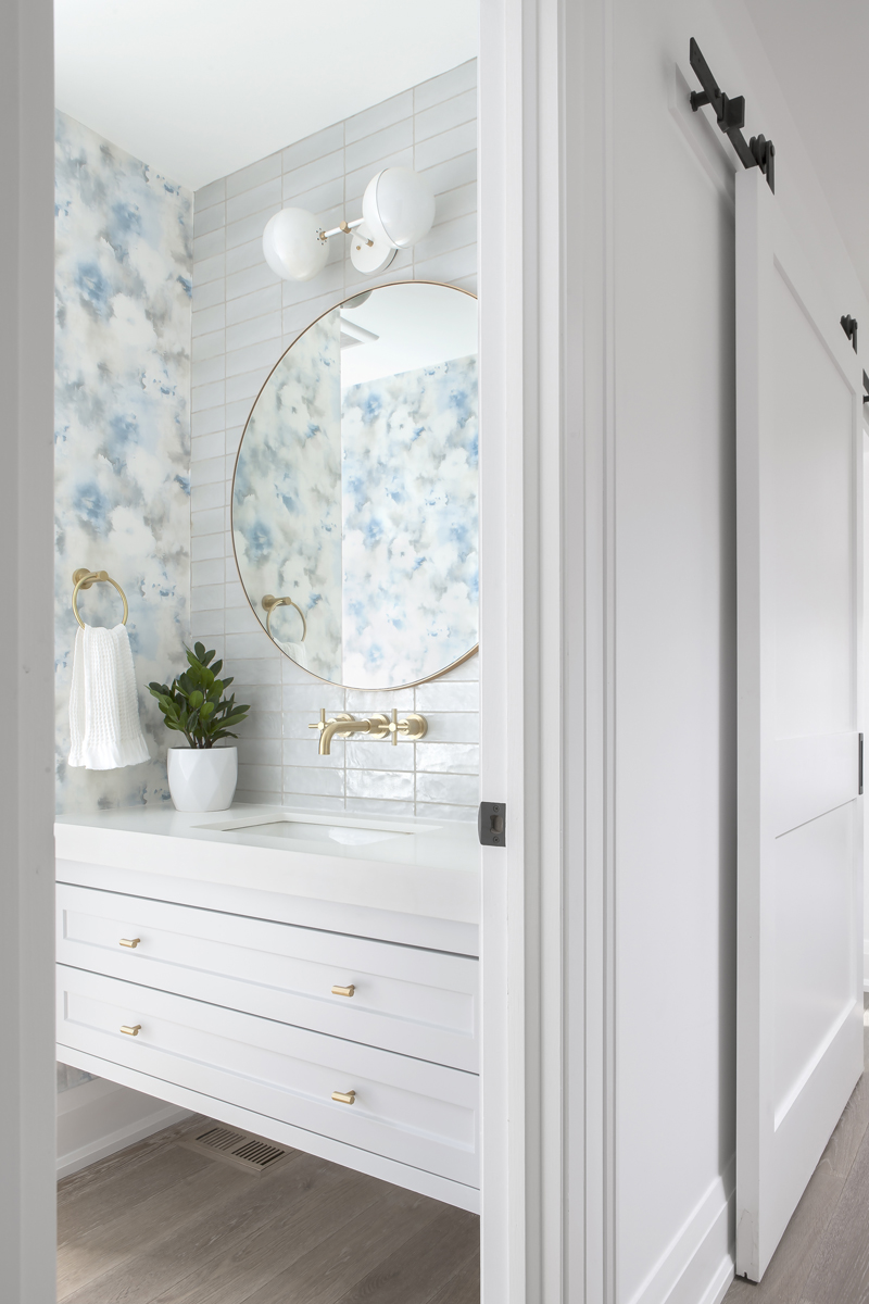
For the powder room, the homeowner knew she wanted to go bold and this wallpaper fit the bill. “I love the outdoors, I love greens. This is a floral print without being in-your-face floral,” she said. The backsplash is a textured subway tile that picks up the light with a unique pearly hue. The brass touches, including the mirror from CB2, complement the hardware in the kitchen.
All Grown Up
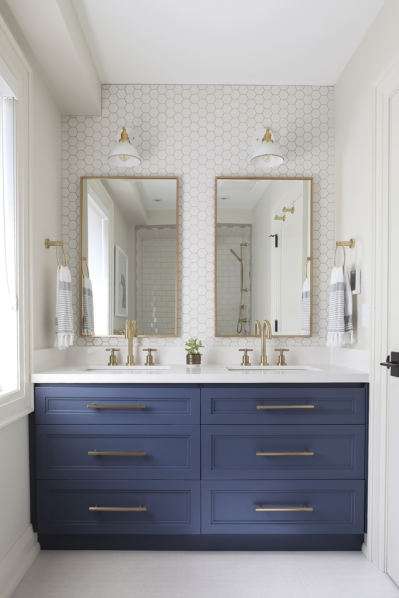
Believe it or not, this is the kids’ bathroom. The homeowner wanted the space to grow with her son. “I was not of the mindset that we would create a bathroom and replace it in five years. I tried to choose things that I would like forever.” For a bit of intrigue, she opted for funky hexagonal backsplash and hand-crafted light fixtures she found on Etsy.
Pin It
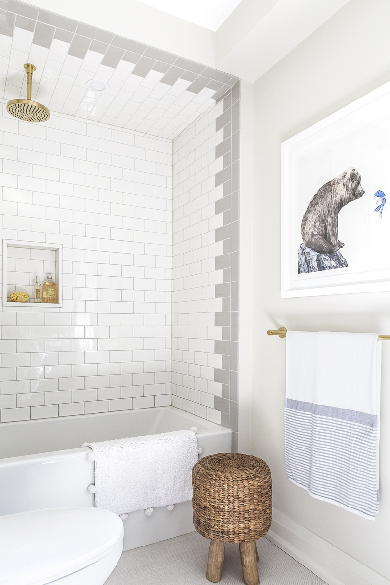
This side of the bathroom was inspired by a post the homeowner spotted on Pinterest. She recreated the white-and-grey tile work and added a striking brass shower head from the Rubinet Faucet Company. The bear artwork across from the toilet is from Minted. “I thought it was adorable,” the homeowner said.
Cottage Chic
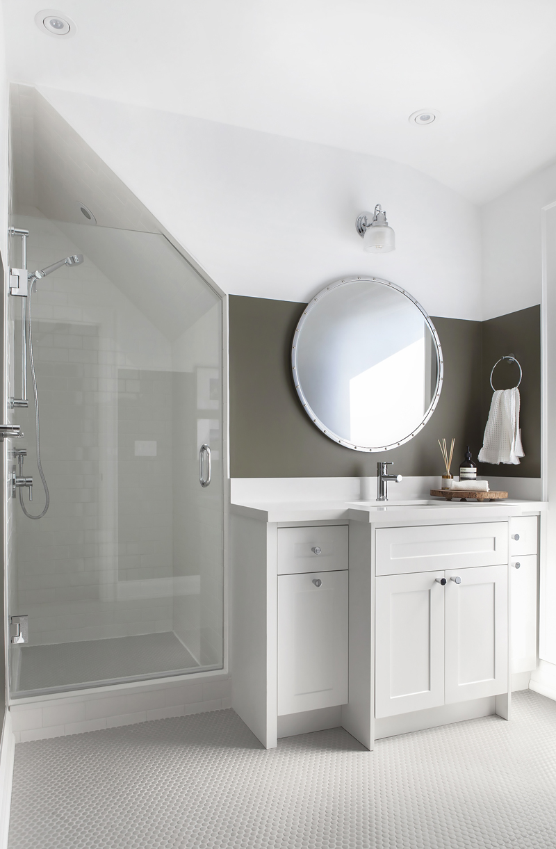
The couple added a new third floor to the house, which is where this bathroom sits. Their house is on a hill and this top-floor view has a clear sightline straight to the CN Tower. The idea to go with penny tiles for the floor came from Collective Studio, as did the green stripe behind the mirror. “Because of the sloped ceiling, it has a bit of a cabin feel in there,” the homeowner said.
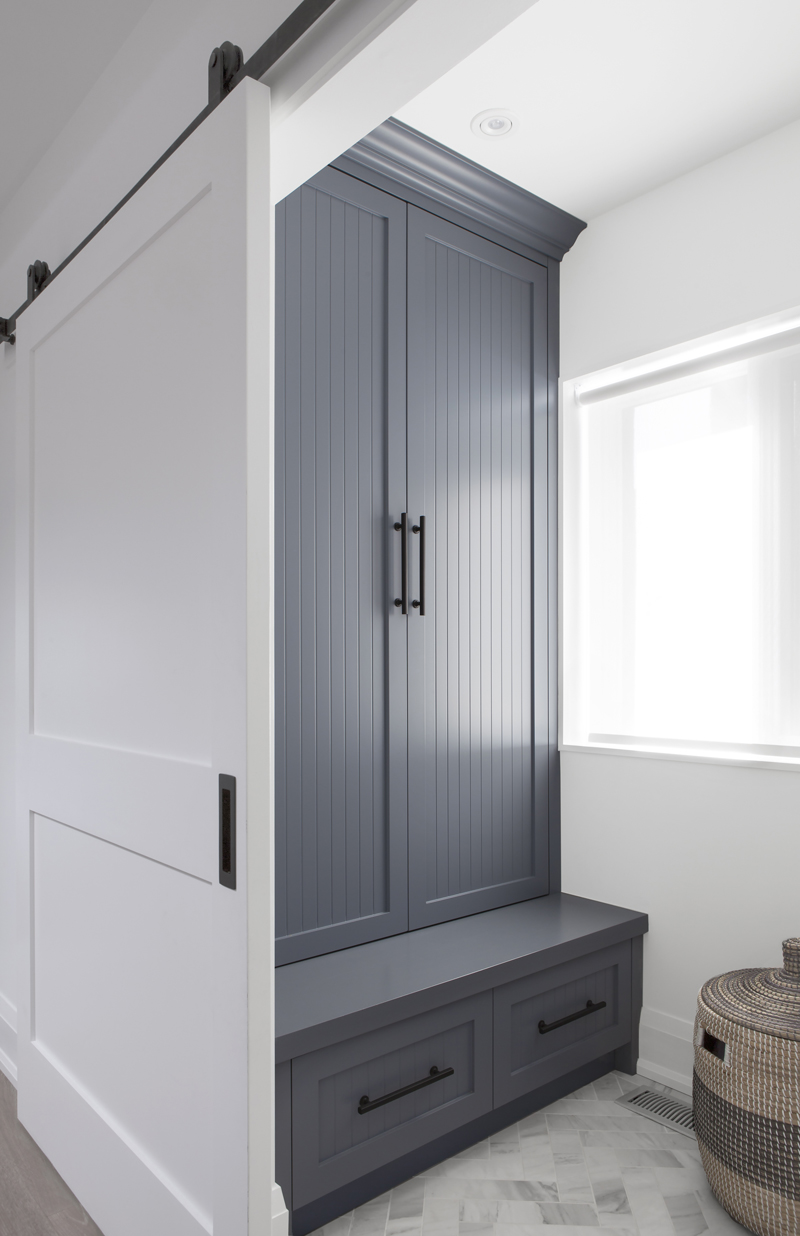
Let it Snow
Canadian winters require loads of accessories – hats, scarves, coats – and this mudroom, hidden behind a sliding door, is the perfect place to store them all. The herringbone-style floor tile was another clever decision by Collective Studio. The blues in the tile pick up the colour of the cabinet, while the grey tones help hide dirt on the floor.
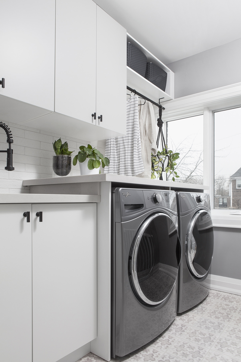
Laundry With a View
Often, laundry rooms are tucked away in basements. The homeowner was intent on having her laundry room on the same floor as the bedrooms, since that’s ground-zero for dirty clothes. Bonus points: a big picture-frame window adds a bit of sunlight to the space and helps the plants flourish.
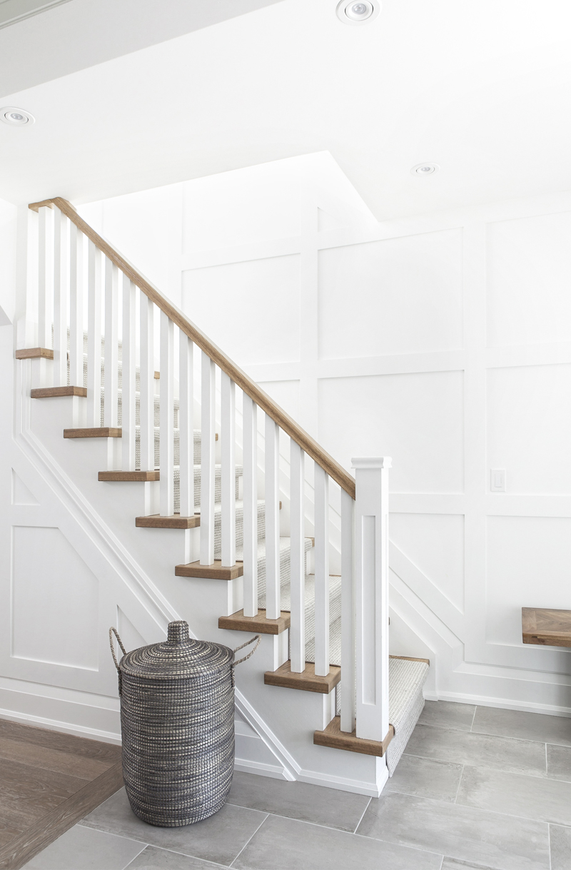
Warm Welcome
The couple wanted something unique for the entryway and they decided to splurge on custom paneling for the walls. “It adds a little something special,” the homeowner said. A carpet runner on the staircase makes climbing to the second floor a bit cozier come winter. The basket beside the staircase, from HomeSense, helps bring out the grey tones in the front-hall tiles.
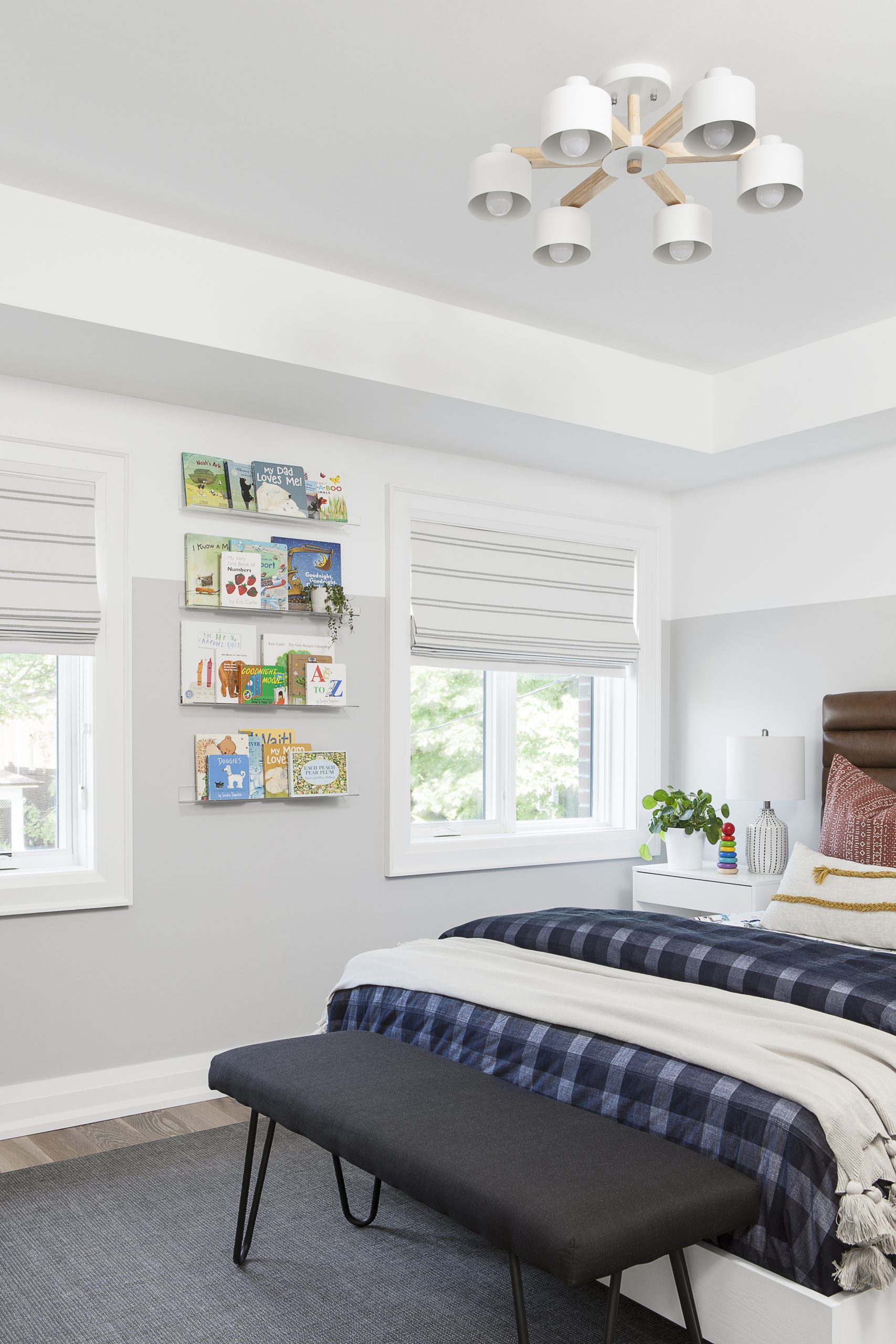
Playful and Mature
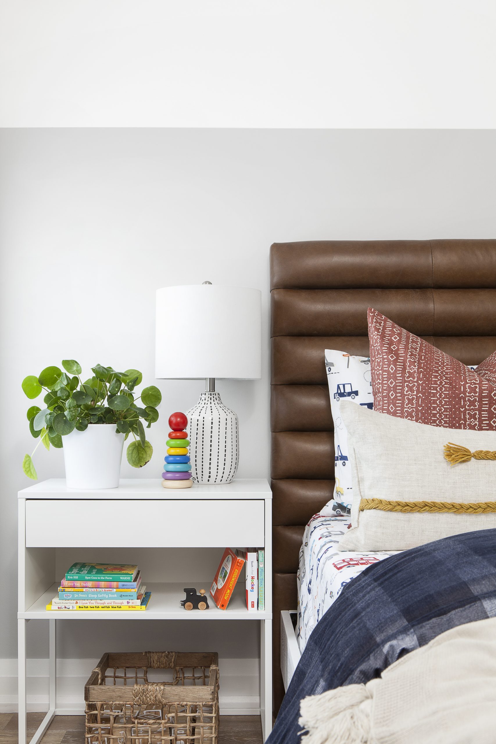
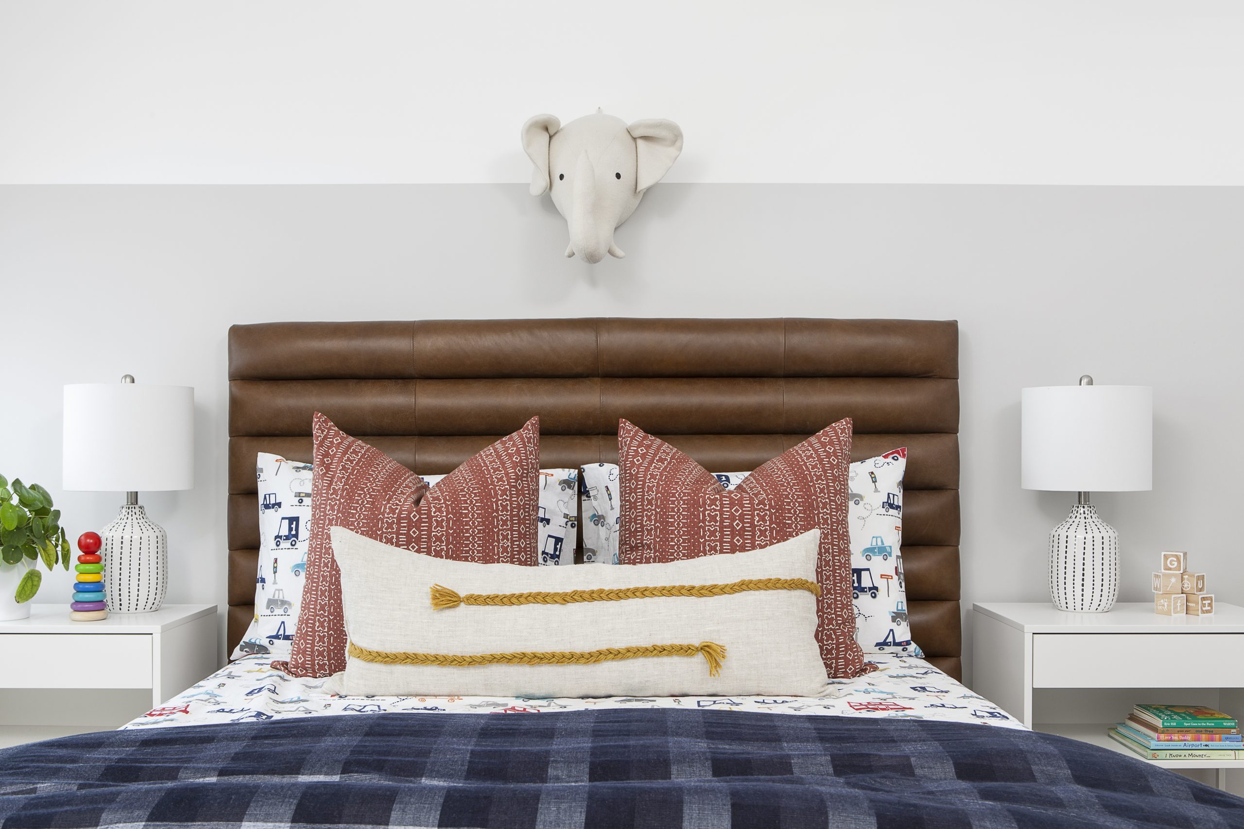
For the homeowner’s son’s room, she wanted to create an ageless space that was both playful and mature. The leather headboard, from Article, is a warm shade of Oxford tan. The little one is going through a major firetruck phase and his bedding – from Pottery Barn and Restoration Hardware – totally fits the bill.
Fit for a King
Here’s a closer look at the headboard and bedding, as well as a fun side table that balances the child (books! toys!) and the adult (greenery! that lamp!).
Elephant in the Room
We’re diggin’ the stuffed elephant head over the bed, too.
Abstract Thought
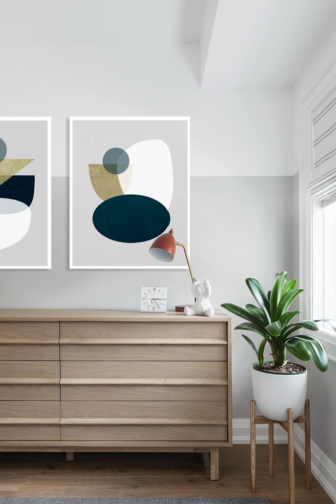
Here’s another angle in the homeowner’s son’s room. The light brown dresser, orange lamp, abstract artwork, mid-century modern plant stand and vibrant greenery are all things that he’ll be able to keep in his room as he grows up.
Home Network your inbox.
By clicking "SIGN UP” you agree to receive emails from Home Network and accept Corus' Terms of Use and Corus' Privacy Policy.


